Style combination · Pairs well
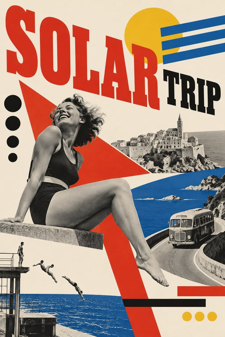
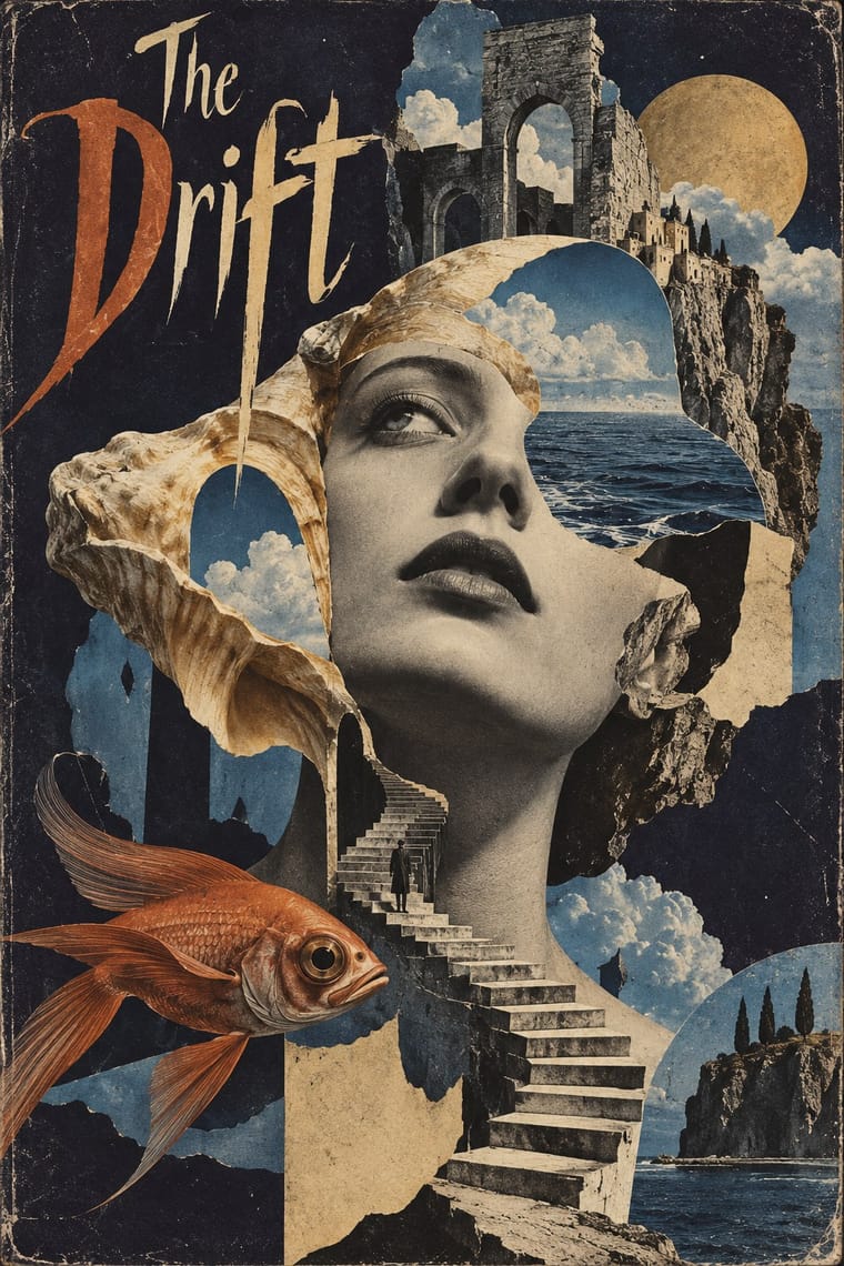
Czech Poetist Book Design × Surrealist Graphics
Štyrský and Toyen pushed this montage toward dream imagery; add one uncanny juxtaposition to tip a lyrical cover into the strange.
Mix them and make something Czech Poetist Book Design Surrealist Graphics
01
What each style brings
Each part of the design comes from the style with the stronger say in it, and each style gives at least two.
Czech Poetist Book Design (Devětsil) Surrealist Graphics
- Type from Czech Poetist Book Design
- Colour from Czech Poetist Book Design
- Form from Surrealist Graphics
- Composition from Czech Poetist Book Design
- Surface from Surrealist Graphics
-
02
The type
Open fonts standing in for each style’s own type, which is often hand-drawn or commercial.
Display · Czech Poetist Book Design
Reverie
Inter Tight, standing in for Jobbing grotesque capitals from Prague print shops
Text · Surrealist Graphics
Launched by André Breton's 1924 manifesto, Surrealism sought the marvellous in dreams, chance and the unconscious. Its graphic legacy (uncanny collage from old engravings, solarised and cameraless photographs, impossible juxtapositions painted with illusionistic precision) passed through magazines like Minotaure into fashion, advertising and book design on both sides of the Atlantic.
Bodoni Moda; Surrealist Graphics used Artists' hand-lettered mastheads and Didone and Victorian display faces lifted from 19th-century catalogues
03
The colours
The ground and leading colours come from Czech Poetist Book Design, with a counter-accent from Surrealist Graphics. The ink reads on the ground at 4.5:1 or more.
Czech Poetist Book Design (Devětsil) Surrealist Graphics
-
#f2ebdcground · 36% -
#161514ink · 14% -
#e9b52caccent · 18% -
#a24a2aaccent · 14% -
#d22f22accent · 10% -
#d8b77aaccent · 8%
As CSS
:root {
  --ground: #f2ebdc;
  --ink: #161514;
  --accent-1: #e9b52c;
  --accent-2: #a24a2a;
  --accent-3: #d22f22;
  --accent-4: #d8b77a;
  --font-display: "Inter Tight", sans-serif;
  --font-text: "Bodoni Moda", serif;
}
04
The two styles
05
More combinations
With Czech Poetist Book Design
- Russian Constructivism Contrasts · Same bars, diagonals and photomontage with the opposite mood; use the Poetist version when a constructivist layout needs lightness and wit instead of command.
- Kinetic Typography & Variable Type Pairs well · Abeceda's dancer-as-letter photographs are a print ancestor of type that moves; borrow the idea of a body performing each glyph for motion identities.
- Risograph & Indie Print Culture Pairs well · Two-colour riso and found photographs recreate the red-and-black montage covers cheaply and with the same playful immediacy.
- Zenitism (Zenit Magazine Typography) Pairs well · Another Central European offshoot of constructivist tools; borrow Poetism's lightness to soften Zenit's agitation.
- Brazilian Modernismo Graphics (Klaxon and the Semana de 22) Pairs well · Two playful letterpress avant-gardes of the 1920s that turned posters, programmes and adverts into poems; Devětsil's photomontage and bars can stand in where Klaxon would use a contour drawing.
With Surrealist Graphics
- Corporate Identity Modernism Contrasts · Place a single dream image inside a strict corporate grid; the calm system heightens the strangeness.
- Isotype Pictorial Statistics Contrasts · Isotype's one-symbol-one-meaning is the antithesis of Surrealist ambiguity; decide whether the viewer should decode or be disturbed.
- Psychedelic Poster Pairs well · Psychedelic posters revived Surrealist dream imagery; combine them for hallucinatory figurative work with melting forms.
- Polish Poster School Pairs well · Polish poster artists fused Surrealist metaphor with painterly lettering; borrow the method for cultural posters built on one uncanny image.
- Post-Punk Record Sleeve (Stiff, Factory, 4AD) Pairs well · Vaughan Oliver drew on Dalí and Surrealism; add an uncanny juxtaposition to a blurred, textured 23 Envelope photograph for a dream-like sleeve.
- Brodovitch Editorial Design (Harper's Bazaar) Pairs well · Take its isolated body parts, torn edges and dreamlike juxtaposition, but apply them to the photographic spread.
- AIZ Political Photomontage (Heartfield) Pairs well · Surrealist photography also makes the impossible look photographed; take its dream logic when a brief needs strangeness, and add the AIZ headline and caption when that strangeness has to land a political point.
- Emblem Book (Motto, Picture & Epigram) Pairs well · Both find meaning in the gap between a picture and the words beside it; pair a framed, uncanny object with a terse motto above and a short verse below for an editorial series that asks to be decoded.