Style combination · Contrasts
Chinese National-Style Animation × Lianhuanhua Picture-Story Books
Its printed contemporary: both told myths and fables, the Monkey King among them, to a mass audience under the same state, but the palm-sized picture-story books drew in black ink line, one framed picture to a page with a caption, while the studio moved painted and cut-paper figures over empty grounds with few or no words.
Mix them and make something Chinese National-Style Animation Lianhuanhua Picture-Story Books
01
What each style brings
Each part of the design comes from the style with the stronger say in it, and each style gives at least two.
Chinese National-Style Animation (Shanghai Animation Film Studio) Lianhuanhua Picture-Story Books
- Type from Lianhuanhua Picture-Story Books
- Colour from Lianhuanhua Picture-Story Books
- Form from Chinese National-Style Animation
- Composition from Lianhuanhua Picture-Story Books
- Surface from Chinese National-Style Animation
02
The type
Open fonts standing in for each style’s own type, which is often hand-drawn or commercial.
Display · Lianhuanhua Picture-Story Books
Fiesta
Shippori Mincho, standing in for Songti (Ming) and Kaiti printing types for captions
Text · Chinese National-Style Animation
The 'national style' of the Shanghai Animation Film Studio, which turned from Disney and Soviet models to Chinese media: Peking-opera masks and movement, paper-cut and folded-paper figures, mural and New Year print colour and, from 1960, ink-wash painting set in motion after Qi Baishi and Li Keran. Graded ink on empty paper, flat outlined figures over painted grounds and brush-written titles carried fables and myths, from Havoc in Heaven (1961-1964) to Feeling from Mountain and Water (1988).
Zen Maru Gothic; Chinese National-Style Animation used Running-script brush calligraphy for main titles and Regular-script brush calligraphy for credits, written in black on pale paper
03
The colours
The ground and leading colours come from Lianhuanhua Picture-Story Books, with a counter-accent from Chinese National-Style Animation. The ink reads on the ground at 4.5:1 or more.
Chinese National-Style Animation (Shanghai Animation Film Studio) Lianhuanhua Picture-Story Books
-
#f0ead8ground · 36% -
#1b1b1bink · 14% -
#e2b84aaccent · 18% -
#c23b2eaccent · 14% -
#3d6e8faccent · 10% -
#2e5d57accent · 8%
As CSS
:root {
  --ground: #f0ead8;
  --ink: #1b1b1b;
  --accent-1: #e2b84a;
  --accent-2: #c23b2e;
  --accent-3: #3d6e8f;
  --accent-4: #2e5d57;
  --font-display: "Shippori Mincho", serif;
  --font-text: "Zen Maru Gothic", sans-serif;
}
Use it with care
Chinese National-Style Animation (Shanghai Animation Film Studio): The films and their character designs, from Zhang Guangyu's Monkey King to Zhang Ding's Nezha, are the work of named designers at a studio that survives as Shanghai Animation Film Studio Co., Ltd. and still exhibits them: borrow the method (graded ink on empty paper, a jointed paper figure, an opera-mask face), never copy a particular character, and never present a generated image as a studio film. The paper-cut films drew on a living folk craft and shadow theatre, so credit those traditions and their makers rather than treating them as free motifs. Opera-mask colours and patterns mark particular character types, so do not paint them onto real people or ethnic groups as caricature. The national style was itself pursued with state backing (a vice premier proposed animating Qi Baishi, and Nezha was made for the People's Republic's thirtieth anniversary), and the studio also made didactic and political films; in the Cultural Revolution its classics were denounced as 'poisonous weeds' and its artists, Te Wei among them, imprisoned or sent to the countryside. Do not present the films as propaganda or as apolitical folk art, and do not dress a design in revolutionary slogans as period decor.
04
The two styles
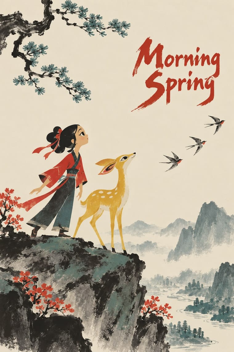
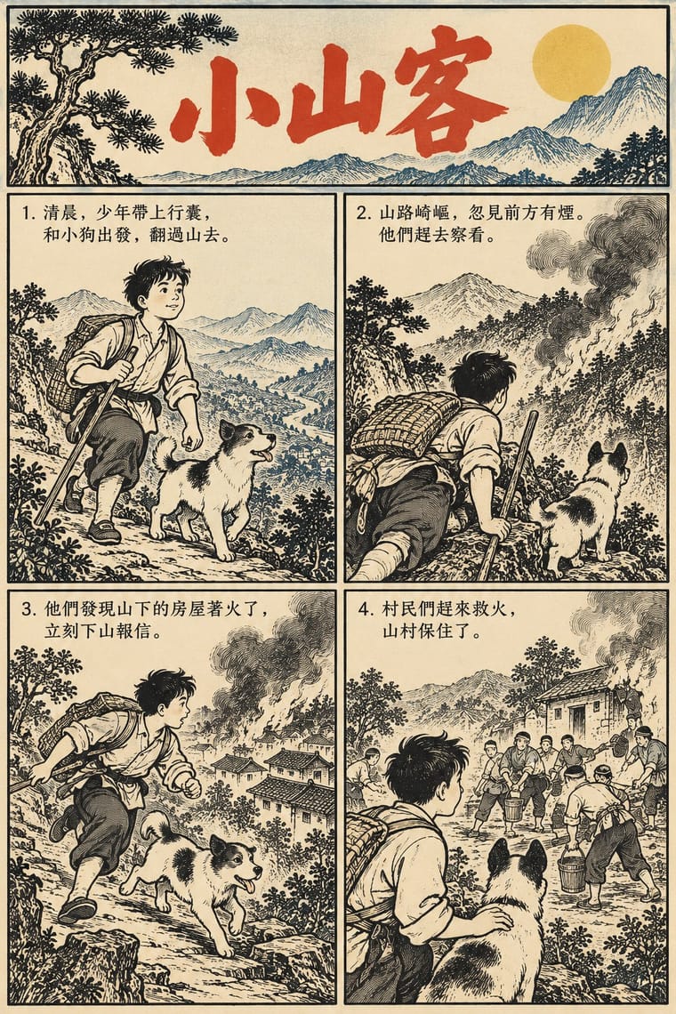
05
More combinations
With Chinese National-Style Animation
- Socialist Realist Propaganda Poster Contrasts · Made in the same state and decades, and like it an official art: the national style was pursued with state backing and its fables carried lessons. But where socialist realism pictured idealised heroes in legible, illusionistic realism, the studio found its forms in ink painting, cut paper, opera and murals; set one against the other to separate a painted, traditional idiom from heroic realism.
- Zagreb School of Animated Film Contrasts · Its contemporary among state-funded animation schools: both broke with Disney's full animation and staged short fables in flat figures and empty fields. Zagreb reduces its small men to geometric caricature for ironic satire of mass society; Shanghai takes its figures from ink painting, opera, paper-cut and murals and tells gentle fables and myths.
- Guochao (China-Chic National Trend) Pairs well · For China-chic packaging and campaigns, borrow the method (an opera-mask face, scrolling clouds, an ink wash on empty paper) rather than quoting the studio's licensed characters.
- UPA & Cartoon Modern Contrasts · Both flattened the cartoon in the 1950s, but UPA took its flat colour and caricature from modern painting, while Shanghai took flatness from cut paper and murals and atmosphere from graded ink washes.
- Chinese Calligraphy & Seal Carving (Shufa & Zhuanke) Pairs well · A brush-written title and a red seal sit naturally on a frame of graded ink and empty paper, as on the paintings the ink-wash films animate.
With Lianhuanhua Picture-Story Books
- Shanghai Modern & Yuefenpai Pairs well · Its parent print culture: pair a lianhuanhua line sequence with a yuefenpai-style painted cover for a period Shanghai feel.
- Chinese Modern Woodcut Movement Pairs well · Woodcut picture-stories and lianhuanhua share the one-image-per-page sequence; mix carved frames with drawn ones for documentary storytelling.
- Pop Art Graphics Contrasts · Pop blew one comic panel up to gallery scale; lianhuanhua keeps hundreds of quiet frames small, a useful test of scale and pace.
- Nianhua & Chinese Folk Print Pairs well · Both retell opera and folk stories for a popular audience; borrow nianhua colour for the cover and keep the inside in line.
- Ligne Claire (Franco-Belgian Clear Line) Contrasts · Both tell stories in outlined drawings; lianhuanhua gives each pocket-sized page one framed black-ink picture with a caption and keeps colour for the cover, ligne claire fills tiered multi-panel pages with balloons and flat, bright colour, caricatural figures in realistic settings.
- Amar Chitra Katha Comics Contrasts · Both are didactic picture-story series of classical and historical tales; lianhuanhua gives each page one black-ink picture over a printed caption, Amar Chitra Katha puts several coloured panels with balloons on every page.
- Story Manga (Postwar Japanese Comics) Contrasts · Both are cheap, widely rented East Asian picture-story books; lianhuanhua gives each palm-sized page one framed drawing with a caption beneath and no balloons, while story manga packs a page with panels of changing size, balloons, speed lines and drawn sound effects.
- Korean Webtoon Graphics Contrasts · Both are picture stories for a mass readership, but lianhuanhua frames one monochrome line drawing per pocket-book page with a caption below; switch to the webtoon when the story should run as one full-colour column with the gutter, not the page turn, setting the pace.