Style combination · Pairs well
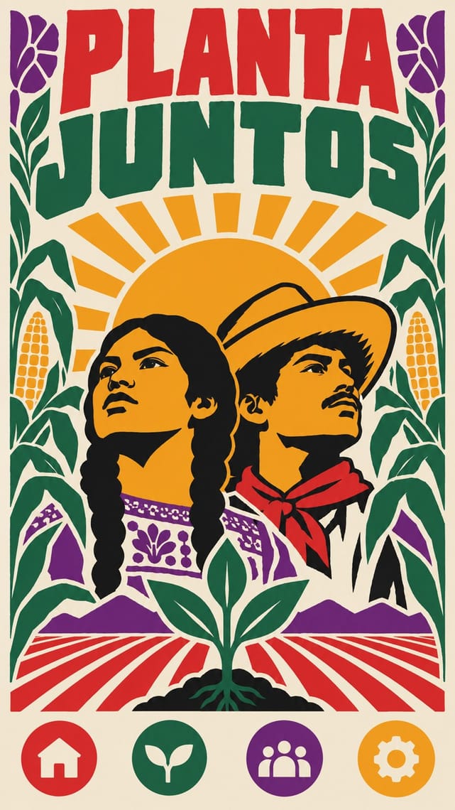
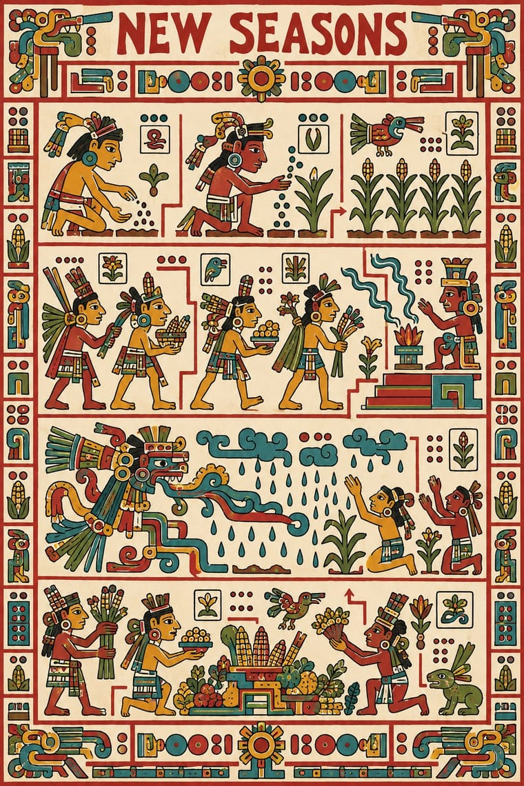
Chicano Screenprint Poster × Mixteca-Puebla Codex Painting
Chicano screenprinters reclaimed Mexica glyphs and calendar imagery for the movement; when contour-and-flat-colour glyphs meet a modern poster, follow their example of community context and credit. Mexica (Aztec) glyphs are a different source from these Mixtec and Borgia Group books: credit a codex source as such rather than folding it into 'Aztec'.
Mix them and make something Chicano Screenprint Poster Mixteca-Puebla Codex Painting
01
What each style brings
Each part of the design comes from the style with the stronger say in it, and each style gives at least two.
Chicano Screenprint Poster Mixteca-Puebla Codex Painting
- Type from Chicano Screenprint Poster
- Colour from Mixteca-Puebla Codex Painting
- Form from Chicano Screenprint Poster
- Composition from Mixteca-Puebla Codex Painting
- Surface from Chicano Screenprint Poster
02
The type
Open fonts standing in for each style’s own type, which is often hand-drawn or commercial.
Display · Chicano Screenprint Poster
Light
Londrina Solid, standing in for Bold sans and hand-drawn capitals for bilingual strike and boycott slogans ('¡Huelga!', 'Boycott Grapes')
Text · Mixteca-Puebla Codex Painting
The painted screenfold books of Postclassic southern and central Mexico (not the Maya codices): long strips of gesso-coated deerskin, folded like a screen and painted on both sides. In the Mixtec histories red guidelines lead the reader in a zigzag through the deeds and marriages of rulers; in the divinatory Borgia Group, pages pair deities with periods of the 260-day count. Profile figures with large heads, glyphs for names, dates and places, and flat colour inside an even black contour make picture and writing one codified system.
Fira Sans; Mixteca-Puebla Codex Painting used Calendar-name glyphs and Place signs, most built on a hill glyph that carries the attributes naming the town
03
The colours
The ground and leading colours come from Mixteca-Puebla Codex Painting, with a counter-accent from Chicano Screenprint Poster. The ink reads on the ground at 4.5:1 or more.
Chicano Screenprint Poster Mixteca-Puebla Codex Painting
-
#f1ead8ground · 36% -
#1a1714ink · 14% -
#d49a2aaccent · 18% -
#b22a2aaccent · 14% -
#3f8f97accent · 10% -
#6f7a34accent · 8%
As CSS
:root {
  --ground: #f1ead8;
  --ink: #1a1714;
  --accent-1: #d49a2a;
  --accent-2: #b22a2a;
  --accent-3: #3f8f97;
  --accent-4: #6f7a34;
  --font-display: "Londrina Solid", cursive;
  --font-text: "Fira Sans", sans-serif;
}
Use it with care
Chicano Screenprint Poster: The Virgin of Guadalupe is a devotional image for many Mexicans and Chicanos, and Chicana feminist reworkings of her have met protest. Mexica glyphs and calendar imagery carry Indigenous meaning, and the UFW black eagle is the union's own emblem, not a free motif. Use them with community context, credit the movement, and commission Chicanx printmakers rather than lifting the look for marketing.
Mixteca-Puebla Codex Painting: These books are Indigenous sacred and dynastic records: Mixtec speakers called them ñee ñuhu, 'sacred skins'; the Borgia Group almanacs set out deities and the ritual 260-day count, and the Mixtec histories record the genealogies of ruling houses whose Ñuu Dzaui (Mixtec) descendants live in Oaxaca, Puebla, Guerrero and the diaspora today. Almost all surviving books left Mexico during the conquest, the colonial period or the nineteenth century and are now in European libraries and museums; the Codex Colombino in Mexico City is a rare exception. 'Mixteca-Puebla' itself is an archaeologists' label, not a name the painters used: George Vaillant described a Mixteca-Puebla 'culture' or 'civilization', H. B. Nicholson redefined it as a style shared by Nahua and Mixtec artists, and its questions remain open. Do not lift deities, calendar signs or named rulers as decoration, logos or generic 'Aztec pattern', never invent pseudo-glyphs or present generated pages as historical, and work with Mixtec and Nahua scholars, artists and communities, crediting the codex and its people.
04
The two styles
05
More combinations
With Chicano Screenprint Poster
- Corporate Identity Modernism Contrasts · Chicano parody works by quoting the clean corporate mark and corrupting it; study the brand's grammar before you subvert it.
- Cuban Revolutionary Poster (OSPAAAL & ICAIC) Pairs well · Both are solidarity screenprints; borrow OSPAAAL's single bold image and add Chicano bilingual wordplay and barrio iconography.
- Mexican Popular Graphics (Posada) Pairs well · Posada's calaveras are a shared ancestor; mix his relief skeletons with flat screen colour for Día de Muertos work with a political edge.
- AfriCOBRA Pairs well · Movement screenprints of the same years, made in and for their own communities: Chicano posters set one emblematic figure on flat colour, often parodying American packaging; AfriCOBRA packs the figure into a lettered, many-coloured field and stays sincere. Pair them, as both pair with the Panthers, for coalition work.
- Fania and Nuyorican Salsa LP Sleeves Pairs well · Another US Latino graphic voice; borrow its community iconography.
- Puerto Rican Silkscreen Poster (DIVEDCO & ICP) Pairs well · Two Spanish-language screenprint traditions of the Americas; add Chicano bilingual slogans and posterised portraits to Puerto Rican letrismo for community event posters.
- Chilean Unidad Popular & Nueva Canción Graphics Pairs well · Both tie community walls to cheap posters for a movement; combine a black-contoured Ramona Parra frieze with Chicano bilingual screenprints for coalition street graphics.
- Lotería Card Imagery (Mexican Lotería) Pairs well · Chicano artists from Carmen Lomas Garza's 1972 tablas onward redraw the lotería card as a sign of Mexican-American home life; frame a screenprinted slogan or portrait as a numbered, named card to borrow that recognition.
With Mixteca-Puebla Codex Painting
- Northwest Coast Formline Design Contrasts · Both are Indigenous American sign systems of contour and flat colour, but formline swells and tapers its line into ovoids and U-forms in symmetric crests, while the codex keeps an even, unmodulated contour around profile figures strung along a guided reading path; do not merge them as generic 'Native' art.
- Ligne Claire (Franco-Belgian Clear Line) Pairs well · Both keep a sequential story readable with an even, unmodulated contour and flat colour, without hatching or modelling; borrow the codex's red-guideline reading path for a clear-line page, as a formal analogy rather than a lineage.
- Isotype Pictorial Statistics Pairs well · Both tell information through standardised, repeatable signs and count by repeating units; codex day signs with counting dots are a precedent for pictogram-plus-number systems.
- Andean Woven Graphic Systems Contrasts · Andean signs are built on the thread grid and repeated as pattern, while codex signs are painted freely in contour and strung along a narrative path; do not merge the two as generic 'pre-Columbian'.
- Mexican Popular Graphics (Posada) Contrasts · Posada's broadsheets carve tone and texture into relief blocks under shouting type, whereas codex painting has no tone at all, only contour and flat colour; keep them apart when the brief just says 'Mexican'.
- Burmese Parabaik Painting (Konbaung Folding Books) Contrasts · Both are screenfold books, but the Mixtec codex reads glyphic figures along red guide-lines on flat colour, while the parabaik frames painted, captioned scenes with European depth.
- Ancient Egyptian Hieroglyphic & Register Composition Contrasts · Both are sacred pictorial records in contour and flat colour with no depth, but Mixtec screenfolds lead the eye in a zigzag along red guidelines past big-headed figures and name glyphs, while Egyptian pages keep strict horizontal registers and ruled columns of a largely phonetic script, with figures sized by rank and drawn to a canon; do not merge them as generic 'ancient glyphs'.