Style combination · Contrasts
Batik Pattern Tradition × Minimalist Graphic Design
Crop a single batik motif onto a large empty field to show its line quality instead of drowning a minimal layout in pattern.
Mix them and make something Batik Pattern Tradition Minimalist Graphic Design
01
What each style brings
Each part of the design comes from the style with the stronger say in it, and each style gives at least two.
Batik Pattern Tradition Minimalist Graphic Design
- Type from Minimalist Graphic Design
- Colour from Minimalist Graphic Design
- Form from Batik Pattern Tradition
-
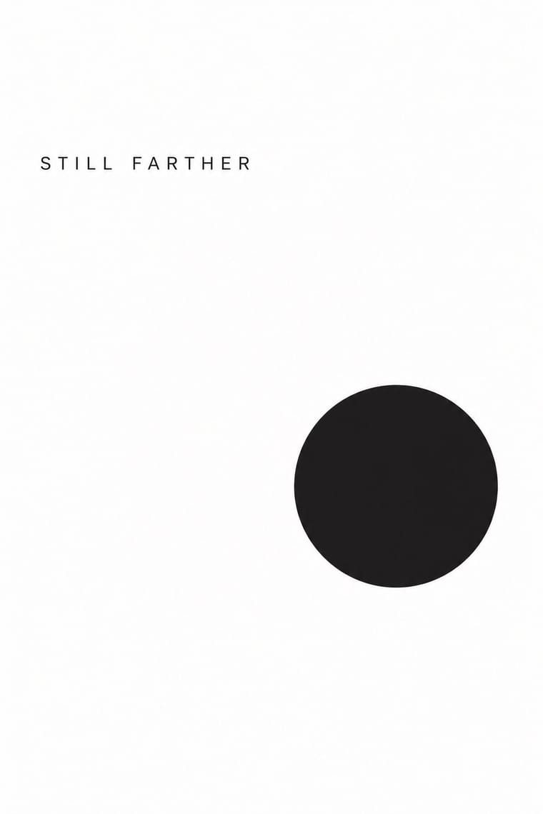
Minimalist Graphic Design avoids abundant decoration: this is where the two pull against each other, which is the point of the contrast.
- Composition from Batik Pattern Tradition
-
Minimalist Graphic Design avoids horror vacui: this is where the two pull against each other, which is the point of the contrast.
- Surface from Batik Pattern Tradition
02
The type
Open fonts standing in for each style’s own type, which is often hand-drawn or commercial.
Display · Minimalist Graphic Design
Tide
Inter Tight, standing in for Helvetica Neue (light weights)
Text · Batik Pattern Tradition
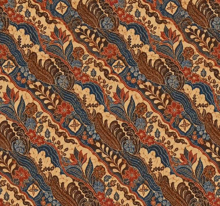
The Javanese wax-resist textile tradition in which hot wax is drawn with a canting or stamped with a copper cap, then dyed in successive baths to build layered all-over patterns. Court batik of Yogyakarta and Surakarta keeps to indigo, soga brown and cream with diagonal parang and four-lobed kawung repeats; north-coast batik absorbs Chinese, Dutch and Arab motifs in brighter colour.
EB Garamond; Batik Pattern Tradition used Arabic calligraphy of batik besurek (Bengkulu) and Cirebon and Signed Latin script of batik Belanda workshops
03
The colours
The ground and leading colours come from Minimalist Graphic Design, with a counter-accent from Batik Pattern Tradition. The ink reads on the ground at 4.5:1 or more.
Batik Pattern Tradition Minimalist Graphic Design
-
#ffffffground · 36% -
#1a1a1aink · 14% -
#d9d6d0accent · 18% -
#a6322baccent · 14% -
#8c8a86accent · 10% -
#2c6aa0accent · 8%
As CSS
:root {
  --ground: #ffffff;
  --ink: #1a1a1a;
  --accent-1: #d9d6d0;
  --accent-2: #a6322b;
  --accent-3: #8c8a86;
  --accent-4: #2c6aa0;
  --font-display: "Inter Tight", sans-serif;
  --font-text: "EB Garamond", serif;
}
Use it with care
Batik Pattern Tradition: Batik is inscribed by UNESCO as Indonesian intangible cultural heritage (2009), and some court motifs such as parang rusak were historically reserved for royalty and carry philosophical meanings. Learn a motif's meaning before using it, credit the region and makers, and do not market printed batik-look fabric as hand-drawn or stamped batik.
04
The two styles
05
More combinations
With Batik Pattern Tradition
- Islamic Geometric & Calligraphic Tradition Pairs well · Coastal batik already absorbs Arabic script and geometric lattices; combine the two for pattern that is both structured and hand-made.
- Art Nouveau Pairs well · Dutch Nieuwe Kunst designers such as Chris Lebeau worked in batik; pair its vegetal repeats with Art Nouveau linework for book covers and textiles.
- Psychedelic Poster Pairs well · Crackle texture and layered dyes suit psychedelic colour; keep batik's dense all-over repeat as the structure underneath.
- Guna Mola Contrasts · Batik builds pattern by resist-dyeing, molas by cutting and sewing; never render a mola as a printed texture, because the stepped, stitched edge is the whole point.
- Nieuwe Kunst (Dutch Art Nouveau) Pairs well · Its direct source: Dutch designers used wax-resist dyeing for covers in cotton, velvet and parchment; pair a constructed Nieuwe Kunst repeat with real batik colour layering, and credit the Javanese craft.
- Javanese Wayang Kulit (Tatah Sungging) Pairs well · Both are court arts of Yogyakarta and Surakarta; set one coded figure against batik's all-over repeat to pair a single focus with a patterned field.
- Mithila (Madhubani) Painting Contrasts · Batik spreads a resist-dyed repeat evenly across cloth; Mithila builds a unique, hand-drawn composition around a centre and closes it with borders. Borrow one or the other, not both, to keep pattern and picture distinct.
- African Wax & Fancy Print Pairs well · Set hand-drawn Javanese batik beside its industrial descendant to show resist turning into mass repeat, crackle and giant scale.
With Minimalist Graphic Design
- ECM Sleeve Aesthetic (Munich) Pairs well · ECM's record sleeves carry the same reduction into music since 1970: one corresponding image, a few lines of small type and a great deal of silence; borrow their wintry photograph and tiny type when a minimal layout needs mood rather than system.
- Ma & Wabi-sabi Aesthetics Pairs well · Add one imperfect texture or natural material so the emptiness feels contemplative rather than sterile.
- Memphis Design Contrasts · Memphis's clashing patterns are the antidote to minimal reticence; a single Memphis accent makes a minimal layout playful.
- Dark Tech Minimalism Pairs well · Invert the palette to near-black and keep the same reduction for a contemporary technology register.
- Neo-Andean Architecture (Cholets) Contrasts · Its exact opposite on ornament and colour; one symmetrical fluorescent panel in a white, empty layout reads as a loud statement of identity.
- Neoclassical Book Typography Pairs well · Set a single Didone headline in minimalism's empty, monochrome field for the classic luxury-fashion register.
- Renaissance Book Typography Pairs well · Keep classical page proportions and a humanist serif but strip the ornament to give minimal layouts warmth and authority.
- Afrobeat Sleeve Art Contrasts · Its exact opposite on density; a single minimal element on a Lemi-style sleeve stands out sharply, and vice versa.