Style combination · Pairs well
Arts × Risograph
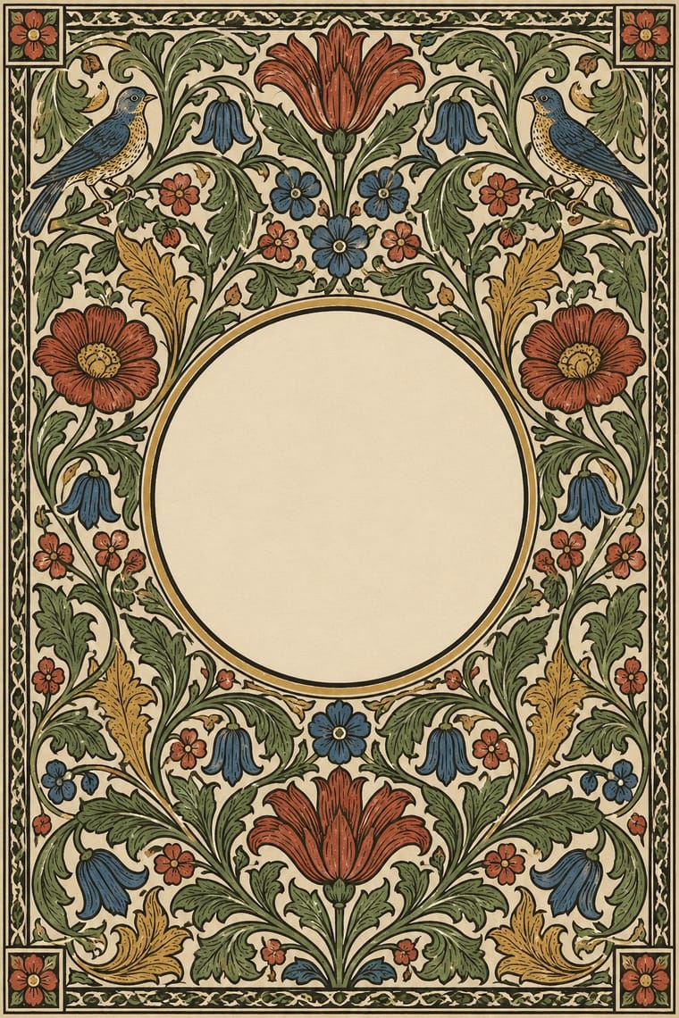
Frame a two-ink riso print with a Morris-style vine border to give indie publishing an heirloom, hand-made gravity.
01
What each style brings
Each part of the design comes from the style with the stronger say in it, and each style gives at least two.
Arts & Crafts Movement Risograph & Indie Print Culture
- Type from Arts
- Colour from Risograph
- Form from Arts
- Composition from Arts
- Surface from Risograph
02
The type
Open fonts standing in for each style’s own type, which is often hand-drawn or commercial.
Text · Risograph
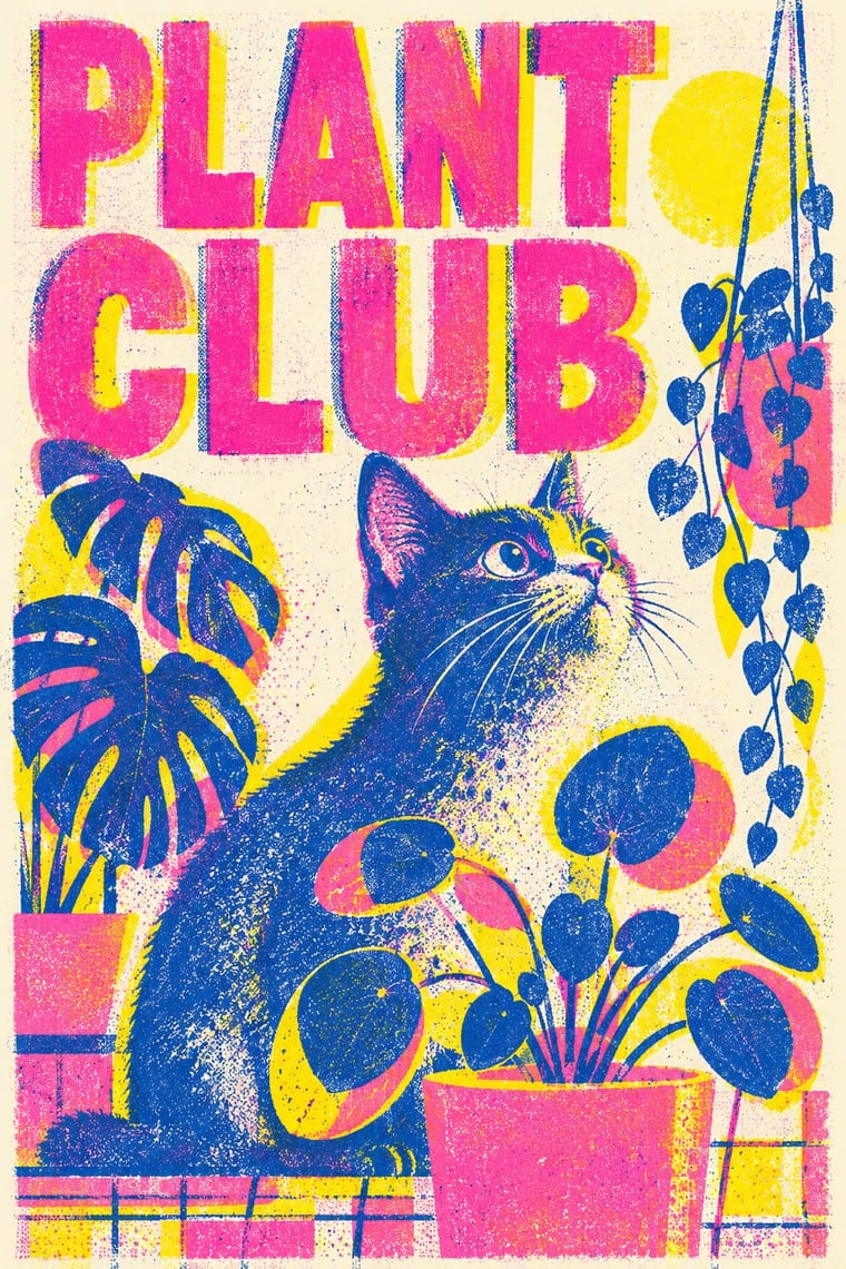
A contemporary culture of zines, art books, posters and prints made on Japanese Risograph stencil duplicators, whose soy-based spot inks (fluorescent pink, yellow, blue, teal) are laid down one drum at a time. Designers embrace the machine's limits: translucent overprints, slight misregistration, grainy coverage and coarse halftones give flat illustration and type a warm, handmade vibrancy at low cost.
Inter; Risograph used Neo-grotesques set large and Monospace and typewriter faces
03
The colours
The ground and leading colours come from Risograph, with a counter-accent from Arts. The ink reads on the ground at 4.5:1 or more.
Arts & Crafts Movement Risograph & Indie Print Culture
-
#f4f1eaground · 36% -
#3255a4ink · 14% -
#ff48b0accent · 18% -
#a33224accent · 14% -
#f15060accent · 10% -
#c39a4aaccent · 8%
As CSS
:root {
  --ground: #f4f1ea;
  --ink: #3255a4;
  --accent-1: #ff48b0;
  --accent-2: #a33224;
  --accent-3: #f15060;
  --accent-4: #c39a4a;
  --font-display: "EB Garamond", serif;
  --font-text: "Inter", sans-serif;
}
04
The two styles
05
More combinations
With Arts
- Flat Design Contrasts · Borrow one engraved border or initial to give a flat interface a crafted, editorial moment against its vector minimalism.
- Scandinavian Functionalism Pairs well · Keep the craft ethic and natural palette but reduce Morris's foliage to a single repeating motif for warmth without clutter.
- Die Neue Typographie Contrasts · Tschichold's asymmetric, unornamented page was built against this centred, bordered book; set them side by side to argue tradition versus machine age.
- Gothic Blackletter & Fraktur Tradition Pairs well · Morris's Kelmscott Press revived gothic type (Troy and Chaucer) inside dense woodcut borders; join the broken letter to foliate frames and handmade paper for a medieval, hand-made book.
- Renaissance Book Typography Pairs well · Morris's Kelmscott Press revived Jenson's roman; pair a Renaissance text block with dense Arts & Crafts borders for a private-press feel.
- Josef Frank and Svenskt Tenn Botanical Prints Pairs well · The parent tradition: both fill a repeat with plants on linen, but Morris is symmetrical, earthy and dense with dark grounds, Frank is looser, brighter and mostly light. Pair a Morris-style framed book page with Frank-style endpapers.
- Italian Futurism Contrasts · Arts & Crafts handwork is everything Futurism wanted to burn; juxtapose them to stage machine against hand.
- Vorticism & BLAST Typography Contrasts · BLAST refused 'a revival of lost folk art' and blasted the 'years 1837 to 1900'; set its hard black shards against a hand-printed floral page to stage machine against handicraft.
With Risograph
- Corporate Identity Modernism Contrasts · Exact Pantone-matched corporate colour is the opposite of riso's drifting inks; use the contrast to signal independence.
- Neo-Swiss Revival Pairs well · Print neo-Swiss grids in two fluorescent riso inks to soften their rigour with grain and overprint.
- Y2K Futurism Contrasts · Glossy chrome renders are everything a riso cannot print; set frictionless screen gloss against tactile grain for deliberate friction.
- WPA Silkscreen Posters Pairs well · WPA silkscreen's flat, separated colour translates directly to riso drums; borrow its layered spot-colour scenes.
- Literatura de Cordel Woodcut Pairs well · Print a cordel-style woodcut on a riso in one ink on tinted stock to keep the pocket-chapbook economy for zines and poetry pamphlets.
- Cubist Pictorial Space Pairs well · Print synthetic-Cubist planes as overlapping flat riso inks so the overprints do the faceting for you.
- Leningrad Avant-Garde Picture Book Pairs well · Today's riso picture books share the few flat inks, bare paper and speckled texture; print a Lebedev-style sequence of floating figures in two or three riso inks.
- Die Neue Typographie Pairs well · Two-colour riso printing suits its black-plus-red restraint for low-budget editorial and posters.