Style combination · Pairs well
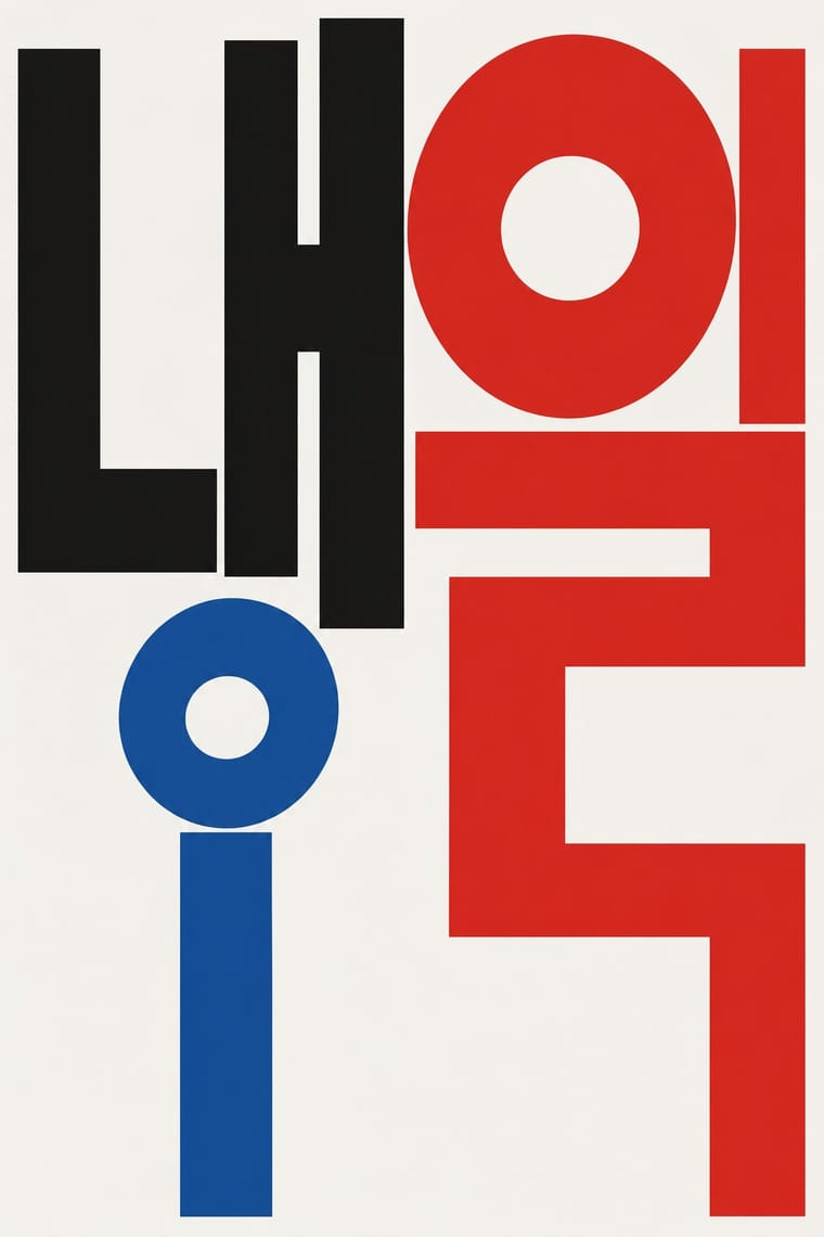
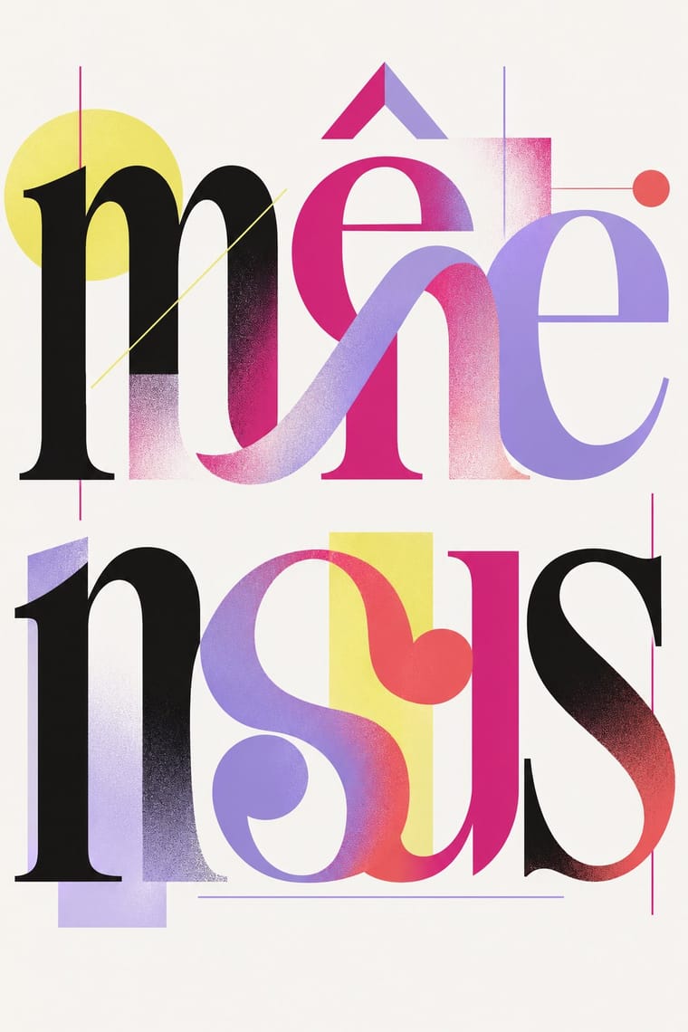
Out-of-Square Hangul Typography × Post-Binary Typography
Both redesign the structure of letters for a social idea: Ahn Sang-soo freed Hangul syllables from the square, post-binary type frees French word endings from the gender binary. Pair them when a project is about how a script could be otherwise.
Mix them and make something Out-of-Square Hangul Typography Post-Binary Typography
01
What each style brings
Each part of the design comes from the style with the stronger say in it, and each style gives at least two.
Out-of-Square Hangul Typography Post-Binary Typography (Bye Bye Binary and Inclusive French Type)
- Type from Out-of-Square Hangul Typography
- Colour from Out-of-Square Hangul Typography
- Form from Out-of-Square Hangul Typography
- Composition from Post-Binary Typography
- Surface from Post-Binary Typography
02
The type
Open fonts standing in for each style’s own type, which is often hand-drawn or commercial.
Display · Out-of-Square Hangul Typography
Riot
Syne; Out-of-Square Hangul Typography used Ahn Sang-soo typeface and Isang-che, Mir-che and Mano-che
Text · Post-Binary Typography
A Franco-Belgian type practice that redesigns written French for gender inclusion inside the word. Instead of the point médian, which the Académie française and the French state call a barrier to reading, new glyphs fuse masculine and feminine endings and ligatures or 'symbiotic' strokes join letters, so inclusive and non-binary words read as one form. Led since 2018 by the collective Bye Bye Binary, it forks open-source families under open licences and its own usage conditions (the CUTE), encodes them in a Queer Unicode Initiative and spreads them through workshops, banners and magazines.
Jost; Post-Binary Typography used BBB Baskervvol (Bye Bye Binary, from 2018), a post-binary fork of ANRT's Baskervville and BBB Poppins TN (Eugénie Bidaut and Camille Circlude, 2022), after Jonny Pinhorn's Poppins
03
The colours
The ground and leading colours come from Out-of-Square Hangul Typography, with a counter-accent from Post-Binary Typography. The ink reads on the ground at 4.5:1 or more.
Out-of-Square Hangul Typography Post-Binary Typography (Bye Bye Binary and Inclusive French Type)
-
#f5f3eeground · 36% -
#111111ink · 14% -
#f2c12eaccent · 18% -
#d42a7faccent · 14% -
#d7261eaccent · 10% -
#ee5d63accent · 8%
As CSS
:root {
  --ground: #f5f3ee;
  --ink: #111111;
  --accent-1: #f2c12e;
  --accent-2: #d42a7f;
  --accent-3: #d7261e;
  --accent-4: #ee5d63;
  --font-display: "Syne", sans-serif;
  --font-text: "Jost", sans-serif;
}
Use it with care
Post-Binary Typography (Bye Bye Binary and Inclusive French Type): This is the living practice of a queer, trans and non-binary community and of named designers, most of them active: do not use the glyphs as decorative 'Pride' texture or for brand campaigns that ignore the people they were made for; follow the CUTE that comes with the fonts: credit and link the designers, keep the files complete, give on its sliding scale (€300 to €1,000 for a cultural institution) and respect its answer to companies that want an inclusive image to pinkwash: 'Look elsewhere'; and never attribute a generated poster or font to the collective or prompt an image model with its members' names. Image models invent fake ligatures and misspell French, so set real inclusive words in the actual fonts and have them checked by people who use them. Type the median-dot forms and let the OpenType features display the glyphs, rather than pasting QUNI's Private Use Area characters, which screen readers cannot voice meaningfully and which turn into blanks or wrong signs when copied or shown in another font. In France, inclusive writing with the point médian is proscribed in schools by circular (2021) and a Senate bill sought to ban it more widely (2023), so check before setting official French public documents this way.
04
The two styles
05
More combinations
With Out-of-Square Hangul Typography
- International Typographic Style Pairs well · Place a modular out-of-square headline on a strict Swiss grid so the hanging, irregular syllables read as deliberate against an ordered page.
- Emigre & Early Digital Type Pairs well · Both turned a constructed alphabet into a magazine laboratory in the 1980s; set an Emigre-era Latin face beside an out-of-square Hangul face for a bilingual experimental spread.
- Chaekgeori & Minhwa Screen Painting Pairs well · Munjado builds a character from pictures and out-of-square Hangul builds pictures from letters; combine them for a Korean identity that spans folk painting and modern type.
- Hong Kong Neon & Beiwei Shop-Sign Lettering Contrasts · Beiwei's chisel-edged, stele-derived brush script is the opposite of monoline geometric jamo; set the two side by side to show calligraphic against constructed East Asian lettering.
- Roman-like Thai Typography (modern loopless Thai) Pairs well · Both modernise an Asian script by dropping a defining convention, the square cell in Hangul and the head loop in Thai; set them together for a pan-Asian modern type specimen or festival identity.
- Seoul Independent Graphic Design (Small-Studio Scene) Pairs well · Ahn Sang-soo freed Hangul from the square in 1985, and Sulki & Min have gone further back, to Cho Young-jae's 1976 proposal to restructure Hangul for typewriters, a study they say has rarely been discussed with the depth it deserves, and to the origins of unsquared Hangul; set a hanging, de-squared headline in a centred one-colour poster to join the generations.
- Korean Commercial Calligraphy (Kaelligeurapi) Contrasts · Both free Hangul from the equal square, but Ahn Sang-soo constructs monoline jamo as a reusable typeface while kaelligeurapi writes each word once with the brush; choose between a system and a signature.
- Newtro (Korean New-Retro) Contrasts · Set the modernist, geometric de-squared Hangul of Ahn Sang-soo against newtro's revived brush and cursive label lettering to show two ideas of fashionable Hangul.
With Post-Binary Typography
- Emigre & Early Digital Type Pairs well · Both are type-led laboratories that publish their own magazine as a showcase for their fonts. In Zone Mixte (2022) êkhô studio chose BBB Baskervvol with Baskerville's erasure of Sarah Eaves in mind, the story Zuzana Licko honoured in Mrs Eaves (1996); set a Baskervvol text in an Emigre-style specimen spread to join the two foundry experiments.
- Contemporary Arabic & Dual-Script Type Design Contrasts · Both extend a typeface's character set for a language need, but dual-script design matches two scripts for neutral, institutional legibility, while post-binary type invents new characters within one script and keeps them visible as a political statement.
- Risograph & Indie Print Culture Pairs well · Fanzines, programmes and short-run posters carry much of the practice, such as Hannah Beaudeux's risograph-printed La tendresse des murs (2025), set with Enby Gertrude; print a post-binary text in one or two riso inks to keep it cheap and communal.
- Acid Graphics / New Ugly Pairs well · The collective's banners share Acid Graphics' blackletter, spiky stars, gradients and chrome-like lettering; borrow that repertoire for a manifesto banner or flyer, but keep the post-binary glyph legible as the subject rather than the surface effect.
- Phototype Expressive Typography (Lubalin & U&lc) Contrasts · Both make new meaning by interlocking letters into ligatures, but Lubalin's phototype ligatures are tight-set display wit for headlines and logotypes, while post-binary ligatures carry gender inside the word, in running French text as well as on banners; choose Lubalin for a witty headline, post-binary glyphs when the grammar of the word is the message.
- ACT UP & Gran Fury AIDS Activist Graphics Contrasts · Both are queer activist graphics, but Gran Fury borrowed advertising's photographs and slogans and kept standard letters (Futura, Gill Sans), while post-binary type leaves the picture ordinary and changes the alphabet. Choose Gran Fury for a public accusation, post-binary glyphs when the words themselves must include everyone.