Style combination · Contrasts
Amar Chitra Katha Comics × Filipino Komiks
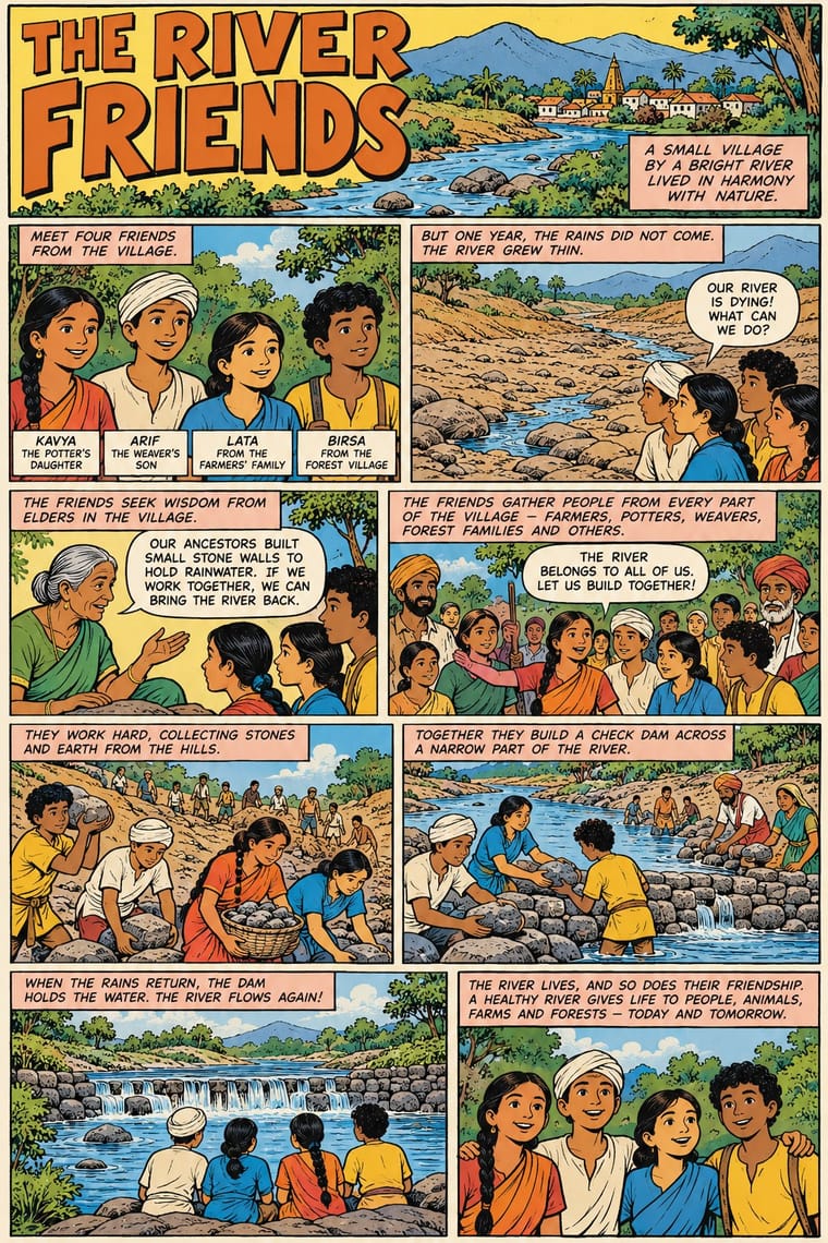
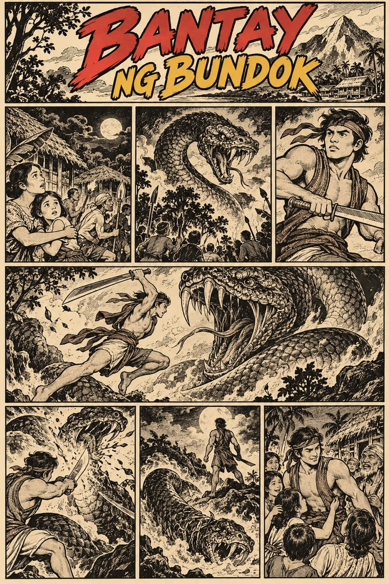
Both retell local myth and history as comics in Asian languages. Amar Chitra Katha prints flat colour on every page in an educational, authoritative voice; komiks keep black-and-white interiors for melodrama, fantasy and folk heroes.
Mix them and make something Amar Chitra Katha Comics Filipino Komiks
01
What each style brings
Each part of the design comes from the style with the stronger say in it, and each style gives at least two.
Amar Chitra Katha Comics Filipino Komiks
- Type from Amar Chitra Katha Comics
- Colour from Amar Chitra Katha Comics
- Form from Filipino Komiks
- Composition from Filipino Komiks
- Surface from Amar Chitra Katha Comics
-
Filipino Komiks avoids flat: this is where the two pull against each other, which is the point of the contrast.
02
The type
Open fonts standing in for each style’s own type, which is often hand-drawn or commercial.
Display · Amar Chitra Katha Comics
Square
Londrina Solid, standing in for Upright hand-lettered capitals (dialogue in round speech balloons, evenly spaced and drawn by hand)
Text · Filipino Komiks
The Philippines' newsstand comics magazines, from Kenkoy in Liwayway (1929) and Ace's Pilipino Komiks (1947) to the fall of the Roces titles in the late 1990s. Weekly or fortnightly anthologies of short Tagalog serials were drawn in black brush and pen in a romantic illustrators' manner: bold curving contours, hatched modelling, dense backgrounds. Casts were folk heroes, aswang and superheroines such as Darna; in the classic years colour was kept for the cover. The state used komiks too, to promote Marcos's martial-law policies and, under Aquino, to urge guerrillas to surrender in romances.
Comic Neue; Filipino Komiks used Hand-lettered Tagalog balloons and Hand-drawn masthead logos
03
The colours
The ground and leading colours come from Amar Chitra Katha Comics, with a counter-accent from Filipino Komiks. The ink reads on the ground at 4.5:1 or more.
Amar Chitra Katha Comics Filipino Komiks
-
#f3ecd4ground · 36% -
#1e1c1aink · 14% -
#e8772eaccent · 18% -
#e3b23caccent · 14% -
#6fa3d8accent · 10% -
#c62a2faccent · 8%
As CSS
:root {
  --ground: #f3ecd4;
  --ink: #1e1c1a;
  --accent-1: #e8772e;
  --accent-2: #e3b23c;
  --accent-3: #6fa3d8;
  --accent-4: #c62a2f;
  --font-display: "Londrina Solid", cursive;
  --font-text: "Comic Neue", cursive;
}
Use it with care
Amar Chitra Katha Comics: The series, its covers, characters and sunburst logo belong to its publisher (Amar Chitra Katha Pvt Ltd) and its artists: draw your own figures, covers and badge, never ask an image model for an ACK title or a named artist's hand, and never present a generated page as an ACK comic. Many of its subjects are deities whom readers worship, so do not mock, crop or deface them. Scholars have criticised the series for giving heroes extremely fair skin while coding dark skin with violence, brutality and low caste, for casting Muslims as either secular heroes or zealous villains, for drawing the British as ugly caricatures, and for leaving women, Muslims and lower castes out of its history: give gods, demons, villains, Muslims, Dalit and Adivasi characters the same drawing care, never use skin colour, features or dress as markers of evil, caste or religion, draw people across the real range of South Asian skin tones rather than one pale, uniform type, and do not present one Hindu reading as the whole of India's past.
Filipino Komiks: Darna, Pedro Penduko and other komiks characters are still in copyright and keep being adapted for film and television, and the artists' pages belong to them and their estates: draw your own heroes, mastheads and roundels in the shared idiom, never ask an image model for these characters or for a named artist's hand, and label generated pages as AI-made. Publishers shredded thousands of original pages and few issues were archived or reprinted, so a fake 'vintage komiks' page easily pollutes a thin record. Aswang, amulets and the other creatures and figures of Philippine folk belief belong to living communities, and pre-colonial warriors stand for a national self-image: draw them with the dignity and research the tradition gave them, never as exotic decoration. Aswang lore has stigmatised a real province, Capiz, many of whose people object to its name as the 'hometown of Aswang', and village gossip has branded real neighbours, such as a widow with no one to help her, as aswang: never tie a monster to a named province, town or community. Do not costume living Indigenous peoples (the Igorot, Lumad, Aeta and others) as pre-colonial warriors or as creatures.
04
The two styles
05
More combinations
With Amar Chitra Katha Comics
- Lianhuanhua Picture-Story Books Contrasts · Both are didactic picture-story series of classical and historical tales; lianhuanhua gives each page one black-ink picture over a printed caption, Amar Chitra Katha puts several coloured panels with balloons on every page.
- Indian Calendar & Bazaar Art Pairs well · Borrow the calendar print's frontal, haloed deity and saturated jewel colour for a cover or a single full-page epiphany panel, and keep the pages around it to flat colour and ruled panels.
- American Four-Colour Comic Book (Golden to Bronze Age) Contrasts · The same ruled panels, balloons and hand-lettered capitals; the newsstand comic shouts with slanted panels, dot tints and sound effects, while Amar Chitra Katha keeps a calm regular grid, long narration captions and an edifying voice.
- Hand-Painted Bollywood Poster Pairs well · Painted Hindi-film publicity from the same Bombay decades; its floating star heads, melodramatic colour and hand-drawn title logos suit an Amar Chitra Katha cover pushed louder.
- Ligne Claire (Franco-Belgian Clear Line) Contrasts · Both fill clean contours with flat colour; ligne claire draws one even, unhatched line around caricatural figures, Amar Chitra Katha a swelling brush contour with heavy blacks around idealised, near-naturalistic bodies.
- Bonelli Fumetto (Italian Popular Adventure Comics) Contrasts · Both lay out regular tiers of ruled panels with white gutters and hand-lettered capitals. Amar Chitra Katha fills every page with flat colour and teaches myth and history in about 32 pages in an authoritative voice; a Bonelli issue keeps about a hundred interior pages in black ink and tells a serial hero's adventure for entertainment.
- Javanese Wayang Kulit (Tatah Sungging) Contrasts · Both retell the Mahabharata and Ramayana with a fixed iconography, but Amar Chitra Katha draws idealised, near-naturalistic bodies in panels, while wayang codes character into impossible proportions.
- Arab Children's Comic Magazines (Samir to Majid) Pairs well · Another postcolonial children's comic that teaches heritage in flat colour; combine its narrated caption boxes with the Arab weekly's gag strips and puzzle pages.
With Filipino Komiks
- American Four-Colour Comic Book (Golden to Bronze Age) Contrasts · Postwar komiks took over the American comic book's format, and from 1971 DC recruited Nestor Redondo, Alfredo Alcala and Alex Niño. Choose the American comic book for flat four-colour dot tints over a keyline; choose komiks for black-and-white pages modelled entirely in hatched and feathered brush ink.
- Jeepney Art Pairs well · Both are Manila's popular street graphics from the same postwar decades. Put a komiks hero, drawn in black brush line, on a jeepney's polychrome panel, chrome trim and shaded sign-painter lettering for a piece that reads as Manila.
- Ligne Claire (Franco-Belgian Clear Line) Contrasts · Both tell stories in ruled panels with hand-lettered balloons, but ligne claire closes forms with one even, unhatched line and flat colour. Komiks swell the brush line and build light and volume from hatching in black and white.
- Story Manga (Postwar Japanese Comics) Contrasts · Manga gets its greys from dot screentone and simplifies faces into big-eyed types; komiks model naturalistic figures with brush hatching. Gerry Alanguilan criticised Filipino professionals for adopting a style so closely tied to Japanese identity.
- Lianhuanhua Picture-Story Books Contrasts · Both are cheap black-line picture stories rented and read at street-level shops. Lianhuanhua give each palm-sized page one framed picture with a caption beneath; komiks pack several panels with speech balloons onto an anthology magazine page.
- Underground Comix Contrasts · Both put black-and-white hatched interiors behind colour covers, but komiks drew naturalistic folk heroes and romances for the country's most widely read periodicals, while comix push big-footed caricature into adult taboo for a head-shop audience.
- Argentine Adventure Historieta (Oesterheld–Breccia) Contrasts · Both are black-and-white anthology magazines of long serials with colour kept for the cover; komiks model romantic, naturalistic figures in hatched and feathered brush on a light page, while the historieta builds its pages from black masses, hard light and, in its darkest work, distorted faces.
- Bonelli Fumetto (Italian Popular Adventure Comics) Contrasts · The nearest style by genome: both are black-and-white newsstand comics drawn in naturalistic brush and pen, with colour kept for the cover. Komiks pack short instalments of about four pages into anthology magazines; Bonelli gives one hero a book-length episode in a constant three-strip cage, under the same cover trade dress every month.