Style combination · Pairs well
AIZ Political Photomontage × Situationist Détournement Graphics
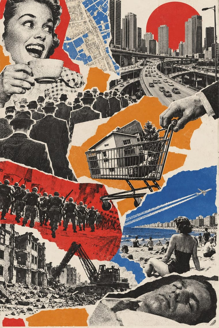
Both turn the opponent's own words and pictures against their source; take détournement's scattered press fragments and rewritten speech balloons for a looser, cheaper attack, and AIZ's seamless single picture when the charge must look like a photograph of fact.
Mix them and make something AIZ Political Photomontage Situationist Détournement Graphics
01
What each style brings
Each part of the design comes from the style with the stronger say in it, and each style gives at least two.
AIZ Political Photomontage (Heartfield) Situationist Détournement Graphics
- Type from AIZ Political Photomontage
- Colour from AIZ Political Photomontage
- Form from AIZ Political Photomontage
- Composition from Situationist Détournement Graphics
-
AIZ Political Photomontage avoids collage & layering: this is where the two pull against each other.
- Surface from Situationist Détournement Graphics
02
The type
Open fonts standing in for each style’s own type, which is often hand-drawn or commercial.
Display · AIZ Political Photomontage
Wow.
Jost, standing in for Bold geometric or grotesque sans capitals of the Erbar, Kabel or Futura kind, with round C and G, for the headline, stacked above the picture ('DER SINN DES HITLERGRUSSES:', AIZ cover, 16 October 1932; 'BLUT UND EISEN', 1934) or widely letterspaced across the foot of a spread ('KRIEG UND LEICHEN – DIE LETZTE HOFFNUNG DER REICHEN', 1932)
Text · Situationist Détournement Graphics
Graphics of the Letterist and Situationist Internationals (1956–1972), built on détournement: taking existing words and pictures (comic strips, advertisements, news photographs, city maps, classic texts) and turning them against their source. Debord and Jorn scattered cut press fragments among splashes of coloured ink in the artist's books Fin de Copenhague and Mémoires, and cut the map of Paris into islands linked by red arrows. Strasbourg students and the CMDO refilled comic-strip balloons with theory and pasted the strips up.
Courier Prime; Situationist Détournement Graphics used Caractères Simples, a nineteenth-century French sans serif shown by Deberny, set in lowercase for the title on every issue of Internationale situationniste and Found press type
03
The colours
The ground and leading colours come from AIZ Political Photomontage, with a counter-accent from Situationist Détournement Graphics. The ink reads on the ground at 4.5:1 or more.
AIZ Political Photomontage (Heartfield) Situationist Détournement Graphics
-
#ede1c3ground · 36% -
#1e1a17ink · 14% -
#c6a67caccent · 18% -
#e08a2caccent · 14% -
#86603faccent · 10% -
#c62f2aaccent · 8%
As CSS
:root {
  --ground: #ede1c3;
  --ink: #1e1a17;
  --accent-1: #c6a67c;
  --accent-2: #e08a2c;
  --accent-3: #86603f;
  --accent-4: #c62f2a;
  --font-display: "Jost", sans-serif;
  --font-text: "Courier Prime", monospace;
}
Use it with care
AIZ Political Photomontage (Heartfield): The montages turn swastikas and portraits of Nazi leaders against the regime; displaying Nazi symbols is restricted by law in Germany and several other countries outside contexts such as art, satire, education and history, so keep any reuse unmistakably critical and check the rules where the work will be shown. AIZ was also a communist magazine informally financed by the Comintern: before 1933 its montages attacked the Social Democrats as well as the Nazis, and in 1934 it devoted a special issue to seventeen years of the Soviet Union, so treat the style as partisan propaganda, and do not turn its literal, accusatory montage on named living people without checking defamation and image-rights law.
04
The two styles
05
More combinations
With AIZ Political Photomontage
- NSK Retro-Avant-Garde Contrasts · NSK lifts Nazi and socialist emblems whole into solemn, centred heraldry and over-identifies with power, leaving the verdict open; AIZ builds the same kind of centred emblem, like the axe swastika, but always adds a caption that convicts. Choose by whether the viewer should be left uneasy or told what to think.
- Surrealist Graphics Pairs well · Surrealist photography also makes the impossible look photographed; take its dream logic when a brief needs strangeness, and add the AIZ headline and caption when that strangeness has to land a political point.
- Russian Constructivism Contrasts · Constructivist photomontage drives heroic figures along diagonals with bars, red ink and exploding type; AIZ uses the same cut photographs in a centred, single-ink picture with a quiet caption, mostly to mock and sometimes, as in the 1937 radio-wave fist, to rally. The debt is direct: Heartfield spent April 1931 to January 1932 in the Soviet Union, looked after by Sergei Tretyakov and, it seems, getting on well with Gustav Klutsis, and the Art Institute of Chicago traces the 1934 many-arms fist cover to Klutsis's 1932 election poster of one raised hand repeated into a crowd.
- ACT UP & Gran Fury AIDS Activist Graphics Pairs well · Both put a photograph under a one-line charge against named people; set Gran Fury's facts and demands in small print beneath a Heartfield-style literal metaphor when the accusation needs evidence.
- Simplicissimus Satirical Style (Munich) Pairs well · Simplicissimus frames a drawn caricature between a set title and a one-line caption; once it dulled its satire in the First World War, the sharpest graphic satire passed to Grosz, Kollwitz and Heartfield. Keep that title-picture-caption sentence and swap the drawing for a seamless montage to make the satire look like evidence.
- West German Conceptual Film & Culture Poster (Hillmann and Rambow) Pairs well · Heartfield tied four bloody axes into a swastika in 1934; Rambow's broken pencils laid into a swastika over a 1938 PEN list (1983) make the same move of an object turned into an emblem. Borrow the AIZ caption when the poster must accuse, and Rambow's wordless object when it should commemorate.
- Israeli Political Poster (Tartakover to Lemel) Pairs well · Compare how a recognisable photographed object becomes an accusation, but keep the Hebrew slogan and local reference specific; resemblance in the montage method is not evidence of direct historical influence.
- Stenberg Brothers Constructivist Film Poster Pairs well · Borrow the political photomontage cut-and-assemble method, then add the Stenbergs' exaggerated scale for dynamism.
With Situationist Détournement Graphics
- Punk & DIY Zine Contrasts · Punk reprised the situationist prank in the late 1970s, but it packs torn photocopies and mixed type into crowded pages; détournement keeps a few recognisable fragments and lets each one say the opposite of what it said. Borrow the rewritten balloon when a punk layout needs a sharper argument.
- Fotoromanzo (Italian Photo-Romance) Pairs well · The photo-romance was a raw material René Viénet named in Internationale situationniste no. 11 (1967), calling for photo-romances to be détourned by adding or altering their speech bubbles: keep the photographed lovers and the grid of frames untouched and change only the balloons, so that the melodrama speaks against itself.
- American Four-Colour Comic Book (Golden to Bronze Age) Pairs well · Mass-market comic panels were a favourite raw material of détournement: keep the drawing of an adventure or western panel untouched and rewrite only the balloons to turn it against its own story.
- Internet Ugly & Meme Vernacular Pairs well · Image macros and reaction memes recaption a known picture to say something new, which is détournement by other means; set a situationist rewritten balloon in a meme layout to bring the method online.
- Pop Art Graphics Contrasts · Both took comic panels and advertisements in the same years, but Lichtenstein enlarged a single panel to painting size as a close copy of what it already said, while détournement kept the panel at reading size and rewrote its balloon to argue against its source; the SI's English section called Pop art 'the last ditch attempt to shore up the decomposition of the spectacle' (1967). Enlarge when the source itself is the subject, rewrite when the message must turn on the source.
- Atelier Populaire (May '68 Screenprint Poster) Contrasts · Same Paris spring of 1968, opposite method: the Atelier populaire drew new figures and slogans and screenprinted them flat in one colour, while the situationists reused existing comics, photographs and texts. Draw when the message must read from across the street, détourn when the audience must recognise the source.
- ACT UP & Gran Fury AIDS Activist Graphics Contrasts · Gran Fury placed its work 'in direct line of descent with Situationist questions' and kept the hijacking of mass media, but it copied whole advertising formats (a Benetton campaign, the front page of The New York Times) in professional offset with staged photographs and one-line slogans, where the situationists scattered cut fragments under ink. Copy the format whole when the work must pass for the real thing in public space; cut it up when the reader should see the seams.
- Fluxus Graphics (Maciunas) Contrasts · Contemporaries who both took found pictures, but Maciunas packed them into a tight, deadpan black grid of mixed dry-transfer type, while Debord and Jorn scattered fragments under painted ink and aimed the joke at revolution; choose order or drift.