Style combination · Contrasts
ACT UP × Situationist Détournement Graphics
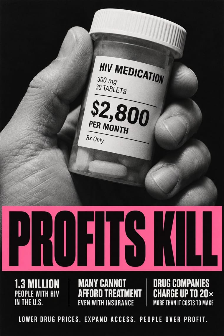
Gran Fury placed its work 'in direct line of descent with Situationist questions' and kept the hijacking of mass media, but it copied whole advertising formats (a Benetton campaign, the front page of The New York Times) in professional offset with staged photographs and one-line slogans, where the situationists scattered cut fragments under ink. Copy the format whole when the work must pass for the real thing in public space; cut it up when the reader should see the seams.
Mix them and make something ACT UP Situationist Détournement Graphics
01
What each style brings
Each part of the design comes from the style with the stronger say in it, and each style gives at least two.
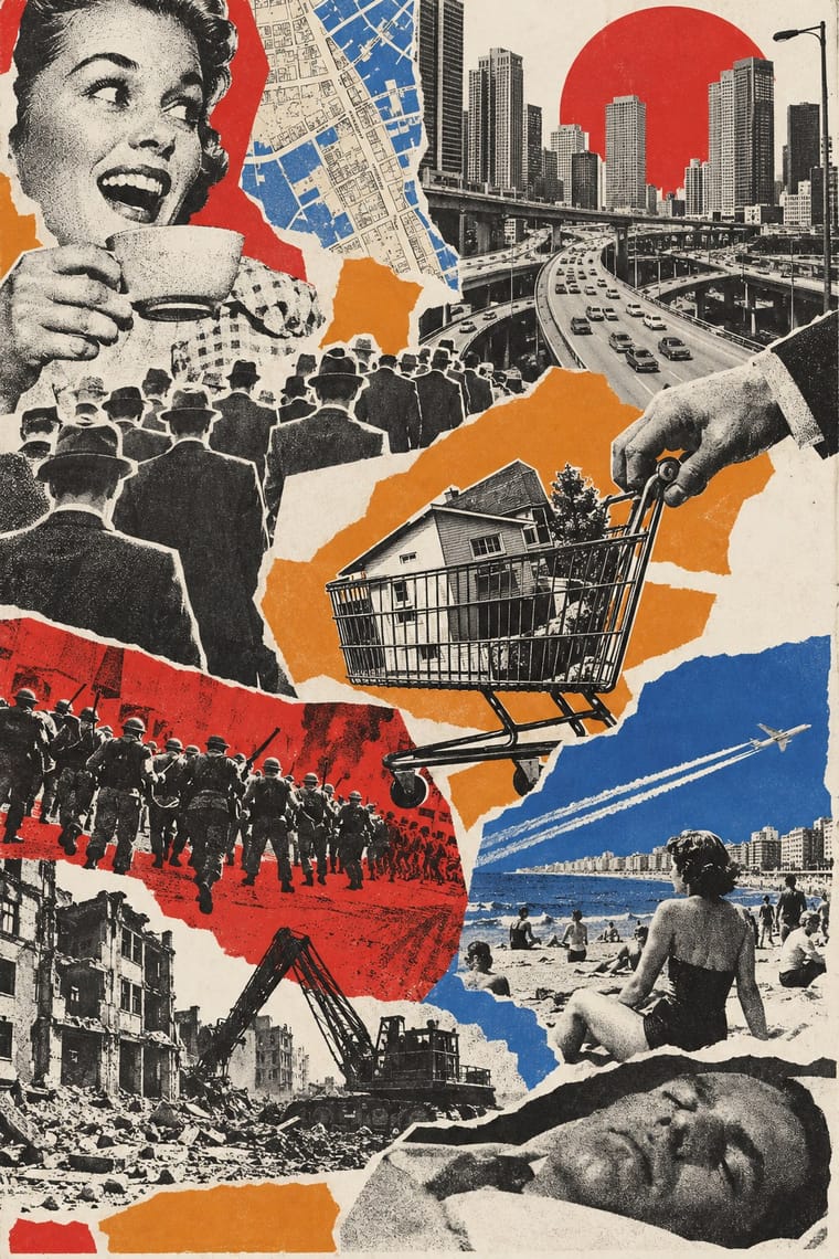
ACT UP & Gran Fury AIDS Activist Graphics Situationist Détournement Graphics
- Type from ACT UP
- Colour from Situationist Détournement Graphics
- Form from ACT UP
- Composition from ACT UP
- Surface from Situationist Détournement Graphics
-
ACT UP avoids painterly brushwork: this is where the two pull against each other, which is the point of the contrast.
02
The type
Open fonts standing in for each style’s own type, which is often hand-drawn or commercial.
Display · ACT UP
Loud
Anton; ACT UP used Gill Sans Bold Extra Condensed in white capitals reversed out of black for SILENCE=DEATH (1987), settled on after months in which the collective 'argued about issues, images and fonts' and Futura Extra Bold, Extra Bold Oblique and Extra Bold Condensed in black or white
Text · Situationist Détournement Graphics
Graphics of the Letterist and Situationist Internationals (1956–1972), built on détournement: taking existing words and pictures (comic strips, advertisements, news photographs, city maps, classic texts) and turning them against their source. Debord and Jorn scattered cut press fragments among splashes of coloured ink in the artist's books Fin de Copenhague and Mémoires, and cut the map of Paris into islands linked by red arrows. Strasbourg students and the CMDO refilled comic-strip balloons with theory and pasted the strips up.
Courier Prime; Situationist Détournement Graphics used Caractères Simples, a nineteenth-century French sans serif shown by Deberny, set in lowercase for the title on every issue of Internationale situationniste and Found press type
03
The colours
The ground and leading colours come from Situationist Détournement Graphics, with a counter-accent from ACT UP. The ink reads on the ground at 4.5:1 or more.
ACT UP & Gran Fury AIDS Activist Graphics Situationist Détournement Graphics
-
#f3f0e8ground · 36% -
#151515ink · 14% -
#e08a2caccent · 18% -
#c8102eaccent · 14% -
#f06ea9accent · 10% -
#2f5aa8accent · 8%
As CSS
:root {
  --ground: #f3f0e8;
  --ink: #151515;
  --accent-1: #e08a2c;
  --accent-2: #c8102e;
  --accent-3: #f06ea9;
  --accent-4: #2f5aa8;
  --font-display: "Anton", sans-serif;
  --font-text: "Courier Prime", monospace;
}
Use it with care
ACT UP & Gran Fury AIDS Activist Graphics: These are the graphics of a movement of gay men, lesbians and people with AIDS who were burying their friends, and many of their makers and subjects are living or died of AIDS (Mark Simpson, who appears in Kissing Doesn't Kill, died in 1996; Oliver Johnston in 1990); HIV remains a global health issue and ACT UP is still active. The pink triangle recalls the homosexual prisoners of the Nazi camps and was turned to point up as 'a disavowal of victimhood' (in Finkelstein's account; the Henry Ford's history says the inversion began as a mistake that the collective kept): do not use it, the SILENCE=DEATH equation or the kissing couples as decoration, Pride merchandise or brand campaigns, since the style was made to turn advertising against corporate greed, and do not picture people with HIV as victims or as a threat. SILENCE=DEATH is © 1987 The Silence = Death Project, which lent it to ACT UP (the poster reads 'Used by permission by ACT-UP'); Gran Fury's website declares its own artwork public domain, but the photographed people and quoted brands are not: write your own slogan and stage your own photograph, and never present a generated image as a period work.
04
The two styles
05
More combinations
With ACT UP
- Extinction Rebellion Graphics Pairs well · A later movement that again reduces its cause to one emblem and a fixed set of slogans in heavy capitals; pair XR's flat colour grounds with ACT UP's facts in small print when a protest poster must both rally and inform.
- Atelier Populaire (May '68 Screenprint Poster) Contrasts · Both answered a crisis with overnight slogans on the street, but the May '68 posters were brushed by hand and pulled in one ink, while most ACT UP and Gran Fury posters were professionally printed in offset and modelled on advertising; choose rough urgency or seductive polish before mixing them.
- Punk & DIY Zine Contrasts · Gran Fury photocopied some posters and handbills like a punk zine, but kept the layout clean and legible: one image, one slogan and plain sans type in place of ransom-note collage, even when the photograph broke into coarse xerox dots (Read My Lips); add punk's torn xerox only when the message should look home-made rather than official.
- Pop Art Graphics Pairs well · RIOT (1988), a painting later issued as a sticker, reworks Robert Indiana's LOVE letters and Kissing Doesn't Kill copies a Benetton campaign: borrow Pop's habit of lifting mass-media images and lettering, but replace Pop's ironic detachment with a named target and a demand.
- Corporate Identity Modernism Contrasts · Stands here for the logo logic of SILENCE=DEATH, one emblem and clean sans capitals repeated like a corporate mark; the advertising Gran Fury and ACT UP otherwise copied was 1980s brand campaigns and mastheads (Benetton, Nike, Coca-Cola, The New York Times) rather than mid-century corporate identity. Set an AIDS-era slogan in a corporate format when the point is to turn a brand's own voice against it.
- Latin American Feminist Protest Graphics (Ni Una Menos and the Green Wave) Contrasts · Two movements signed with a triangle, ACT UP's pink one on black and the green kerchief, but Gran Fury bought ad space and printed offset photographs and Futura, while the green wave wears its sign and letters its placards by hand; polish against handmade multitude.
- Instagram Slideshow Activism (Social-Justice Infographics) Contrasts · Its confrontational opposite: black grounds, hot pink and one blunt slogan, where the typical slideshow shuns 'blood red or black messaging' (Ría Thompson-Washington) and softens the message to stay comfortable.
- Plain Tobacco Packaging Pairs well · Gran Fury's white capitals on black are the activist cousin of the mandated warning statement; borrow their wit when a health message must persuade without leaning on clinical shock photographs.
With Situationist Détournement Graphics
- Punk & DIY Zine Contrasts · Punk reprised the situationist prank in the late 1970s, but it packs torn photocopies and mixed type into crowded pages; détournement keeps a few recognisable fragments and lets each one say the opposite of what it said. Borrow the rewritten balloon when a punk layout needs a sharper argument.
- Fotoromanzo (Italian Photo-Romance) Pairs well · The photo-romance was a raw material René Viénet named in Internationale situationniste no. 11 (1967), calling for photo-romances to be détourned by adding or altering their speech bubbles: keep the photographed lovers and the grid of frames untouched and change only the balloons, so that the melodrama speaks against itself.
- American Four-Colour Comic Book (Golden to Bronze Age) Pairs well · Mass-market comic panels were a favourite raw material of détournement: keep the drawing of an adventure or western panel untouched and rewrite only the balloons to turn it against its own story.
- Internet Ugly & Meme Vernacular Pairs well · Image macros and reaction memes recaption a known picture to say something new, which is détournement by other means; set a situationist rewritten balloon in a meme layout to bring the method online.
- Pop Art Graphics Contrasts · Both took comic panels and advertisements in the same years, but Lichtenstein enlarged a single panel to painting size as a close copy of what it already said, while détournement kept the panel at reading size and rewrote its balloon to argue against its source; the SI's English section called Pop art 'the last ditch attempt to shore up the decomposition of the spectacle' (1967). Enlarge when the source itself is the subject, rewrite when the message must turn on the source.
- Atelier Populaire (May '68 Screenprint Poster) Contrasts · Same Paris spring of 1968, opposite method: the Atelier populaire drew new figures and slogans and screenprinted them flat in one colour, while the situationists reused existing comics, photographs and texts. Draw when the message must read from across the street, détourn when the audience must recognise the source.
- Fluxus Graphics (Maciunas) Contrasts · Contemporaries who both took found pictures, but Maciunas packed them into a tight, deadpan black grid of mixed dry-transfer type, while Debord and Jorn scattered fragments under painted ink and aimed the joke at revolution; choose order or drift.
- Il Male Newspaper-Forgery Satire Pairs well · Take the cut-up method and add the dense tabloid page to turn theory into a prank.