Style combination · Pairs well
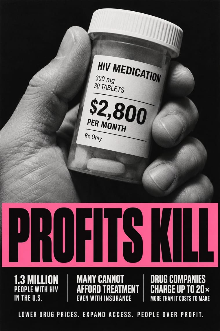
ACT UP × AIZ Political Photomontage
Both put a photograph under a one-line charge against named people; set Gran Fury's facts and demands in small print beneath a Heartfield-style literal metaphor when the accusation needs evidence.
Mix them and make something ACT UP AIZ Political Photomontage
01
What each style brings
Each part of the design comes from the style with the stronger say in it, and each style gives at least two.
ACT UP & Gran Fury AIDS Activist Graphics AIZ Political Photomontage (Heartfield)
- Type from ACT UP
- Colour from AIZ Political Photomontage
- Form from AIZ Political Photomontage
- Composition from ACT UP
- Surface from ACT UP
-
AIZ Political Photomontage avoids photocopy & distress: this is where the two pull against each other.
02
The type
Open fonts standing in for each style’s own type, which is often hand-drawn or commercial.
Display · ACT UP
Now!
Anton; ACT UP used Gill Sans Bold Extra Condensed in white capitals reversed out of black for SILENCE=DEATH (1987), settled on after months in which the collective 'argued about issues, images and fonts' and Futura Extra Bold, Extra Bold Oblique and Extra Bold Condensed in black or white
Text · AIZ Political Photomontage
The political photomontage John Heartfield made for the communist weekly AIZ from 1930 to 1938, in Berlin and, from 1933, in Prague exile. Press photographs were cut, joined, retouched with airbrush and rephotographed into one seamless, believable picture that usually takes an opponent's slogan or symbol, most often a Nazi one, literally and, less often, raises a heroic emblem such as the clenched fist. It was printed full-page in single-ink photogravure between a short headline and a deadpan caption or quotation in plain bold sans.
Jost; AIZ Political Photomontage used Bold geometric or grotesque sans capitals of the Erbar and Bold geometric or grotesque sans upper- and lowercase, often with a double-storey a, for the punchline, often reversed white out of the dark gravure ('Kleiner Mann bittet um große Gaben', 1932; 'Hurrah, die Butter ist alle!', 1935; 'Die Stimme der Freiheit in deutscher Nacht – auf Welle 29,8', 1937)
03
The colours
The ground and leading colours come from AIZ Political Photomontage, with a counter-accent from ACT UP. The ink reads on the ground at 4.5:1 or more.
ACT UP & Gran Fury AIDS Activist Graphics AIZ Political Photomontage (Heartfield)
-
#ede1c3ground · 36% -
#1e1a17ink · 14% -
#c6a67caccent · 18% -
#c8102eaccent · 14% -
#86603faccent · 10% -
#f06ea9accent · 8%
As CSS
:root {
  --ground: #ede1c3;
  --ink: #1e1a17;
  --accent-1: #c6a67c;
  --accent-2: #c8102e;
  --accent-3: #86603f;
  --accent-4: #f06ea9;
  --font-display: "Anton", sans-serif;
  --font-text: "Jost", sans-serif;
}
Use it with care
ACT UP & Gran Fury AIDS Activist Graphics: These are the graphics of a movement of gay men, lesbians and people with AIDS who were burying their friends, and many of their makers and subjects are living or died of AIDS (Mark Simpson, who appears in Kissing Doesn't Kill, died in 1996; Oliver Johnston in 1990); HIV remains a global health issue and ACT UP is still active. The pink triangle recalls the homosexual prisoners of the Nazi camps and was turned to point up as 'a disavowal of victimhood' (in Finkelstein's account; the Henry Ford's history says the inversion began as a mistake that the collective kept): do not use it, the SILENCE=DEATH equation or the kissing couples as decoration, Pride merchandise or brand campaigns, since the style was made to turn advertising against corporate greed, and do not picture people with HIV as victims or as a threat. SILENCE=DEATH is © 1987 The Silence = Death Project, which lent it to ACT UP (the poster reads 'Used by permission by ACT-UP'); Gran Fury's website declares its own artwork public domain, but the photographed people and quoted brands are not: write your own slogan and stage your own photograph, and never present a generated image as a period work.
AIZ Political Photomontage (Heartfield): The montages turn swastikas and portraits of Nazi leaders against the regime; displaying Nazi symbols is restricted by law in Germany and several other countries outside contexts such as art, satire, education and history, so keep any reuse unmistakably critical and check the rules where the work will be shown. AIZ was also a communist magazine informally financed by the Comintern: before 1933 its montages attacked the Social Democrats as well as the Nazis, and in 1934 it devoted a special issue to seventeen years of the Soviet Union, so treat the style as partisan propaganda, and do not turn its literal, accusatory montage on named living people without checking defamation and image-rights law.
04
The two styles
05
More combinations
With ACT UP
- Extinction Rebellion Graphics Pairs well · A later movement that again reduces its cause to one emblem and a fixed set of slogans in heavy capitals; pair XR's flat colour grounds with ACT UP's facts in small print when a protest poster must both rally and inform.
- Atelier Populaire (May '68 Screenprint Poster) Contrasts · Both answered a crisis with overnight slogans on the street, but the May '68 posters were brushed by hand and pulled in one ink, while most ACT UP and Gran Fury posters were professionally printed in offset and modelled on advertising; choose rough urgency or seductive polish before mixing them.
- Punk & DIY Zine Contrasts · Gran Fury photocopied some posters and handbills like a punk zine, but kept the layout clean and legible: one image, one slogan and plain sans type in place of ransom-note collage, even when the photograph broke into coarse xerox dots (Read My Lips); add punk's torn xerox only when the message should look home-made rather than official.
- Pop Art Graphics Pairs well · RIOT (1988), a painting later issued as a sticker, reworks Robert Indiana's LOVE letters and Kissing Doesn't Kill copies a Benetton campaign: borrow Pop's habit of lifting mass-media images and lettering, but replace Pop's ironic detachment with a named target and a demand.
- Corporate Identity Modernism Contrasts · Stands here for the logo logic of SILENCE=DEATH, one emblem and clean sans capitals repeated like a corporate mark; the advertising Gran Fury and ACT UP otherwise copied was 1980s brand campaigns and mastheads (Benetton, Nike, Coca-Cola, The New York Times) rather than mid-century corporate identity. Set an AIDS-era slogan in a corporate format when the point is to turn a brand's own voice against it.
- Latin American Feminist Protest Graphics (Ni Una Menos and the Green Wave) Contrasts · Two movements signed with a triangle, ACT UP's pink one on black and the green kerchief, but Gran Fury bought ad space and printed offset photographs and Futura, while the green wave wears its sign and letters its placards by hand; polish against handmade multitude.
- Instagram Slideshow Activism (Social-Justice Infographics) Contrasts · Its confrontational opposite: black grounds, hot pink and one blunt slogan, where the typical slideshow shuns 'blood red or black messaging' (Ría Thompson-Washington) and softens the message to stay comfortable.
- Plain Tobacco Packaging Pairs well · Gran Fury's white capitals on black are the activist cousin of the mandated warning statement; borrow their wit when a health message must persuade without leaning on clinical shock photographs.
With AIZ Political Photomontage
- NSK Retro-Avant-Garde Contrasts · NSK lifts Nazi and socialist emblems whole into solemn, centred heraldry and over-identifies with power, leaving the verdict open; AIZ builds the same kind of centred emblem, like the axe swastika, but always adds a caption that convicts. Choose by whether the viewer should be left uneasy or told what to think.
- Surrealist Graphics Pairs well · Surrealist photography also makes the impossible look photographed; take its dream logic when a brief needs strangeness, and add the AIZ headline and caption when that strangeness has to land a political point.
- Russian Constructivism Contrasts · Constructivist photomontage drives heroic figures along diagonals with bars, red ink and exploding type; AIZ uses the same cut photographs in a centred, single-ink picture with a quiet caption, mostly to mock and sometimes, as in the 1937 radio-wave fist, to rally. The debt is direct: Heartfield spent April 1931 to January 1932 in the Soviet Union, looked after by Sergei Tretyakov and, it seems, getting on well with Gustav Klutsis, and the Art Institute of Chicago traces the 1934 many-arms fist cover to Klutsis's 1932 election poster of one raised hand repeated into a crowd.
- Situationist Détournement Graphics Pairs well · Both turn the opponent's own words and pictures against their source; take détournement's scattered press fragments and rewritten speech balloons for a looser, cheaper attack, and AIZ's seamless single picture when the charge must look like a photograph of fact.
- Simplicissimus Satirical Style (Munich) Pairs well · Simplicissimus frames a drawn caricature between a set title and a one-line caption; once it dulled its satire in the First World War, the sharpest graphic satire passed to Grosz, Kollwitz and Heartfield. Keep that title-picture-caption sentence and swap the drawing for a seamless montage to make the satire look like evidence.
- West German Conceptual Film & Culture Poster (Hillmann and Rambow) Pairs well · Heartfield tied four bloody axes into a swastika in 1934; Rambow's broken pencils laid into a swastika over a 1938 PEN list (1983) make the same move of an object turned into an emblem. Borrow the AIZ caption when the poster must accuse, and Rambow's wordless object when it should commemorate.
- Israeli Political Poster (Tartakover to Lemel) Pairs well · Compare how a recognisable photographed object becomes an accusation, but keep the Hebrew slogan and local reference specific; resemblance in the montage method is not evidence of direct historical influence.
- Stenberg Brothers Constructivist Film Poster Pairs well · Borrow the political photomontage cut-and-assemble method, then add the Stenbergs' exaggerated scale for dynamism.