Style combination · Pairs well
AIZ Political Photomontage × Surrealist Graphics
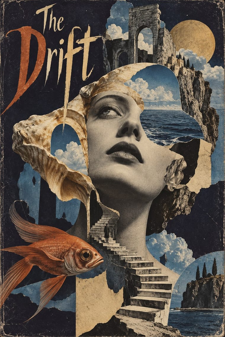
Surrealist photography also makes the impossible look photographed; take its dream logic when a brief needs strangeness, and add the AIZ headline and caption when that strangeness has to land a political point.
Mix them and make something AIZ Political Photomontage Surrealist Graphics
01
What each style brings
Each part of the design comes from the style with the stronger say in it, and each style gives at least two.
AIZ Political Photomontage (Heartfield) Surrealist Graphics
- Type from AIZ Political Photomontage
- Colour from AIZ Political Photomontage
- Form from Surrealist Graphics
- Composition from Surrealist Graphics
-
AIZ Political Photomontage avoids collage & layering: this is where the two pull against each other.
- Surface from Surrealist Graphics
-
02
The type
Open fonts standing in for each style’s own type, which is often hand-drawn or commercial.
Display · AIZ Political Photomontage
Okay
Jost, standing in for Bold geometric or grotesque sans capitals of the Erbar, Kabel or Futura kind, with round C and G, for the headline, stacked above the picture ('DER SINN DES HITLERGRUSSES:', AIZ cover, 16 October 1932; 'BLUT UND EISEN', 1934) or widely letterspaced across the foot of a spread ('KRIEG UND LEICHEN – DIE LETZTE HOFFNUNG DER REICHEN', 1932)
Text · Surrealist Graphics
Launched by André Breton's 1924 manifesto, Surrealism sought the marvellous in dreams, chance and the unconscious. Its graphic legacy (uncanny collage from old engravings, solarised and cameraless photographs, impossible juxtapositions painted with illusionistic precision) passed through magazines like Minotaure into fashion, advertising and book design on both sides of the Atlantic.
Bodoni Moda; Surrealist Graphics used Artists' hand-lettered mastheads and Didone and Victorian display faces lifted from 19th-century catalogues
03
The colours
The ground and leading colours come from AIZ Political Photomontage, with a counter-accent from Surrealist Graphics. The ink reads on the ground at 4.5:1 or more.
AIZ Political Photomontage (Heartfield) Surrealist Graphics
-
#ede1c3ground · 36% -
#1e1a17ink · 14% -
#c6a67caccent · 18% -
#a24a2aaccent · 14% -
#4b2b1caccent · 10% -
#6f8fb5accent · 8%
As CSS
:root {
  --ground: #ede1c3;
  --ink: #1e1a17;
  --accent-1: #c6a67c;
  --accent-2: #a24a2a;
  --accent-3: #4b2b1c;
  --accent-4: #6f8fb5;
  --font-display: "Jost", sans-serif;
  --font-text: "Bodoni Moda", serif;
}
Use it with care
AIZ Political Photomontage (Heartfield): The montages turn swastikas and portraits of Nazi leaders against the regime; displaying Nazi symbols is restricted by law in Germany and several other countries outside contexts such as art, satire, education and history, so keep any reuse unmistakably critical and check the rules where the work will be shown. AIZ was also a communist magazine informally financed by the Comintern: before 1933 its montages attacked the Social Democrats as well as the Nazis, and in 1934 it devoted a special issue to seventeen years of the Soviet Union, so treat the style as partisan propaganda, and do not turn its literal, accusatory montage on named living people without checking defamation and image-rights law.
04
The two styles
05
More combinations
With AIZ Political Photomontage
- NSK Retro-Avant-Garde Contrasts · NSK lifts Nazi and socialist emblems whole into solemn, centred heraldry and over-identifies with power, leaving the verdict open; AIZ builds the same kind of centred emblem, like the axe swastika, but always adds a caption that convicts. Choose by whether the viewer should be left uneasy or told what to think.
- Russian Constructivism Contrasts · Constructivist photomontage drives heroic figures along diagonals with bars, red ink and exploding type; AIZ uses the same cut photographs in a centred, single-ink picture with a quiet caption, mostly to mock and sometimes, as in the 1937 radio-wave fist, to rally. The debt is direct: Heartfield spent April 1931 to January 1932 in the Soviet Union, looked after by Sergei Tretyakov and, it seems, getting on well with Gustav Klutsis, and the Art Institute of Chicago traces the 1934 many-arms fist cover to Klutsis's 1932 election poster of one raised hand repeated into a crowd.
- Situationist Détournement Graphics Pairs well · Both turn the opponent's own words and pictures against their source; take détournement's scattered press fragments and rewritten speech balloons for a looser, cheaper attack, and AIZ's seamless single picture when the charge must look like a photograph of fact.
- ACT UP & Gran Fury AIDS Activist Graphics Pairs well · Both put a photograph under a one-line charge against named people; set Gran Fury's facts and demands in small print beneath a Heartfield-style literal metaphor when the accusation needs evidence.
- Simplicissimus Satirical Style (Munich) Pairs well · Simplicissimus frames a drawn caricature between a set title and a one-line caption; once it dulled its satire in the First World War, the sharpest graphic satire passed to Grosz, Kollwitz and Heartfield. Keep that title-picture-caption sentence and swap the drawing for a seamless montage to make the satire look like evidence.
- West German Conceptual Film & Culture Poster (Hillmann and Rambow) Pairs well · Heartfield tied four bloody axes into a swastika in 1934; Rambow's broken pencils laid into a swastika over a 1938 PEN list (1983) make the same move of an object turned into an emblem. Borrow the AIZ caption when the poster must accuse, and Rambow's wordless object when it should commemorate.
- Israeli Political Poster (Tartakover to Lemel) Pairs well · Compare how a recognisable photographed object becomes an accusation, but keep the Hebrew slogan and local reference specific; resemblance in the montage method is not evidence of direct historical influence.
- Stenberg Brothers Constructivist Film Poster Pairs well · Borrow the political photomontage cut-and-assemble method, then add the Stenbergs' exaggerated scale for dynamism.
With Surrealist Graphics
- Corporate Identity Modernism Contrasts · Place a single dream image inside a strict corporate grid; the calm system heightens the strangeness.
- Isotype Pictorial Statistics Contrasts · Isotype's one-symbol-one-meaning is the antithesis of Surrealist ambiguity; decide whether the viewer should decode or be disturbed.
- Psychedelic Poster Pairs well · Psychedelic posters revived Surrealist dream imagery; combine them for hallucinatory figurative work with melting forms.
- Polish Poster School Pairs well · Polish poster artists fused Surrealist metaphor with painterly lettering; borrow the method for cultural posters built on one uncanny image.
- Post-Punk Record Sleeve (Stiff, Factory, 4AD) Pairs well · Vaughan Oliver drew on Dalí and Surrealism; add an uncanny juxtaposition to a blurred, textured 23 Envelope photograph for a dream-like sleeve.
- Brodovitch Editorial Design (Harper's Bazaar) Pairs well · Take its isolated body parts, torn edges and dreamlike juxtaposition, but apply them to the photographic spread.
- Emblem Book (Motto, Picture & Epigram) Pairs well · Both find meaning in the gap between a picture and the words beside it; pair a framed, uncanny object with a terse motto above and a short verse below for an editorial series that asks to be decoded.
- Basel Object Poster (Swiss Sachplakat) Pairs well · Both paint ordinary things with illusionistic precision until they look strange; borrow a Magritte-like juxtaposition to push a Basel still life from product portrait to visual riddle, as Leupin did with his newspaper and globe.