Style combination · Pairs well
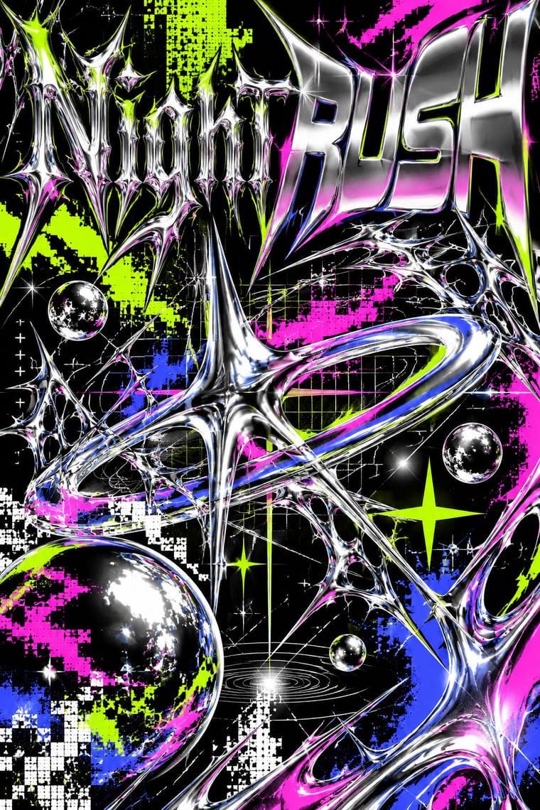
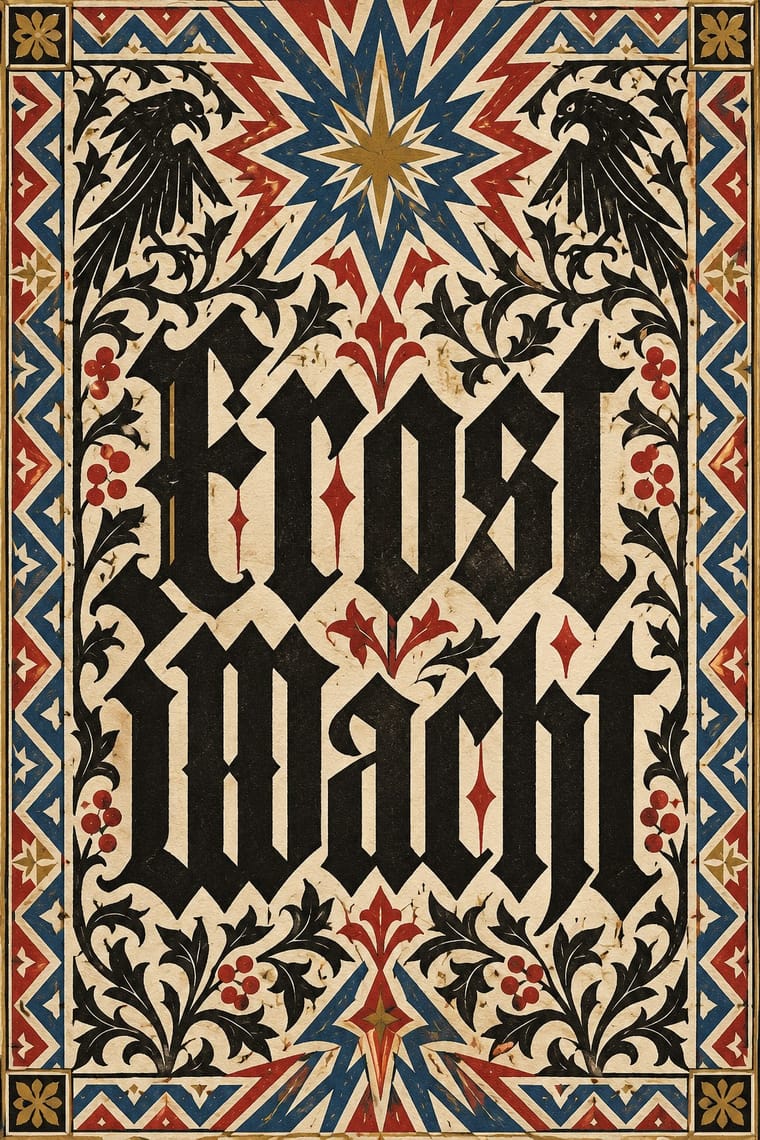
Acid Graphics × Gothic Blackletter
Its club-poster revival: acid graphics mixes blackletter with liquid chrome, ultra-wide grotesques and pixel faces. Render one broken-letter wordmark in chrome on black and leave the parchment, rubrics and justified page behind.
Mix them and make something Acid Graphics Gothic Blackletter
01
What each style brings
Each part of the design comes from the style with the stronger say in it, and each style gives at least two.
Acid Graphics / New Ugly Gothic Blackletter & Fraktur Tradition
- Type from Gothic Blackletter
- Colour from Acid Graphics
-
Gothic Blackletter avoids fluorescent & neon: this is where the two pull against each other.
- Form from Gothic Blackletter
- Composition from Acid Graphics
- Surface from Acid Graphics
02
The type
Open fonts standing in for each style’s own type, which is often hand-drawn or commercial.
Display · Gothic Blackletter
Daydream
UnifrakturMaguntia, standing in for Gutenberg's 42-line Bible textura (Mainz, c. 1454–55)
Text · Acid Graphics
A late-2010s club and poster style that updates 1990s rave graphics with modern 3D tools: liquid-chrome and melting lettering, neo-tribal spikes, wireframes, op-art patterns and acid-green palettes on black, mixed with blackletter and stretched grotesques. Associated with David Rudnick, Studio Cryo and Anja Kaiser and collected on Instagram's @acidgraphix, it overlaps with the 'New Ugly' turn towards deliberate antidesign.
VT323; Acid Graphics used Liquid-chrome and melted custom lettering and Blackletter and neo-gothic display
03
The colours
The ground and leading colours come from Acid Graphics, with a counter-accent from Gothic Blackletter. The ink reads on the ground at 4.5:1 or more.
Acid Graphics / New Ugly Gothic Blackletter & Fraktur Tradition
-
#000000ground · 36% -
#ffffffink · 14% -
#ccff00accent · 18% -
#b0302aaccent · 14% -
#ff1ad9accent · 10% -
#b8913aaccent · 8%
As CSS
:root {
  --ground: #000000;
  --ink: #ffffff;
  --accent-1: #ccff00;
  --accent-2: #b0302a;
  --accent-3: #ff1ad9;
  --accent-4: #b8913a;
  --font-display: "UnifrakturMaguntia", serif;
  --font-text: "VT323", monospace;
}
Use it with care
Gothic Blackletter & Fraktur Tradition: Blackletter carries political weight in German-speaking countries: the Nazi regime pushed Fraktur as the German script in its first years before banning it in January 1941 as supposed 'Schwabacher Jewish letters', and neo-Nazis still use broken scripts. In the United States, too, certain blackletter faces are associated with hate groups, on tattoos and clothing. Check how a blackletter wordmark will read, especially for anything German, national or political. Cholo placas are territorial inscriptions of Los Angeles Latino street writing with their own codes: do not copy a real neighbourhood's placa or roll call, and commission or credit Chicano letterers (such as Chaz Bojórquez) rather than borrowing their menace as decoration.
04
The two styles
05
More combinations
With Acid Graphics
- Neo-Swiss Revival Contrasts · Set a single liquid-chrome wordmark inside a clean neo-Swiss grid so information stays legible around the spectacle.
- Graffiti & Hip-Hop Graphics Pairs well · Graffiti wildstyle letter structures translate naturally into chrome 3D renders for gig posters and merch.
- Corporate Memphis Contrasts · Acid graphics defines itself against Corporate Memphis' friendliness; lean into the contrast to signal underground credibility.
- Techno-Futurist Graphics Pairs well · Borrow The Designers Republic's corporate-parody logos and tiny technical captions to give acid layouts a systematic backbone.
- Rave & Acid House Graphics Pairs well · Acid graphics is rave's digital heir; reuse the chrome logotype and fluorescent-on-black palette with contemporary 3D tools.
- Post-Binary Typography (Bye Bye Binary and Inclusive French Type) Pairs well · The collective's banners share Acid Graphics' blackletter, spiky stars, gradients and chrome-like lettering; borrow that repertoire for a manifesto banner or flyer, but keep the post-binary glyph legible as the subject rather than the surface effect.
- Glitch Art & Datamosh Graphics Contrasts · Acid graphics renders polished chrome and adds glitch as a finish; glitch art breaks the file and keeps what comes out. Decide whether a brief wants spectacle or exposure.
- PC Music Graphics Contrasts · Neighbours in the late 2010s club scene, but acid graphics crowd chrome, blackletter and neon on black, where PC Music isolates one clean object on a plain field.
With Gothic Blackletter
- Arts & Crafts Movement Pairs well · Morris's Kelmscott Press revived gothic type (Troy and Chaucer) inside dense woodcut borders; join the broken letter to foliate frames and handmade paper for a medieval, hand-made book.
- Die Neue Typographie Contrasts · Its flush-left sans-serif page on an asymmetric axis is everything the centred, justified blackletter block is not; set the two side by side to stage the argument between tradition and modernity.
- Graffiti & Hip-Hop Graphics Pairs well · Old English letters run through Los Angeles cholo writing into later street lettering; give a hand-drawn textura wordmark aerosol fills, outlines and drop shadows for street weight.
- Renaissance Book Typography Contrasts · Its historical rival: the light, round, open humanist roman page against the dark, broken, woven gothic one. Drop one blackletter title or initial into an Aldine-style page for a deliberate clash of eras.
- Victorian Letterpress & Wood Type Pairs well · English proclamations and notices kept black letter for gravity; set one blackletter line among slab and Tuscan wood type to lend a playbill or notice an official, old-world voice.
- Gothic Book of Hours (Illuminated Devotional Book) Pairs well · Compare the shared Gothic text block, then distinguish the book-of-hours page by its coordinated miniatures, graded initials and marginal programme; a blackletter wordmark alone does not reproduce this system.
- Pixação (São Paulo Tag Reto) Pairs well · Tag reto descends from gothic and runic forms by way of metal logos; set a textura line above a row of straight, pointed tag-reto letters, both in black, to show the lineage from the book page to the façade.
- Celtic Revival Illumination & Lettering Contrasts · The other national script of the same decades: Fraktur set German text until its ban in 1941, as Gaelic type set Irish until the mid-twentieth century; set the dark, broken gothic weave against the round, open insular letter.