Style combination · Pairs well
Acid Graphics × Graffiti
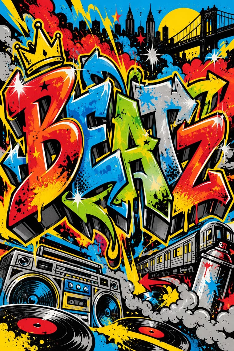
Graffiti wildstyle letter structures translate naturally into chrome 3D renders for gig posters and merch.
01
What each style brings
Each part of the design comes from the style with the stronger say in it, and each style gives at least two.
Acid Graphics / New Ugly Graffiti & Hip-Hop Graphics
- Type from Graffiti
- Colour from Acid Graphics
- Form from Graffiti
- Composition from Acid Graphics
- Surface from Acid Graphics
02
The type
Open fonts standing in for each style’s own type, which is often hand-drawn or commercial.
Text · Acid Graphics
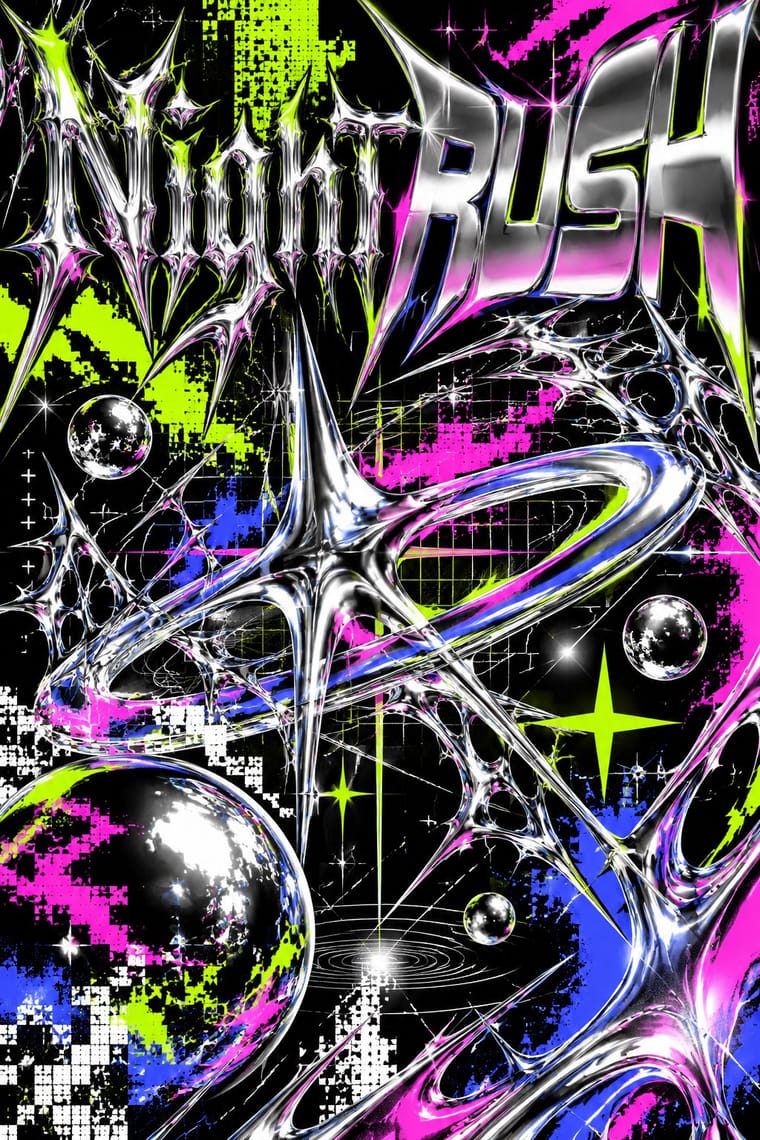
A late-2010s club and poster style that updates 1990s rave graphics with modern 3D tools: liquid-chrome and melting lettering, neo-tribal spikes, wireframes, op-art patterns and acid-green palettes on black, mixed with blackletter and stretched grotesques. Associated with David Rudnick, Studio Cryo and Anja Kaiser and collected on Instagram's @acidgraphix, it overlaps with the 'New Ugly' turn towards deliberate antidesign.
VT323; Acid Graphics used Liquid-chrome and melted custom lettering and Blackletter and neo-gothic display
03
The colours
The ground and leading colours come from Acid Graphics, with a counter-accent from Graffiti. The ink reads on the ground at 4.5:1 or more.
Acid Graphics / New Ugly Graffiti & Hip-Hop Graphics
-
#000000ground · 36% -
#ffffffink · 14% -
#ccff00accent · 18% -
#e4002baccent · 14% -
#ff1ad9accent · 10% -
#00a3e0accent · 8%
As CSS
:root {
  --ground: #000000;
  --ink: #ffffff;
  --accent-1: #ccff00;
  --accent-2: #e4002b;
  --accent-3: #ff1ad9;
  --accent-4: #00a3e0;
  --font-display: "Sedgwick Ave Display", cursive;
  --font-text: "VT323", monospace;
}
04
The two styles
05
More combinations
With Acid Graphics
- Neo-Swiss Revival Contrasts · Set a single liquid-chrome wordmark inside a clean neo-Swiss grid so information stays legible around the spectacle.
- Corporate Memphis Contrasts · Acid graphics defines itself against Corporate Memphis' friendliness; lean into the contrast to signal underground credibility.
- Techno-Futurist Graphics Pairs well · Borrow The Designers Republic's corporate-parody logos and tiny technical captions to give acid layouts a systematic backbone.
- Rave & Acid House Graphics Pairs well · Acid graphics is rave's digital heir; reuse the chrome logotype and fluorescent-on-black palette with contemporary 3D tools.
- Post-Binary Typography (Bye Bye Binary and Inclusive French Type) Pairs well · The collective's banners share Acid Graphics' blackletter, spiky stars, gradients and chrome-like lettering; borrow that repertoire for a manifesto banner or flyer, but keep the post-binary glyph legible as the subject rather than the surface effect.
- Glitch Art & Datamosh Graphics Contrasts · Acid graphics renders polished chrome and adds glitch as a finish; glitch art breaks the file and keeps what comes out. Decide whether a brief wants spectacle or exposure.
- Gothic Blackletter & Fraktur Tradition Pairs well · Its club-poster revival: acid graphics mixes blackletter with liquid chrome, ultra-wide grotesques and pixel faces. Render one broken-letter wordmark in chrome on black and leave the parchment, rubrics and justified page behind.
- PC Music Graphics Contrasts · Neighbours in the late 2010s club scene, but acid graphics crowd chrome, blackletter and neon on black, where PC Music isolates one clean object on a plain field.
With Graffiti
- International Typographic Style Contrasts · Put a single tag or throw-up over a strict Swiss grid to stage the clash between institutional order and a street voice.
- Corporate Identity Modernism Contrasts · Use graffiti as the foil to corporate identity: a painted name over a logo makes the ownership of public space visible.
- Pop Art Graphics Pairs well · Pair letter-pieces with Ben-Day comic panels and bold outlines, as 1980s gallery graffiti often did, for a street-meets-gallery look.
- Hype Streetwear Graphics (Box Logo to Quotation Marks) Pairs well · Streetwear grew out of New York hip-hop dress; pair a set geometric wordmark with a hand-drawn graffiti piece for a back print, but keep the logo flat and centred so the tag reads as the decoration and the box as the brand.
- Pixação (São Paulo Tag Reto) Contrasts · Both write names on walls, and Pesquisa FAPESP lists hip-hop among the 1980s influences on pixação, but graffiti builds the letter into a coloured, outlined, three-dimensional piece with characters, while pixação keeps a flat black straight letter in level rows and goes for height. Brazilian law since 2011 tolerates graffiti made with the owner's consent and keeps pichação a crime, so decide which one the brief needs.
- Stencil Street Art Contrasts · Both use spray paint in the street, but graffiti makes the writer's name a freehand, many-coloured letter-sculpture with 3D blocks and fades; stencil art sprays a reproducible photographic picture in black. Decide which one the brief needs before mixing them.
- Guochao (China-Chic National Trend) Pairs well · Guochao's streetwear wing already borrows hip-hop lockups; treat a brush character as the tag and keep the heritage palette.
- Black Lives Matter Street Murals Contrasts · Graffiti writers paint their own names on walls and trains, uninvited and in letters few outsiders can read; these murals lay one shared, legible slogan on the road, usually with the city's permission. Let a writer fill one letter, as Sam Sneke did in Seattle, without turning the slogan into a piece.