Style combination · Pairs well
Gothic Blackletter × Graffiti
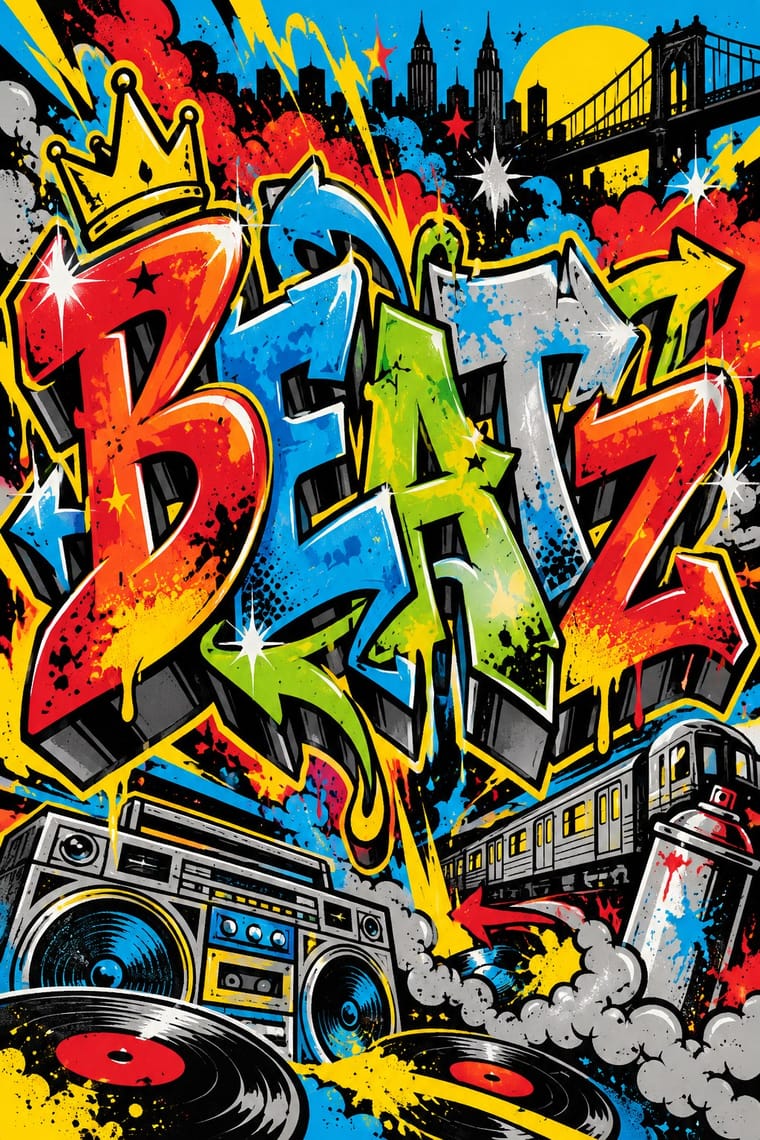
Old English letters run through Los Angeles cholo writing into later street lettering; give a hand-drawn textura wordmark aerosol fills, outlines and drop shadows for street weight.
01
What each style brings
Each part of the design comes from the style with the stronger say in it, and each style gives at least two.
Gothic Blackletter & Fraktur Tradition Graffiti & Hip-Hop Graphics
- Type from Graffiti
- Colour from Gothic Blackletter
- Form from Gothic Blackletter
- Composition from Gothic Blackletter
-
Graffiti avoids classical text block: this is where the two pull against each other.
- Surface from Graffiti
02
The type
Open fonts standing in for each style’s own type, which is often hand-drawn or commercial.
Text · Gothic Blackletter
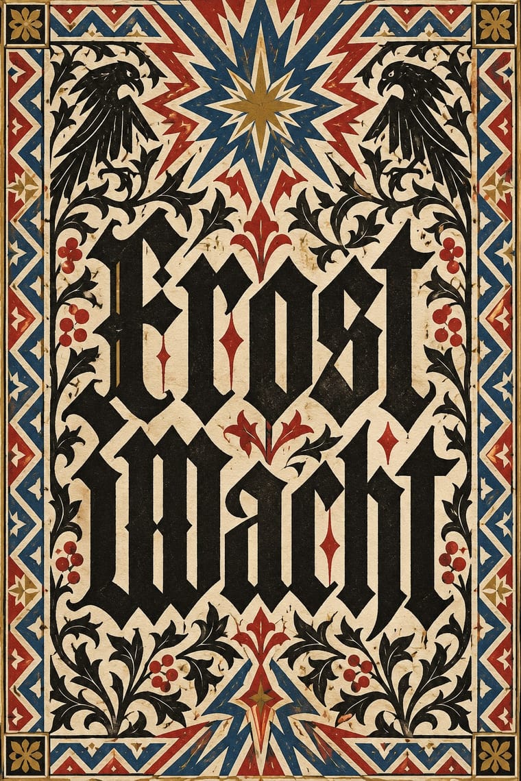
The broken scripts of the Latin West. Textualis, a book hand from the late 12th century (Rotunda its rounder Italian form), went into type with Gutenberg's 42-line Bible (Mainz, c. 1454–55); Schwabacher followed from 1472, and Fraktur was cut for Maximilian I's Prayer Book (1513). Curves break into angles; tight justified pages read as a dark, even weave with red rubrics. Fraktur set German text until the Nazi ban of 1941. Elsewhere it had long become a display letter, and today signals age, gravity or menace on mastheads, beer labels, metal logos and cholo lettering.
Libre Caslon Text; Gothic Blackletter used Gutenberg's 42-line Bible textura and Schwabacher
03
The colours
The ground and leading colours come from Gothic Blackletter, with a counter-accent from Graffiti. The ink reads on the ground at 4.5:1 or more.
Gothic Blackletter & Fraktur Tradition Graffiti & Hip-Hop Graphics
-
#efe6cfground · 36% -
#1b1714ink · 14% -
#b0302aaccent · 18% -
#e4002baccent · 14% -
#b8913aaccent · 10% -
#00a3e0accent · 8%
As CSS
:root {
  --ground: #efe6cf;
  --ink: #1b1714;
  --accent-1: #b0302a;
  --accent-2: #e4002b;
  --accent-3: #b8913a;
  --accent-4: #00a3e0;
  --font-display: "Sedgwick Ave Display", cursive;
  --font-text: "Libre Caslon Text", serif;
}
Use it with care
Gothic Blackletter & Fraktur Tradition: Blackletter carries political weight in German-speaking countries: the Nazi regime pushed Fraktur as the German script in its first years before banning it in January 1941 as supposed 'Schwabacher Jewish letters', and neo-Nazis still use broken scripts. In the United States, too, certain blackletter faces are associated with hate groups, on tattoos and clothing. Check how a blackletter wordmark will read, especially for anything German, national or political. Cholo placas are territorial inscriptions of Los Angeles Latino street writing with their own codes: do not copy a real neighbourhood's placa or roll call, and commission or credit Chicano letterers (such as Chaz Bojórquez) rather than borrowing their menace as decoration.
04
The two styles
05
More combinations
With Gothic Blackletter
- Arts & Crafts Movement Pairs well · Morris's Kelmscott Press revived gothic type (Troy and Chaucer) inside dense woodcut borders; join the broken letter to foliate frames and handmade paper for a medieval, hand-made book.
- Die Neue Typographie Contrasts · Its flush-left sans-serif page on an asymmetric axis is everything the centred, justified blackletter block is not; set the two side by side to stage the argument between tradition and modernity.
- Renaissance Book Typography Contrasts · Its historical rival: the light, round, open humanist roman page against the dark, broken, woven gothic one. Drop one blackletter title or initial into an Aldine-style page for a deliberate clash of eras.
- Acid Graphics / New Ugly Pairs well · Its club-poster revival: acid graphics mixes blackletter with liquid chrome, ultra-wide grotesques and pixel faces. Render one broken-letter wordmark in chrome on black and leave the parchment, rubrics and justified page behind.
- Victorian Letterpress & Wood Type Pairs well · English proclamations and notices kept black letter for gravity; set one blackletter line among slab and Tuscan wood type to lend a playbill or notice an official, old-world voice.
- Gothic Book of Hours (Illuminated Devotional Book) Pairs well · Compare the shared Gothic text block, then distinguish the book-of-hours page by its coordinated miniatures, graded initials and marginal programme; a blackletter wordmark alone does not reproduce this system.
- Pixação (São Paulo Tag Reto) Pairs well · Tag reto descends from gothic and runic forms by way of metal logos; set a textura line above a row of straight, pointed tag-reto letters, both in black, to show the lineage from the book page to the façade.
- Celtic Revival Illumination & Lettering Contrasts · The other national script of the same decades: Fraktur set German text until its ban in 1941, as Gaelic type set Irish until the mid-twentieth century; set the dark, broken gothic weave against the round, open insular letter.
With Graffiti
- International Typographic Style Contrasts · Put a single tag or throw-up over a strict Swiss grid to stage the clash between institutional order and a street voice.
- Corporate Identity Modernism Contrasts · Use graffiti as the foil to corporate identity: a painted name over a logo makes the ownership of public space visible.
- Pop Art Graphics Pairs well · Pair letter-pieces with Ben-Day comic panels and bold outlines, as 1980s gallery graffiti often did, for a street-meets-gallery look.
- Hype Streetwear Graphics (Box Logo to Quotation Marks) Pairs well · Streetwear grew out of New York hip-hop dress; pair a set geometric wordmark with a hand-drawn graffiti piece for a back print, but keep the logo flat and centred so the tag reads as the decoration and the box as the brand.
- Pixação (São Paulo Tag Reto) Contrasts · Both write names on walls, and Pesquisa FAPESP lists hip-hop among the 1980s influences on pixação, but graffiti builds the letter into a coloured, outlined, three-dimensional piece with characters, while pixação keeps a flat black straight letter in level rows and goes for height. Brazilian law since 2011 tolerates graffiti made with the owner's consent and keeps pichação a crime, so decide which one the brief needs.
- Stencil Street Art Contrasts · Both use spray paint in the street, but graffiti makes the writer's name a freehand, many-coloured letter-sculpture with 3D blocks and fades; stencil art sprays a reproducible photographic picture in black. Decide which one the brief needs before mixing them.
- Guochao (China-Chic National Trend) Pairs well · Guochao's streetwear wing already borrows hip-hop lockups; treat a brush character as the tag and keep the heritage palette.
- Black Lives Matter Street Murals Contrasts · Graffiti writers paint their own names on walls and trains, uninvited and in letters few outsiders can read; these murals lay one shared, legible slogan on the road, usually with the city's permission. Let a writer fill one letter, as Sam Sneke did in Seattle, without turning the slogan into a piece.