Style combination · Contrasts
Song–Ming Woodblock Book Typography × Tibetan Woodblock Print Culture
Both are woodblock canons cut from a calligrapher's copy, but the Chinese page runs in vertical columns of square cells on a folded, sewn leaf, while the pecha runs horizontal lines across loose oblong leaves descended from Indian palm-leaf books.
Mix them and make something Song–Ming Woodblock Book Typography Tibetan Woodblock Print Culture
01
What each style brings
Each part of the design comes from the style with the stronger say in it, and each style gives at least two.
Song–Ming Woodblock Book Typography (Songti / Mincho) Tibetan Woodblock Print Culture (Pecha & Prayer Flags)
- Type from Tibetan Woodblock Print Culture
- Colour from Tibetan Woodblock Print Culture
-
Song–Ming Woodblock Book Typography avoids full polychrome: this is where the two pull against each other, which is the point of the contrast.
- Form from Song–Ming Woodblock Book Typography
- Composition from Song–Ming Woodblock Book Typography
- Surface from Song–Ming Woodblock Book Typography
02
The type
Open fonts standing in for each style’s own type, which is often hand-drawn or commercial.
Display · Tibetan Woodblock Print Culture
Civic
Yatra One; Tibetan Woodblock Print Culture used Uchen (dbu can, 'with a head'), the headed script of print, written out by monk calligraphers as master copies for the block cutters and Umê (dbu med), the headless cursive of everyday handwriting
Text · Song–Ming Woodblock Book Typography
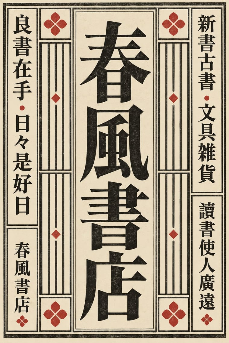
The page and letter of the East Asian book. Song block cutters copied the regular script of Tang masters; from the mid-16th century Ming cutters straightened it into a knife-made letter of thin horizontals, thick verticals and triangular stroke ends. Equal square characters run in right-to-left vertical columns in a ruled frame folded at a central column. As metal type in Shanghai and Nagasaki it became Mincho, Myeongjo and the standard CJK text face. Frame, rules and fold column belong to the woodblock page; type keeps the letter, the square and, in Japan and Taiwan, the vertical column.
Shippori Mincho; Song–Ming Woodblock Book Typography used Song block-cut regular script after Ouyang Xun, Yan Zhenqing and Liu Gongquan and Ming-style Songti / Mingti, the straightened 'craftsman's' letter, mature by the Wanli era
03
The colours
The ground and leading colours come from Tibetan Woodblock Print Culture, with a counter-accent from Song–Ming Woodblock Book Typography. The ink reads on the ground at 4.5:1 or more.
Song–Ming Woodblock Book Typography (Songti / Mincho) Tibetan Woodblock Print Culture (Pecha & Prayer Flags)
-
#efe6cfground · 36% -
#1c1a17ink · 14% -
#e3b02eaccent · 18% -
#b5342baccent · 14% -
#d6c49caccent · 10% -
#2f5aa8accent · 8%
As CSS
:root {
  --ground: #efe6cf;
  --ink: #1c1a17;
  --accent-1: #e3b02e;
  --accent-2: #b5342b;
  --accent-3: #d6c49c;
  --accent-4: #2f5aa8;
  --font-display: "Yatra One", cursive;
  --font-text: "Shippori Mincho", serif;
}
Use it with care
Song–Ming Woodblock Book Typography (Songti / Mincho): Have any Chinese, Japanese or Korean text set and proofread by a fluent reader: Song, Mincho and Myeongjo fonts draw some characters differently for each locale, and pseudo-characters, mirrored glyphs or random hanzi used as texture read as nonsense or worse. Pages of Buddhist sutras and other scripture carry devotional text; do not crop them into decoration.
Tibetan Woodblock Print Culture (Pecha & Prayer Flags): Pecha, icon prints and prayer flags are sacred objects in living Tibetan Buddhist and Bön practice. The Kangyur is the Buddha's word (hence its cinnabar ink), icon prints guide the painting of deities, and flags carry mantras, the four dignities and prayers for a named sponsor. By tradition flags are not put on the ground or worn as clothing, and old ones are burned rather than thrown away. Do not use real or imitation pages, mantras or flags as texture, party bunting, fashion prints or logos, do not crop or mirror them, and have any Tibetan written or checked by a fluent reader. Image models cannot write Uchen and invent letters, so leave text areas blank in generated images and never present one as a real text or flag. Derge still prints by hand from its historic blocks, while Narthang's main halls were razed in 1966: credit and commission Tibetan calligraphers, carvers and printers, in Tibet and in exile, rather than tracing their blocks.
04
The two styles
05
More combinations
With Song–Ming Woodblock Book Typography
- Dazibao (Big-Character Posters) Contrasts · The big-character poster is the hand-brushed, crowded, personal opposite of the quiet official printed page; set one against the other to weigh public urgency against canonical calm.
- Urdu Katib Lithography Contrasts · Urdu turned down type to keep the calligrapher's hand while Song–Ming printing depersonalised the brush for the block cutter; choose deliberately between a written page and a cut one.
- Out-of-Square Hangul Typography Contrasts · Ahn Sang-soo's typeface broke exactly the equal square that Myeongjo keeps; run Myeongjo body text under out-of-square headings to stage tradition against experiment.
- Chaekgeori & Minhwa Screen Painting Pairs well · Chaekgeori screens paint stacks of the scholar's books; pair a painted bookcase grid with real ruled, framed Myeongjo text pages for a Korean scholarly identity.
- Japanese Postwar Modernism Pairs well · The postwar school set Mincho beside gothic and Latin sans; use a vertical Mincho column beside a flat colour field to give a modern grid a literary voice.
- Renaissance Book Typography Pairs well · Its Western counterpart: both fix one justified text block in a proportioned page with deep margins, so set a Ming face and a Garalde side by side in a bilingual book and let each keep its own grid.
- Ten Bamboo Studio Colour Woodblock (Douban & Gonghua) Pairs well · The same Nanjing book trade cut both: put a ruled Song-style text page opposite a graded colour leaf, as an album or a book with plates.
- Republican Chinese Book Cover Design (Lu Xun & Tao Yuanqing) Contrasts · The ruled woodblock page and Songti type that the new covers left behind; set a Song-type text block against a drawn, off-centre cover title to show old book and new.
All 18 combinations with Song–Ming Woodblock Book Typography
With Tibetan Woodblock Print Culture
- Nianhua & Chinese Folk Print Contrasts · Both are popular devotional woodblock prints pasted or hung for good fortune. Nianhua floods the paper with saturated figure scenes, whereas the Tibetan print keeps to one ink and lets the dyed cloth or the lines of script carry the effect.
- Mongol Bichig Calligraphy & Ugalz Ornament Pairs well · Mongolian Buddhism printed Tibetan books (the Urga Kangyur, 1908–1910) and keeps the wind horse as khiimori; Mongolian vertical calligraphy and Tibetan horizontal lines can share a bilingual Buddhist page or emblem, with fluent readers of both.
- Thai Yantra (Yant) Diagrams Pairs well · Both are consecrated Buddhist signs printed in one ink on paper and cloth and hung up for protection and fortune. The yantra's grid of cells and the flag's field of mantras round a central figure share a logic, so they suit a calm, devotional layout of text-as-pattern, made only with practitioners.
- Gothic Blackletter & Fraktur Tradition Contrasts · Textura and Uchen both turn scripture into an even horizontal weave of letters. Set beside the tall Gothic page, the pecha's long oblong leaf of a few headed lines shows how much the page format, not only the letterform, decides the texture.
- Nirnaya Sagar Devanagari Typography (Bombay Metal Type) Contrasts · Set against the carved, oblong pecha page, it shows what cast metal type did to an Indic script: repeatable sorts, sizes and tiers of commentary instead of one carved block per page.
- Burmese Parabaik Painting (Konbaung Folding Books) Contrasts · Tibetan pecha are loose horizontal leaves printed from carved blocks in many copies; the parabaik is a single hand-painted book that unfolds into one strip.