Style combination · Contrasts
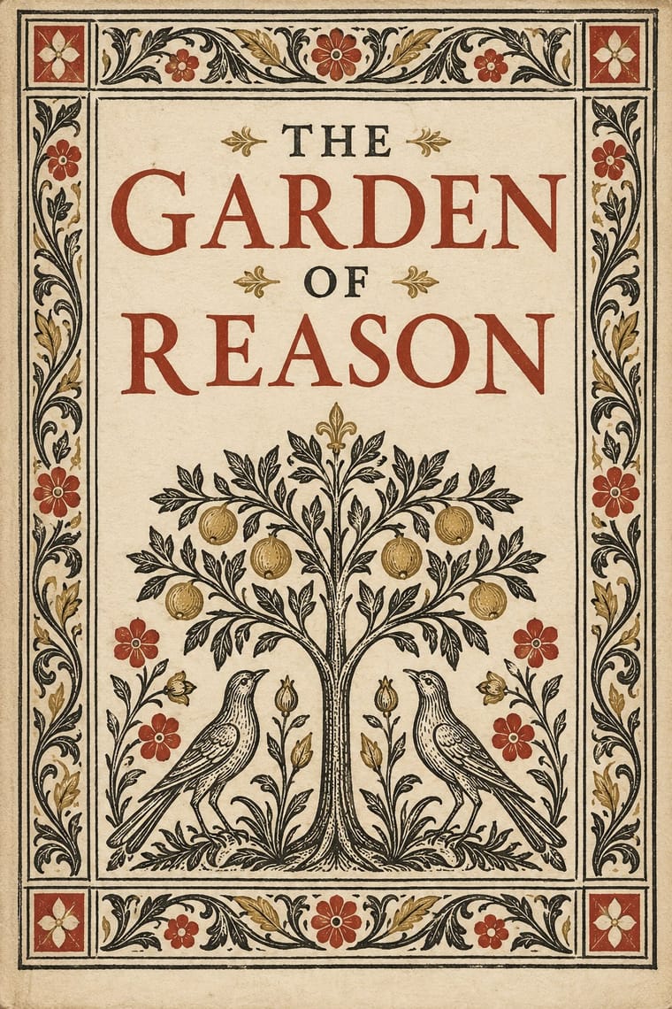
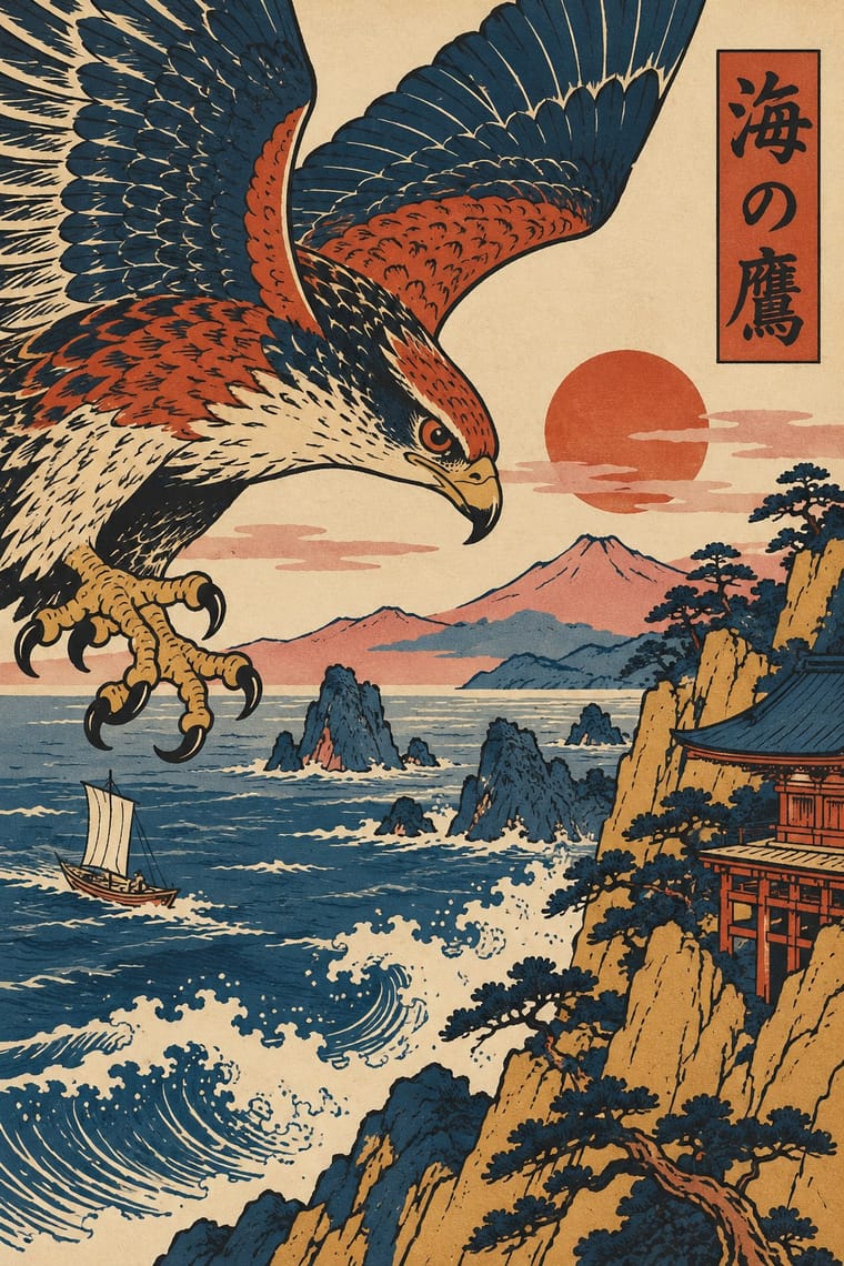
Renaissance Book Typography × Ukiyo-e Woodblock Prints
Set an off-centre, edge-cropped print against a symmetric classical text block to stage East-West contrast deliberately.
Mix them and make something Renaissance Book Typography Ukiyo-e Woodblock Prints
01
What each style brings
Each part of the design comes from the style with the stronger say in it, and each style gives at least two.
Renaissance Book Typography Ukiyo-e Woodblock Prints
- Type from Renaissance Book Typography
- Colour from Ukiyo-e Woodblock Prints
-
Renaissance Book Typography avoids full polychrome: this is where the two pull against each other, which is the point of the contrast.
- Form from Ukiyo-e Woodblock Prints
- Composition from Renaissance Book Typography
-
Ukiyo-e Woodblock Prints avoids central symmetry: this is where the two pull against each other, which is the point of the contrast.
- Surface from Renaissance Book Typography
02
The type
Open fonts standing in for each style’s own type, which is often hand-drawn or commercial.
Display · Renaissance Book Typography
Tide
EB Garamond; Renaissance Book Typography used Jenson's roman and Griffo's roman
Text · Ukiyo-e Woodblock Prints
Mass-produced Edo-period woodblock prints of actors, courtesans, legends and landscapes, designed by an artist, cut and printed by specialist craftsmen and sold cheaply by commercial publishers. Flat colour blocks inside a carved keyline, bold cropping, high or oblique viewpoints and diagonal compositions, with titles in small cartouches, later handed Europe a new model for the poster.
Shippori Mincho; Ukiyo-e Woodblock Prints used Brush-written kana and kanji titles and Kantei-ryū kabuki lettering
03
The colours
The ground and leading colours come from Ukiyo-e Woodblock Prints, with a counter-accent from Renaissance Book Typography. The ink reads on the ground at 4.5:1 or more.
Renaissance Book Typography Ukiyo-e Woodblock Prints
-
#efe5cfground · 36% -
#1d1b18ink · 14% -
#c64a2daccent · 18% -
#d4a64aaccent · 14% -
#d98c8caccent · 10% -
#1e3b5caccent · 8%
As CSS
:root {
  --ground: #efe5cf;
  --ink: #1d1b18;
  --accent-1: #c64a2d;
  --accent-2: #d4a64a;
  --accent-3: #d98c8c;
  --accent-4: #1e3b5c;
  --font-display: "EB Garamond", serif;
  --font-text: "Shippori Mincho", serif;
}
04
The two styles
05
More combinations
With Renaissance Book Typography
- Minimalist Graphic Design Pairs well · Keep classical page proportions and a humanist serif but strip the ornament to give minimal layouts warmth and authority.
- Arts & Crafts Movement Pairs well · Morris's Kelmscott Press revived Jenson's roman; pair a Renaissance text block with dense Arts & Crafts borders for a private-press feel.
- Gothic Blackletter & Fraktur Tradition Contrasts · The humanist roman was drawn against the gothic textura it replaced in Italy: open, round and light where blackletter is dense, broken and dark.
- Islamic Geometric & Calligraphic Tradition Pairs well · Use arabesque or moresque fleurons, as Venetian and Lyon printers did, to frame a classical text block.
- International Typographic Style Contrasts · Centred, justified and serifed versus asymmetric, ragged and sans: the clearest foil for deciding which order a page should follow.
- Ethiopian Ge'ez Manuscript & Haräg Illumination Pairs well · Ge'ez manuscripts share the logic of black text with red rubrics; borrow the principle of red for names and headings, not the sacred imagery.
- Gothic Book of Hours (Illuminated Devotional Book) Contrasts · Compare a hand-painted devotional opening with a printed humanist text page: the former gives pictures and illuminated margins a larger organising role, while the latter centres roman type and measured margins.
- Emblem Book (Motto, Picture & Epigram) Contrasts · Its parent shares the humanist roman and italic, the paper and the woodcut, but lets text carry the page with ornament at its edges; the emblem book puts a framed picture at the centre of every page and makes it part of the argument.
With Ukiyo-e Woodblock Prints
- Japonisme Pairs well · Its direct European heir: combine ukiyo-e cropping and flat colour with Western display lettering for a Japonisme poster.
- Belle Époque Lithographic Poster Pairs well · Use the flat silhouette and keyline of ukiyo-e inside a lithographic poster, as Toulouse-Lautrec did, to read at a distance.
- Japanese Postwar Modernism Pairs well · Reduce ukiyo-e motifs to flat emblems on a strict grid to get the postwar Japanese blend of tradition and modernism.
- Kamon (Japanese Family Crests) Pairs well · Kabuki actors had their own mon, and actor prints show them on the costume, as on the sleeve of Ichikawa Yaozō III in a print of 1796; pair a flat crest with ukiyo-e figures to identify characters without captions.
- Serizawa Katazome and Mingei Stencil-Dye Graphics Contrasts · Ukiyo-e is carved line, urban pleasure and diagonal drama; Serizawa is a stencil edge, rural work and calm panel grids.
- Taishō Roman & Lyrical Illustration Pairs well · Yumeji's beauties continue the bijin-ga print; pair a woodblock-printed pattern ground with a lyrical modern figure.
- Kinngait (Cape Dorset) Inuit Printmaking Contrasts · Houston studied with the sōsaku-hanga printmaker Un'ichi Hiratsuka in 1958–59, and Kinngait shares ukiyo-e's hand-rubbed relief, Japanese paper, margin seals and a split between designer, cutter and printer (which sōsaku hanga itself rejected); but ukiyo-e fills a cropped scene inside a carved keyline with cartouche text, while Kinngait usually floats a few silhouettes on open paper, so use ukiyo-e for a full scene and Kinngait for a lone presence.
- Cel-Shaded Game Graphics (Toon-Shaded Real-Time 3D) Pairs well · Borrow woodblock outline, flat colour and paper tone to push the bands towards the painted register of Okami.