Style combination · Pairs well
Taishō Roman × Ukiyo-e Woodblock Prints
Yumeji's beauties continue the bijin-ga print; pair a woodblock-printed pattern ground with a lyrical modern figure.
Mix them and make something Taishō Roman Ukiyo-e Woodblock Prints
01
What each style brings
Each part of the design comes from the style with the stronger say in it, and each style gives at least two.
Taishō Roman & Lyrical Illustration Ukiyo-e Woodblock Prints
- Type from Taishō Roman
- Colour from Taishō Roman
- Form from Taishō Roman
- Composition from Ukiyo-e Woodblock Prints
- Surface from Ukiyo-e Woodblock Prints
02
The type
Open fonts standing in for each style’s own type, which is often hand-drawn or commercial.
Text · Ukiyo-e Woodblock Prints
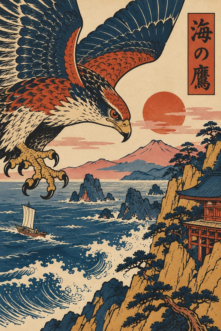
Mass-produced Edo-period woodblock prints of actors, courtesans, legends and landscapes, designed by an artist, cut and printed by specialist craftsmen and sold cheaply by commercial publishers. Flat colour blocks inside a carved keyline, bold cropping, high or oblique viewpoints and diagonal compositions, with titles in small cartouches, later handed Europe a new model for the poster.
Shippori Mincho; Ukiyo-e Woodblock Prints used Brush-written kana and kanji titles and Kantei-ryū kabuki lettering
03
The colours
The ground and leading colours come from Taishō Roman, with a counter-accent from Ukiyo-e Woodblock Prints. The ink reads on the ground at 4.5:1 or more.
Taishō Roman & Lyrical Illustration Ukiyo-e Woodblock Prints
-
#f1e8d5ground · 36% -
#3b4a6bink · 14% -
#b8333aaccent · 18% -
#c9a548accent · 14% -
#d98b8faccent · 10% -
#9bb39aaccent · 8%
As CSS
:root {
  --ground: #f1e8d5;
  --ink: #3b4a6b;
  --accent-1: #b8333a;
  --accent-2: #c9a548;
  --accent-3: #d98b8f;
  --accent-4: #9bb39a;
  --font-display: "Federant", sans-serif;
  --font-text: "Shippori Mincho", serif;
}
04
The two styles
05
More combinations
With Taishō Roman
- Japanese Postwar Modernism Contrasts · Postwar modernism replaced this sentimental figure with emblems and empty fields; set one against the other to calibrate warmth against austerity.
- Kawaii Design Pairs well · Nakahara Jun'ichi's large-eyed girls link the two; give kawaii characters Taishō's muted palette and wistful mood for an older, nostalgic audience.
- Art Nouveau Pairs well · Its source of line: keep Art Nouveau's contour but drop the ornamental excess, leaving one figure and a few flowers for an intimate Taishō register.
- Shōjo Manga (Japanese Girls' Comics) Pairs well · Its root: Takahashi Macoto took Nakahara Jun'ichi's large, doll-like eyes with highlights and long lashes and added dots, stars and colour to the iris. Borrow jojōga's single wistful figure, muted cream paper and hand lettering for a cover or title page with a period mood.
- Mavo Contrasts · The same Taishō Tokyo in two moods: pastel lyrical illustration of modern girls against Mavo's black linocuts, newsprint and price tags.
- Story Manga (Postwar Japanese Comics) Pairs well · Jojōga's large, highlighted, long-lashed eyes passed from Nakahara Jun'ichi to Takahashi Macoto, who added stars and dots to the iris, and so into shōjo manga; add Taishō lyrical faces, kimono patterns and soft lines to a manga page for a period romance.
- Republican Chinese Book Cover Design (Lu Xun & Tao Yuanqing) Pairs well · Feng Zikai found Takehisa Yumeji's lyrical drawings in Tokyo; Yumeji's soft line suits the quiet, literary register of these covers.
- Angura Theatre Poster Pairs well · Angura recycled Meiji and Taishō imagery as found material; cut a Taishō beauty into an angura collage for ironic retro nostalgia.
With Ukiyo-e Woodblock Prints
- Japonisme Pairs well · Its direct European heir: combine ukiyo-e cropping and flat colour with Western display lettering for a Japonisme poster.
- Belle Époque Lithographic Poster Pairs well · Use the flat silhouette and keyline of ukiyo-e inside a lithographic poster, as Toulouse-Lautrec did, to read at a distance.
- Japanese Postwar Modernism Pairs well · Reduce ukiyo-e motifs to flat emblems on a strict grid to get the postwar Japanese blend of tradition and modernism.
- Renaissance Book Typography Contrasts · Set an off-centre, edge-cropped print against a symmetric classical text block to stage East-West contrast deliberately.
- Kamon (Japanese Family Crests) Pairs well · Kabuki actors had their own mon, and actor prints show them on the costume, as on the sleeve of Ichikawa Yaozō III in a print of 1796; pair a flat crest with ukiyo-e figures to identify characters without captions.
- Serizawa Katazome and Mingei Stencil-Dye Graphics Contrasts · Ukiyo-e is carved line, urban pleasure and diagonal drama; Serizawa is a stencil edge, rural work and calm panel grids.
- Kinngait (Cape Dorset) Inuit Printmaking Contrasts · Houston studied with the sōsaku-hanga printmaker Un'ichi Hiratsuka in 1958–59, and Kinngait shares ukiyo-e's hand-rubbed relief, Japanese paper, margin seals and a split between designer, cutter and printer (which sōsaku hanga itself rejected); but ukiyo-e fills a cropped scene inside a carved keyline with cartouche text, while Kinngait usually floats a few silhouettes on open paper, so use ukiyo-e for a full scene and Kinngait for a lone presence.
- Cel-Shaded Game Graphics (Toon-Shaded Real-Time 3D) Pairs well · Borrow woodblock outline, flat colour and paper tone to push the bands towards the painted register of Okami.