Style combination · Pairs well
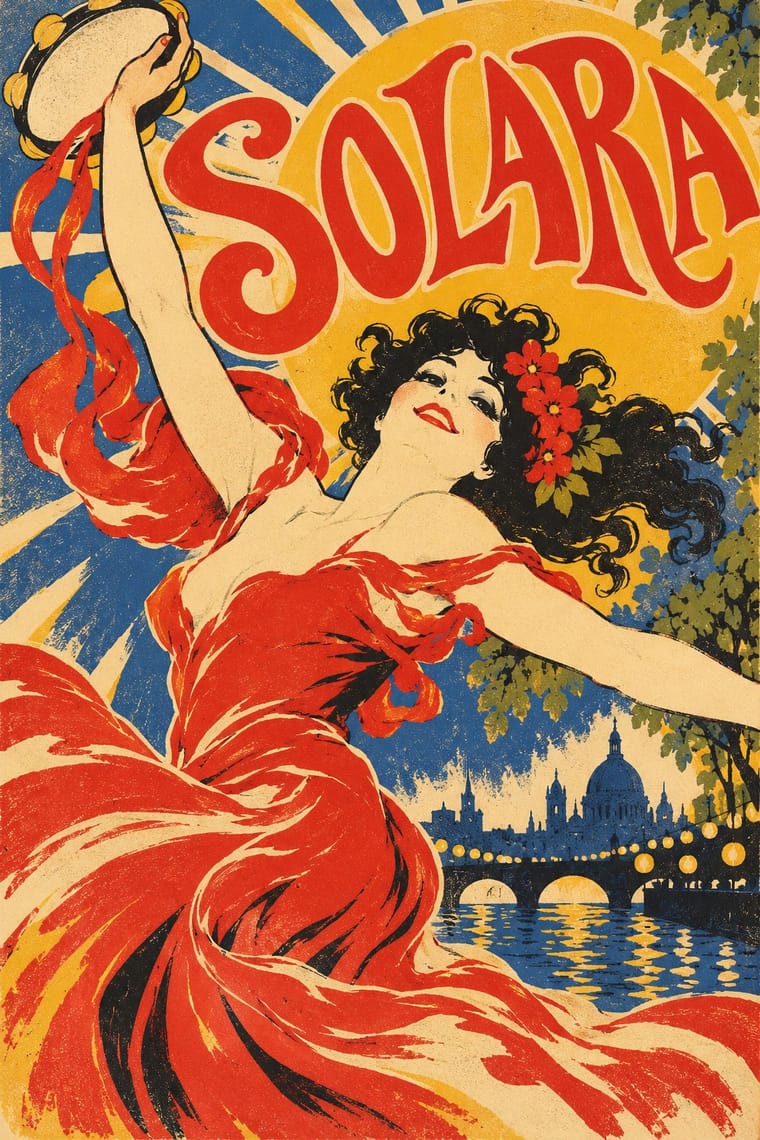
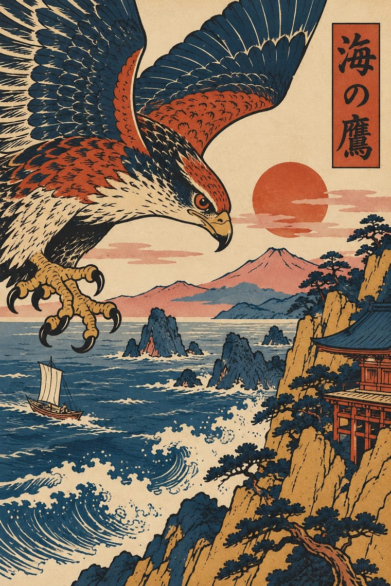
Belle Époque Lithographic Poster × Ukiyo-e Woodblock Prints
Use the flat silhouette and keyline of ukiyo-e inside a lithographic poster, as Toulouse-Lautrec did, to read at a distance.
Mix them and make something Belle Époque Lithographic Poster Ukiyo-e Woodblock Prints
01
What each style brings
Each part of the design comes from the style with the stronger say in it, and each style gives at least two.
Belle Époque Lithographic Poster Ukiyo-e Woodblock Prints
- Type from Belle Époque Lithographic Poster
- Colour from Belle Époque Lithographic Poster
- Form from Belle Époque Lithographic Poster
- Composition from Ukiyo-e Woodblock Prints
- Surface from Ukiyo-e Woodblock Prints
02
The type
Open fonts standing in for each style’s own type, which is often hand-drawn or commercial.
Display · Belle Époque Lithographic Poster
Rose
Ultra, standing in for Fat-face and Clarendon poster capitals inherited from letterpress bills
Text · Ukiyo-e Woodblock Prints
Mass-produced Edo-period woodblock prints of actors, courtesans, legends and landscapes, designed by an artist, cut and printed by specialist craftsmen and sold cheaply by commercial publishers. Flat colour blocks inside a carved keyline, bold cropping, high or oblique viewpoints and diagonal compositions, with titles in small cartouches, later handed Europe a new model for the poster.
Shippori Mincho; Ukiyo-e Woodblock Prints used Brush-written kana and kanji titles and Kantei-ryū kabuki lettering
03
The colours
The ground and leading colours come from Belle Époque Lithographic Poster, with a counter-accent from Ukiyo-e Woodblock Prints. The ink reads on the ground at 4.5:1 or more.
Belle Époque Lithographic Poster Ukiyo-e Woodblock Prints
-
#1b1a1aground · 36% -
#f3e7c9ink · 14% -
#f0b62baccent · 18% -
#c64a2daccent · 14% -
#2b4f8caccent · 10% -
#7d8a3aaccent · 8%
As CSS
:root {
  --ground: #1b1a1a;
  --ink: #f3e7c9;
  --accent-1: #f0b62b;
  --accent-2: #c64a2d;
  --accent-3: #2b4f8c;
  --accent-4: #7d8a3a;
  --font-display: "Ultra", serif;
  --font-text: "Shippori Mincho", serif;
}
04
The two styles
05
More combinations
With Belle Époque Lithographic Poster
- Isotype Pictorial Statistics Contrasts · Neurath's neutral pictograms are the opposite of this seductive, personal figure; use the contrast to separate information from persuasion.
- Die Neue Typographie Contrasts · Swap the hand-drawn lettering and painted figure for set sans-serif and photography to see exactly what the modernists rejected.
- Hand-Painted Signage & Vernacular Lettering Pairs well · Both letter by hand at street scale; combine sign-painter lettering with one bold figure for a lively event or shopfront poster.
- Push Pin Style Pairs well · Push Pin revived this exuberance; pair a Chéret-style dancing figure with bouncy display lettering for nostalgic entertainment graphics.
- Beggarstaffs Poster (Nicholson & Pryde) Contrasts · Lithographic tone and drawn line against flat cut shapes.
- Italian Liberty Poster (Ricordi and the Stile Liberty Affiche) Pairs well · Take the French poster's single-figure punch but add Ricordi's framed, theatrical symmetry and floral borders.
- Cuban Tobacco Lithography (Habilitaciones & Marquillas) Contrasts · Both are colour lithography of the same decades, but the Paris poster puts one figure on a wall at a distance, while the cigar label packs medals, arms and views into a matched set read in the hand; borrow the poster's single figure when a label grows too crowded.
- Egyptian Painted Film Poster Pairs well · Both are colour-lithographed street posters; borrow the Belle Époque's flat colour and single animated figure to calm a crowded star montage.
With Ukiyo-e Woodblock Prints
- Japonisme Pairs well · Its direct European heir: combine ukiyo-e cropping and flat colour with Western display lettering for a Japonisme poster.
- Japanese Postwar Modernism Pairs well · Reduce ukiyo-e motifs to flat emblems on a strict grid to get the postwar Japanese blend of tradition and modernism.
- Renaissance Book Typography Contrasts · Set an off-centre, edge-cropped print against a symmetric classical text block to stage East-West contrast deliberately.
- Kamon (Japanese Family Crests) Pairs well · Kabuki actors had their own mon, and actor prints show them on the costume, as on the sleeve of Ichikawa Yaozō III in a print of 1796; pair a flat crest with ukiyo-e figures to identify characters without captions.
- Serizawa Katazome and Mingei Stencil-Dye Graphics Contrasts · Ukiyo-e is carved line, urban pleasure and diagonal drama; Serizawa is a stencil edge, rural work and calm panel grids.
- Taishō Roman & Lyrical Illustration Pairs well · Yumeji's beauties continue the bijin-ga print; pair a woodblock-printed pattern ground with a lyrical modern figure.
- Kinngait (Cape Dorset) Inuit Printmaking Contrasts · Houston studied with the sōsaku-hanga printmaker Un'ichi Hiratsuka in 1958–59, and Kinngait shares ukiyo-e's hand-rubbed relief, Japanese paper, margin seals and a split between designer, cutter and printer (which sōsaku hanga itself rejected); but ukiyo-e fills a cropped scene inside a carved keyline with cartouche text, while Kinngait usually floats a few silhouettes on open paper, so use ukiyo-e for a full scene and Kinngait for a lone presence.
- Cel-Shaded Game Graphics (Toon-Shaded Real-Time 3D) Pairs well · Borrow woodblock outline, flat colour and paper tone to push the bands towards the painted register of Okami.