Style combination · Pairs well
Psychedelic Poster × Push Pin Style
Both revive Art Nouveau lettering; add Push Pin's clean contour and wit to tame psychedelic excess into readable posters.
Mix them and make something Psychedelic Poster Push Pin Style
01
What each style brings
Each part of the design comes from the style with the stronger say in it, and each style gives at least two.
Psychedelic Poster Push Pin Style
- Type from Push Pin Style
- Colour from Psychedelic Poster
- Form from Psychedelic Poster
- Composition from Psychedelic Poster
- Surface from Push Pin Style
02
The type
Open fonts standing in for each style’s own type, which is often hand-drawn or commercial.
Text · Psychedelic Poster
The concert-poster language of the 1960s counterculture, born in San Francisco's Fillmore and Avalon ballrooms and echoed in London's underground press. Hand-drawn letters melt and swell to fill whole shapes, Art Nouveau and Vienna Secession curves are revived at hallucinatory intensity, and vibrating complementary or fluorescent colours make reading a slow, immersive act.
Special Elite; Psychedelic Poster used Hand-drawn melting lettering after Alfred Roller and Victorian wood-type and Tuscan display faces
03
The colours
The ground and leading colours come from Psychedelic Poster, with a counter-accent from Push Pin Style. The ink reads on the ground at 4.5:1 or more.
Psychedelic Poster Push Pin Style
-
#ffd200ground · 36% -
#2e3192ink · 14% -
#ff6a13accent · 18% -
#f2b632accent · 14% -
#e4007caccent · 10% -
#e0512faccent · 8%
As CSS
:root {
  --ground: #ffd200;
  --ink: #2e3192;
  --accent-1: #ff6a13;
  --accent-2: #f2b632;
  --accent-3: #e4007c;
  --accent-4: #e0512f;
  --font-display: "Righteous", sans-serif;
  --font-text: "Special Elite", monospace;
}
04
The two styles
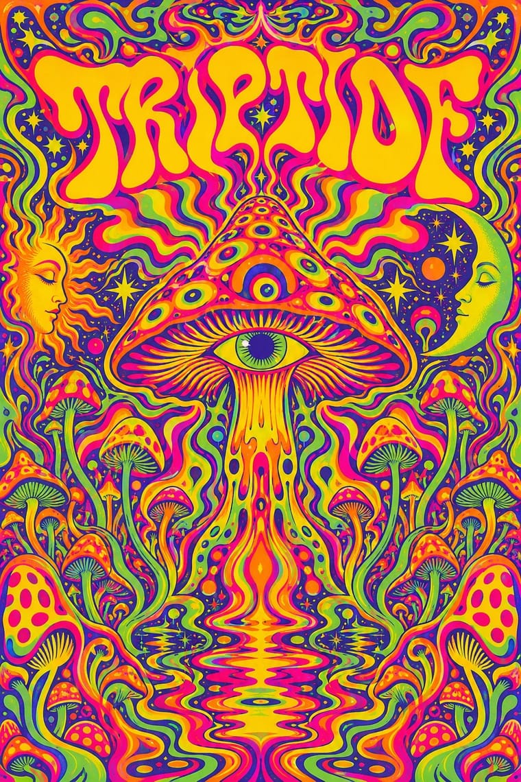
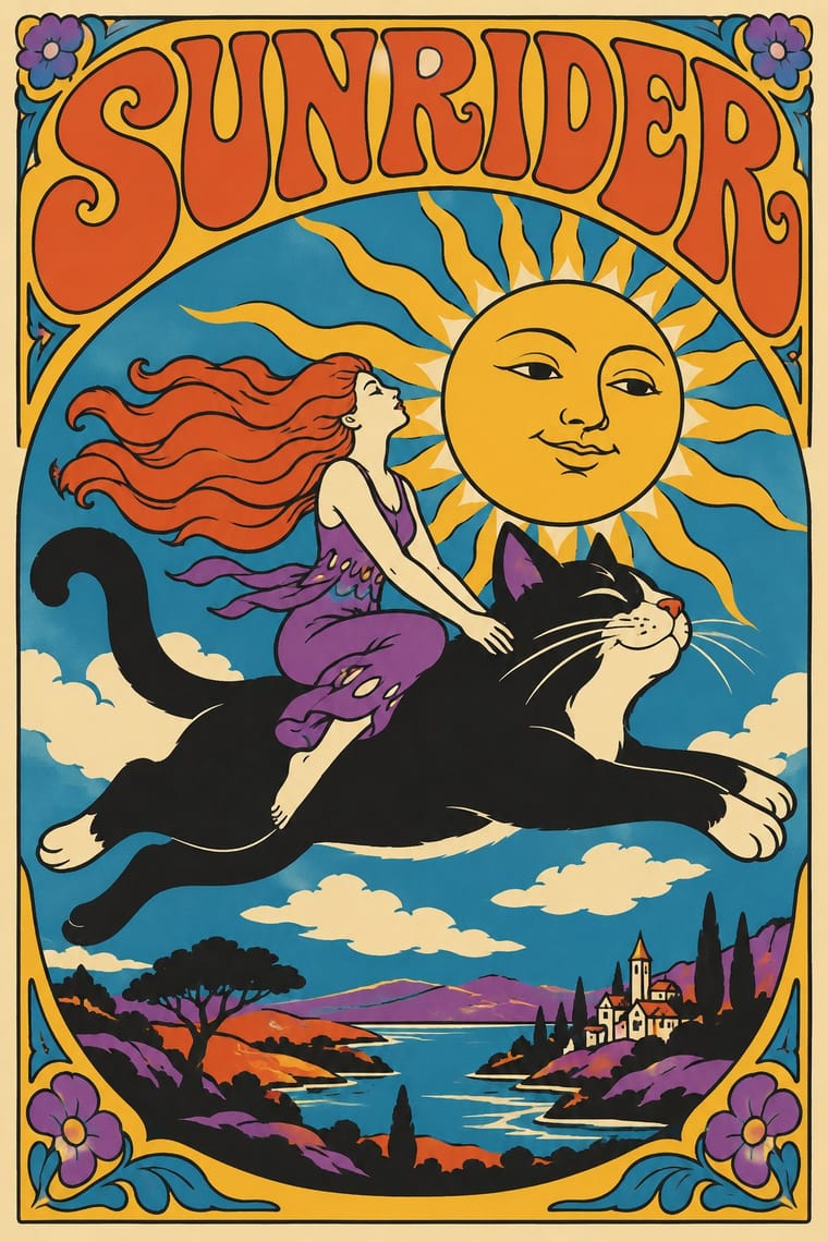
05
More combinations
With Psychedelic Poster
- Rave & Acid House Graphics Pairs well · Carry the vibrating fluorescent palette into rave-style chrome and airbrush to signal the 1960s-to-1990s lineage on purpose.
- Angura Theatre Poster Pairs well · Tokyo's angura theatre posters met psychedelia halfway; swap Art Nouveau curls for collaged Japanese ephemera and ukiyo-e waves while keeping the fluorescent silkscreen inks.
- Minimalist Graphic Design Contrasts · Set a single dense psychedelic panel in a field of white space for maximum shock and a clear focal point.
- Art Nouveau Pairs well · Borrow Art Nouveau's framing borders and flowing hair, then push the colour to fluorescent clash for an instant 1967 look.
- International Typographic Style Contrasts · Its exact opposite on legibility; one melting, shape-filling word can loosen an otherwise rigid Swiss layout.
- Hand-Painted Bollywood Poster Pairs well · 1970s Hindi film titles already flirted with psychedelic lettering; fuse the two for swirling, glowing title logos.
- Screenprinted Gig & Alt-Movie Poster Pairs well · The 1960s Fillmore and Avalon posters are its ancestor; borrow one swelling, shape-filling title from them, but keep the band, date and venue line readable.
- Underground Comix Pairs well · Take the cover from the ballroom poster, with its clashing flat inks and melting letters, and keep the hatched black-and-white panels inside, as Zap did with Moscoso and Griffin.
With Push Pin Style
- International Typographic Style Contrasts · Push Pin defined itself against Helvetica neutrality; pit a bespoke illustrated letterform against a Swiss grid to dramatise personality versus system.
- Corporate Memphis Contrasts · Generic, faceless corporate figures are the opposite of Push Pin's authored characters; use Push Pin to restore a distinct illustrative voice.
- Belle Époque Lithographic Poster Pairs well · Borrow Chéret's dancing figures alongside Push Pin's revived display faces for exuberant entertainment graphics.
- Phototype Expressive Typography (Lubalin & U&lc) Pairs well · Push Pin revives old styles through drawn figures and Lubalin through the letters themselves; pair a Push Pin illustration with a swash, tightly kerned Lubalin headline for full 1970s New York warmth.
- UPA & Cartoon Modern Contrasts · Its New York contemporary shared UPA's comic, distorted figures and irony but went the opposite way on ornament: Push Pin piled on revived Victorian and Art Nouveau lettering, borders and ornament, while UPA stripped the picture to a figure, a line and a flat field.
- Angura Theatre Poster Pairs well · Yokoo started from Push Pin's illustrated eclecticism; pair Push Pin's period-pastiche lettering with angura's crowded Japanese ephemera.
- Ligne Claire (Franco-Belgian Clear Line) Contrasts · Push Pin also draws in outline and flat colour, but mixes revived Victorian and Art Nouveau display faces, ornament and distortion; switch to ligne claire for one disciplined line, no ornament and evenly legible scenes.
- Blue Note Jazz Sleeve Modernism Contrasts · Same city and years, opposite method: Push Pin draws figures and revives Victorian display letters, while Blue Note crops a photograph and sets one grotesque huge.