Style combination · Pairs well
Hand-Painted Bollywood Poster × Psychedelic Poster
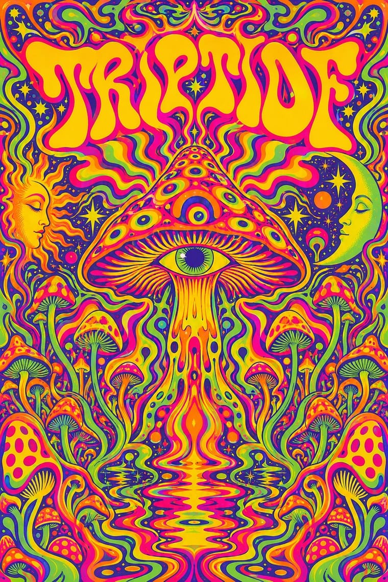
1970s Hindi film titles already flirted with psychedelic lettering; fuse the two for swirling, glowing title logos.
Mix them and make something Hand-Painted Bollywood Poster Psychedelic Poster
01
What each style brings
Each part of the design comes from the style with the stronger say in it, and each style gives at least two.
Hand-Painted Bollywood Poster Psychedelic Poster
- Type from Psychedelic Poster
- Colour from Hand-Painted Bollywood Poster
- Form from Psychedelic Poster
- Composition from Hand-Painted Bollywood Poster
- Surface from Hand-Painted Bollywood Poster
02
The type
Open fonts standing in for each style’s own type, which is often hand-drawn or commercial.
Text · Hand-Painted Bollywood Poster
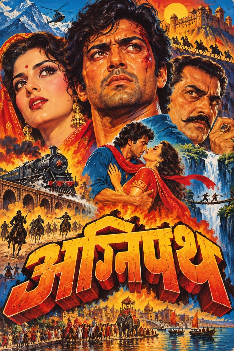
The painted publicity of Bombay's Hindi film industry, at its height from the 1940s to the 1980s. Studio artists painted portrait-led montages that were printed by lithography and offset as posters, booklets and press ads, while hoarding painters enlarged them by hand onto giant cinema billboards. Floating star heads, melodramatic colour and bold hand-drawn title logos were its signature until digital photo printing displaced it in the 1990s.
Archivo; Hand-Painted Bollywood Poster used Hand-drawn 3D title logos and Extruded and drop-shadowed display capitals
03
The colours
The ground and leading colours come from Hand-Painted Bollywood Poster, with a counter-accent from Psychedelic Poster. The ink reads on the ground at 4.5:1 or more.
Hand-Painted Bollywood Poster Psychedelic Poster
-
#1a1418ground · 36% -
#ffd23fink · 14% -
#f28c1caccent · 18% -
#b3121baccent · 14% -
#e4007caccent · 10% -
#1b6fa8accent · 8%
As CSS
:root {
  --ground: #1a1418;
  --ink: #ffd23f;
  --accent-1: #f28c1c;
  --accent-2: #b3121b;
  --accent-3: #e4007c;
  --accent-4: #1b6fa8;
  --font-display: "Federant", sans-serif;
  --font-text: "Archivo", sans-serif;
}
04
The two styles
05
More combinations
With Hand-Painted Bollywood Poster
- Ghanaian Movie Poster Pairs well · Set Ghana's lurid invention beside Bollywood's glossy star heads for a film-festival or film-club identity built on painted publicity.
- Socialist Realist Propaganda Poster Pairs well · Borrow its heroic low-angle faces and saturated reds to give portrait montages even more monumentality.
- International Typographic Style Contrasts · Photographic objectivity and white space throw painted melodrama into relief; place a single painted head inside a strict grid.
- Egyptian Painted Film Poster Pairs well · Cairo's painted film posters share the floating star heads and hand-drawn titles; borrow their calligraphic title logotypes, which act out the story, for a stronger film wordmark.
- Nollywood Video Jacket & Film Poster Pairs well · Both float star heads in a melodramatic montage; borrow Bombay's hand-drawn 3D title logo to give the photographic collage a stronger centre.
- Matatu & Nganya Art Contrasts · The atlas's nearest genome: both are built on painted, glossy star portraits at a huge scale, but the Bollywood poster is a printed and hoarding-painted montage that sells one film, while the nganya is one commissioned vehicle that mixes global pop, sport and politics with hip-hop slang, lights and sound.
- Indian Institutional Modernism (NID) Contrasts · Set a hand-painted film poster's melodrama beside a reductive public-sector mark to contrast popular and institutional India.
- Indian Pop-Kitsch Design (Desi Kitsch) Pairs well · Old film posters and dialogues are a staple of the style; borrow the painted star heads and drawn title logos of the hand-painted posters for a film-club or café identity, then flatten them into kitsch's vector colour for the merchandise.
With Psychedelic Poster
- Rave & Acid House Graphics Pairs well · Carry the vibrating fluorescent palette into rave-style chrome and airbrush to signal the 1960s-to-1990s lineage on purpose.
- Angura Theatre Poster Pairs well · Tokyo's angura theatre posters met psychedelia halfway; swap Art Nouveau curls for collaged Japanese ephemera and ukiyo-e waves while keeping the fluorescent silkscreen inks.
- Minimalist Graphic Design Contrasts · Set a single dense psychedelic panel in a field of white space for maximum shock and a clear focal point.
- Art Nouveau Pairs well · Borrow Art Nouveau's framing borders and flowing hair, then push the colour to fluorescent clash for an instant 1967 look.
- International Typographic Style Contrasts · Its exact opposite on legibility; one melting, shape-filling word can loosen an otherwise rigid Swiss layout.
- Screenprinted Gig & Alt-Movie Poster Pairs well · The 1960s Fillmore and Avalon posters are its ancestor; borrow one swelling, shape-filling title from them, but keep the band, date and venue line readable.
- Underground Comix Pairs well · Take the cover from the ballroom poster, with its clashing flat inks and melting letters, and keep the hatched black-and-white panels inside, as Zap did with Moscoso and Griffin.
- Hipgnosis Photographic Concept Sleeve Contrasts · Same Pink Floyd scene, opposite answer: Hipgnosis's 1969 Royal Festival Hall poster is still a psychedelic dreamscape collage, but by Atom Heart Mother the band wanted 'something plain' and got a cow. Swap melting hand-lettering and vibrating colour for one calm photograph and almost no type.