Style combination · Pairs well
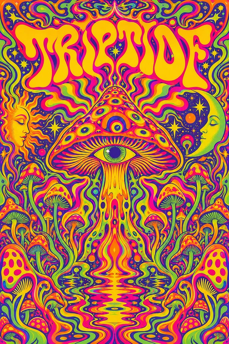
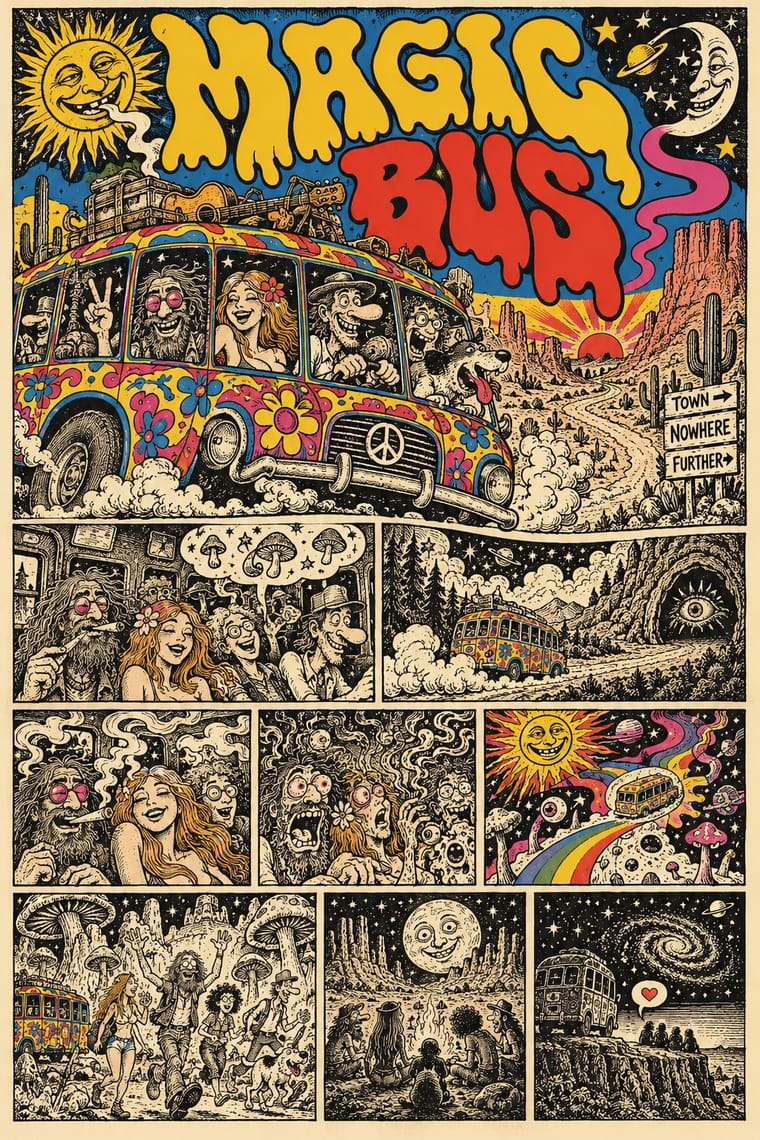
Psychedelic Poster × Underground Comix
Take the cover from the ballroom poster, with its clashing flat inks and melting letters, and keep the hatched black-and-white panels inside, as Zap did with Moscoso and Griffin.
Mix them and make something Psychedelic Poster Underground Comix
01
What each style brings
Each part of the design comes from the style with the stronger say in it, and each style gives at least two.
Psychedelic Poster Underground Comix
- Type from Underground Comix
- Colour from Psychedelic Poster
- Form from Psychedelic Poster
- Composition from Psychedelic Poster
- Surface from Underground Comix
-
02
The type
Open fonts standing in for each style’s own type, which is often hand-drawn or commercial.
Display · Underground Comix
Loud
Bangers, standing in for Pen-drawn balloon capitals (each cartoonist's own hand on the page, in the same pen as the drawing)
Text · Psychedelic Poster
The concert-poster language of the 1960s counterculture, born in San Francisco's Fillmore and Avalon ballrooms and echoed in London's underground press. Hand-drawn letters melt and swell to fill whole shapes, Art Nouveau and Vienna Secession curves are revived at hallucinatory intensity, and vibrating complementary or fluorescent colours make reading a slow, immersive act.
Special Elite; Psychedelic Poster used Hand-drawn melting lettering after Alfred Roller and Victorian wood-type and Tuscan display faces
03
The colours
The ground and leading colours come from Psychedelic Poster, with a counter-accent from Underground Comix. The ink reads on the ground at 4.5:1 or more.
Psychedelic Poster Underground Comix
-
#ffd200ground · 36% -
#2e3192ink · 14% -
#ff6a13accent · 18% -
#d4302aaccent · 14% -
#e4007caccent · 10% -
#c9307aaccent · 8%
As CSS
:root {
  --ground: #ffd200;
  --ink: #2e3192;
  --accent-1: #ff6a13;
  --accent-2: #d4302a;
  --accent-3: #e4007c;
  --accent-4: #c9307a;
  --font-display: "Bangers", sans-serif;
  --font-text: "Special Elite", monospace;
}
Use it with care
Underground Comix: Much of the canon trades in racial caricature, such as a Black woman drawn as an 'African native' caricature, and in graphic sexual violence against women and casual misogyny, which the women's comics of 1970 and 1972 answered in their own books: borrow the hatched line, the crowded panel and the candour, not the stereotypes, and give every character the same anatomy and drawing care. The characters and mastheads (Mr. Natural, Fritz the Cat, the Freak Brothers, the Checkered Demon, the Zap logo) still belong to their makers and estates: draw your own, never ask an image model for a named cartoonist's hand, living or dead, and never present a generated page as a vintage comic.
04
The two styles
05
More combinations
With Psychedelic Poster
- Rave & Acid House Graphics Pairs well · Carry the vibrating fluorescent palette into rave-style chrome and airbrush to signal the 1960s-to-1990s lineage on purpose.
- Angura Theatre Poster Pairs well · Tokyo's angura theatre posters met psychedelia halfway; swap Art Nouveau curls for collaged Japanese ephemera and ukiyo-e waves while keeping the fluorescent silkscreen inks.
- Minimalist Graphic Design Contrasts · Set a single dense psychedelic panel in a field of white space for maximum shock and a clear focal point.
- Art Nouveau Pairs well · Borrow Art Nouveau's framing borders and flowing hair, then push the colour to fluorescent clash for an instant 1967 look.
- International Typographic Style Contrasts · Its exact opposite on legibility; one melting, shape-filling word can loosen an otherwise rigid Swiss layout.
- Hand-Painted Bollywood Poster Pairs well · 1970s Hindi film titles already flirted with psychedelic lettering; fuse the two for swirling, glowing title logos.
- Screenprinted Gig & Alt-Movie Poster Pairs well · The 1960s Fillmore and Avalon posters are its ancestor; borrow one swelling, shape-filling title from them, but keep the band, date and venue line readable.
- Hipgnosis Photographic Concept Sleeve Contrasts · Same Pink Floyd scene, opposite answer: Hipgnosis's 1969 Royal Festival Hall poster is still a psychedelic dreamscape collage, but by Atom Heart Mother the band wanted 'something plain' and got a cow. Swap melting hand-lettering and vibrating colour for one calm photograph and almost no type.
With Underground Comix
- Filipino Komiks Contrasts · Both put black-and-white hatched interiors behind colour covers, but komiks drew naturalistic folk heroes and romances for the country's most widely read periodicals, while comix push big-footed caricature into adult taboo for a head-shop audience.
- Escuela Bruguera (Spanish Humour Comics) Contrasts · Both draw rubbery big-footed caricatures, but Bruguera's are coloured, family-friendly gags; the undergrounds use the same cartoon body for adult taboo.
- Turkish Weekly Humour Magazines (Gırgır to Uykusuz) Contrasts · Both learned from Mad and crowd hand-lettered caricature into the panel, but the Istanbul weeklies are mass-circulation collective magazines whose cover lampoons the week's politics, while comix are self-published books whose shock is sex, drugs and taboo.
- L'Association and French Alternative Comics Pairs well · A later French-language small-press scene, one of whose founders turned to psychedelic and autobiographical comics after discovering Crumb and Shelton, keeps the black ink and the single author's hand but clears the crowding and the shock; borrow its book design to give a comix page a calmer format.
- Métal hurlant Science-Fiction Comics (Mœbius, Druillet & Les Humanoïdes Associés) Contrasts · Adult comics of the 1970s in two opposite registers: painted, luminous science-fiction vistas against cheap, crowded black-and-white satire.
- American Four-Colour Comic Book (Golden to Bronze Age) Contrasts · Same format, everything else reversed: set a four-colour, Code-approved house-style page beside a hatched black-and-white page by a single author to show what the undergrounds rejected.
- Punk & DIY Zine Pairs well · Both are cheap, self-published print made outside the mainstream; add cut-and-paste collage and Xerox grit to a hand-drawn comix page for the later punk-zine voice.
- See Red Women's Workshop Feminist Screenprints Pairs well · Borrow the comic strip and speech balloon, but cleaned up into a few flat inks and turned against the sexism much of the comix canon traded in.