Style combination · Pairs well
Belle Époque Lithographic Poster × Push Pin Style
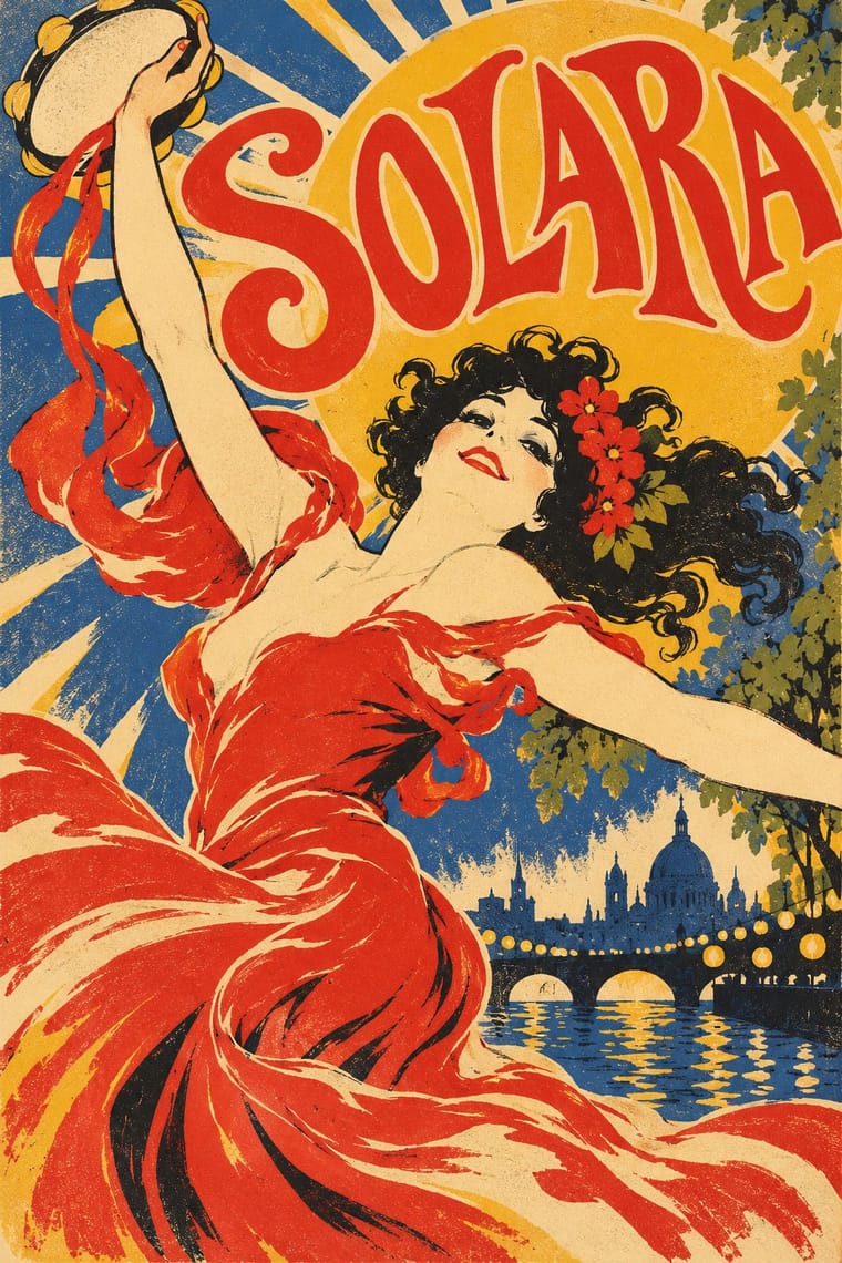
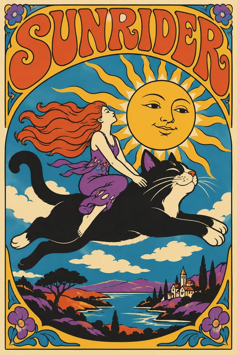
Push Pin revived this exuberance; pair a Chéret-style dancing figure with bouncy display lettering for nostalgic entertainment graphics.
Borrow Chéret's dancing figures alongside Push Pin's revived display faces for exuberant entertainment graphics.
Mix them and make something Belle Époque Lithographic Poster Push Pin Style
01
What each style brings
Each part of the design comes from the style with the stronger say in it, and each style gives at least two.
Belle Époque Lithographic Poster Push Pin Style
- Type from Push Pin Style
- Colour from Belle Époque Lithographic Poster
- Form from Push Pin Style
- Composition from Belle Époque Lithographic Poster
- Surface from Belle Époque Lithographic Poster
02
The type
Open fonts standing in for each style’s own type, which is often hand-drawn or commercial.
Text · Belle Époque Lithographic Poster
The large colour lithographic street poster that turned Paris into an open-air gallery, from Jules Chéret's first posters of 1866 to Leonetto Cappiello before the First World War. One dominant, animated figure, flat or vaporous colour printed from a few stones, and lettering drawn by the artist directly on the stone sell cabarets, spectacles, drinks and bicycles at a glance.
Bodoni Moda; Belle Époque Lithographic Poster used Artist's lettering drawn directly on the lithographic stone and Chéret's bouncing, irregular display capitals
03
The colours
The ground and leading colours come from Belle Époque Lithographic Poster, with a counter-accent from Push Pin Style. The ink reads on the ground at 4.5:1 or more.
Belle Époque Lithographic Poster Push Pin Style
-
#1b1a1aground · 36% -
#f3e7c9ink · 14% -
#f0b62baccent · 18% -
#d7322aaccent · 14% -
#2b4f8caccent · 10% -
#7d8a3aaccent · 8%
As CSS
:root {
  --ground: #1b1a1a;
  --ink: #f3e7c9;
  --accent-1: #f0b62b;
  --accent-2: #d7322a;
  --accent-3: #2b4f8c;
  --accent-4: #7d8a3a;
  --font-display: "Righteous", sans-serif;
  --font-text: "Bodoni Moda", serif;
}
04
The two styles
05
More combinations
With Belle Époque Lithographic Poster
- Isotype Pictorial Statistics Contrasts · Neurath's neutral pictograms are the opposite of this seductive, personal figure; use the contrast to separate information from persuasion.
- Die Neue Typographie Contrasts · Swap the hand-drawn lettering and painted figure for set sans-serif and photography to see exactly what the modernists rejected.
- Hand-Painted Signage & Vernacular Lettering Pairs well · Both letter by hand at street scale; combine sign-painter lettering with one bold figure for a lively event or shopfront poster.
- Beggarstaffs Poster (Nicholson & Pryde) Contrasts · Lithographic tone and drawn line against flat cut shapes.
- Ukiyo-e Woodblock Prints Pairs well · Use the flat silhouette and keyline of ukiyo-e inside a lithographic poster, as Toulouse-Lautrec did, to read at a distance.
- Italian Liberty Poster (Ricordi and the Stile Liberty Affiche) Pairs well · Take the French poster's single-figure punch but add Ricordi's framed, theatrical symmetry and floral borders.
- Cuban Tobacco Lithography (Habilitaciones & Marquillas) Contrasts · Both are colour lithography of the same decades, but the Paris poster puts one figure on a wall at a distance, while the cigar label packs medals, arms and views into a matched set read in the hand; borrow the poster's single figure when a label grows too crowded.
- Egyptian Painted Film Poster Pairs well · Both are colour-lithographed street posters; borrow the Belle Époque's flat colour and single animated figure to calm a crowded star montage.
With Push Pin Style
- Psychedelic Poster Pairs well · Both revive Art Nouveau lettering; add Push Pin's clean contour and wit to tame psychedelic excess into readable posters.
- International Typographic Style Contrasts · Push Pin defined itself against Helvetica neutrality; pit a bespoke illustrated letterform against a Swiss grid to dramatise personality versus system.
- Corporate Memphis Contrasts · Generic, faceless corporate figures are the opposite of Push Pin's authored characters; use Push Pin to restore a distinct illustrative voice.
- Phototype Expressive Typography (Lubalin & U&lc) Pairs well · Push Pin revives old styles through drawn figures and Lubalin through the letters themselves; pair a Push Pin illustration with a swash, tightly kerned Lubalin headline for full 1970s New York warmth.
- UPA & Cartoon Modern Contrasts · Its New York contemporary shared UPA's comic, distorted figures and irony but went the opposite way on ornament: Push Pin piled on revived Victorian and Art Nouveau lettering, borders and ornament, while UPA stripped the picture to a figure, a line and a flat field.
- Angura Theatre Poster Pairs well · Yokoo started from Push Pin's illustrated eclecticism; pair Push Pin's period-pastiche lettering with angura's crowded Japanese ephemera.
- Ligne Claire (Franco-Belgian Clear Line) Contrasts · Push Pin also draws in outline and flat colour, but mixes revived Victorian and Art Nouveau display faces, ornament and distortion; switch to ligne claire for one disciplined line, no ornament and evenly legible scenes.
- Blue Note Jazz Sleeve Modernism Contrasts · Same city and years, opposite method: Push Pin draws figures and revives Victorian display letters, while Blue Note crops a photograph and sets one grotesque huge.