Style combination · Contrasts
Newtro × Showa and Heisei Retro Revival
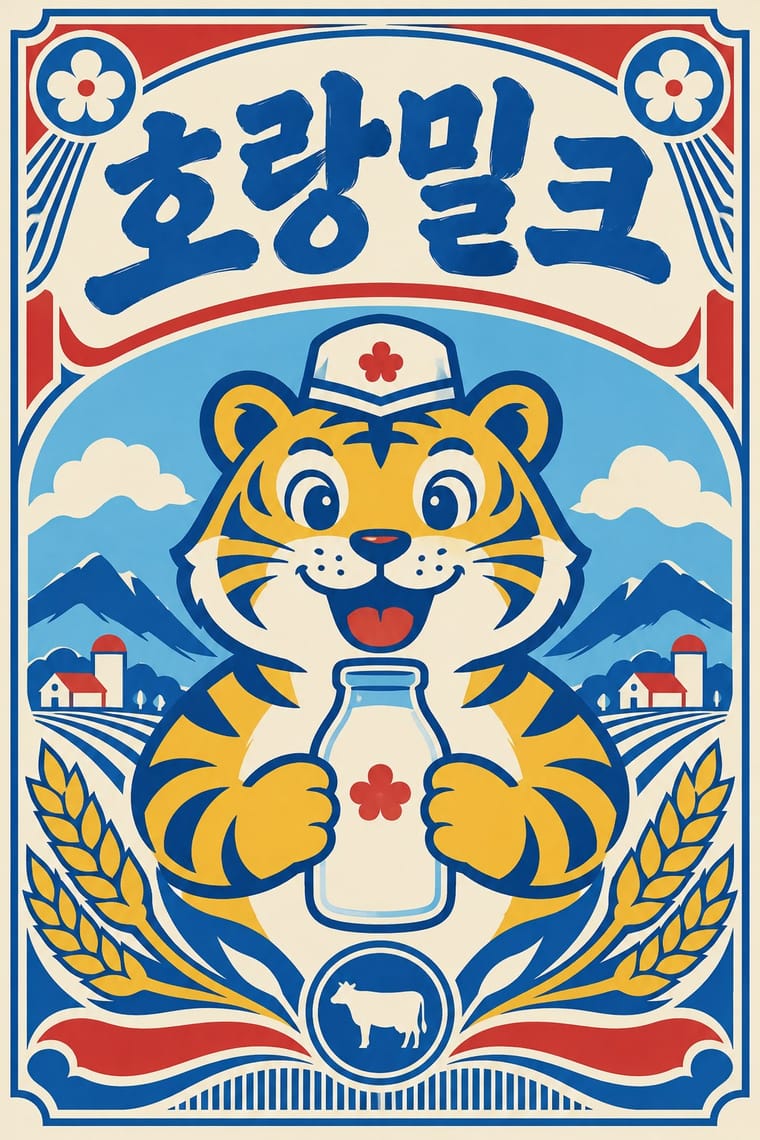
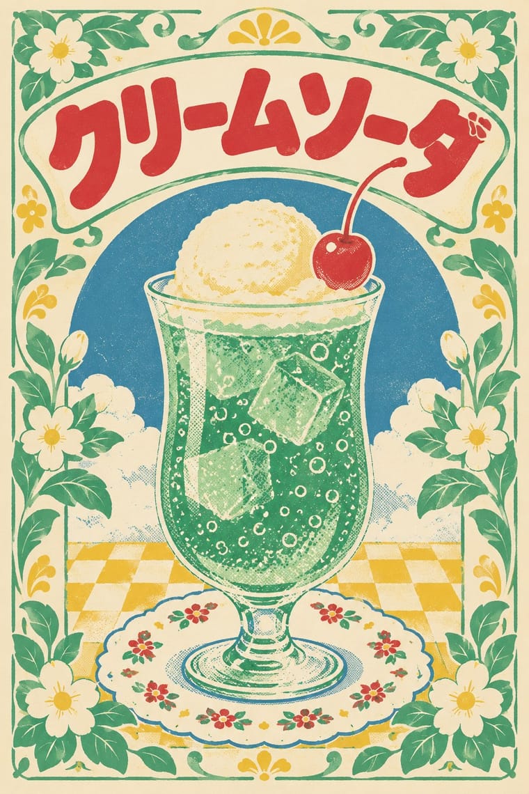
Both revive old everyday graphics, but newtro is Korean heritage-brand reissue with badge-led logic, while this is Japanese katakana-led kissaten and dagashi graphics in pastel spot colour.
Mix them and make something Newtro Showa and Heisei Retro Revival
01
What each style brings
Each part of the design comes from the style with the stronger say in it, and each style gives at least two.
Newtro (Korean New-Retro) Showa and Heisei Retro Revival (Japanese Packaging and Kissaten Graphics)
- Type from Showa and Heisei Retro Revival
- Colour from Newtro
- Form from Newtro
- Composition from Newtro
- Surface from Showa and Heisei Retro Revival
02
The type
Open fonts standing in for each style’s own type, which is often hand-drawn or commercial.
Display · Showa and Heisei Retro Revival
Souvenir
Zen Maru Gothic, standing in for Maru gothic (rounded gothic) display
Text · Showa and Heisei Retro Revival
A contemporary Japanese revival of mid-to-late twentieth-century everyday graphics: kissaten cafe menus and tableware, dagashi sweet packaging, reissued products and calendars. It reuses hand-lettered katakana, rounded display type, floral patterns and flat spot-colour figures, worn with faded ink, halftone and misregistration, to evoke warm, remembered ordinary life. Unlike newtro (Korean heritage-brand reissues), it is led by Japanese katakana lettering, kissaten props and a pale pastel spot-colour palette.
Zen Maru Gothic; Showa and Heisei Retro Revival used Hand-lettered katakana and menu lettering and Maru gothic (rounded gothic) display
03
The colours
The ground and leading colours come from Newtro, with a counter-accent from Showa and Heisei Retro Revival. The ink reads on the ground at 4.5:1 or more.
Newtro (Korean New-Retro) Showa and Heisei Retro Revival (Japanese Packaging and Kissaten Graphics)
-
#f4ecd8ground · 36% -
#1c1c1cink · 14% -
#f0b929accent · 18% -
#d7322baccent · 14% -
#1f58a8accent · 10% -
#7cc3e3accent · 8%
As CSS
:root {
  --ground: #f4ecd8;
  --ink: #1c1c1c;
  --accent-1: #f0b929;
  --accent-2: #d7322b;
  --accent-3: #1f58a8;
  --accent-4: #7cc3e3;
  --font-display: "Zen Maru Gothic", sans-serif;
  --font-text: "Zen Maru Gothic", sans-serif;
}
Use it with care
Newtro (Korean New-Retro): Newtro revives a firm's own archive: for any other client draw on that client's history, not Jinro's toad or Gompyo's bear, which their owners guard. In 2023 the first cans of 7Bräu's Daepyo Wheat Beer, which kept Gompyo's colour scheme and a bear, drew Daehan Flour Mills' warning that copying the brand's design could be unfair competition, and 7Bräu promised a redesign with a tiger. Keep Hangul and Hanja correct and legible, and do not swap in Japanese Shōwa-retro or colonial-era 'Gyeongseong' imagery: a 2018 JoongAng Ilbo column called restaurants that mix Japanese food with Gyeongseong nostalgia 'tasteless', since those who lived through the occupation remember it as 'shameful and painful'.
04
The two styles
05
More combinations
With Newtro
- Out-of-Square Hangul Typography Contrasts · Set the modernist, geometric de-squared Hangul of Ahn Sang-soo against newtro's revived brush and cursive label lettering to show two ideas of fashionable Hangul.
- Hipster Artisanal Revival Contrasts · Both dress a product in the past, but hipster badges invent a Victorian heritage for a new firm while newtro reissues a real firm's own recent archive.
- Synthwave / Outrun Contrasts · Synthwave imagines an eighties that never shipped, in neon gradients; newtro reprints packaging that actually sat on Korean shelves, in flat spot colours.
- Guochao (China-Chic National Trend) Contrasts · China's contemporary heritage trend draws on imperial and folk motifs in red and gold; newtro draws on late-twentieth-century consumer packaging and its mascots.
- Hand-Painted Signage & Vernacular Lettering Pairs well · Newtro's lettering is borrowed from Korean signboards; pair a revived label with real sign-painted shopfronts, as Euljiro's cafés keep their old hardware-store signs.
- Kawaii Design Pairs well · Revived trademarks become cute merchandise and emoticons; push the toad or bear toward kawaii roundness for spin-offs while keeping the label's period lettering.
- Taiwan Floral Cloth (Huabu) Pairs well · Both turn a postwar household look into nostalgia for young buyers; pair a reissued retro label or mascot with a floral-cloth band for packaging that recalls a grandmother's home.
- Korean Commercial Calligraphy (Kaelligeurapi) Contrasts · Both meet on Korean soju shelves: newtro redraws a firm's old label lettering and mascot in flat spot colours, while commercial calligraphy writes a new brushed name in black on a pale label.
With Showa and Heisei Retro Revival
- Japanese Postwar Modernism Contrasts · Its restrained emblem-and-grid discipline opposes the cluttered, warm vernacular of retro packaging.
- City Pop Illustration Pairs well · Shares 1980s nostalgia; pair its painted, airy scenes with retro tableware graphics for a fuller period feel.
- Kawaii Design Pairs well · Its rounded mascots and pastel softness supply the friendly figure at the centre of a retro wrapper.