Style combination · Contrasts
Korean Commercial Calligraphy × Newtro
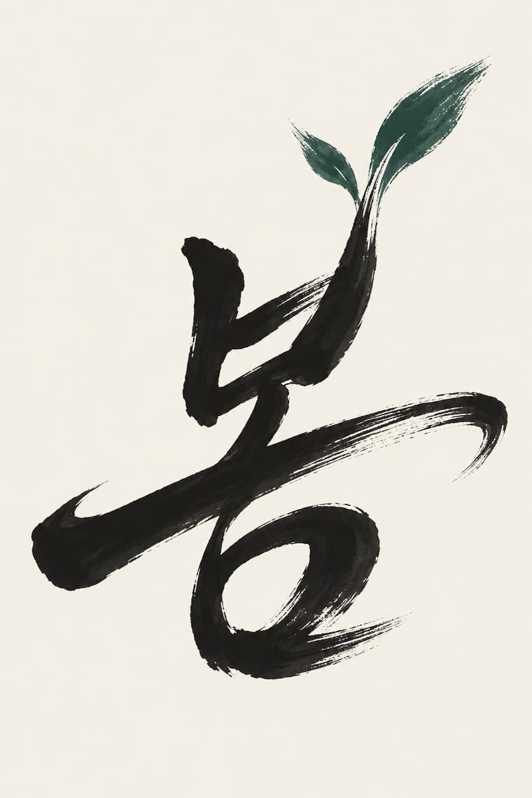
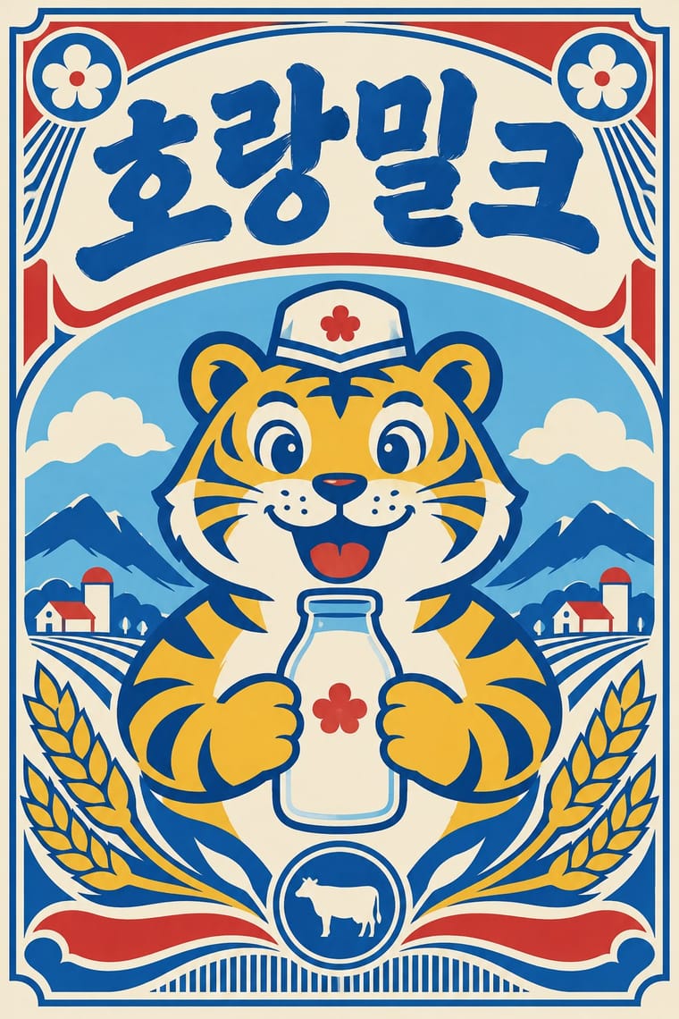
Both meet on Korean soju shelves: newtro redraws a firm's old label lettering and mascot in flat spot colours, while commercial calligraphy writes a new brushed name in black on a pale label.
Mix them and make something Korean Commercial Calligraphy Newtro
01
What each style brings
Each part of the design comes from the style with the stronger say in it, and each style gives at least two.
Korean Commercial Calligraphy (Kaelligeurapi) Newtro (Korean New-Retro)
- Type from Korean Commercial Calligraphy
- Colour from Newtro
- Form from Newtro
- Composition from Korean Commercial Calligraphy
- Surface from Korean Commercial Calligraphy
02
The type
Open fonts standing in for each style’s own type, which is often hand-drawn or commercial.
Display · Korean Commercial Calligraphy
Together
Kaushan Script; Korean Commercial Calligraphy used Gungche (궁체), the palace style of Hangul seoye in regular, semi-cursive and cursive forms, a trained hand some commercial calligraphers start from, though Kang names Chusa's Hanja writing as his model and many brush-pen hobbyists have no seoye training and Panbonche (판본체), modelled on the woodblock Hangul of the Hunminjeongeum, and minche (민체), the less regular folk style
Text · Newtro
A South Korean branding trend, named 'Going New-tro' in Seoul National University's Trend Korea 2019 (October 2018), in which heritage firms reissue their own postwar to 1990s labels, trademarks and mascots, polished for young buyers. Jinro's sky-blue bottle and toad label (2019) and Gompyo flour's white bear on beer cans (2020) set the look: centred labels and badges, two or three flat colours on pale grounds, brush, cursive or hand-drawn logotypes, often Hanja with Hangul beside them, and a cartoon mascot as hero. Its source is the recent consumer past, reinterpreted, not reproduced.
Zen Maru Gothic; Newtro used Revived label logotypes in Hanja with Hangul beside them, such as Jinro's Hanja name from its 1970s–80s labels and Daesun soju's cursive lettering from its 1965 launch and Thick brush and hand-drawn Hangul display lettering of postwar Korean packaging and shop signboards
03
The colours
The ground and leading colours come from Newtro, with a counter-accent from Korean Commercial Calligraphy. The ink reads on the ground at 4.5:1 or more.
Korean Commercial Calligraphy (Kaelligeurapi) Newtro (Korean New-Retro)
-
#f4ecd8ground · 36% -
#1c1c1cink · 14% -
#f0b929accent · 18% -
#b9312baccent · 14% -
#2f5d50accent · 10% -
#1f58a8accent · 8%
As CSS
:root {
  --ground: #f4ecd8;
  --ink: #1c1c1c;
  --accent-1: #f0b929;
  --accent-2: #b9312b;
  --accent-3: #2f5d50;
  --accent-4: #1f58a8;
  --font-display: "Kaushan Script", cursive;
  --font-text: "Zen Maru Gothic", sans-serif;
}
Use it with care
Korean Commercial Calligraphy (Kaelligeurapi): Kaelligeurapi is a living profession with named authors: commission or credit a calligrapher, never trace or imitate a published logotype such as Chamisul's or Hwayo's, which belong to their brands, and never present a generated hand as the work of Kang Byung-in, Kim Jong-gun or another named writer. Have every word written or checked by a fluent Hangul reader, since image models produce pseudo-Hangul with broken or misplaced jamo and Korean buyers spot a misspelt syllable at once. It grew from Korean seoye, a tradition distinct from Chinese shufa and Japanese shodō, so do not label it Chinese or Japanese or swap Hanja or kana in for Hangul, and do not stamp a red seal bearing a real person's name without their consent.
Newtro (Korean New-Retro): Newtro revives a firm's own archive: for any other client draw on that client's history, not Jinro's toad or Gompyo's bear, which their owners guard. In 2023 the first cans of 7Bräu's Daepyo Wheat Beer, which kept Gompyo's colour scheme and a bear, drew Daehan Flour Mills' warning that copying the brand's design could be unfair competition, and 7Bräu promised a redesign with a tiger. Keep Hangul and Hanja correct and legible, and do not swap in Japanese Shōwa-retro or colonial-era 'Gyeongseong' imagery: a 2018 JoongAng Ilbo column called restaurants that mix Japanese food with Gyeongseong nostalgia 'tasteless', since those who lived through the occupation remember it as 'shameful and painful'.
04
The two styles
05
More combinations
With Korean Commercial Calligraphy
- Out-of-Square Hangul Typography Contrasts · Both free Hangul from the equal square, but Ahn Sang-soo constructs monoline jamo as a reusable typeface while kaelligeurapi writes each word once with the brush; choose between a system and a signature.
- Ma & Wabi-sabi Aesthetics Pairs well · Give one brushed word a wide, quiet field of paper-toned space so its dry streaks and pooled ink read as the whole design.
- Chaekgeori & Minhwa Screen Painting Pairs well · Munjado paints a character full of pictures and commercial calligraphy bends a brushed word into a picture of its meaning; pair them for a Korean identity in which writing and image are the same mark.
- Edo-moji Commercial Lettering (Kanteiryū, Yose-moji, Sumō-ji) Contrasts · Edo-moji packs fat, gapless brush letters into crowded columns for a full house; Korean commercial calligraphy lets one airy, expressive word breathe, so decide between a crowd-pulling block and a personal gesture.
- Song–Ming Woodblock Book Typography (Songti / Mincho) Pairs well · Set a brushed Hangul title over a Myeongjo (Batang) text block, as on Korean book covers and film posters, so the hand-written word carries the feeling and the type carries the reading.
- Seoul Independent Graphic Design (Small-Studio Scene) Contrasts · Commercial calligraphy writes one warm brushed word for a soju label or a drama title; the small studios construct and systematise Hangul, even when they reinterpret old calligraphic scripts. Decide between a signature and a system.
- Modern Calligraphy and Brush Lettering Contrasts · Both make one hand-written word the whole design, but kaelligeurapi brushes Hangul in black with dry, pooled strokes that picture the word's meaning, while modern calligraphy writes a looping Latin script in soft colour for an occasion.
With Newtro
- Out-of-Square Hangul Typography Contrasts · Set the modernist, geometric de-squared Hangul of Ahn Sang-soo against newtro's revived brush and cursive label lettering to show two ideas of fashionable Hangul.
- Hipster Artisanal Revival Contrasts · Both dress a product in the past, but hipster badges invent a Victorian heritage for a new firm while newtro reissues a real firm's own recent archive.
- Synthwave / Outrun Contrasts · Synthwave imagines an eighties that never shipped, in neon gradients; newtro reprints packaging that actually sat on Korean shelves, in flat spot colours.
- Guochao (China-Chic National Trend) Contrasts · China's contemporary heritage trend draws on imperial and folk motifs in red and gold; newtro draws on late-twentieth-century consumer packaging and its mascots.
- Hand-Painted Signage & Vernacular Lettering Pairs well · Newtro's lettering is borrowed from Korean signboards; pair a revived label with real sign-painted shopfronts, as Euljiro's cafés keep their old hardware-store signs.
- Kawaii Design Pairs well · Revived trademarks become cute merchandise and emoticons; push the toad or bear toward kawaii roundness for spin-offs while keeping the label's period lettering.
- Showa and Heisei Retro Revival (Japanese Packaging and Kissaten Graphics) Contrasts · Both revive old everyday graphics, but newtro is Korean heritage-brand reissue with badge-led logic, while this is Japanese katakana-led kissaten and dagashi graphics in pastel spot colour.
- Taiwan Floral Cloth (Huabu) Pairs well · Both turn a postwar household look into nostalgia for young buyers; pair a reissued retro label or mascot with a floral-cloth band for packaging that recalls a grandmother's home.