Style combination · Contrasts
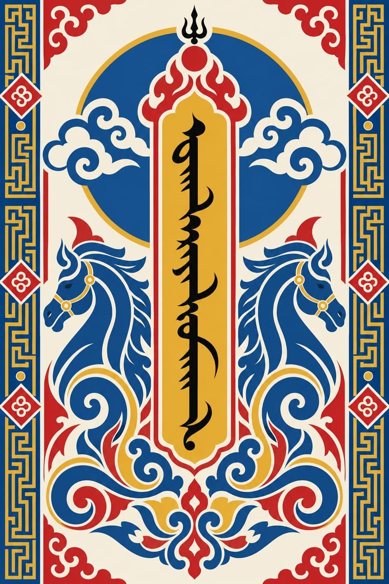
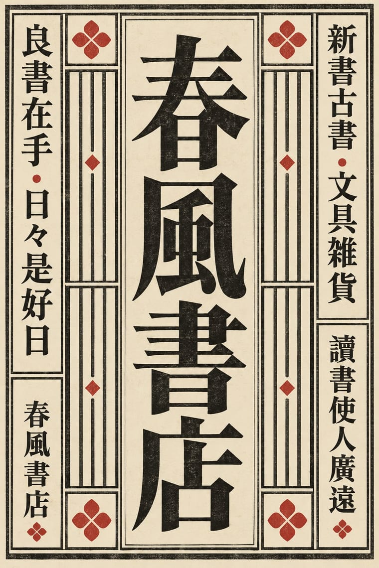
Mongol Bichig Calligraphy × Song–Ming Woodblock Book Typography
Both set text in vertical columns, but Song–Ming fills square cells in columns that advance from right to left, while bichig joins its letters down a spine and reads from left to right.
Mix them and make something Mongol Bichig Calligraphy Song–Ming Woodblock Book Typography
01
What each style brings
Each part of the design comes from the style with the stronger say in it, and each style gives at least two.
Mongol Bichig Calligraphy & Ugalz Ornament Song–Ming Woodblock Book Typography (Songti / Mincho)
- Type from Mongol Bichig Calligraphy
- Colour from Mongol Bichig Calligraphy
- Form from Mongol Bichig Calligraphy
- Composition from Song–Ming Woodblock Book Typography
- Surface from Song–Ming Woodblock Book Typography
02
The type
Open fonts standing in for each style’s own type, which is often hand-drawn or commercial.
Display · Mongol Bichig Calligraphy
Atlas
Kaushan Script; Mongol Bichig Calligraphy used Classical Mongolian (Uyghur-Mongolian) script, ninety letter forms joined vertically by continuous strokes, written with a reed pen until the 18th century and with the brush after it and 'Folded' condensed forms of the script, drawn to fill emblems, logos, coins and stamps, as in the 'Mongol Uls' of the State Seal
Text · Song–Ming Woodblock Book Typography
The page and letter of the East Asian book. Song block cutters copied the regular script of Tang masters; from the mid-16th century Ming cutters straightened it into a knife-made letter of thin horizontals, thick verticals and triangular stroke ends. Equal square characters run in right-to-left vertical columns in a ruled frame folded at a central column. As metal type in Shanghai and Nagasaki it became Mincho, Myeongjo and the standard CJK text face. Frame, rules and fold column belong to the woodblock page; type keeps the letter, the square and, in Japan and Taiwan, the vertical column.
Shippori Mincho; Song–Ming Woodblock Book Typography used Song block-cut regular script after Ouyang Xun, Yan Zhenqing and Liu Gongquan and Ming-style Songti / Mingti, the straightened 'craftsman's' letter, mature by the Wanli era
03
The colours
The ground and leading colours come from Mongol Bichig Calligraphy, with a counter-accent from Song–Ming Woodblock Book Typography. The ink reads on the ground at 4.5:1 or more.
Mongol Bichig Calligraphy & Ugalz Ornament Song–Ming Woodblock Book Typography (Songti / Mincho)
-
#f4efe3ground · 36% -
#16130fink · 14% -
#e0a526accent · 18% -
#b5342baccent · 14% -
#d6c49caccent · 10% -
#1d4f91accent · 8%
As CSS
:root {
  --ground: #f4efe3;
  --ink: #16130f;
  --accent-1: #e0a526;
  --accent-2: #b5342b;
  --accent-3: #d6c49c;
  --accent-4: #1d4f91;
  --font-display: "Kaushan Script", cursive;
  --font-text: "Shippori Mincho", serif;
}
Use it with care
Mongol Bichig Calligraphy & Ugalz Ornament: Mongol bichig is the living script of Mongols in Mongolia and in Inner Mongolia, where in 2020 China moved three school subjects in Mongolian-medium schools into Mandarin, met by protests and school boycotts; UNESCO lists Mongolian calligraphy as heritage in need of urgent safeguarding, and at inscription in 2013 only three scholars were training just over twenty young calligraphers. Have every word written or checked by a fluent reader or calligrapher: letters change shape by position, so pseudo-script, mirrored text, text rotated the wrong way and letters broken up as texture read as nonsense. The Soyombo is a state symbol on the flag and emblem, and Mongolia regulates the use of its state symbols by law (Constitution, Article 12(7)): the Law on State Symbols (1994) forbids disparaging them and imitating the State Seal. The endless knot, wishing jewel and lotus are Buddhist auspicious signs; keep them and the state symbols out of trivial or demeaning uses. The khas (swastika) is an old Mongolian sign of good fortune but reads as the Nazi swastika to many audiences, so avoid it outside a context that explains it, and commission or credit Mongolian calligraphers and craftspeople rather than tracing their work.
Song–Ming Woodblock Book Typography (Songti / Mincho): Have any Chinese, Japanese or Korean text set and proofread by a fluent reader: Song, Mincho and Myeongjo fonts draw some characters differently for each locale, and pseudo-characters, mirrored glyphs or random hanzi used as texture read as nonsense or worse. Pages of Buddhist sutras and other scripture carry devotional text; do not crop them into decoration.
04
The two styles
05
More combinations
With Mongol Bichig Calligraphy
- Early Turkish Republican Graphic Design Contrasts · Both make the state's alphabet part of its official graphics, by opposite moves: Turkish Republican posters hand-letter the new Latin alphabet at display size to promote it, while Mongolia sets its revived old script beside Cyrillic on seals, signboards and letterheads as a national mark.
- Contemporary Arabic & Dual-Script Type Design Pairs well · Its dual-script matchmaking methods fit the Cyrillic and bichig signboards and documents Mongolia's state bodies are moving to: match weight and colour across a horizontal and a vertical script.
- Kamon (Japanese Family Crests) Pairs well · Both reduce a name or a lineage to a symmetric emblem; set a folded bichig word inside a kamon-style monochrome roundel for a seal or mark.
- Tibetan Woodblock Print Culture (Pecha & Prayer Flags) Pairs well · Mongolian Buddhism printed Tibetan books (the Urga Kangyur, 1908–1910) and keeps the wind horse as khiimori; Mongolian vertical calligraphy and Tibetan horizontal lines can share a bilingual Buddhist page or emblem, with fluent readers of both.
- Baybayin Revival Graphics Contrasts · Both revive an old script as a national mark beside a dominant one, Cyrillic in Mongolia and Latin in the Philippines, but bichig runs in vertical columns framed by ugalz ornament, while baybayin stands as one bare horizontal character or word; choose between a framed ornamental seal and a single unadorned sign.
With Song–Ming Woodblock Book Typography
- Dazibao (Big-Character Posters) Contrasts · The big-character poster is the hand-brushed, crowded, personal opposite of the quiet official printed page; set one against the other to weigh public urgency against canonical calm.
- Urdu Katib Lithography Contrasts · Urdu turned down type to keep the calligrapher's hand while Song–Ming printing depersonalised the brush for the block cutter; choose deliberately between a written page and a cut one.
- Out-of-Square Hangul Typography Contrasts · Ahn Sang-soo's typeface broke exactly the equal square that Myeongjo keeps; run Myeongjo body text under out-of-square headings to stage tradition against experiment.
- Chaekgeori & Minhwa Screen Painting Pairs well · Chaekgeori screens paint stacks of the scholar's books; pair a painted bookcase grid with real ruled, framed Myeongjo text pages for a Korean scholarly identity.
- Japanese Postwar Modernism Pairs well · The postwar school set Mincho beside gothic and Latin sans; use a vertical Mincho column beside a flat colour field to give a modern grid a literary voice.
- Renaissance Book Typography Pairs well · Its Western counterpart: both fix one justified text block in a proportioned page with deep margins, so set a Ming face and a Garalde side by side in a bilingual book and let each keep its own grid.
- Ten Bamboo Studio Colour Woodblock (Douban & Gonghua) Pairs well · The same Nanjing book trade cut both: put a ruled Song-style text page opposite a graded colour leaf, as an album or a book with plates.
- Republican Chinese Book Cover Design (Lu Xun & Tao Yuanqing) Contrasts · The ruled woodblock page and Songti type that the new covers left behind; set a Song-type text block against a drawn, off-centre cover title to show old book and new.
All 18 combinations with Song–Ming Woodblock Book Typography