Style combination · Contrasts
Vicente Rojo × International Typographic Style
Rojo admired Swiss printing such as the Zurich magazine Du, but kept Prieto's axial book page, classical faces and printer's ornaments instead of a modular grid and one neo-grotesque; set them side by side to choose between literary warmth and institutional neutrality.
Mix them and make something Vicente Rojo International Typographic Style
01
What each style brings
Each part of the design comes from the style with the stronger say in it, and each style gives at least two.
Vicente Rojo & Mexican Editorial Modernism International Typographic Style
- Type from International Typographic Style
- Colour from International Typographic Style
- Form from Vicente Rojo
- Composition from International Typographic Style
- Surface from Vicente Rojo
02
The type
Open fonts standing in for each style’s own type, which is often hand-drawn or commercial.
Text · Vicente Rojo
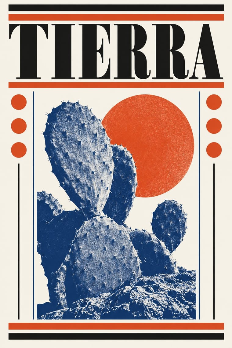
The design of Mexico City's literary and cultural press, shaped from the 1950s by the Barcelona-born exile Vicente Rojo: México en la Cultura, the Revista de la Universidad, Plural, La Jornada and the covers of Ediciones Era. Taught by Miguel Prieto to add nothing beyond what must be read, it sets an image on white inside a fine rule, orders text with the printer's stock (rules, bullets, stars, pointing hands), prints grainy high-contrast photographs in two inks, and keeps design below the text.
Jost; Vicente Rojo used Bodoni and Egyptian slab serifs
03
The colours
The ground and leading colours come from International Typographic Style, with a counter-accent from Vicente Rojo. The ink reads on the ground at 4.5:1 or more.
Vicente Rojo & Mexican Editorial Modernism International Typographic Style
-
#f2f0e9ground · 36% -
#111111ink · 14% -
#e1251baccent · 18% -
#1f4e9caccent · 14% -
#d9a820accent · 10% -
#7a7a7aaccent · 8%
As CSS
:root {
  --ground: #f2f0e9;
  --ink: #111111;
  --accent-1: #e1251b;
  --accent-2: #1f4e9c;
  --accent-3: #d9a820;
  --accent-4: #7a7a7a;
  --font-display: "Inter Tight", sans-serif;
  --font-text: "Jost", sans-serif;
}
Use it with care
Vicente Rojo & Mexican Editorial Modernism: Rojo's covers, his drawn alphabets and the T of his Negaciones paintings are one artist's work: borrow the method (a white ground, a fine rule, the printer's stock, a two-ink treated photograph), not a particular Era cover or his signs, and never present a new design as an Era book. Some covers draw on pre-Hispanic codices (Los indios de México) and Mexican popular imagery (Cien años de soledad); do not lift codex figures as decoration.
04
The two styles

05
More combinations
With Vicente Rojo
- American Mid-Century Modernism Contrasts · Both made idea-led covers in the same decades, but American modernists composed asymmetric cut-paper shapes and hand-drawn marks in bright flat colours, while Rojo, who found the US and French advertising manuals he could get in Mexico not to his liking, framed one treated photograph or found vignette on white with a fine rule and Bodoni, Baskerville or Futura, ordering the text with printer's ornaments. Choose Rojo when the type should serve the reading rather than play the joke.
- Di Tella Graphic Design (Instituto Torcuato Di Tella) Pairs well · Two Latin American cultural presses of the 1960s working in one or two inks: add the Di Tella's giant title word to Rojo's framed image and ordered text for a cultural programme or catalogue.
- Taller de Gráfica Popular Pairs well · Rojo set Leopoldo Méndez's engravings in the Revista de la Universidad de México (no. 3, 1971); a black linocut framed by fine rules on a white page joins Mexico City's militant print culture to its editorial modernism.
- Victorian Letterpress & Wood Type Pairs well · Rojo's pointing hands, stars, bullets, double rules, borders and wood types come from the nineteenth-century printer's stock; take a few more of them, sparingly and in hierarchy, to warm a modernist page without crowding it.
- Penguin Paperback Design (Three Bands to the Marber Grid) Pairs well · Rojo's Ediciones Era covers share the white ground, fine rules and one image in a fixed field; combine them for a literary list that needs both a rigid frame and grainy, two-ink photographs.
With International Typographic Style
- Art Nouveau Contrasts · Ornamental curves against an orthogonal grid make a strong deliberate tension.
- Brutalist Web Design Pairs well · Strip the grid to raw HTML defaults to get a rawer, contemporary take on Swiss honesty.
- Psychedelic Poster Contrasts · Its exact opposite on legibility; borrow one swirling element to break a too-cold Swiss layout.
- Japanese Postwar Modernism Pairs well · Add Japanese restraint and emblematic colour fields to the grid for warmth without losing order.
- American Traditional Tattoo Flash Contrasts · Rational grid and sans-serif against sentimental, hand-lettered emblems: one flash motif on a Swiss layout makes a sharp contrast.
- Graffiti & Hip-Hop Graphics Contrasts · Put a single tag or throw-up over a strict Swiss grid to stage the clash between institutional order and a street voice.
- Pop Art Graphics Contrasts · Set one loud appropriated Pop image inside a strict grid with a neutral grotesque so the irony reads as deliberate rather than chaotic.
- Italian Painted Film Poster (Rome Studios) Contrasts · Grid, restraint and photographic objectivity are the opposite of a crowded painted montage.