Style combination · Contrasts
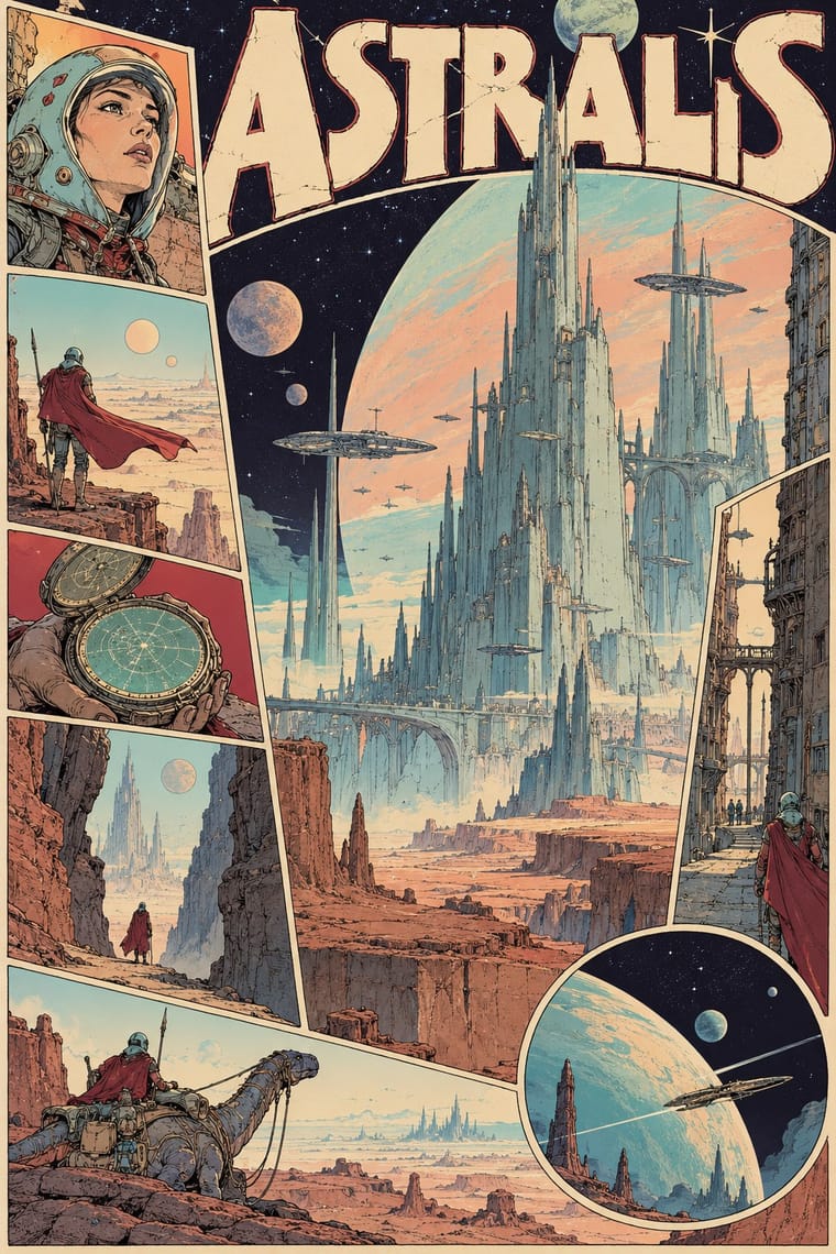
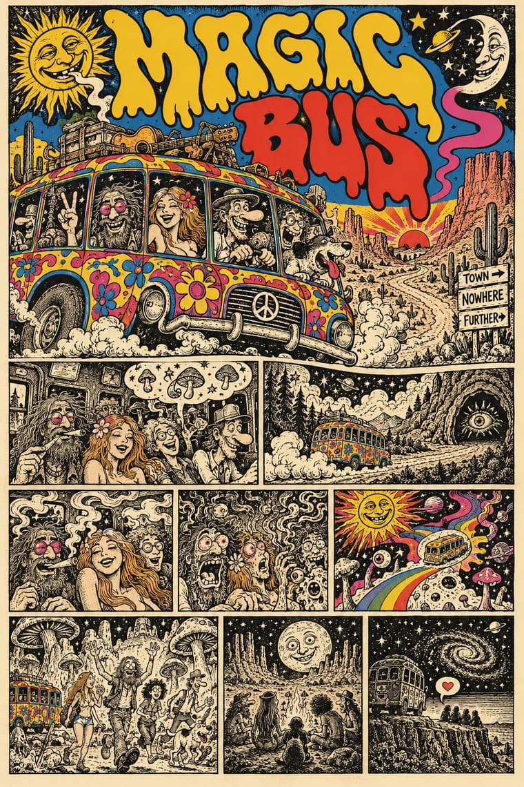
Métal hurlant Science-Fiction Comics × Underground Comix
Adult comics of the 1970s in two opposite registers: painted, luminous science-fiction vistas against cheap, crowded black-and-white satire.
Mix them and make something Métal hurlant Science-Fiction Comics Underground Comix
01
What each style brings
Each part of the design comes from the style with the stronger say in it, and each style gives at least two.
Métal hurlant Science-Fiction Comics (Mœbius, Druillet & Les Humanoïdes Associés) Underground Comix
- Type from Underground Comix
- Colour from Underground Comix
- Form from Métal hurlant Science-Fiction Comics
- Composition from Métal hurlant Science-Fiction Comics
- Surface from Métal hurlant Science-Fiction Comics
02
The type
Open fonts standing in for each style’s own type, which is often hand-drawn or commercial.
Display · Underground Comix
Riot
Bangers, standing in for Pen-drawn balloon capitals (each cartoonist's own hand on the page, in the same pen as the drawing)
Text · Métal hurlant Science-Fiction Comics
The adult science-fiction comics of Métal hurlant, the Paris magazine founded in 1974 by Mœbius, Philippe Druillet, Jean-Pierre Dionnet and Bernard Farkas. Mœbius's fine pen line and luminous colour set tiny figures in vast, silent deserts; Druillet exploded the page into baroque architecture and painterly double spreads. Sometimes wholly wordless, as in Arzach, and often dreamlike and erotic, it was carried abroad by Heavy Metal from 1977 and shaped film design from Alien to Blade Runner.
Archivo; Métal hurlant Science-Fiction Comics used Pen-lettered balloon capitals and Monumental drawn title lettering
03
The colours
The ground and leading colours come from Underground Comix, with a counter-accent from Métal hurlant Science-Fiction Comics. The ink reads on the ground at 4.5:1 or more.
Métal hurlant Science-Fiction Comics (Mœbius, Druillet & Les Humanoïdes Associés) Underground Comix
-
#f1e9d4ground · 36% -
#141210ink · 14% -
#f2c12eaccent · 18% -
#a3243faccent · 14% -
#d4302aaccent · 10% -
#e7a487accent · 8%
As CSS
:root {
  --ground: #f1e9d4;
  --ink: #141210;
  --accent-1: #f2c12e;
  --accent-2: #a3243f;
  --accent-3: #d4302a;
  --accent-4: #e7a487;
  --font-display: "Bangers", sans-serif;
  --font-text: "Archivo", sans-serif;
}
Use it with care
Métal hurlant Science-Fiction Comics (Mœbius, Druillet & Les Humanoïdes Associés): The stories, characters and drawings of Mœbius, Druillet, Bilal and the other contributors remain in copyright with their authors, estates and publishers: build your own worlds, creatures and title lettering in the shared idiom, do not ask an image model to imitate a named artist, and never present a generated picture as a page from the magazine. The magazine's adult register also ran to sexualised depictions of women; keep that choice deliberate and give women the same agency and drawing care as the heroes.
Underground Comix: Much of the canon trades in racial caricature, such as a Black woman drawn as an 'African native' caricature, and in graphic sexual violence against women and casual misogyny, which the women's comics of 1970 and 1972 answered in their own books: borrow the hatched line, the crowded panel and the candour, not the stereotypes, and give every character the same anatomy and drawing care. The characters and mastheads (Mr. Natural, Fritz the Cat, the Freak Brothers, the Checkered Demon, the Zap logo) still belong to their makers and estates: draw your own, never ask an image model for a named cartoonist's hand, living or dead, and never present a generated page as a vintage comic.
04
The two styles
05
More combinations
With Métal hurlant Science-Fiction Comics
- Ligne Claire (Franco-Belgian Clear Line) Contrasts · Both grew from Franco-Belgian albums, and the magazine also printed clear-line artists such as Yves Chaland and Serge Clerc; ligne claire closes every form with one even, unhatched contour and flat colour in tidy panels, while Métal hurlant hatches and stipples its detail, modulates its colour and breaks the page into tableaux.
- Synthwave / Outrun Contrasts · Both picture the future as a 1970s and 1980s fantasy, but synthwave uses neon gradients, chrome and a perspective grid on black; switch to Métal hurlant for hand-drawn, pale desert light and alien organic forms.
- Story Manga (Postwar Japanese Comics) Contrasts · Hayao Miyazaki said he directed Nausicaä under Mœbius's influence; manga stays black and white with screentone, speed lines and fast cinematic cutting, while Métal hurlant slows down into colour tableaux and, in Arzach, tells whole stories without a word.
- Art Nouveau Pairs well · Druillet drew the huge structures behind Lone Sloane partly from Art Nouveau and Gothic cathedrals; borrow Art Nouveau's whiplash frames and arched borders to turn a science-fiction splash page or cover into a baroque altarpiece.
- Solarpunk Contrasts · Both paint pale, luminous futures full of biomorphic forms, and solarpunk counts Nausicaä of the Valley of the Wind among its models, a film Miyazaki said he directed under Mœbius's influence; solarpunk is utopian, verdant and floral, while Métal hurlant sets lone figures in empty alien deserts and colossal architecture, tells adult stories with sex and violence, and breaks comic pages into tableaux.
- Surrealist Graphics Pairs well · Mœbius's silent deserts and metamorphosing creatures share Surrealism's dream logic and long empty perspectives; add its uncanny juxtapositions to a science-fiction landscape, but keep the comic's sequence of drawn panels.
- American Four-Colour Comic Book (Golden to Bronze Age) Contrasts · The American newsstand comic tells superhero stories in ruled panel grids with flat four-colour dot tints on newsprint; Métal hurlant, and Heavy Metal as a glossy full-colour magazine, told adult science fiction with sex and violence, painterly colour and pages exploded into single visions.
- L'Association and French Alternative Comics Contrasts · Luminous colour, vast science-fiction vistas and painterly spreads against small black-and-white books about dreams, illness and family: the two poles of adult French comics.
With Underground Comix
- Filipino Komiks Contrasts · Both put black-and-white hatched interiors behind colour covers, but komiks drew naturalistic folk heroes and romances for the country's most widely read periodicals, while comix push big-footed caricature into adult taboo for a head-shop audience.
- Psychedelic Poster Pairs well · Take the cover from the ballroom poster, with its clashing flat inks and melting letters, and keep the hatched black-and-white panels inside, as Zap did with Moscoso and Griffin.
- Escuela Bruguera (Spanish Humour Comics) Contrasts · Both draw rubbery big-footed caricatures, but Bruguera's are coloured, family-friendly gags; the undergrounds use the same cartoon body for adult taboo.
- Turkish Weekly Humour Magazines (Gırgır to Uykusuz) Contrasts · Both learned from Mad and crowd hand-lettered caricature into the panel, but the Istanbul weeklies are mass-circulation collective magazines whose cover lampoons the week's politics, while comix are self-published books whose shock is sex, drugs and taboo.
- L'Association and French Alternative Comics Pairs well · A later French-language small-press scene, one of whose founders turned to psychedelic and autobiographical comics after discovering Crumb and Shelton, keeps the black ink and the single author's hand but clears the crowding and the shock; borrow its book design to give a comix page a calmer format.
- American Four-Colour Comic Book (Golden to Bronze Age) Contrasts · Same format, everything else reversed: set a four-colour, Code-approved house-style page beside a hatched black-and-white page by a single author to show what the undergrounds rejected.
- Punk & DIY Zine Pairs well · Both are cheap, self-published print made outside the mainstream; add cut-and-paste collage and Xerox grit to a hand-drawn comix page for the later punk-zine voice.
- See Red Women's Workshop Feminist Screenprints Pairs well · Borrow the comic strip and speech balloon, but cleaned up into a few flat inks and turned against the sexism much of the comix canon traded in.