Style combination · Contrasts
Escuela Bruguera × Underground Comix
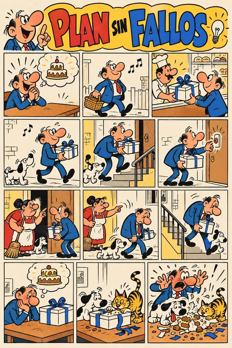
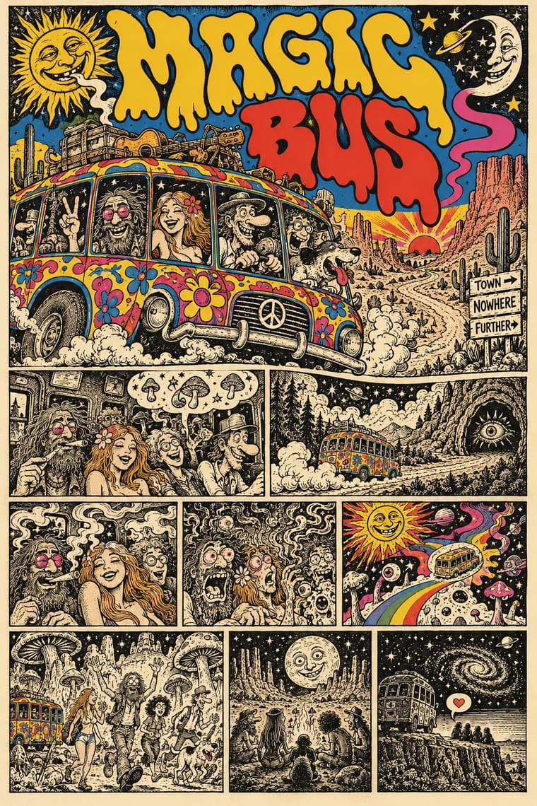
Both draw rubbery big-footed caricatures, but Bruguera's are coloured, family-friendly gags; the undergrounds use the same cartoon body for adult taboo.
Mix them and make something Escuela Bruguera Underground Comix
01
What each style brings
Each part of the design comes from the style with the stronger say in it, and each style gives at least two.
Escuela Bruguera (Spanish Humour Comics) Underground Comix
- Type from Underground Comix
- Colour from Escuela Bruguera
- Form from Escuela Bruguera
- Composition from Escuela Bruguera
- Surface from Underground Comix
-
02
The type
Open fonts standing in for each style’s own type, which is often hand-drawn or commercial.
Display · Underground Comix
Hello
Bangers, standing in for Pen-drawn balloon capitals (each cartoonist's own hand on the page, in the same pen as the drawing)
Text · Escuela Bruguera
The house style of Editorial Bruguera's humour cartoonists in Barcelona from 1947 to 1986, named the 'Escuela Bruguera' by Terenci Moix in 1968. Grotesque caricatures of everyday Spanish types (a starving tramp, warring spinster sisters, two bungling agents) act out one-page gags in tiers of small panels against barely sketched urban settings, with onomatopoeia and motion symbols, and the gag ends in a blow. Halfway between children's fun and satire of manners, it mirrored postwar hunger and petty tyranny under Franco's censors, who made it soften after the 1955 decree on children's press.
Archivo; Escuela Bruguera used Hand-lettered pen dialogue in balloons and captions and Typed balloon text from the 1960s
03
The colours
The ground and leading colours come from Escuela Bruguera, with a counter-accent from Underground Comix. The ink reads on the ground at 4.5:1 or more.
Escuela Bruguera (Spanish Humour Comics) Underground Comix
-
#f5eedbground · 36% -
#1b1a19ink · 14% -
#f3c13aaccent · 18% -
#d63a2faccent · 14% -
#2f6db5accent · 10% -
#f2b08caccent · 8%
As CSS
:root {
  --ground: #f5eedb;
  --ink: #1b1a19;
  --accent-1: #f3c13a;
  --accent-2: #d63a2f;
  --accent-3: #2f6db5;
  --accent-4: #f2b08c;
  --font-display: "Bangers", sans-serif;
  --font-text: "Archivo", sans-serif;
}
Use it with care
Escuela Bruguera (Spanish Humour Comics): Mortadelo y Filemón, Zipi y Zape, Carpanta, Superlópez and the other Bruguera characters are still published and adapted by Ediciones B, part of Penguin Random House since 2017 (Bruguera registered characters in its own name, as it did Superlópez, taking them from their authors): draw your own types, mastheads and gags in the shared idiom, never ask an image model for these characters or for a named cartoonist's hand, and do not present a generated page as a vintage tebeo. The humour runs on stock types, violence and humiliation (the spinster hunting a husband, the beaten child): aim the satire at pretension and power, not at people's bodies, sex, class or origin.
Underground Comix: Much of the canon trades in racial caricature, such as a Black woman drawn as an 'African native' caricature, and in graphic sexual violence against women and casual misogyny, which the women's comics of 1970 and 1972 answered in their own books: borrow the hatched line, the crowded panel and the candour, not the stereotypes, and give every character the same anatomy and drawing care. The characters and mastheads (Mr. Natural, Fritz the Cat, the Freak Brothers, the Checkered Demon, the Zap logo) still belong to their makers and estates: draw your own, never ask an image model for a named cartoonist's hand, living or dead, and never present a generated page as a vintage comic.
04
The two styles
05
More combinations
With Escuela Bruguera
- American Four-Colour Comic Book (Golden to Bronze Age) Contrasts · Jan's Superlópez began as a parody of Superman: take the comic book's heroic anatomy, foreshortening and cosmic stakes and deflate them into a clerk's one-page gag about office trouble, with a humiliating last panel.
- ROSTA Windows Contrasts · Both tell satire in sequences of crude, flat-colour stock figures with hand lettering; ROSTA hand-stencilled numbered news frames with rhymed captions for shop windows as open agitation, while Bruguera printed balloon gags in children's weeklies that end on a blow and keep the satire under the fun.
- Ligne Claire (Franco-Belgian Clear Line) Contrasts · Both are mid-century European weekly-magazine comics in outlined drawing and flat colour; ligne claire sets caricatured heroes in researched, evenly drawn decor, while the Bruguera gag strip swells its losers into grotesque caricature against barely sketched backgrounds and ends on a blow. Ibáñez's El sulfato atómico (1969) did borrow Franco-Belgian detail, chiefly from Franquin.
- UPA & Cartoon Modern Pairs well · Both caricature ordinary postwar people for laughs; borrow UPA's flat colour fields and sparse, stylised staging for a Bruguera-type gag on a poster or in animation, while keeping the grotesque faces, the onomatopoeia and the final blow.
- Spanish Civil War Poster Contrasts · Barcelona's wartime posters agitated openly in large single images; a decade later in the same city, Bruguera's cartoonists put postwar hunger and petty tyranny into children's gags under Franco's censors, who made them soften after the 1955 decree. Choose the poster for an open call, the gag strip for satire kept under the fun.
- Turkish Weekly Humour Magazines (Gırgır to Uykusuz) Contrasts · Both are weekly humour magazines from a stable of cartoonists, with grotesque caricature in hand-lettered panels. Bruguera kept its satire of manners under children's slapstick for Franco's censors; the Turkish weeklies put named politicians on the cover every week and took the lawsuits that followed.
- La Movida Madrileña Graphics Contrasts · Both are Spanish comics: Bruguera's Barcelona weeklies caricatured postwar losers in regular gag panels for children under Franco's censors, while Madriz and the Movida fanzines gave adults experimental, drug- and sex-aware strips, some of which barely told a story, paid for by Madrid's city council.
- Mexican Historieta (Pepines to Sensacionales) Contrasts · Two Spanish-language humour lines of the same decades: Bruguera's tebeos are flat-coloured slapstick for children, while the Sensacionales caricature adult barrio and market types in crowded, fully painted scenes with sex and double meanings.
With Underground Comix
- Filipino Komiks Contrasts · Both put black-and-white hatched interiors behind colour covers, but komiks drew naturalistic folk heroes and romances for the country's most widely read periodicals, while comix push big-footed caricature into adult taboo for a head-shop audience.
- Psychedelic Poster Pairs well · Take the cover from the ballroom poster, with its clashing flat inks and melting letters, and keep the hatched black-and-white panels inside, as Zap did with Moscoso and Griffin.
- Turkish Weekly Humour Magazines (Gırgır to Uykusuz) Contrasts · Both learned from Mad and crowd hand-lettered caricature into the panel, but the Istanbul weeklies are mass-circulation collective magazines whose cover lampoons the week's politics, while comix are self-published books whose shock is sex, drugs and taboo.
- L'Association and French Alternative Comics Pairs well · A later French-language small-press scene, one of whose founders turned to psychedelic and autobiographical comics after discovering Crumb and Shelton, keeps the black ink and the single author's hand but clears the crowding and the shock; borrow its book design to give a comix page a calmer format.
- Métal hurlant Science-Fiction Comics (Mœbius, Druillet & Les Humanoïdes Associés) Contrasts · Adult comics of the 1970s in two opposite registers: painted, luminous science-fiction vistas against cheap, crowded black-and-white satire.
- American Four-Colour Comic Book (Golden to Bronze Age) Contrasts · Same format, everything else reversed: set a four-colour, Code-approved house-style page beside a hatched black-and-white page by a single author to show what the undergrounds rejected.
- Punk & DIY Zine Pairs well · Both are cheap, self-published print made outside the mainstream; add cut-and-paste collage and Xerox grit to a hand-drawn comix page for the later punk-zine voice.
- See Red Women's Workshop Feminist Screenprints Pairs well · Borrow the comic strip and speech balloon, but cleaned up into a few flat inks and turned against the sexism much of the comix canon traded in.