Style combination · Contrasts
Métal hurlant Science-Fiction Comics × Solarpunk
Both paint pale, luminous futures full of biomorphic forms, and solarpunk counts Nausicaä of the Valley of the Wind among its models, a film Miyazaki said he directed under Mœbius's influence; solarpunk is utopian, verdant and floral, while Métal hurlant sets lone figures in empty alien deserts and colossal architecture, tells adult stories with sex and violence, and breaks comic pages into tableaux.
Mix them and make something Métal hurlant Science-Fiction Comics Solarpunk
01
What each style brings
Each part of the design comes from the style with the stronger say in it, and each style gives at least two.
Métal hurlant Science-Fiction Comics (Mœbius, Druillet & Les Humanoïdes Associés) Solarpunk
- Type from Métal hurlant Science-Fiction Comics
- Form from Solarpunk
- Composition from Métal hurlant Science-Fiction Comics
- Surface from Solarpunk
02
The type
Open fonts standing in for each style’s own type, which is often hand-drawn or commercial.
Display · Métal hurlant Science-Fiction Comics
Future
Bangers; Métal hurlant Science-Fiction Comics used Pen-lettered balloon capitals and Monumental drawn title lettering
Text · Solarpunk
Hopeful eco-futurist imagery born online. The word dates from a 2008 blog post; the look from an August 2014 Tumblr post by the artist Olivia Louise asking for renewable technology with 'an Art Nouveau veneer'. Sunlit painted vistas, or flat, textured cover illustrations thick with foliage, show cities grown over with gardens, stained-glass solar panels, airships, wind power and shared streets full of people, in natural greens and sky blues warmed by gold. It fills book and magazine covers, concept art and animation as the daylit, communal opposite of cyberpunk's neon night.
Newsreader; Solarpunk used Swash, Art Nouveau-flavoured upper- and lowercase display lettering, as in Solarpunk Magazine's orange masthead and Wide, flared capitals with sun-wheel O's on a translucent title panel over the painting, as on the Sunvault cover
03
The colours
The ground and leading colours come from Métal hurlant Science-Fiction Comics, with a counter-accent from Solarpunk. The ink reads on the ground at 4.5:1 or more.
Métal hurlant Science-Fiction Comics (Mœbius, Druillet & Les Humanoïdes Associés) Solarpunk
-
#151312ground · 36% -
#ecdcb9ink · 14% -
#a3243faccent · 18% -
#e8b445accent · 14% -
#e7a487accent · 10% -
#b8652faccent · 8%
As CSS
:root {
  --ground: #151312;
  --ink: #ecdcb9;
  --accent-1: #a3243f;
  --accent-2: #e8b445;
  --accent-3: #e7a487;
  --accent-4: #b8652f;
  --font-display: "Bangers", sans-serif;
  --font-text: "Newsreader", serif;
}
Use it with care
Métal hurlant Science-Fiction Comics (Mœbius, Druillet & Les Humanoïdes Associés): The stories, characters and drawings of Mœbius, Druillet, Bilal and the other contributors remain in copyright with their authors, estates and publishers: build your own worlds, creatures and title lettering in the shared idiom, do not ask an image model to imitate a named artist, and never present a generated picture as a page from the magazine. The magazine's adult register also ran to sexualised depictions of women; keep that choice deliberate and give women the same agency and drawing care as the heroes.
Solarpunk: Draw original worlds rather than pastiches of Studio Ghibli films or of living illustrators such as Likhain, Fei Fei Ruan or Stephen Lillie, and do not prompt an image model with their names. Do not use the look to greenwash: Adam Flynn calls luxury condos with a green roof that price out existing communities 'fake Solarpunk urbanism', so show shared, affordable infrastructure and ordinary people. When a scene borrows architecture, dress or symbols from a specific culture (Afrofuturist, Indigenous or other), keep their meanings and credit their makers.
04
The two styles
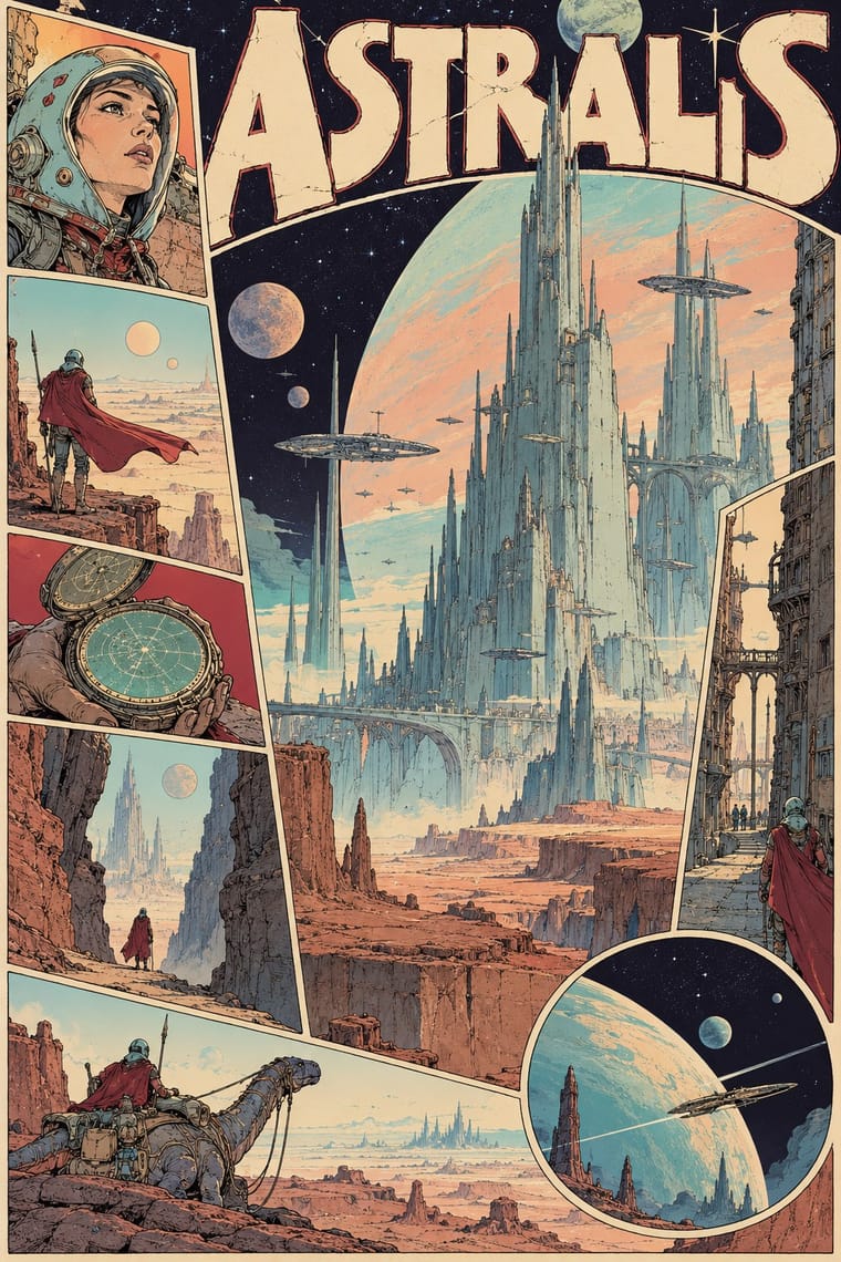
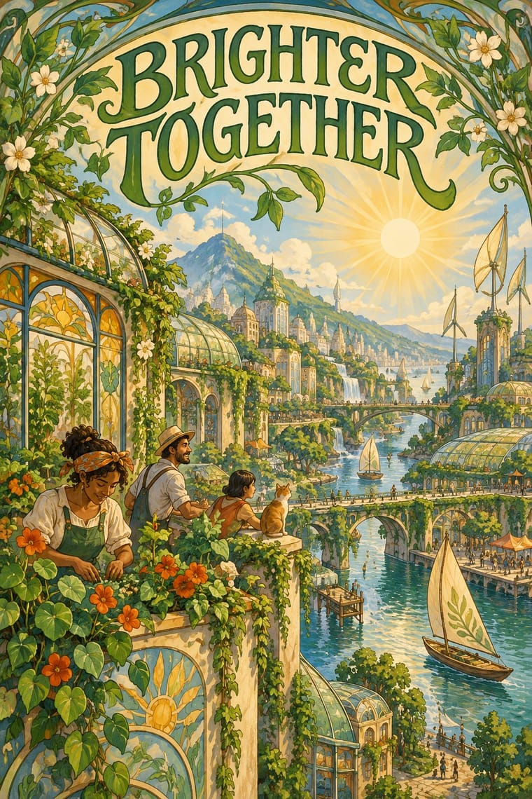
05
More combinations
With Métal hurlant Science-Fiction Comics
- Ligne Claire (Franco-Belgian Clear Line) Contrasts · Both grew from Franco-Belgian albums, and the magazine also printed clear-line artists such as Yves Chaland and Serge Clerc; ligne claire closes every form with one even, unhatched contour and flat colour in tidy panels, while Métal hurlant hatches and stipples its detail, modulates its colour and breaks the page into tableaux.
- Synthwave / Outrun Contrasts · Both picture the future as a 1970s and 1980s fantasy, but synthwave uses neon gradients, chrome and a perspective grid on black; switch to Métal hurlant for hand-drawn, pale desert light and alien organic forms.
- Story Manga (Postwar Japanese Comics) Contrasts · Hayao Miyazaki said he directed Nausicaä under Mœbius's influence; manga stays black and white with screentone, speed lines and fast cinematic cutting, while Métal hurlant slows down into colour tableaux and, in Arzach, tells whole stories without a word.
- Art Nouveau Pairs well · Druillet drew the huge structures behind Lone Sloane partly from Art Nouveau and Gothic cathedrals; borrow Art Nouveau's whiplash frames and arched borders to turn a science-fiction splash page or cover into a baroque altarpiece.
- Surrealist Graphics Pairs well · Mœbius's silent deserts and metamorphosing creatures share Surrealism's dream logic and long empty perspectives; add its uncanny juxtapositions to a science-fiction landscape, but keep the comic's sequence of drawn panels.
- American Four-Colour Comic Book (Golden to Bronze Age) Contrasts · The American newsstand comic tells superhero stories in ruled panel grids with flat four-colour dot tints on newsprint; Métal hurlant, and Heavy Metal as a glossy full-colour magazine, told adult science fiction with sex and violence, painterly colour and pages exploded into single visions.
- L'Association and French Alternative Comics Contrasts · Luminous colour, vast science-fiction vistas and painterly spreads against small black-and-white books about dreams, illness and family: the two poles of adult French comics.
- Underground Comix Contrasts · Adult comics of the 1970s in two opposite registers: painted, luminous science-fiction vistas against cheap, crowded black-and-white satire.
With Solarpunk
- Afrofuturist Design Pairs well · Wakanda is claimed by both: Afrofuturism brings ancestral glyphs, regal figures and cosmic dark grounds, solarpunk daylight, gardens and ordinary communities; join them with the symbols' meanings intact and Black artists credited.
- Frutiger Aero Contrasts · Both pair green nature with optimistic technology, but Aero renders it as glossy stock photography, bubbles and glass for a product; choose solarpunk for painted, handmade, lived-in places and shared infrastructure.
- Extinction Rebellion Graphics Contrasts · Both answer the climate crisis: XR shouts alarm in woodcut and flat spot colour; solarpunk paints the hopeful world after it. Pair them for campaigns that move from warning to vision.
- Synthwave / Outrun Contrasts · Synthwave's retro future is neon, chrome and night on an empty grid; solarpunk is daylit, green and crowded with people. Put them side by side to stage a fossil-fuelled nostalgia against a renewable future.
- Art Nouveau Pairs well · Olivia Louise built the look on 'updated Art Nouveau': borrow arched frames, whiplash vines and Mucha-style lettering for the veneer, but keep the painted vista and future infrastructure so it reads as a world to come rather than a period revival.
- Lo-fi Anime Aesthetic Pairs well · Both draw on Miyazaki and Ghibli-style painted backgrounds; lofi turns inward to one quiet room at dusk, solarpunk outward to a shared, sunlit city.
- Arts & Crafts Movement Pairs well · Both prize the artisan over the factory; wrap a solarpunk scene in a Morris-style foliage border or woodcut initial for zines, seed packets and printed manifestos.
- Cottagecore Pairs well · Add solarpunk's hopeful green futures to cottagecore's gardens for an eco-pastoral look.