Style combination · Pairs well
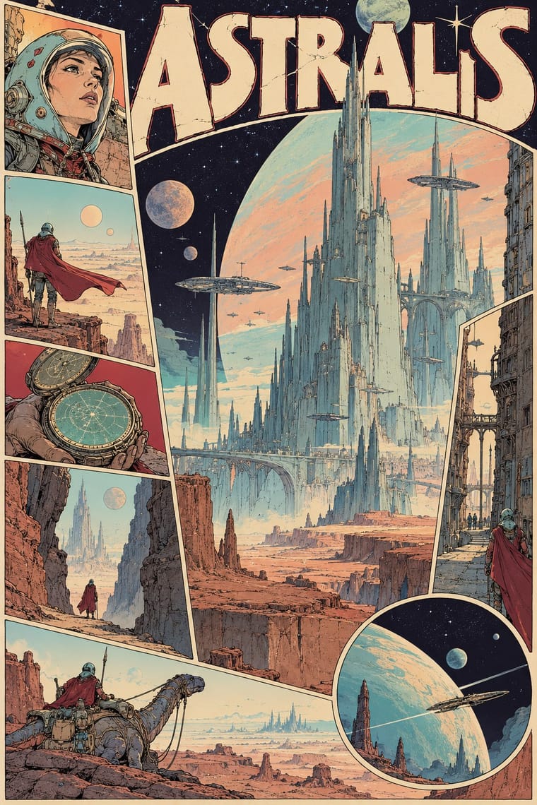
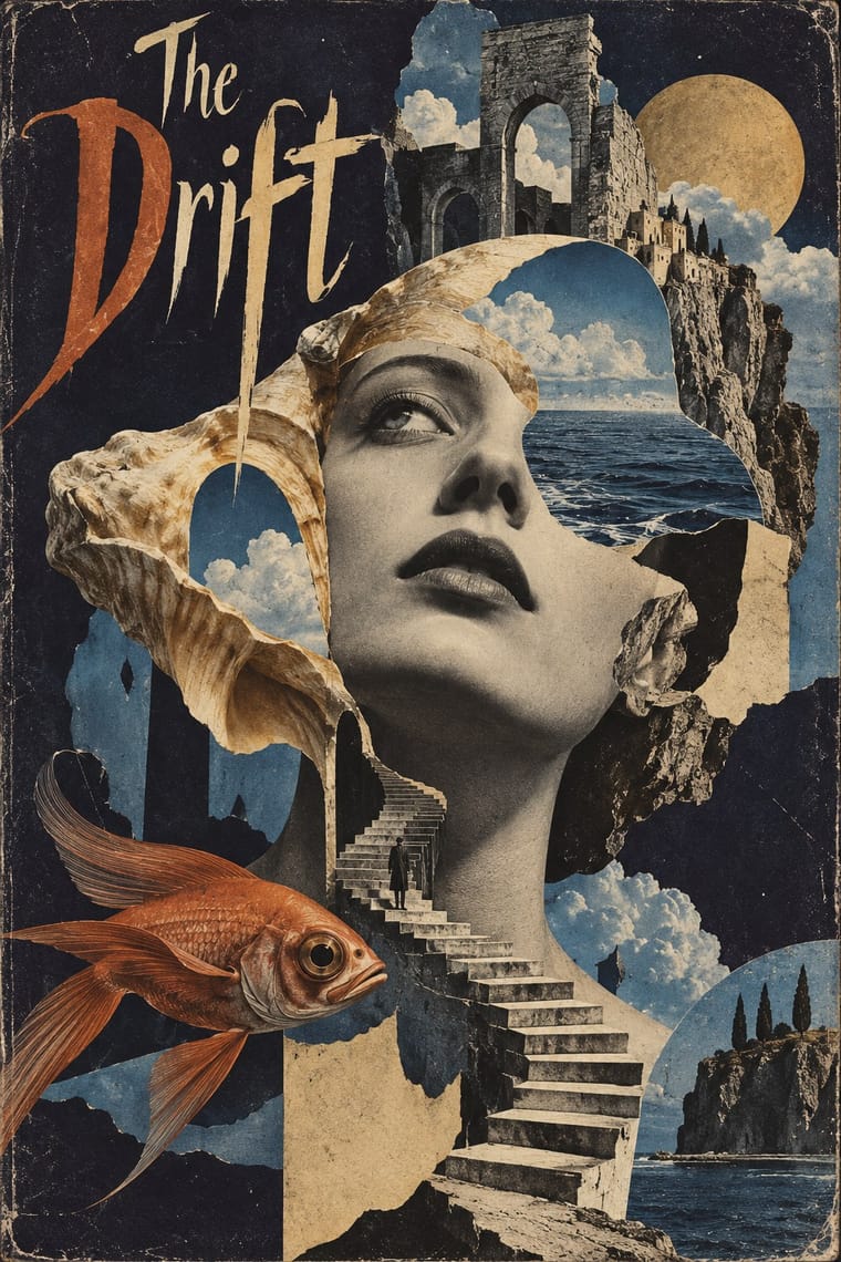
Métal hurlant Science-Fiction Comics × Surrealist Graphics
Mœbius's silent deserts and metamorphosing creatures share Surrealism's dream logic and long empty perspectives; add its uncanny juxtapositions to a science-fiction landscape, but keep the comic's sequence of drawn panels.
Mix them and make something Métal hurlant Science-Fiction Comics Surrealist Graphics
01
What each style brings
Each part of the design comes from the style with the stronger say in it, and each style gives at least two.
Métal hurlant Science-Fiction Comics (Mœbius, Druillet & Les Humanoïdes Associés) Surrealist Graphics
- Type from Métal hurlant Science-Fiction Comics
- Colour from Surrealist Graphics
- Form from Surrealist Graphics
- Composition from Métal hurlant Science-Fiction Comics
- Surface from Métal hurlant Science-Fiction Comics
02
The type
Open fonts standing in for each style’s own type, which is often hand-drawn or commercial.
Display · Métal hurlant Science-Fiction Comics
Amour
Bangers; Métal hurlant Science-Fiction Comics used Pen-lettered balloon capitals and Monumental drawn title lettering
Text · Surrealist Graphics
Launched by André Breton's 1924 manifesto, Surrealism sought the marvellous in dreams, chance and the unconscious. Its graphic legacy (uncanny collage from old engravings, solarised and cameraless photographs, impossible juxtapositions painted with illusionistic precision) passed through magazines like Minotaure into fashion, advertising and book design on both sides of the Atlantic.
Bodoni Moda; Surrealist Graphics used Artists' hand-lettered mastheads and Didone and Victorian display faces lifted from 19th-century catalogues
03
The colours
The ground and leading colours come from Surrealist Graphics, with a counter-accent from Métal hurlant Science-Fiction Comics. The ink reads on the ground at 4.5:1 or more.
Métal hurlant Science-Fiction Comics (Mœbius, Druillet & Les Humanoïdes Associés) Surrealist Graphics
-
#1d1b2eground · 36% -
#efe8d8ink · 14% -
#a24a2aaccent · 18% -
#d8b77aaccent · 14% -
#6f8fb5accent · 10% -
#9fd0c9accent · 8%
As CSS
:root {
  --ground: #1d1b2e;
  --ink: #efe8d8;
  --accent-1: #a24a2a;
  --accent-2: #d8b77a;
  --accent-3: #6f8fb5;
  --accent-4: #9fd0c9;
  --font-display: "Bangers", sans-serif;
  --font-text: "Bodoni Moda", serif;
}
Use it with care
Métal hurlant Science-Fiction Comics (Mœbius, Druillet & Les Humanoïdes Associés): The stories, characters and drawings of Mœbius, Druillet, Bilal and the other contributors remain in copyright with their authors, estates and publishers: build your own worlds, creatures and title lettering in the shared idiom, do not ask an image model to imitate a named artist, and never present a generated picture as a page from the magazine. The magazine's adult register also ran to sexualised depictions of women; keep that choice deliberate and give women the same agency and drawing care as the heroes.
04
The two styles
05
More combinations
With Métal hurlant Science-Fiction Comics
- Ligne Claire (Franco-Belgian Clear Line) Contrasts · Both grew from Franco-Belgian albums, and the magazine also printed clear-line artists such as Yves Chaland and Serge Clerc; ligne claire closes every form with one even, unhatched contour and flat colour in tidy panels, while Métal hurlant hatches and stipples its detail, modulates its colour and breaks the page into tableaux.
- Synthwave / Outrun Contrasts · Both picture the future as a 1970s and 1980s fantasy, but synthwave uses neon gradients, chrome and a perspective grid on black; switch to Métal hurlant for hand-drawn, pale desert light and alien organic forms.
- Story Manga (Postwar Japanese Comics) Contrasts · Hayao Miyazaki said he directed Nausicaä under Mœbius's influence; manga stays black and white with screentone, speed lines and fast cinematic cutting, while Métal hurlant slows down into colour tableaux and, in Arzach, tells whole stories without a word.
- Art Nouveau Pairs well · Druillet drew the huge structures behind Lone Sloane partly from Art Nouveau and Gothic cathedrals; borrow Art Nouveau's whiplash frames and arched borders to turn a science-fiction splash page or cover into a baroque altarpiece.
- Solarpunk Contrasts · Both paint pale, luminous futures full of biomorphic forms, and solarpunk counts Nausicaä of the Valley of the Wind among its models, a film Miyazaki said he directed under Mœbius's influence; solarpunk is utopian, verdant and floral, while Métal hurlant sets lone figures in empty alien deserts and colossal architecture, tells adult stories with sex and violence, and breaks comic pages into tableaux.
- American Four-Colour Comic Book (Golden to Bronze Age) Contrasts · The American newsstand comic tells superhero stories in ruled panel grids with flat four-colour dot tints on newsprint; Métal hurlant, and Heavy Metal as a glossy full-colour magazine, told adult science fiction with sex and violence, painterly colour and pages exploded into single visions.
- L'Association and French Alternative Comics Contrasts · Luminous colour, vast science-fiction vistas and painterly spreads against small black-and-white books about dreams, illness and family: the two poles of adult French comics.
- Underground Comix Contrasts · Adult comics of the 1970s in two opposite registers: painted, luminous science-fiction vistas against cheap, crowded black-and-white satire.
With Surrealist Graphics
- Corporate Identity Modernism Contrasts · Place a single dream image inside a strict corporate grid; the calm system heightens the strangeness.
- Isotype Pictorial Statistics Contrasts · Isotype's one-symbol-one-meaning is the antithesis of Surrealist ambiguity; decide whether the viewer should decode or be disturbed.
- Psychedelic Poster Pairs well · Psychedelic posters revived Surrealist dream imagery; combine them for hallucinatory figurative work with melting forms.
- Polish Poster School Pairs well · Polish poster artists fused Surrealist metaphor with painterly lettering; borrow the method for cultural posters built on one uncanny image.
- Post-Punk Record Sleeve (Stiff, Factory, 4AD) Pairs well · Vaughan Oliver drew on Dalí and Surrealism; add an uncanny juxtaposition to a blurred, textured 23 Envelope photograph for a dream-like sleeve.
- Brodovitch Editorial Design (Harper's Bazaar) Pairs well · Take its isolated body parts, torn edges and dreamlike juxtaposition, but apply them to the photographic spread.
- AIZ Political Photomontage (Heartfield) Pairs well · Surrealist photography also makes the impossible look photographed; take its dream logic when a brief needs strangeness, and add the AIZ headline and caption when that strangeness has to land a political point.
- Emblem Book (Motto, Picture & Epigram) Pairs well · Both find meaning in the gap between a picture and the words beside it; pair a framed, uncanny object with a terse motto above and a short verse below for an editorial series that asks to be decoded.