Style combination · Contrasts
Ligne Claire × Métal hurlant Science-Fiction Comics
Both grew from Franco-Belgian albums, and the magazine also printed clear-line artists such as Yves Chaland and Serge Clerc; ligne claire closes every form with one even, unhatched contour and flat colour in tidy panels, while Métal hurlant hatches and stipples its detail, modulates its colour and breaks the page into tableaux.
Mix them and make something Ligne Claire Métal hurlant Science-Fiction Comics
01
What each style brings
Each part of the design comes from the style with the stronger say in it, and each style gives at least two.
Ligne Claire (Franco-Belgian Clear Line) Métal hurlant Science-Fiction Comics (Mœbius, Druillet & Les Humanoïdes Associés)
- Type from Métal hurlant Science-Fiction Comics
- Colour from Ligne Claire
- Form from Ligne Claire
- Composition from Métal hurlant Science-Fiction Comics
- Surface from Métal hurlant Science-Fiction Comics
-
Ligne Claire avoids painterly brushwork: this is where the two pull against each other, which is the point of the contrast.
02
The type
Open fonts standing in for each style’s own type, which is often hand-drawn or commercial.
Display · Métal hurlant Science-Fiction Comics
Circuit
Bangers; Métal hurlant Science-Fiction Comics used Pen-lettered balloon capitals and Monumental drawn title lettering
Text · Ligne Claire
The comic drawing style of Hergé's Tintin and the Brussels school, named 'klare lijn' by Joost Swarte in 1977. One even, unhatched contour closes every figure and object, and flat, bright colour fills it without shading. Caricatural characters stand in researched, realistically drawn streets, machines and landscapes, all evenly lit and equally legible. Revived from the late 1970s by Swarte, Chaland, Floc'h and Ted Benoit, it left the album page for posters, record sleeves, magazine covers, murals and advertising, often in a knowing 1950s-retro key.
Comic Neue; Ligne Claire used Bold hand-drawn capitals for titles and Heavy hand-drawn display capitals
03
The colours
The ground and leading colours come from Ligne Claire, with a counter-accent from Métal hurlant Science-Fiction Comics. The ink reads on the ground at 4.5:1 or more.
Ligne Claire (Franco-Belgian Clear Line) Métal hurlant Science-Fiction Comics (Mœbius, Druillet & Les Humanoïdes Associés)
-
#fbf6e9ground · 36% -
#1a1a1aink · 14% -
#f0b73aaccent · 18% -
#a3243faccent · 14% -
#d8352aaccent · 10% -
#e7a487accent · 8%
As CSS
:root {
  --ground: #fbf6e9;
  --ink: #1a1a1a;
  --accent-1: #f0b73a;
  --accent-2: #a3243f;
  --accent-3: #d8352a;
  --accent-4: #e7a487;
  --font-display: "Bangers", sans-serif;
  --font-text: "Comic Neue", cursive;
}
Use it with care
Ligne Claire (Franco-Belgian Clear Line): Tintin and his companions and Blake and Mortimer are copyrighted characters whose rights are actively enforced (Hergé's by Tintinimaginatio, called Moulinsart until 2022), and Swarte, Floc'h and Meulen are working artists: draw your own characters, settings and lettering in the shared idiom, never ask an image model for these artists or characters by name, and never present a generated picture as theirs. The style's clarity does not neutralise its early content: Tintin in the Congo caricatures Congolese people as childlike in a colonial frame, and The Shooting Star, serialised in the German-controlled Le Soir in 1941–42, made its villain an antisemitic caricature of a Jewish financier (renamed in 1954). Simplify every character with the same economy as the lead, and never use exaggerated lips, noses, skin colour or dress as ethnic markers.
Métal hurlant Science-Fiction Comics (Mœbius, Druillet & Les Humanoïdes Associés): The stories, characters and drawings of Mœbius, Druillet, Bilal and the other contributors remain in copyright with their authors, estates and publishers: build your own worlds, creatures and title lettering in the shared idiom, do not ask an image model to imitate a named artist, and never present a generated picture as a page from the magazine. The magazine's adult register also ran to sexualised depictions of women; keep that choice deliberate and give women the same agency and drawing care as the heroes.
04
The two styles
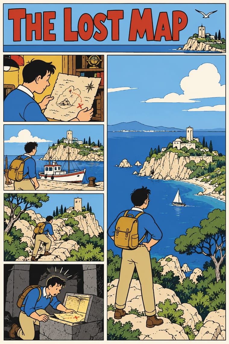
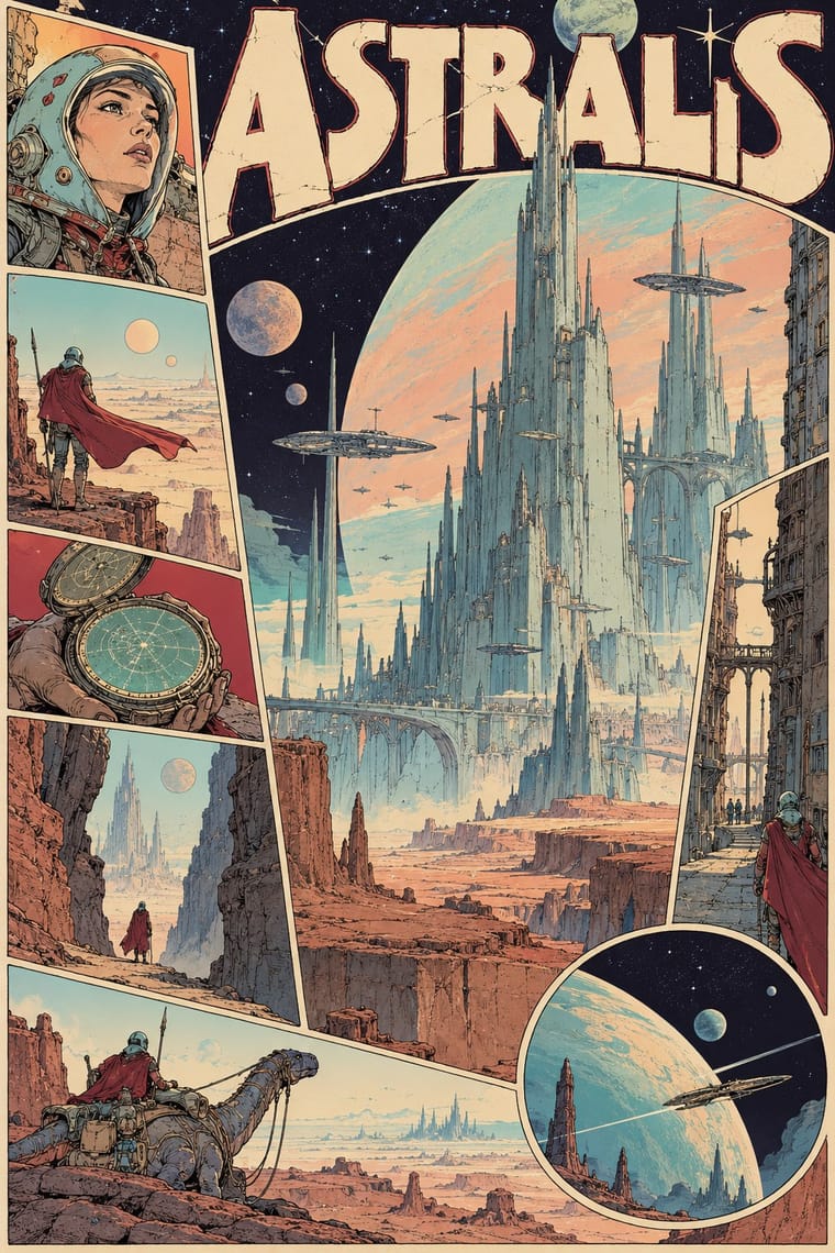
05
More combinations
With Ligne Claire
- Lianhuanhua Picture-Story Books Contrasts · Both tell stories in outlined drawings; lianhuanhua gives each pocket-sized page one framed black-ink picture with a caption and keeps colour for the cover, ligne claire fills tiered multi-panel pages with balloons and flat, bright colour, caricatural figures in realistic settings.
- Push Pin Style Contrasts · Push Pin also draws in outline and flat colour, but mixes revived Victorian and Art Nouveau display faces, ornament and distortion; switch to ligne claire for one disciplined line, no ornament and evenly legible scenes.
- Flat Design Pairs well · Flat, unshaded fields translate directly to screen; add ligne claire's even outline and documented settings to flat UI illustration for scenes with more narrative and character, keeping ligne claire's perspective, which flat design avoids.
- Googie & Atomic Age Pairs well · The 1980s revival's 'atomic style' (Swarte's 1977 name for the 1950s Marcinelle school of Spirou, above all Jijé's early work, which Ever Meulen and Yves Chaland remade, with Franquin among Chaland's models; its figures rounder and more dynamic than Hergé's static, schematic line) drew on the optimism and futurism of the 1950s; Googie's boomerangs, starbursts, atoms and roadside signs suit a clear-line street scene or poster, drawn with ligne claire's even contour.
- Pop Art Graphics Contrasts · Hergé admired Roy Lichtenstein, but pop art blows single comic panels up, with enlarged Ben-Day dots and irony; choose ligne claire when the picture should tell a story legibly across a page, in flat, dot-free colour, rather than comment on mass media.
- City Pop Illustration Pairs well · Eizin Suzuki drew his city-pop sleeves and FM Station covers in a ligne-claire manner likened to Hergé's, rendering gradation in solid lines; pair them for a sunlit resort or street scene drawn in clear line under a deep blue sky, keeping ligne claire's unshaded colour.
- Korean Webtoon Graphics Contrasts · Both tell stories in outlined character art; webtoon scrolls one vertical strip on a phone with painterly gradients and brushwork, ligne claire tiers framed panels on a printed page in flat, unshaded colour.
- Ukiyo-e Woodblock Prints Pairs well · Hergé absorbed Chinese and Japanese woodcuts while researching The Blue Lotus, some of his seascapes recall Hokusai and Hiroshige, and the style was also influenced by Japan's shin-hanga prints; borrow ukiyo-e's waves, skies and outlined flat colour for a clear-line landscape.
With Métal hurlant Science-Fiction Comics
- Synthwave / Outrun Contrasts · Both picture the future as a 1970s and 1980s fantasy, but synthwave uses neon gradients, chrome and a perspective grid on black; switch to Métal hurlant for hand-drawn, pale desert light and alien organic forms.
- Story Manga (Postwar Japanese Comics) Contrasts · Hayao Miyazaki said he directed Nausicaä under Mœbius's influence; manga stays black and white with screentone, speed lines and fast cinematic cutting, while Métal hurlant slows down into colour tableaux and, in Arzach, tells whole stories without a word.
- Art Nouveau Pairs well · Druillet drew the huge structures behind Lone Sloane partly from Art Nouveau and Gothic cathedrals; borrow Art Nouveau's whiplash frames and arched borders to turn a science-fiction splash page or cover into a baroque altarpiece.
- Solarpunk Contrasts · Both paint pale, luminous futures full of biomorphic forms, and solarpunk counts Nausicaä of the Valley of the Wind among its models, a film Miyazaki said he directed under Mœbius's influence; solarpunk is utopian, verdant and floral, while Métal hurlant sets lone figures in empty alien deserts and colossal architecture, tells adult stories with sex and violence, and breaks comic pages into tableaux.
- Surrealist Graphics Pairs well · Mœbius's silent deserts and metamorphosing creatures share Surrealism's dream logic and long empty perspectives; add its uncanny juxtapositions to a science-fiction landscape, but keep the comic's sequence of drawn panels.
- American Four-Colour Comic Book (Golden to Bronze Age) Contrasts · The American newsstand comic tells superhero stories in ruled panel grids with flat four-colour dot tints on newsprint; Métal hurlant, and Heavy Metal as a glossy full-colour magazine, told adult science fiction with sex and violence, painterly colour and pages exploded into single visions.
- L'Association and French Alternative Comics Contrasts · Luminous colour, vast science-fiction vistas and painterly spreads against small black-and-white books about dreams, illness and family: the two poles of adult French comics.
- Underground Comix Contrasts · Adult comics of the 1970s in two opposite registers: painted, luminous science-fiction vistas against cheap, crowded black-and-white satire.