Style combination · Contrasts
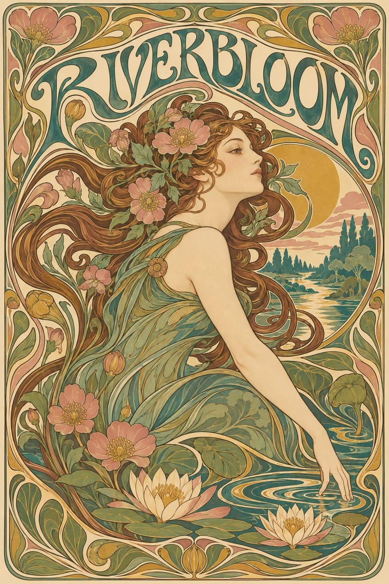
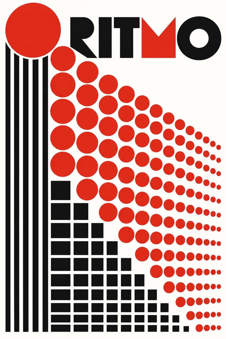
Art Nouveau × Mechano-Faktura
Whiplash curves and ornament against strict mechanical lines.
01
What each style brings
Each part of the design comes from the style with the stronger say in it, and each style gives at least two.
Art Nouveau Mechano-Faktura & Polish Constructivist Advertising
- Type from Art Nouveau
- Colour from Mechano-Faktura
- Form from Art Nouveau
- Composition from Mechano-Faktura
-
Art Nouveau avoids modular grid: this is where the two pull against each other, which is the point of the contrast.
- Surface from Art Nouveau
02
The type
Open fonts standing in for each style’s own type, which is often hand-drawn or commercial.
Text · Mechano-Faktura
Henryk Berlewi's system of two-dimensional pictures built mechanically from rhythmic parallel lines, circles and squares in black, white and red. It rejected the illusion of space and was promptly applied to commercial advertising, brochures and packaging by the agency Reklama-Mechano. Unlike Russian Constructivism, it was a theory of mechanical surface texture sold to business, with no photomontage, diagonals or agitprop. Berlewi quit the research in 1926 and returned to figurative art.
Jost; Mechano-Faktura used Lettering not verified; no typeface attribution confirmed and Geometric sans-serif display lettering is an unconfirmed assumption
03
The colours
The ground and leading colours come from Mechano-Faktura, with a counter-accent from Art Nouveau. The ink reads on the ground at 4.5:1 or more.
Art Nouveau Mechano-Faktura & Polish Constructivist Advertising
-
#ffffffground · 36% -
#111111ink · 14% -
#d62718accent · 18% -
#c9a24baccent · 14% -
#3f7a75accent · 10% -
#d9a6a0accent · 8%
As CSS
:root {
  --ground: #ffffff;
  --ink: #111111;
  --accent-1: #d62718;
  --accent-2: #c9a24b;
  --accent-3: #3f7a75;
  --accent-4: #d9a6a0;
  --font-display: "Federant", sans-serif;
  --font-text: "Jost", sans-serif;
}
04
The two styles
05
More combinations
With Art Nouveau
- Fileteado Porteño Pairs well · Fileteado's acanthus scrolls share the whiplash; combine them for ornate, hand-made lettering frames.
- International Typographic Style Contrasts · Ornamental curves against an orthogonal grid make a strong deliberate tension; let one botanical flourish break a cold grid.
- Psychedelic Poster Pairs well · San Francisco poster artists lifted Mucha's figures and whiplash wholesale; push the curves into saturated, vibrating colour for a 1960s-flavoured revival.
- Russian Constructivism Contrasts · Organic sensuality versus machine-age diagonals: use the opposition to stage nature against industry.
- Vienna Secession Contrasts · Set French whiplash against the Viennese square to show the turn from organic to geometric ornament within one decorative idiom.
- Skønvirke (Danish Art Nouveau, Bindesbøll) Contrasts · Shares the hand-lettering and abundance but swaps the whiplash line and the female figure for blunt abstract masses; set side by side they show the heavy Danish variant.
- Expressionist Woodcut Graphics Contrasts · The parent's smooth whiplash and floral harmony is exactly what the gouge splinters; use one against the other to stage order breaking down.
- Beggarstaffs Poster (Nicholson & Pryde) Contrasts · Its curving floral line is the opposite of cut masses; set side by side to show how much a poster can drop.
With Mechano-Faktura
- Die Neue Typographie Pairs well · Pair the line-field image with asymmetric sans setting for an advertising layout.
- De Stijl Pairs well · Shared flat colour and orthogonal discipline; swap the Dutch primaries for red-black-white.
- Suprematism Pairs well · Borrow its flat geometric primitives, then fill them with Berlewi's mechanical line rhythm.