Style combination · Pairs well
Mechano-Faktura × Die Neue Typographie
Pair the line-field image with asymmetric sans setting for an advertising layout.
Mix them and make something Mechano-Faktura Die Neue Typographie
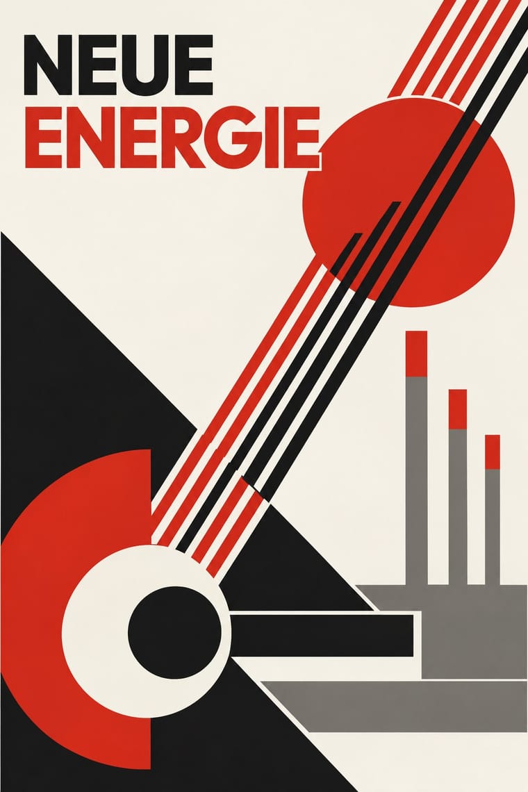
01
What each style brings
Each part of the design comes from the style with the stronger say in it, and each style gives at least two.
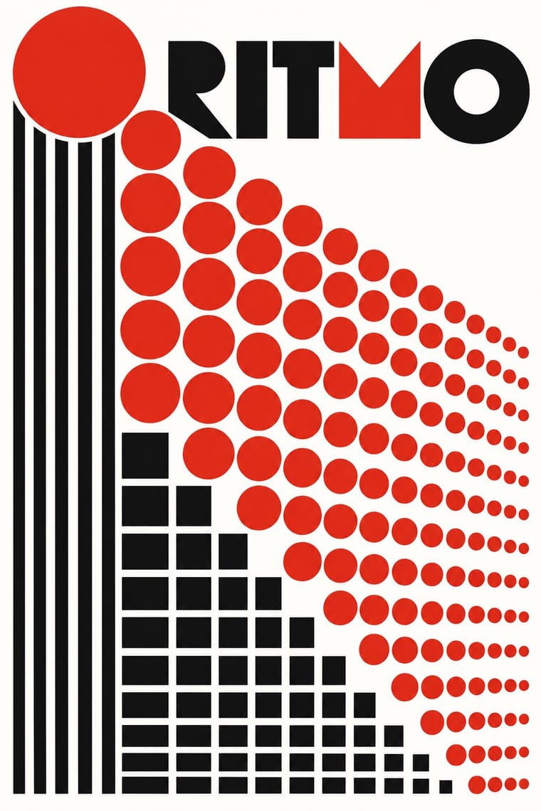
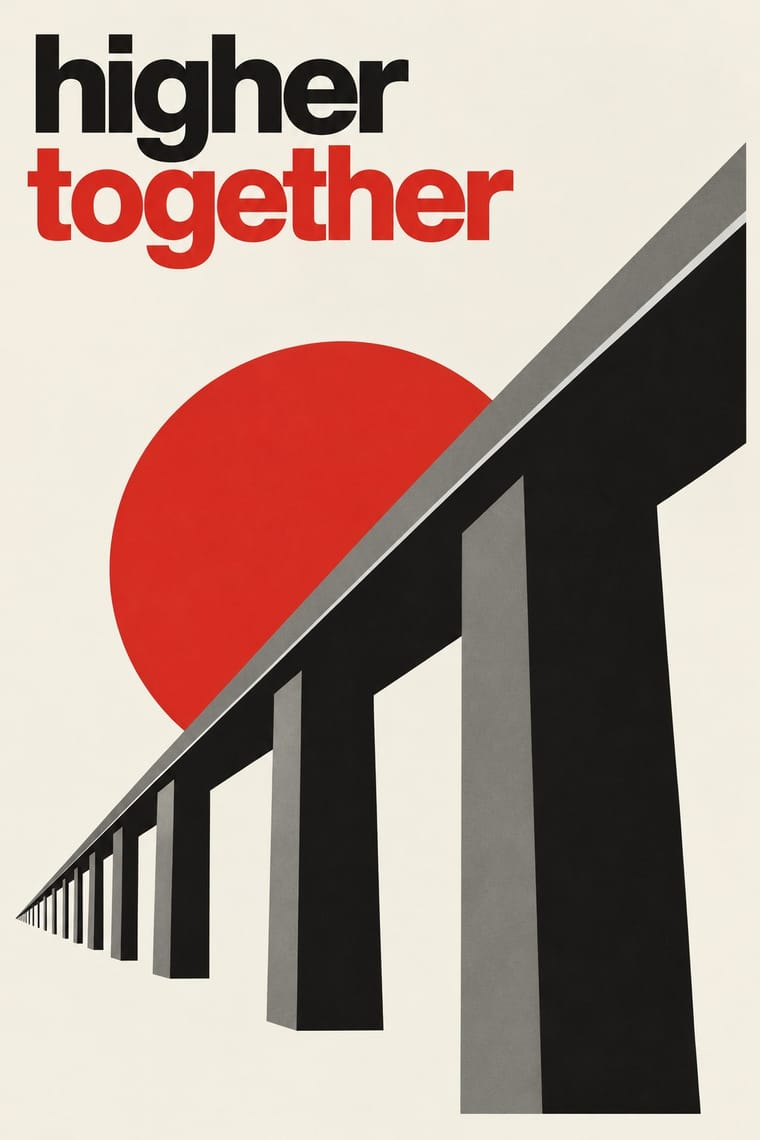
Mechano-Faktura & Polish Constructivist Advertising Die Neue Typographie
- Type from Die Neue Typographie
- Colour from Mechano-Faktura
- Form from Mechano-Faktura
- Composition from Die Neue Typographie
- Surface from Mechano-Faktura
02
The type
Open fonts standing in for each style’s own type, which is often hand-drawn or commercial.
Text · Die Neue Typographie
The programme that turned avant-garde experiment into a functional typographic method, named by Moholy-Nagy in 1923 and codified in Jan Tschichold's 'elementare typographie' (1925) and Die neue Typographie (1928). It demanded asymmetric layouts, sans-serif type, standard paper formats, photography and active white space, all justified by clarity of communication, and spread through the Ring neue Werbegestalter and designers from Delft to Prague.
Jost; Die Neue Typographie used Futura and Akzidenz-Grotesk
03
The colours
The ground and leading colours come from Mechano-Faktura, with a counter-accent from Die Neue Typographie. The ink reads on the ground at 4.5:1 or more.
Mechano-Faktura & Polish Constructivist Advertising Die Neue Typographie
-
#ffffffground · 39% -
#111111ink · 15% -
#d62718accent · 20% -
#e2dccbaccent · 15% -
#7d7a73accent · 11%
As CSS
:root {
  --ground: #ffffff;
  --ink: #111111;
  --accent-1: #d62718;
  --accent-2: #e2dccb;
  --accent-3: #7d7a73;
  --font-display: "Jost", sans-serif;
  --font-text: "Jost", sans-serif;
}
04
The two styles
05
More combinations
With Mechano-Faktura
- De Stijl Pairs well · Shared flat colour and orthogonal discipline; swap the Dutch primaries for red-black-white.
- Art Nouveau Contrasts · Whiplash curves and ornament against strict mechanical lines.
- Suprematism Pairs well · Borrow its flat geometric primitives, then fill them with Berlewi's mechanical line rhythm.
With Die Neue Typographie
- Risograph & Indie Print Culture Pairs well · Two-colour riso printing suits its black-plus-red restraint for low-budget editorial and posters.
- Cranbrook & Deconstructivist Typography Contrasts · Cranbrook dismantled exactly these rules; state one New Typography convention clearly, then break it on purpose.
- International Typographic Style Pairs well · Extend its asymmetric black-and-red onto a full modular grid for a seamless Swiss-era update.
- Renaissance Book Typography Contrasts · Tschichold himself returned to the centred classical page; set the two side by side to choose between symmetric tradition and asymmetric function.
- Post-Punk Record Sleeve (Stiff, Factory, 4AD) Pairs well · Saville's model: borrow Tschichold's asymmetric placement and small sans-serif capitals, then replace his photographs with one quoted image to get a cool, ordered sleeve.
- Brodovitch Editorial Design (Harper's Bazaar) Contrasts · Asymmetry without rules: improvised and photographic rather than systematic.
- German Book Art Movement (Buchkunstbewegung) Contrasts · From the mid-1920s the Bauhaus and the New Typography took over the avant-garde of the book; centred hand-press pages against asymmetric sans-serif layouts make a clear old-against-new tension.
- ECM Sleeve Aesthetic (Munich) Pairs well · Barbara Wojirsch named Tschichold as an influence: borrow his asymmetric blocks of small sans-serif type and set them beside one quiet photograph instead of his photomontage.