Style combination · Contrasts
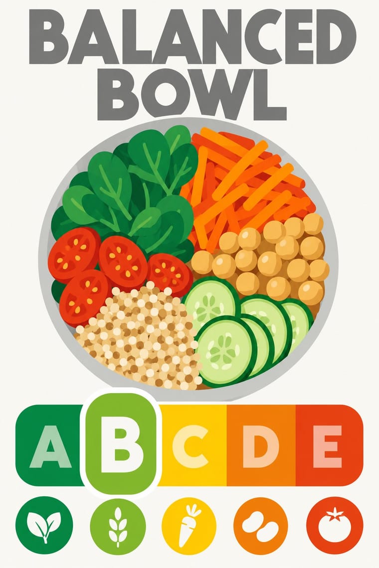
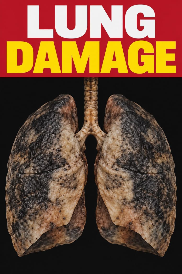
Nutri-Score × Plain Tobacco Packaging
Plain packaging strips the brand and hands the face to the state; Nutri-Score leaves the brand intact and adds a small standardised inset in the lower third. Decide whether the public message should replace the design or sit inside it.
Mix them and make something Nutri-Score Plain Tobacco Packaging
01
What each style brings
Each part of the design comes from the style with the stronger say in it, and each style gives at least two.
Nutri-Score (Front-of-Pack Colour-Grade Label) Plain Tobacco Packaging
- Type from Nutri-Score
- Colour from Plain Tobacco Packaging
- Form from Plain Tobacco Packaging
- Composition from Nutri-Score
- Surface from Nutri-Score
02
The type
Open fonts standing in for each style’s own type, which is often hand-drawn or commercial.
Display · Nutri-Score
Form
Jost, standing in for The logo's own lettering: a heavy geometric sans in capitals for the grey 'NUTRI-SCORE' heading and the white and tinted A–E grades, supplied only as vector outlines in the charter's Illustrator files; the charter's rule is 'Don't change fonts'
Text · Plain Tobacco Packaging
A packaging language written into law to strip tobacco of persuasion. Since Australia's Tobacco Plain Packaging Act 2011 (all retail packs from 1 December 2012), logos, brand colours, imagery and embossing are banned: every pack is a rigid, matt rectangle in Pantone 448C 'drab dark brown', chosen in consumer testing as the least appealing colour. Clinical photographs of disease under bold Helvetica capitals fill most of the front and back, and the brand survives as one small centred line of grey sans-serif, with the variant name on a smaller line below. More than twenty countries followed.
Inter; Plain Tobacco Packaging used Lucida Sans (Charles Bigelow and Kris Holmes) and Helvetica (Max Miedinger with Eduard Hoffmann, 1957)
03
The colours
The ground and leading colours come from Plain Tobacco Packaging, with a counter-accent from Nutri-Score. The ink reads on the ground at 4.5:1 or more.
Nutri-Score (Front-of-Pack Colour-Grade Label) Plain Tobacco Packaging
-
#111111ground · 36% -
#ffffffink · 14% -
#ffd100accent · 18% -
#ee8100accent · 14% -
#c8102eaccent · 10% -
#e63e11accent · 8%
As CSS
:root {
  --ground: #111111;
  --ink: #ffffff;
  --accent-1: #ffd100;
  --accent-2: #ee8100;
  --accent-3: #c8102e;
  --accent-4: #e63e11;
  --font-display: "Jost", sans-serif;
  --font-text: "Inter", sans-serif;
}
Use it with care
Nutri-Score (Front-of-Pack Colour-Grade Label): Nutri-Score is an EU trade mark of Santé publique France, licensed to food firms only under its conditions of use, and a grade printed on a pack is a nutrition claim. Do not put the real logo or a convincing imitation on products, mock-ups or generated images in a way that could pass for a genuine score; for fictional or teaching work, change the name or say clearly that the grade is illustrative, and check the current algorithm before showing any real product's letter.
Plain Tobacco Packaging: Graphic health warnings show real disease and are official public-health instruments; WHO's warning database lists the Australian Government as the owner of its warning images, which it may license to other countries free of charge. Use the shock imagery only for genuine health communication, never as decoration or as a parody that could mislead about a product's risks, and check the terms before reproducing a country's actual warning photographs or mandated layouts. Respect the dignity of the people pictured, never generate imagery that could pass for an official warning, and do not turn the drab-pack look into anti-brand styling for tobacco, vaping or nicotine products, which would make a tool against persuasion persuasive again.
04
The two styles
05
More combinations
With Nutri-Score
- Material Design Pairs well · Rounded tiles, a fixed colour ramp and one raised selected state behave like a UI rating chip; Material's elevation and state rules suit screen versions of the grade in shopping apps.
- Isotype Pictorial Statistics Pairs well · Both turn data into a sign anyone can read at a glance; borrow Isotype's repeated pictograms to explain the five grades on shelf talkers, leaflets or school material.
- British Road Signage (Kinneir & Calvert) Pairs well · Both are public signs built from a manual of fixed sizes, colours and clear zones; take the road-sign discipline when a colour-scale rating has to be applied by thousands of firms without drifting.
- Front-of-Pack Warning Octagons (Latin American Food Warning Seals) Contrasts · The Latin American seals warn in black, one nutrient at a time, by law; Nutri-Score grades the whole food on a coloured five-step scale and is voluntary in most countries. Choose the octagon to stop a purchase and the colour scale to steer a comparison.
With Plain Tobacco Packaging
- GOV.UK Design (GDS Style) Pairs well · Another state system of fixed constants where each colour has one job; borrow its plain wording and one-message-per-surface discipline for the leaflets and screens that sit around a health warning.
- HfG Ulm Systematic Design Contrasts · Ulm's coded colours, single type family and manual built recognition for Braun and Lufthansa; plain packaging uses the same rule-bound specification to erase it, a reminder that a design system can suppress identity as well as build it.
- ACT UP & Gran Fury AIDS Activist Graphics Pairs well · Gran Fury's white capitals on black are the activist cousin of the mandated warning statement; borrow their wit when a health message must persuade without leaning on clinical shock photographs.
- DTC 'Blanding' / Millennial Minimalism Contrasts · Both reduce a pack to one colour and a small sans-serif name, but blanding picks a pleasing pastel to seduce and plain packaging picks the least appealing shade to repel; choose the colour first, because it decides which way the reduction works.
- Cuban Tobacco Lithography (Habilitaciones & Marquillas) Contrasts · The gilded, embossed and bordered cigar label is everything a plain pack is forbidden to be; set the two side by side to show how much of tobacco's appeal was carried by ornament alone.
- Front-of-Pack Warning Octagons (Latin American Food Warning Seals) Contrasts · Plain packaging erases the brand and hands the face to a shock photograph; the octagons leave the brand intact and add a small, uniform black sign. Choose between them by deciding whether the warning should replace the design or interrupt it.
- Analog Horror Graphics Contrasts · Both frighten with the flat, mandatory voice of an official warning: plain packaging does it for real, in print, with matt drab brown, clinical photographs and Helvetica capitals; analog horror fakes it on a screen and lets the signal decay. Borrow plain packaging's uncompromising flatness for a fictional warning screen, and save the noise for the moment the threat appears.
- Muji No-Brand Design (Mujirushi Ryohin) Contrasts · Both strip branding, but one is a regulatory sanction in drab brown and the other a voluntary, serene choice.