Style combination · Contrasts
Front-of-Pack Warning Octagons × Nutri-Score
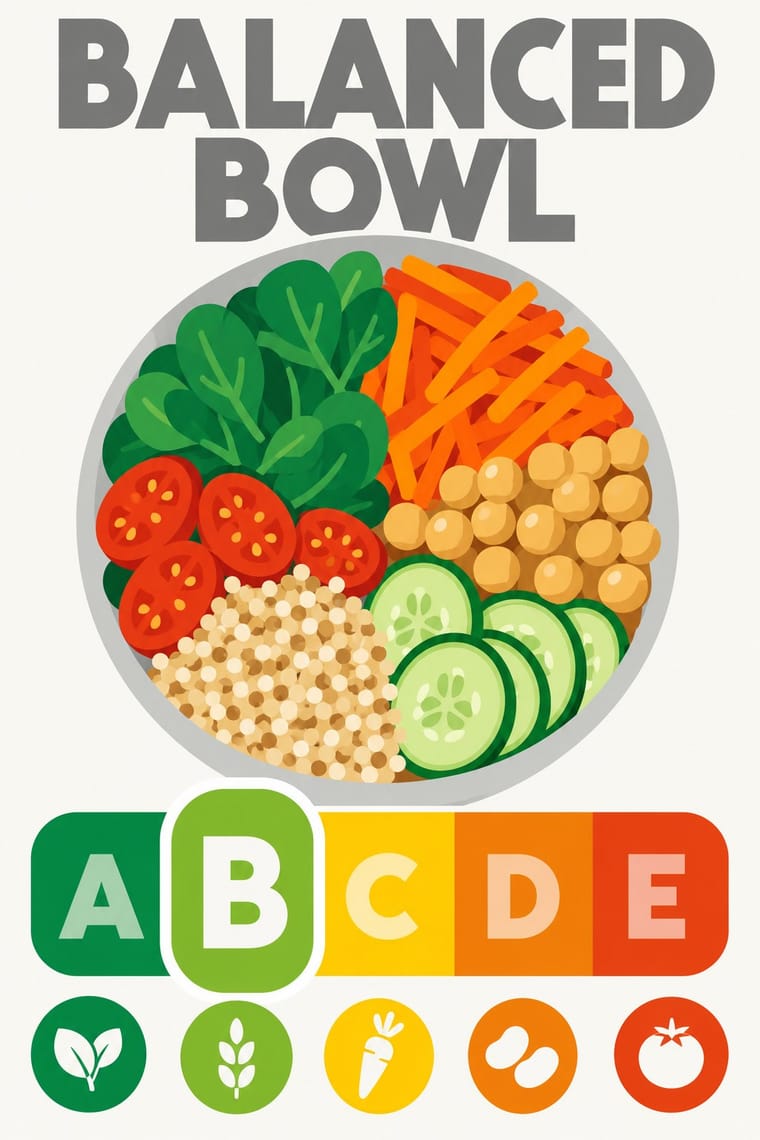
The Latin American seals warn in black, one nutrient at a time, by law; Nutri-Score grades the whole food on a coloured five-step scale and is voluntary in most countries. Choose the octagon to stop a purchase and the colour scale to steer a comparison.
Mix them and make something Front-of-Pack Warning Octagons Nutri-Score
01
What each style brings
Each part of the design comes from the style with the stronger say in it, and each style gives at least two.
Front-of-Pack Warning Octagons (Latin American Food Warning Seals) Nutri-Score (Front-of-Pack Colour-Grade Label)
- Type from Nutri-Score
- Colour from Front-of-Pack Warning Octagons
- Form from Front-of-Pack Warning Octagons
- Composition from Nutri-Score
- Surface from Front-of-Pack Warning Octagons
02
The type
Open fonts standing in for each style’s own type, which is often hand-drawn or commercial.
Display · Nutri-Score
Order
Jost, standing in for The logo's own lettering: a heavy geometric sans in capitals for the grey 'NUTRI-SCORE' heading and the white and tinted A–E grades, supplied only as vector outlines in the charter's Illustrator files; the charter's rule is 'Don't change fonts'
Text · Front-of-Pack Warning Octagons
A state warning system stacked on commercial food packs. Under Chile's Law 20.606 and Decree 13 (in force 27 June 2016), every packaged food with added sugars, sodium or saturated fat that exceeds the limits for those nutrients or for calories carries one black octagon per nutrient: a stop-sign shape with a white margin, 'ALTO EN' and the nutrient in white Arial Bold capitals, signed by the health ministry and clustered near the top right of the front. The brand design survives, but sealed packs lose child-directed characters and toys. Peru, Uruguay, Mexico, Argentina and Colombia followed.
Inter; Front-of-Pack Warning Octagons used Arial Bold (Robin Nicholas and Patricia Saunders for Monotype, 1982) and Arial Bold in Mexico's NOM-051, Appendix A (A.2.2)
03
The colours
The ground and leading colours come from Front-of-Pack Warning Octagons, with a counter-accent from Nutri-Score. The ink reads on the ground at 4.5:1 or more.
Front-of-Pack Warning Octagons (Latin American Food Warning Seals) Nutri-Score (Front-of-Pack Colour-Grade Label)
-
#000000ground · 36% -
#ffffffink · 14% -
#ffcc00accent · 18% -
#ee8100accent · 14% -
#e30613accent · 10% -
#e63e11accent · 8%
As CSS
:root {
  --ground: #000000;
  --ink: #ffffff;
  --accent-1: #ffcc00;
  --accent-2: #ee8100;
  --accent-3: #e30613;
  --accent-4: #e63e11;
  --font-display: "Jost", sans-serif;
  --font-text: "Inter", sans-serif;
}
Use it with care
Front-of-Pack Warning Octagons (Latin American Food Warning Seals): The octagons are legal instruments owned by health ministries, and imitating them on real products, in advertising or in generated images can mislead shoppers about a food's composition or pass for an official warning. Use the visual language for health communication, research or clearly fictional work, check each country's current specification before reproducing a seal, and do not turn the warning into decoration or a parody that could make a sign meant to discourage consumption appealing again.
Nutri-Score (Front-of-Pack Colour-Grade Label): Nutri-Score is an EU trade mark of Santé publique France, licensed to food firms only under its conditions of use, and a grade printed on a pack is a nutrition claim. Do not put the real logo or a convincing imitation on products, mock-ups or generated images in a way that could pass for a genuine score; for fictional or teaching work, change the name or say clearly that the grade is illustrative, and check the current algorithm before showing any real product's letter.
04
The two styles
05
More combinations
With Front-of-Pack Warning Octagons
- Plain Tobacco Packaging Contrasts · Plain packaging erases the brand and hands the face to a shock photograph; the octagons leave the brand intact and add a small, uniform black sign. Choose between them by deciding whether the warning should replace the design or interrupt it.
- Yuru-chara (Japanese Local Mascot Design) Contrasts · Mascot design is exactly what a sealed pack must give up in Chile and Mexico; put the two side by side to show how much of a snack's appeal is carried by a character.
- ACT UP & Gran Fury AIDS Activist Graphics Pairs well · Both speak in white bold capitals on black; take Gran Fury's wit when a nutrition campaign must persuade around the shelf rather than only on the pack.
- Corporate Identity Modernism Pairs well · The seal is built like a corporate mark, from a unit grid, one typeface, one colour and a size table; borrow the standards-manual discipline when a public-health sign must stay identical across thousands of packs.
With Nutri-Score
- Plain Tobacco Packaging Contrasts · Plain packaging strips the brand and hands the face to the state; Nutri-Score leaves the brand intact and adds a small standardised inset in the lower third. Decide whether the public message should replace the design or sit inside it.
- Material Design Pairs well · Rounded tiles, a fixed colour ramp and one raised selected state behave like a UI rating chip; Material's elevation and state rules suit screen versions of the grade in shopping apps.
- Isotype Pictorial Statistics Pairs well · Both turn data into a sign anyone can read at a glance; borrow Isotype's repeated pictograms to explain the five grades on shelf talkers, leaflets or school material.
- British Road Signage (Kinneir & Calvert) Pairs well · Both are public signs built from a manual of fixed sizes, colours and clear zones; take the road-sign discipline when a colour-scale rating has to be applied by thousands of firms without drifting.