Style combination · Pairs well
Isotype Pictorial Statistics × Nutri-Score
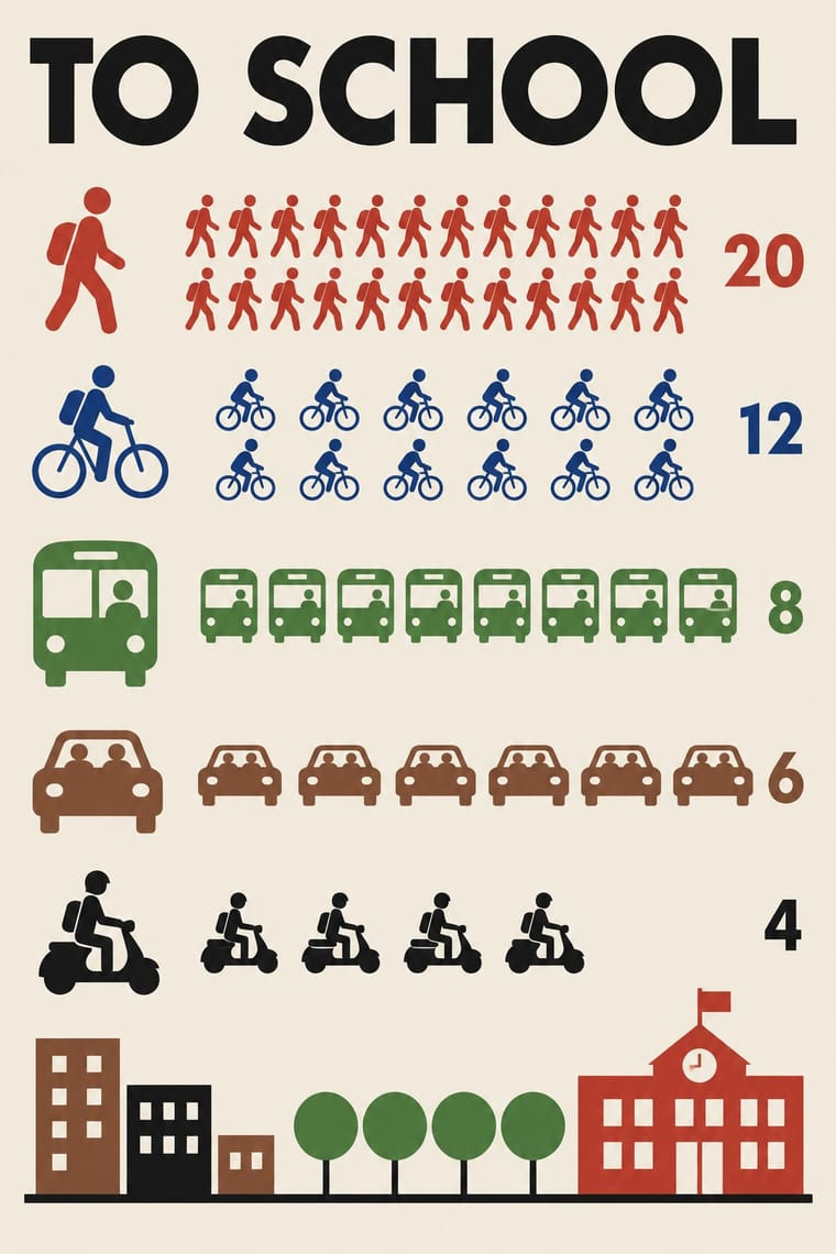
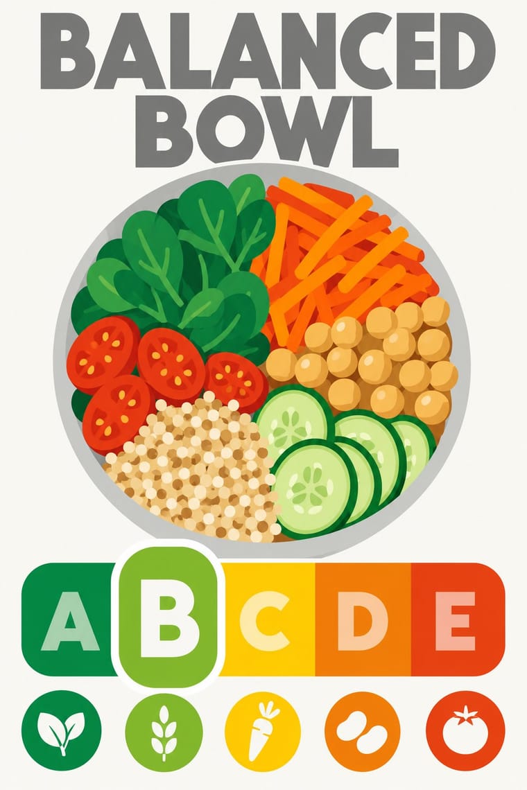
Both turn data into a sign anyone can read at a glance; borrow Isotype's repeated pictograms to explain the five grades on shelf talkers, leaflets or school material.
Mix them and make something Isotype Pictorial Statistics Nutri-Score
01
What each style brings
Each part of the design comes from the style with the stronger say in it, and each style gives at least two.
Isotype Pictorial Statistics Nutri-Score (Front-of-Pack Colour-Grade Label)
- Type from Nutri-Score
- Colour from Isotype Pictorial Statistics
- Form from Isotype Pictorial Statistics
- Composition from Nutri-Score
- Surface from Isotype Pictorial Statistics
02
The type
Open fonts standing in for each style’s own type, which is often hand-drawn or commercial.
Display · Nutri-Score
Index
Jost, standing in for The logo's own lettering: a heavy geometric sans in capitals for the grey 'NUTRI-SCORE' heading and the white and tinted A–E grades, supplied only as vector outlines in the charter's Illustrator files; the charter's rule is 'Don't change fonts'
Text · Nutri-Score
A small, fixed public-health sign that grades a whole food instead of warning about one nutrient. A white rounded box holds a grey 'NUTRI-SCORE' heading in heavy geometric capitals over five tiles from dark green A to dark orange E; the product's own letter swells into a taller capsule with a white keyline while the other four letters fade to tints. Owned as a trade mark by Santé publique France and voluntary, it is built from fixed modules, six fixed colours and a minimum size, and sits in the lower third of the pack front.
Jost; Nutri-Score used The logo's own lettering and Raleway, the open-source geometric sans in which Santé publique France sets the graphic charter itself, from light text weights to Black display
03
The colours
The ground and leading colours come from Isotype Pictorial Statistics, with a counter-accent from Nutri-Score. The ink reads on the ground at 4.5:1 or more.
Isotype Pictorial Statistics Nutri-Score (Front-of-Pack Colour-Grade Label)
-
#f2ecdfground · 36% -
#1a1a1aink · 14% -
#c8372daccent · 18% -
#ee8100accent · 14% -
#2c5aa0accent · 10% -
#8a5a3baccent · 8%
As CSS
:root {
  --ground: #f2ecdf;
  --ink: #1a1a1a;
  --accent-1: #c8372d;
  --accent-2: #ee8100;
  --accent-3: #2c5aa0;
  --accent-4: #8a5a3b;
  --font-display: "Jost", sans-serif;
  --font-text: "Jost", sans-serif;
}
Use it with care
Nutri-Score (Front-of-Pack Colour-Grade Label): Nutri-Score is an EU trade mark of Santé publique France, licensed to food firms only under its conditions of use, and a grade printed on a pack is a nutrition claim. Do not put the real logo or a convincing imitation on products, mock-ups or generated images in a way that could pass for a genuine score; for fictional or teaching work, change the name or say clearly that the grade is illustrative, and check the current algorithm before showing any real product's letter.
04
The two styles
05
More combinations
With Isotype Pictorial Statistics
- International Typographic Style Pairs well · Set Isotype rows of pictograms on a Swiss grid for public information that is rigorous yet friendly.
- Socialist Realist Propaganda Poster Contrasts · Socialist Realism dramatises with heroic figures while Isotype persuades by counting; choose evidence over emotion when trust matters.
- Flat Design Pairs well · Flat icon sets are Isotype's heirs; apply its one-symbol-one-meaning rule to keep an icon family consistent.
- Corporate Memphis Contrasts · Corporate Memphis uses flat figures for mood; Isotype's figures always count something, so use people icons only when they carry data.
- Ancient Egyptian Hieroglyphic & Register Composition Pairs well · Otto Neurath called his visual autobiography From hieroglyphics to Isotype, with chapters on hieroglyphics through the centuries and their renaissance; borrow the rule-bound sign family and rows of standing figures, but note the opposite rule of size: Isotype shows more by adding signs of equal size, Egypt shows rank by making one figure bigger.
- Data Humanism Contrasts · Isotype fixes one standard sign per thing and counts by repeating it so anyone can read the chart; data humanism invents a new code for each dataset and asks for slow reading. Choose Isotype for public information, data humanism for portraits of particular lives.
- Schematic Transit Diagram (Beck Tube Map Idiom) Pairs well · Add pictorial statistics beside the diagram to carry quantities as well as connections.
- Warli Painting Contrasts · Both build people from a few reduced shapes and repeat them in rows; Isotype's figures count data in flat colours on a light ground, Warli's narrate ritual and village life in white on earth, so borrow the repetition but not the meaning.
With Nutri-Score
- Plain Tobacco Packaging Contrasts · Plain packaging strips the brand and hands the face to the state; Nutri-Score leaves the brand intact and adds a small standardised inset in the lower third. Decide whether the public message should replace the design or sit inside it.
- Material Design Pairs well · Rounded tiles, a fixed colour ramp and one raised selected state behave like a UI rating chip; Material's elevation and state rules suit screen versions of the grade in shopping apps.
- British Road Signage (Kinneir & Calvert) Pairs well · Both are public signs built from a manual of fixed sizes, colours and clear zones; take the road-sign discipline when a colour-scale rating has to be applied by thousands of firms without drifting.
- Front-of-Pack Warning Octagons (Latin American Food Warning Seals) Contrasts · The Latin American seals warn in black, one nutrient at a time, by law; Nutri-Score grades the whole food on a coloured five-step scale and is voluntary in most countries. Choose the octagon to stop a purchase and the colour scale to steer a comparison.