Style combination · Contrasts
Claymorphism × Neumorphism
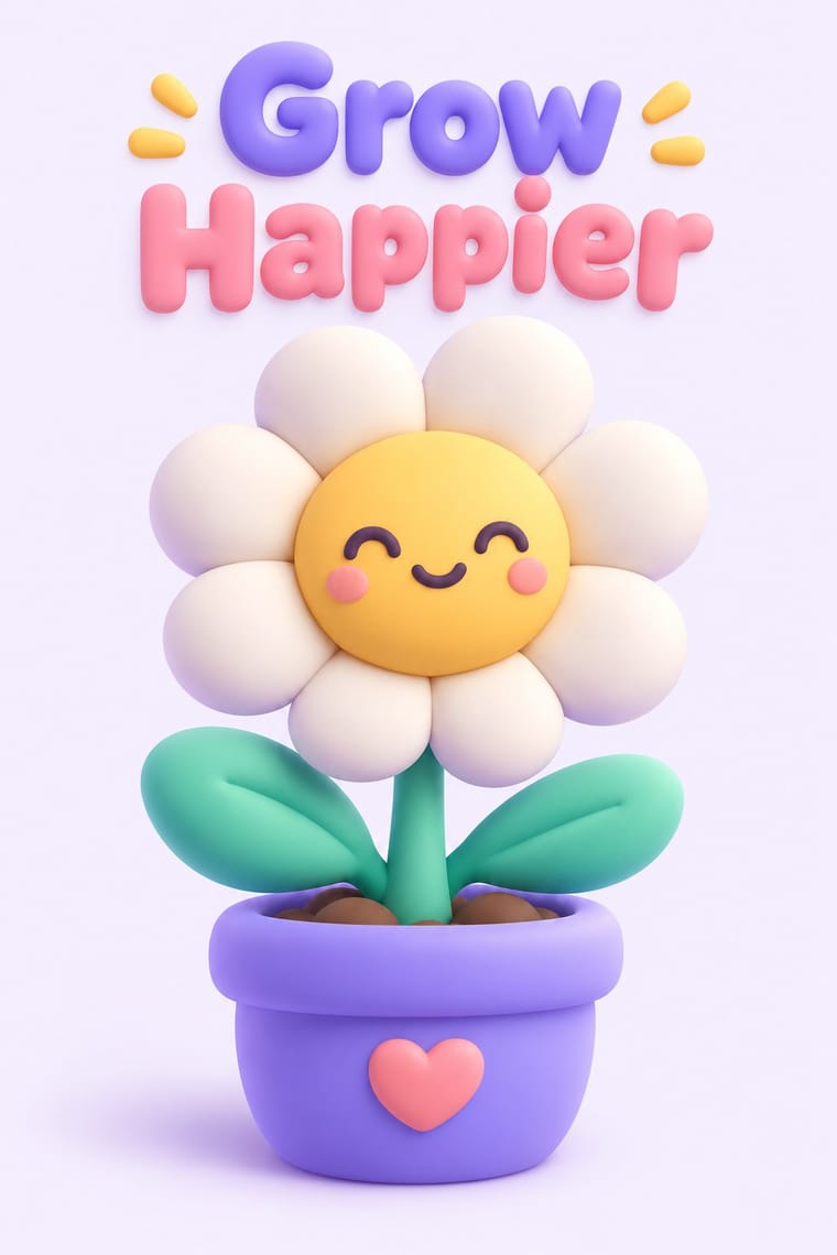
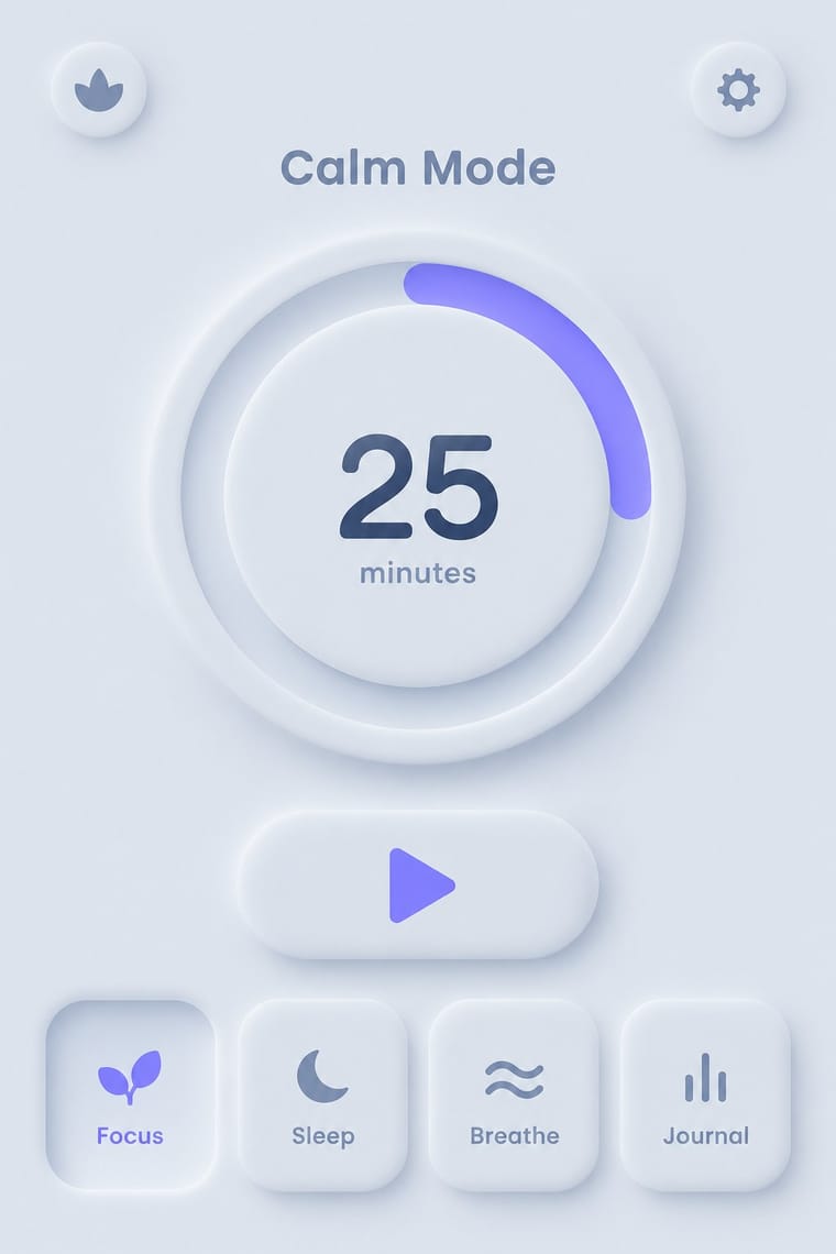
Neumorphism presses monochrome controls out of a same-coloured surface with paired outer shadows; claymorphism inflates them into separately coloured objects that cast one drop shadow, so switch to it when soft relief loses contrast and every control starts to look like a button.
01
What each style brings
Each part of the design comes from the style with the stronger say in it, and each style gives at least two.
Claymorphism & Soft 3D Neumorphism
- Type from Claymorphism
- Colour from Neumorphism
- Form from Claymorphism
- Composition from Claymorphism
- Surface from Neumorphism
02
The type
Open fonts standing in for each style’s own type, which is often hand-drawn or commercial.
Display · Claymorphism
Wow
Bagel Fat One, standing in for Rounded sans-serifs with soft terminals, such as Nunito (Vernon Adams) or VAG Rounded, only for the most childlike or playful products: they echo the inflated shapes but add to the toy-like feel that the minimal type is meant to balance
Text · Neumorphism
A short-lived interface trend in which controls are extruded from, or pressed into, a background of the same colour and modelled only by paired soft shadows. Sparked by Alexander Plyuto's 2019 Dribbble banking-app concept and named on UX Collective, it revived skeuomorphic tactility in a monochrome, minimal form, then faded quickly over its weak contrast and poor accessibility.
Jost; Neumorphism used Poppins and Nunito
03
The colours
The ground and leading colours come from Neumorphism, with a counter-accent from Claymorphism. The ink reads on the ground at 4.5:1 or more.
Claymorphism & Soft 3D Neumorphism
-
#ffffffground · 36% -
#31456aink · 14% -
#6c63ffaccent · 18% -
#ffd36eaccent · 14% -
#a3b1c6accent · 10% -
#ff9fb6accent · 8%
As CSS
:root {
  --ground: #ffffff;
  --ink: #31456a;
  --accent-1: #6c63ff;
  --accent-2: #ffd36e;
  --accent-3: #a3b1c6;
  --accent-4: #ff9fb6;
  --font-display: "Bagel Fat One", sans-serif;
  --font-text: "Jost", sans-serif;
}
04
The two styles
05
More combinations
With Claymorphism
- Kawaii Design Pairs well · Kawaii's oversized heads, minimal faces and scattered sparkles translate directly into clay volumes; use its character rules for mascots and emoji so the 3D figures stay simple and readable at small sizes.
- Corporate Memphis Contrasts · It does the same friendly job in tech marketing with flat vectors; render the figures as volumes to escape the over-familiar flat look, or go back to flat when 3D production is too slow or icons must work at tiny sizes.
- Glassmorphism Pairs well · Set opaque clay icons on or behind frosted glass panes: the blur gives the toys a layered backdrop, and the solid objects anchor translucent cards that would otherwise drift.
- Y2K Futurism Contrasts · Both float rounded 3D renders on pale grounds, but Y2K is chrome, liquid metal and translucent candy plastic sold as the future; keep claymorphism opaque, soft and cute, with satin or matte surfaces and at most a soft highlight, and borrow chrome only for a retro-tech joke.
- Neo-Brutalism Contrasts · Neo-brutalism's black outlines and hard, unblurred offset shadows are the crisp counterpart to clay's soft blurred ones; borrow a solid outline for focus states when the inflated cards need sharper edges.
- Low Poly Illustration Contrasts · Both float one rendered object on a pale ground, but clay is inflated, rounded and softly shaded while low poly is cut into hard facets with stepped tones; choose clay for warmth and touch, low poly for crispness and a constructed, mineral feel.
- Biobrand (Organic Biotech CGI) Contrasts · Both float soft 3D forms on pale grounds, but clay is opaque, cute and interface-bound, while the biobrand is translucent, intricate and biological; use clay for friendlier app icons.
- Isometric Tech Illustration Contrasts · Soft, inflated 3D forms against crisp axonometric blocks: the same toy worlds, rendered rather than projected.
With Neumorphism
- Neo-Brutalism Contrasts · Neo-brutalism's black outlines and hard offset shadows solve neumorphism's contrast problem; borrow a crisp border for focus states.
- Minimalist Graphic Design Pairs well · Neumorphic relief only reads in near-empty layouts; apply minimalist restraint so a few controls carry the whole surface.
- HfG Ulm Systematic Design Pairs well · Model controls on Braun-style product design from the Ulm tradition: knobs, sliders and grilles that look moulded from one material.
- Material Design Contrasts · Material's crisp, directional elevation shadows are the accessible answer to neumorphism's ambiguous soft relief; compare both when tuning shadow contrast.
- Skeuomorphic UI Pairs well · Neumorphism keeps the light source and extrusion but drops the textures; borrow one material cue to give soft UI more character.