Style combination · Pairs well
Neumorphism × HfG Ulm Systematic Design
Model controls on Braun-style product design from the Ulm tradition: knobs, sliders and grilles that look moulded from one material.
Mix them and make something Neumorphism HfG Ulm Systematic Design
01
What each style brings
Each part of the design comes from the style with the stronger say in it, and each style gives at least two.
Neumorphism HfG Ulm Systematic Design
- Type from HfG Ulm Systematic Design
- Colour from HfG Ulm Systematic Design
- Form from Neumorphism
- Composition from Neumorphism
- Surface from Neumorphism
02
The type
Open fonts standing in for each style’s own type, which is often hand-drawn or commercial.
Text · Neumorphism
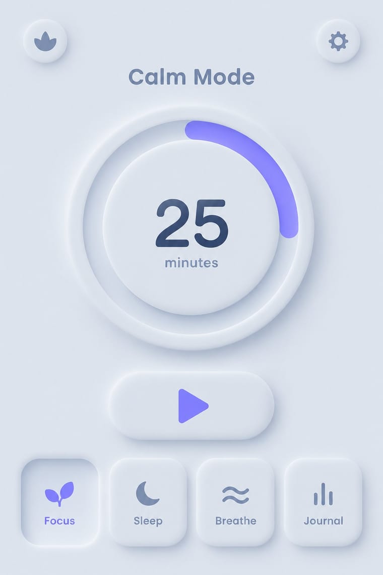
A short-lived interface trend in which controls are extruded from, or pressed into, a background of the same colour and modelled only by paired soft shadows. Sparked by Alexander Plyuto's 2019 Dribbble banking-app concept and named on UX Collective, it revived skeuomorphic tactility in a monochrome, minimal form, then faded quickly over its weak contrast and poor accessibility.
Jost; Neumorphism used Poppins and Nunito
03
The colours
The ground and leading colours come from HfG Ulm Systematic Design, with a counter-accent from Neumorphism. The ink reads on the ground at 4.5:1 or more.
Neumorphism HfG Ulm Systematic Design
-
#f4f4f1ground · 36% -
#1b1b1bink · 14% -
#f2b01eaccent · 18% -
#6c63ffaccent · 14% -
#8a8d8faccent · 10% -
#a3b1c6accent · 8%
As CSS
:root {
  --ground: #f4f4f1;
  --ink: #1b1b1b;
  --accent-1: #f2b01e;
  --accent-2: #6c63ff;
  --accent-3: #8a8d8f;
  --accent-4: #a3b1c6;
  --font-display: "Inter Tight", sans-serif;
  --font-text: "Jost", sans-serif;
}
04
The two styles
05
More combinations
With Neumorphism
- Neo-Brutalism Contrasts · Neo-brutalism's black outlines and hard offset shadows solve neumorphism's contrast problem; borrow a crisp border for focus states.
- Minimalist Graphic Design Pairs well · Neumorphic relief only reads in near-empty layouts; apply minimalist restraint so a few controls carry the whole surface.
- Material Design Contrasts · Material's crisp, directional elevation shadows are the accessible answer to neumorphism's ambiguous soft relief; compare both when tuning shadow contrast.
- Claymorphism & Soft 3D Contrasts · Neumorphism presses monochrome controls out of a same-coloured surface with paired outer shadows; claymorphism inflates them into separately coloured objects that cast one drop shadow, so switch to it when soft relief loses contrast and every control starts to look like a button.
- Skeuomorphic UI Pairs well · Neumorphism keeps the light source and extrusion but drops the textures; borrow one material cue to give soft UI more character.
With HfG Ulm Systematic Design
- Victorian Letterpress & Wood Type Contrasts · A Victorian mixed-face handbill is the clutter Ulm's one-family rule was meant to cure; use it as a before-and-after foil.
- Dada Contrasts · Dada's chance operations expose what Ulm's method suppresses; one deliberately random element can humanise an over-engineered system.
- Isotype Pictorial Statistics Pairs well · Combine Ulm's rulebook rigour with Isotype's counted pictograms to build wayfinding and data systems that stay legible across languages.
- Generative & Dynamic Identities Pairs well · Use Ulm's parameter-driven manual as the rule set behind a generative identity, so variation stays inside a coded system.
- Plain Tobacco Packaging Contrasts · Ulm's coded colours, single type family and manual built recognition for Braun and Lufthansa; plain packaging uses the same rule-bound specification to erase it, a reminder that a design system can suppress identity as well as build it.
- Googie & Atomic Age Contrasts · Ulm's anti-styling functionalism is its sober opposite; use the contrast to calibrate how much showmanship a brand can bear.
- Munich 1972 Olympic Design (Otl Aicher) Contrasts · Aicher's own Ulm method (one grid, one grotesque, a manual) applied to a public festival instead of a company: Lufthansa's dark blue, yellow, black and white give way to a landscape spectrum of blues, greens, silver and oranges, pictograms and posterised photographs. Start from Ulm for a corporate system, from Munich when the system must feel friendly.
- British Road Signage (Kinneir & Calvert) Contrasts · Both govern design by a written rule book, but Ulm ruled a company's print with a flush-left grid and one grotesque, while the Worboys kit rules roadside panels through colour, shape and pictogram codes read at speed; start from Ulm for a corporate programme and from the road signs when the reader is moving.