Style combination · Contrasts
Hong Kong East–West Graphic Modernism × Shanghai Modern
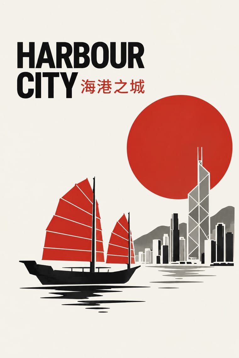
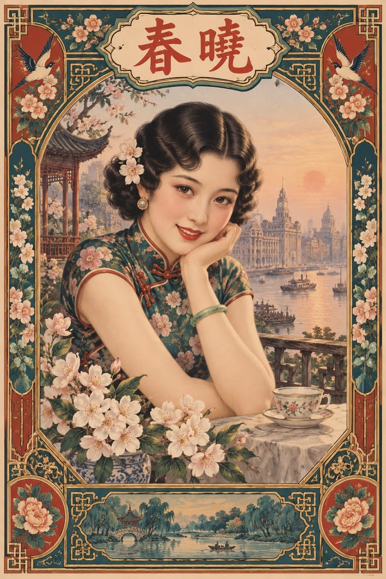
An earlier East–West commercial art of painted beauties and ornamental borders; compare it to see how Hong Kong studios replaced the figure and frame with one symbol and empty space.
Mix them and make something Hong Kong East–West Graphic Modernism Shanghai Modern
01
What each style brings
Each part of the design comes from the style with the stronger say in it, and each style gives at least two.
Hong Kong East–West Graphic Modernism Shanghai Modern & Yuefenpai
- Type from Shanghai Modern
-
Hong Kong East–West Graphic Modernism avoids ornamented display: this is where the two pull against each other, which is the point of the contrast.
- Colour from Hong Kong East–West Graphic Modernism
- Form from Shanghai Modern
- Composition from Hong Kong East–West Graphic Modernism
- Surface from Hong Kong East–West Graphic Modernism
02
The type
Open fonts standing in for each style’s own type, which is often hand-drawn or commercial.
Text · Hong Kong East–West Graphic Modernism
The studio design of Hong Kong from the 1960s, made for banks, developers, trade bodies, hotels and cultural events in a city that had to speak Chinese and English at once. Henry Steiner, a Yale student of Paul Rand, and a local generation taught by Wucius Wong, led by Kan Tai-keung, set compact symbols, sans-serif type and white space against quoted Chinese signs: ancient coins, characters, mythical creatures and, from the 1980s, ink washes and brush strokes, often staged as an East–West visual pun.
Inter; Hong Kong East–West Graphic Modernism used Sans-serifs for the Latin and Chinese set horizontally and smaller than the Latin, as the title 香港之進展 beside the skewed English of 'Progress Hong Kong'
03
The colours
The ground and leading colours come from Hong Kong East–West Graphic Modernism, with a counter-accent from Shanghai Modern. The ink reads on the ground at 4.5:1 or more.
Hong Kong East–West Graphic Modernism Shanghai Modern & Yuefenpai
-
#f3efe6ground · 36% -
#151515ink · 14% -
#c62a20accent · 18% -
#b08d4aaccent · 14% -
#8c8b86accent · 10% -
#1f5f5baccent · 8%
As CSS
:root {
  --ground: #f3efe6;
  --ink: #151515;
  --accent-1: #c62a20;
  --accent-2: #b08d4a;
  --accent-3: #8c8b86;
  --accent-4: #1f5f5b;
  --font-display: "Limelight", sans-serif;
  --font-text: "Inter", sans-serif;
}
Use it with care
Hong Kong East–West Graphic Modernism: Hong Kong uses traditional Chinese characters, so do not substitute simplified forms, and have every Chinese word in a lockup checked by a literate reader, since image models often invent or garble characters. The style used real Chinese signs and characters for their meaning, such as the coin and 中 of the Bank of China emblem; do not fall back on brush-effect 'chop-suey' Latin fonts or random characters as exotic texture.
04
The two styles
05
More combinations
With Hong Kong East–West Graphic Modernism
- Japanese Postwar Modernism Pairs well · Take its single emblem on an empty field, then add a bilingual Chinese–English lockup and one ink stroke to move the poster from Tokyo to Hong Kong.
- Hong Kong Neon & Beiwei Shop-Sign Lettering Contrasts · The same city's street lettering: set dense, glowing Beiwei signboards against a white-space bilingual lockup to choose between vernacular and institutional Hong Kong.
- Song–Ming Woodblock Book Typography (Songti / Mincho) Pairs well · Set running Chinese text in Song/Ming type beside a neo-grotesque Latin so the bilingual page keeps one even colour.
- Ten Bamboo Studio Colour Woodblock (Douban & Gonghua) Pairs well · From the 1980s Hong Kong designers such as Kan Tai-keung staged ink washes and brush strokes in wide modernist white space; a single graded bamboo or plum spray on a clean field works the same way on packaging or a poster.
With Shanghai Modern
- Socialist Realist Propaganda Poster Contrasts · After 1949 the same painters and rubbed-watercolour technique served propaganda; compare how one rendering style sells glamour versus ideology.
- Nianhua & Chinese Folk Print Pairs well · Fold nianhua's auspicious symbols and bright folk colour into a calendar-poster layout for festive packaging.
- International Typographic Style Contrasts · Its framed, ornamented, figurative poster is the opposite of Swiss reduction; strip elements one by one to find what carries the mood.
- Art Deco Pairs well · Wrap a softly painted yuefenpai figure in Deco borders and geometric lettering for East–West period glamour.
- Republican Chinese Book Cover Design (Lu Xun & Tao Yuanqing) Contrasts · Same city and decades, opposite intent: calendar posters model glamorous women in soft polychrome with ornamental borders, while New Literature covers leave a plain field to one flat, symbolic motif and a drawn title.
- Mexican Calendar Chromo (Cromos calendáricos) Contrasts · Both are tobacco-sponsored calendar pictures of beauties, but yuefenpai set softly rubbed watercolour women inside decorative borders with the products alongside, while the Mexican chromo is an oil painting of a whole scene that fills the sheet, with the pad pasted at its foot.
- Cuban Tobacco Lithography (Habilitaciones & Marquillas) Pairs well · Shanghai's calendar posters were also given away by tobacco firms; pair their softly modelled women and ornamental borders with the Havana label's medals and arms for a cross-continental tobacco or spirits heritage line.
- Showa Modern Commercial Art and Zuan-moji Pairs well · Both put a modern-girl figure in East Asian commercial posters; combine the Japanese geometric lettering with Shanghai's painterly figure for a pan-Asian Deco look.