Style combination · Contrasts
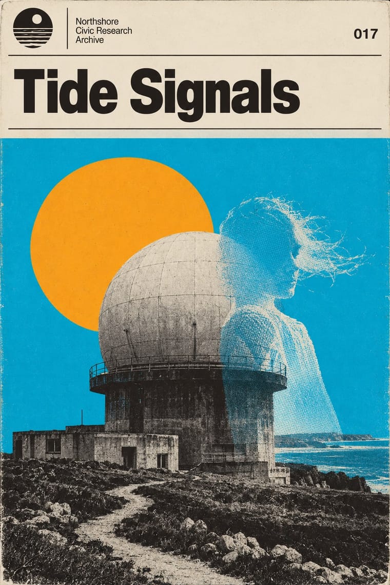
Hauntology × Post-Punk Record Sleeve
House names Peter Saville among his influences, but Saville's Factory sleeves quote one modernist or classical source per record, while Ghost Box invents a whole institution and dresses every release in its one template; choose a single quotation or a fictional series.
Mix them and make something Hauntology Post-Punk Record Sleeve
01
What each style brings
Each part of the design comes from the style with the stronger say in it, and each style gives at least two.
Hauntology & Ghost Box Design Post-Punk Record Sleeve (Stiff, Factory, 4AD)
- Type from Hauntology
- Colour from Hauntology
- Form from Post-Punk Record Sleeve
- Composition from Post-Punk Record Sleeve
- Surface from Hauntology
02
The type
Open fonts standing in for each style’s own type, which is often hand-drawn or commercial.
Display · Hauntology
Daydream
Archivo; Hauntology used Monotype Grotesque (MT Grotesque), the main face of the Ghost Box front covers, chosen over Helvetica and Clarendon (Bitstream's cut) on Ghost Box back covers and booklets
Text · Post-Punk Record Sleeve
The record sleeves that British art-school designers made after punk, for independent labels and some majors: Barney Bubbles at Stiff, Malcolm Garrett for Buzzcocks, Peter Saville at Factory and 23 Envelope at 4AD. Instead of xerox collage, a sleeve became an art-directed object: one quoted or treated image (a pulsar plot, a Fantin-Latour still life, a Futurist poster, a misty photograph) on a quiet field or edge to edge, the band's name shrunk, coded or left off, riddles and catalogue numbers in its place, printed offset on textured, silver, gold or die-cut stock.
Space Mono; Post-Punk Record Sleeve used Peter Saville's colour-coded alphabet, one coloured block per letter, decoded by a wheel on the back of Power, Corruption & Lies (1983) and used for the title of Blue Monday and Small, ordered sans-serif capitals in the manner of Jan Tschichold's New Typography, which Saville took as his model from the 1978 Factory poster onwards
03
The colours
The ground and leading colours come from Hauntology, with a counter-accent from Post-Punk Record Sleeve. The ink reads on the ground at 4.5:1 or more.
Hauntology & Ghost Box Design Post-Punk Record Sleeve (Stiff, Factory, 4AD)
-
#efe9d8ground · 36% -
#1e1b18ink · 14% -
#f9a61aaccent · 18% -
#01b2deaccent · 14% -
#b8963eaccent · 10% -
#d51a21accent · 8%
As CSS
:root {
  --ground: #efe9d8;
  --ink: #1e1b18;
  --accent-1: #f9a61a;
  --accent-2: #01b2de;
  --accent-3: #b8963e;
  --accent-4: #d51a21;
  --font-display: "Archivo", sans-serif;
  --font-text: "Space Mono", monospace;
}
Use it with care
Hauntology & Ghost Box Design: The Ghost Box sleeves and logo, Littler's Scarfolk images and Frances Castle's Clay Pipe sleeves are in copyright, and much of what they imitate (Penguin covers, government public information posters, textbook illustrations, archive photographs) has its own rights holders: build a new fictional institution from public-domain or licensed material rather than copying a Ghost Box sleeve or Penguin's trade dress.
Post-Punk Record Sleeve (Stiff, Factory, 4AD): The sleeves are in copyright, and several of their quoted images have their own authors, such as Harold Craft's pulsar plot and Bernard Pierre Wolff's photograph of the Appiani tomb: make a new quotation from a public-domain or licensed source rather than copying a Factory, Stiff or 4AD cover or its colour code.
04
The two styles
05
More combinations
With Hauntology
- Surrealist Graphics Pairs well · House named Max Ernst among his influences: add an Ernst-like collage juxtaposition to a textbook photograph to make an educational image turn eerie.
- London Transport Design Pairs well · Borrow the logic of a public-service programme (fixed elements, a roundel, varied pictures within one system) to give an invented hauntological institution a believable house style.
- Vaporwave Contrasts · Both build nostalgia from found media, but vaporwave mourns consumer electronics in neon pastels on screens while hauntology misremembers public, educational print in flat offset colour on paper; choose which lost future a design should haunt.
- Neo-Swiss Revival Contrasts · Swiss revival uses the modernist grid straight, crisp and current; hauntology keeps a grid but ages its pictures with grain and halftone and lets something uncanny into them.
- Hipster Artisanal Revival Contrasts · Both fake an old firm, but the hipster badge revives Victorian craft for warmth and trust, while hauntology revives a post-war public institution so that it feels slightly wrong.
- Risograph & Indie Print Culture Pairs well · Print the template on a risograph to get real grain, two or three inks and genuine misregistration instead of simulated wear.
- Witch House Graphics (Symbol Names and Haunted Web Imagery) Contrasts · Choose between Ghost Box's fictitious institutional series and this scene's coded artist identity: trade the ruled paperback title band for a glyph-name and a distressed photographic field.
- Dark Academia Contrasts · Both turn institutional nostalgia uncanny, but Ghost Box uses grotesque type, halftone and flat fields where this is serif, photographic and dense.
With Post-Punk Record Sleeve
- Surrealist Graphics Pairs well · Vaughan Oliver drew on Dalí and Surrealism; add an uncanny juxtaposition to a blurred, textured 23 Envelope photograph for a dream-like sleeve.
- Die Neue Typographie Pairs well · Saville's model: borrow Tschichold's asymmetric placement and small sans-serif capitals, then replace his photographs with one quoted image to get a cool, ordered sleeve.
- Swiss Punk / New Wave Typography Contrasts · Both took modernism apart in the same years: Weingart's Basel school layered type and broke the grid, while post-punk sleeves quoted one borrowed image and withheld the type; choose between layering and withholding.
- Afrobeat Sleeve Art Contrasts · Lemi Ghariokwu's sleeves fill every inch to state the record's argument, while post-punk sleeves leave the name off and say nothing; use the pair to decide how much a cover should explain.
- Minimalist Graphic Design Pairs well · Both let one image or word stand on an empty field; minimalism keeps it calm and neutral, post-punk adds a borrowed image, a code and a darker mood.
- Punk & DIY Zine Contrasts · Same scene, opposite means: punk pasted ransom-note collage onto photocopies, post-punk withheld text and printed one quoted image offset on special stock; choose between shouting and withholding.
- Hipgnosis Photographic Concept Sleeve Contrasts · The generation that made it look dated: post-punk designers quoted one found image and coded or shrank the type, where Hipgnosis paid for elaborate location shoots and darkroom work. Choose between quoting a picture and staging one.
- 2 Tone Graphics Contrasts · Shares restraint and a single focal point, but swaps abstraction for a cartoon mascot.