Style combination · Pairs well
Extinction Rebellion Graphics × Solidarność
A later movement that also lives on one simple mark anyone can copy by hand; pair a single shared emblem with locally made, cheaply printed posters to keep a campaign recognisable without central design.
Mix them and make something Extinction Rebellion Graphics Solidarność
01
What each style brings
Each part of the design comes from the style with the stronger say in it, and each style gives at least two.
Extinction Rebellion Graphics Solidarność & Polish Underground Graphics
- Type from Solidarność
- Colour from Extinction Rebellion Graphics
- Form from Solidarność
- Composition from Extinction Rebellion Graphics
- Surface from Extinction Rebellion Graphics
02
The type
Open fonts standing in for each style’s own type, which is often hand-drawn or commercial.
Display · Solidarność
Wake
Londrina Solid, standing in for Red hand-drawn capitals on amateur posters of the 1989 election campaign, such as Chylak's 'Głosuj na Solidarność'
Text · Extinction Rebellion Graphics
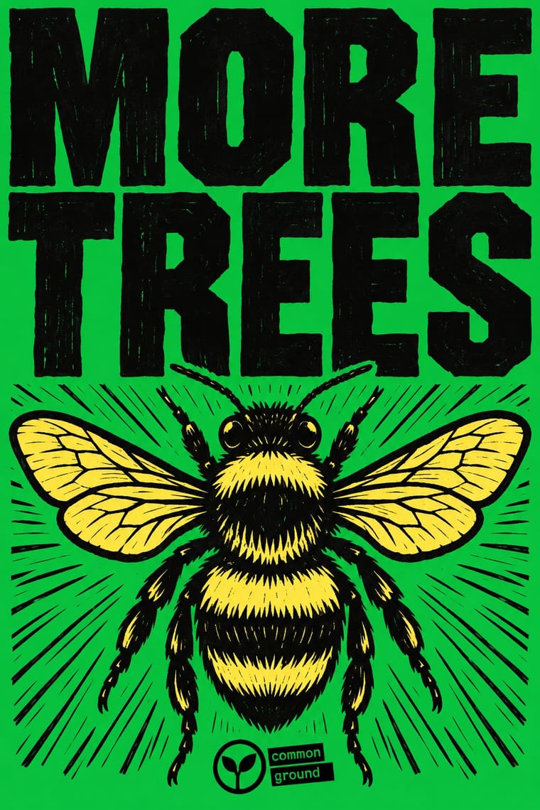
The visual identity of Extinction Rebellion, the climate movement founded in Stroud in 2018, built by its volunteer Art Group as a free kit anyone may print. Heavy, slightly wonky capitals based on old wood type (FUCXED) sit on flat grounds from a twelve-colour palette of brights and light tints, beside woodcut skulls, bees, butterflies, birds and flowers, signed with the XR logotype and often the circled-hourglass Extinction Symbol, attributed to the street artist ESP, who dates it to 2011. Blocks, screens and free downloads let crowds print their own flags, banners, placards and patches.
Oswald; Extinction Rebellion Graphics used FUCXED Caps and Condensed wood type
03
The colours
The ground and leading colours come from Extinction Rebellion Graphics, with a counter-accent from Solidarność. The ink reads on the ground at 4.5:1 or more.
Extinction Rebellion Graphics Solidarność & Polish Underground Graphics
-
#f7ee6aground · 36% -
#000000ink · 14% -
#c80082accent · 18% -
#d4161faccent · 14% -
#14aa37accent · 10% -
#a5835caccent · 8%
As CSS
:root {
  --ground: #f7ee6a;
  --ink: #000000;
  --accent-1: #c80082;
  --accent-2: #d4161f;
  --accent-3: #14aa37;
  --accent-4: #a5835c;
  --font-display: "Londrina Solid", cursive;
  --font-text: "Oswald", sans-serif;
}
Use it with care
Extinction Rebellion Graphics: Extinction Rebellion is a living movement and the Extinction Symbol is credited to the artist ESP, who lends it to XR only for non-commercial use; XR says it will pursue anyone selling merchandise with it. Do not put the symbol, the XR logotype or a close imitation of the kit on products, fundraising, advertising or brand campaigns, and do not dress a company's climate message in XR's look to borrow its credibility.
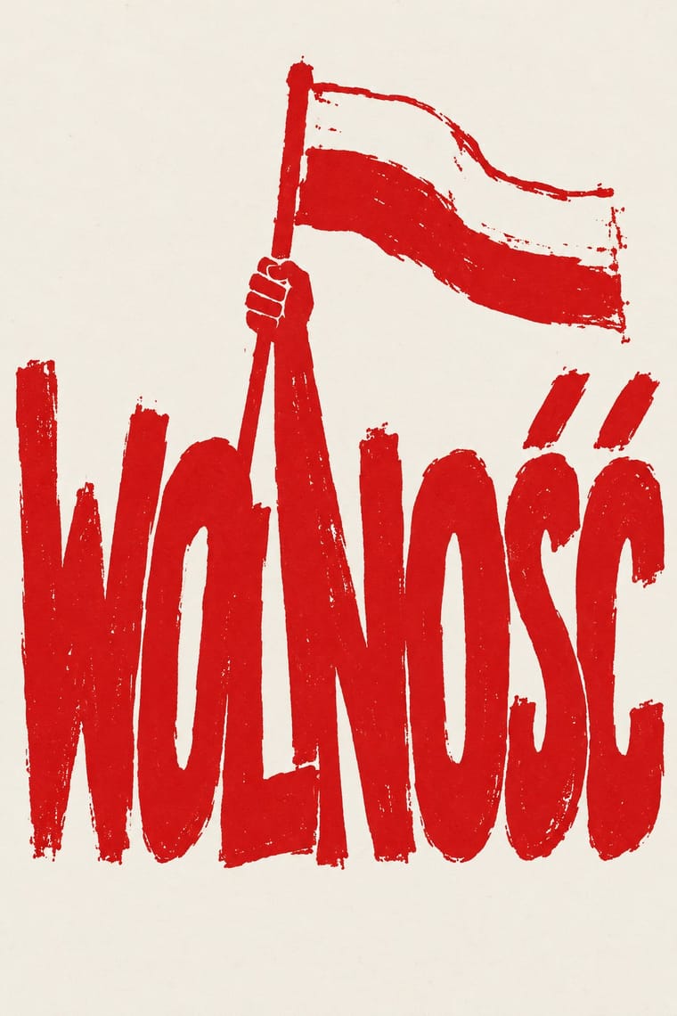
Solidarność & Polish Underground Graphics: This is still a living, contested sign: the NSZZ Solidarność union claims the logo, and a Gdańsk court awarded it the copyright and barred Janiszewski from licensing it, a ruling the Warsaw Court of Appeal upheld (reported in November 2025), while Fydrych won a copyright case over his Orange Alternative dwarf against the city of Wrocław in 2014; do not reuse the logo, or a pastiche of it, for a brand or campaign as if it were public domain. The iconography also carries Catholic symbols and the memory of people killed under martial law and after it (the nine Wujek miners shot in December 1981; Father Jerzy Popiełuszko, murdered by security-service officers in October 1984). Solidaryca is still used for logos and slogans about Poland, freedom and democracy, its designer has criticised its exploitation by right-wing groups, and the union itself has grown increasingly aligned with Law and Justice, so do not use the cross, the candles or the lettering as decoration or to suggest an endorsement nobody gave.
04
The two styles
05
More combinations
With Extinction Rebellion Graphics
- Pop Art Graphics Pairs well · The twelve bright colours were influenced by Eduardo Paolozzi; push a slogan poster further towards British Pop with fluorescent flat grounds and one playful image.
- Victorian Letterpress & Wood Type Pairs well · FUCXED imitates old wood type and Burrill printed XR slogans from real wood type; pair the bright XR grounds with a jobbing printer's condensed wood letters for a hand-set protest poster.
- South African Resistance Poster Pairs well · Both are cheap workshop prints with heavy capitals and an organisation's emblem; XR adds a centrally specified twelve-colour kit where the struggle posters kept to one to three hand-cut inks.
- Corporate Identity Modernism Contrasts · XR borrows a corporate identity's tools (one symbol, a fixed logotype, a colour palette, a design guide) and turns them into a free, hand-printed kit that bans commercial use.
- Stencil Street Art Pairs well · ESP spread the symbol as a street artist before XR adopted it, chalking it on Brick Lane and putting up posters and tiles around East London; pair XR's one-colour emblem and short slogans with stencil street art's hard-edged sprayed figures for walls and pavements.
- ACT UP & Gran Fury AIDS Activist Graphics Pairs well · A later movement that again reduces its cause to one emblem and a fixed set of slogans in heavy capitals; pair XR's flat colour grounds with ACT UP's facts in small print when a protest poster must both rally and inform.
- Belarusian Protest Illustration (2020 Uprising) Contrasts · Compare a prescribed wood-type and woodcut identity with an illustrator-led shared vocabulary: Belarusian examples do not require XR's oversized headline, carved texture, print workshop or fixed logo. Shared protest tone and few-colour printing are not evidence of descent.
- Solarpunk Contrasts · Both answer the climate crisis: XR shouts alarm in woodcut and flat spot colour; solarpunk paints the hopeful world after it. Pair them for campaigns that move from warning to vision.
With Solidarność
- Punk & DIY Zine Contrasts · Same years and the same cheap reproduction, opposite temper: punk defaces the flag and the monarch with ransom-note collage, while Solidarity graphics carry the flag and the cross with reverence and keep to one disciplined hand-drawn word.
- NSK Retro-Avant-Garde Contrasts · Both answered a socialist state in the 1980s, but NSK impersonates power in solemn, centred heraldry, while the Polish underground mocked it with jokes, and the Orange Alternative with dwarfs, and Solidarity kept its reverence for church and nation; choose between over-identifying and laughing.
- Socialist Realist Propaganda Poster Contrasts · As the V&A notes, Janiszewski replaced the socialist motif of a leader conducting the crowd with the national flag; set a crowd of equal letters against one heroic leader to make that point.
- Atelier Populaire (May '68 Screenprint Poster) Pairs well · Both made anonymous protest prints on whatever press was to hand in one or two inks; borrow the Atelier's single brushed silhouette to give a crowded Solidarity-style word a figure to stand beside.
- Grapus (French Militant Graphic Collective) Pairs well · Opposite sides of the communist divide but the same Polish poster lineage: Janiszewski's crowded red letters and Grapus's loose handwriting both make a movement's voice look written by people, not set by an office.
- Latin American Feminist Protest Graphics (Ni Una Menos and the Green Wave) Contrasts · Both are movement identities copied by hand in the street, but Solidarność gathered behind one logo of crowded red letters and printed posters, bulletins and stamps, while the green wave gathers behind a wearable cloth and a colour; letters as the sign against an object as the sign.
- Syrian Revolution Graphics (Kafranbel Banners & Poster Collectives) Contrasts · Both made hand-lettered protest banners and cheap copies and answered force with irony, but Solidarność gathered under one logotype and a union, where these sheets were signed only by a town or a collective, bilingual and made for the feed; set them side by side to weigh one shared mark against many local, dated voices.
- Belarusian Protest Illustration (2020 Uprising) Contrasts · Both activate red-white national references, but the Belarusian sample places figures and visual metaphors ahead of the tightly joined lettering that defines Solidarność. Compare the role of a shared flag with that of a shared wordmark; do not infer a direct lineage.