Style combination · Contrasts
Corporate Identity Modernism × Extinction Rebellion Graphics
XR borrows a corporate identity's tools (one symbol, a fixed logotype, a colour palette, a design guide) and turns them into a free, hand-printed kit that bans commercial use.
Mix them and make something Corporate Identity Modernism Extinction Rebellion Graphics
01
What each style brings
Each part of the design comes from the style with the stronger say in it, and each style gives at least two.
Corporate Identity Modernism Extinction Rebellion Graphics
- Type from Extinction Rebellion Graphics
- Colour from Extinction Rebellion Graphics
- Form from Corporate Identity Modernism
- Composition from Corporate Identity Modernism
- Surface from Extinction Rebellion Graphics
02
The type
Open fonts standing in for each style’s own type, which is often hand-drawn or commercial.
Display · Extinction Rebellion Graphics
Public
Alfa Slab One, standing in for FUCXED Caps (drawn by Clive Russell of This Ain't Rock'n'Roll from an old woodcut-style wood type he found on eBay, deliberately slightly wonky; XR's headline print face, download file FUCXED v4; FUCXED Latin is recommended for online graphics)
Text · Corporate Identity Modernism
Modernist reduction applied to corporate communication. A company's whole public face (trademark, logotype, stationery, packaging, vehicles and signage) was unified by an abstract symbol, a single typeface and one colour, all policed by a graphic standards manual. Pioneered by Paul Rand, Chermayeff & Geismar, Unimark and Lippincott & Margulies, it made the reductive mark and the grid the visual language of multinational business and government.
Inter; Corporate Identity Modernism used Helvetica and Univers
03
The colours
The ground and leading colours come from Extinction Rebellion Graphics, with a counter-accent from Corporate Identity Modernism. The ink reads on the ground at 4.5:1 or more.
Corporate Identity Modernism Extinction Rebellion Graphics
-
#f7ee6aground · 36% -
#000000ink · 14% -
#c80082accent · 18% -
#d7261eaccent · 14% -
#14aa37accent · 10% -
#0a4fa0accent · 8%
As CSS
:root {
  --ground: #f7ee6a;
  --ink: #000000;
  --accent-1: #c80082;
  --accent-2: #d7261e;
  --accent-3: #14aa37;
  --accent-4: #0a4fa0;
  --font-display: "Alfa Slab One", serif;
  --font-text: "Inter", sans-serif;
}
Use it with care
Extinction Rebellion Graphics: Extinction Rebellion is a living movement and the Extinction Symbol is credited to the artist ESP, who lends it to XR only for non-commercial use; XR says it will pursue anyone selling merchandise with it. Do not put the symbol, the XR logotype or a close imitation of the kit on products, fundraising, advertising or brand campaigns, and do not dress a company's climate message in XR's look to borrow its credibility.
04
The two styles
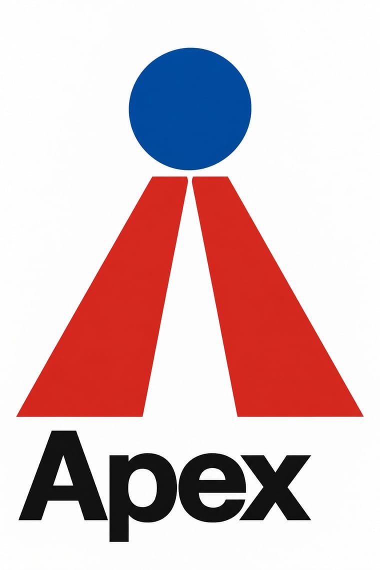
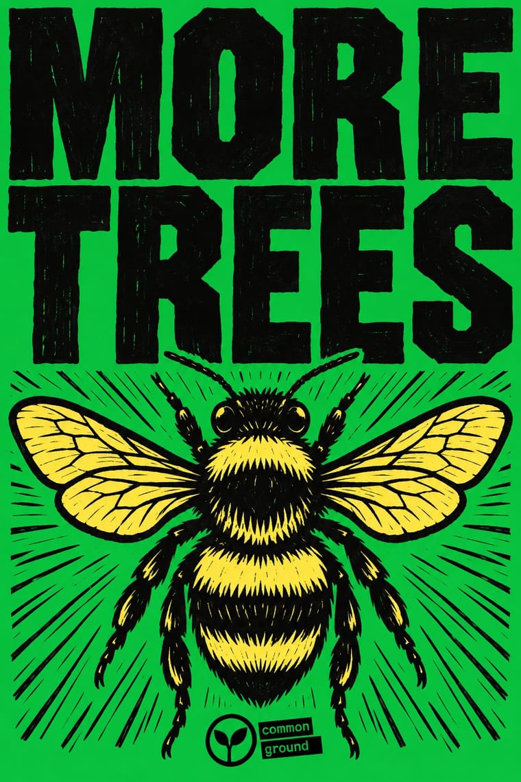
05
More combinations
With Corporate Identity Modernism
- Corporate Memphis Contrasts · Its successor trades abstract authority for rubbery friendliness; compare the two to decide how institutional or human a brand should feel.
- Generative & Dynamic Identities Pairs well · Keep the manual's mark, colour and grid as constants and let generative rules vary one parameter, so the system still reads as one company.
- Flat Design Pairs well · Flat UI inherits these reductive marks; reuse their clear-space and colour-code discipline when scaling icons across screens.
- Punk & DIY Zine Contrasts · Punk's ransom-note lettering is the anti-manual; one torn, xeroxed element against a corporate grid reads instantly as critique.
- Plakatstil / Sachplakat Pairs well · Its brand-name-plus-object formula prefigures logo-led identity; pair it with a modernist grid for confident product campaigns.
- Risograph & Indie Print Culture Contrasts · Exact Pantone-matched corporate colour is the opposite of riso's drifting inks; use the contrast to signal independence.
- Contemporary Arabic & Dual-Script Type Design Pairs well · Roll a matched Arabic–Latin family through a standards manual so both scripts carry the identity with equal authority.
- Milanese Industrial Modernism (Olivetti, Pirelli, Studio Boggeri) Contrasts · American corporate identity policed one mark through a manual, while Milan let artists vary the language; compare the two when deciding how strict a brand system should be.
With Extinction Rebellion Graphics
- Pop Art Graphics Pairs well · The twelve bright colours were influenced by Eduardo Paolozzi; push a slogan poster further towards British Pop with fluorescent flat grounds and one playful image.
- Victorian Letterpress & Wood Type Pairs well · FUCXED imitates old wood type and Burrill printed XR slogans from real wood type; pair the bright XR grounds with a jobbing printer's condensed wood letters for a hand-set protest poster.
- South African Resistance Poster Pairs well · Both are cheap workshop prints with heavy capitals and an organisation's emblem; XR adds a centrally specified twelve-colour kit where the struggle posters kept to one to three hand-cut inks.
- Stencil Street Art Pairs well · ESP spread the symbol as a street artist before XR adopted it, chalking it on Brick Lane and putting up posters and tiles around East London; pair XR's one-colour emblem and short slogans with stencil street art's hard-edged sprayed figures for walls and pavements.
- Solidarność & Polish Underground Graphics Pairs well · A later movement that also lives on one simple mark anyone can copy by hand; pair a single shared emblem with locally made, cheaply printed posters to keep a campaign recognisable without central design.
- ACT UP & Gran Fury AIDS Activist Graphics Pairs well · A later movement that again reduces its cause to one emblem and a fixed set of slogans in heavy capitals; pair XR's flat colour grounds with ACT UP's facts in small print when a protest poster must both rally and inform.
- Belarusian Protest Illustration (2020 Uprising) Contrasts · Compare a prescribed wood-type and woodcut identity with an illustrator-led shared vocabulary: Belarusian examples do not require XR's oversized headline, carved texture, print workshop or fixed logo. Shared protest tone and few-colour printing are not evidence of descent.
- Solarpunk Contrasts · Both answer the climate crisis: XR shouts alarm in woodcut and flat spot colour; solarpunk paints the hopeful world after it. Pair them for campaigns that move from warning to vision.