Style combination · Pairs well
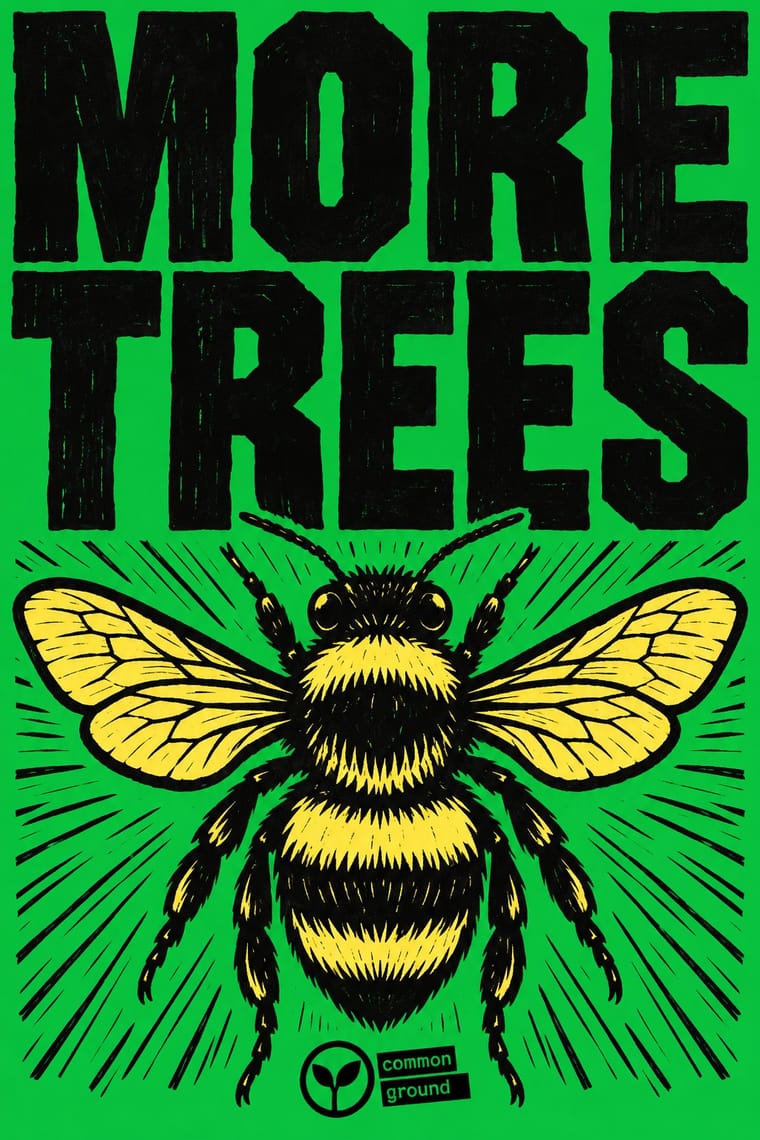
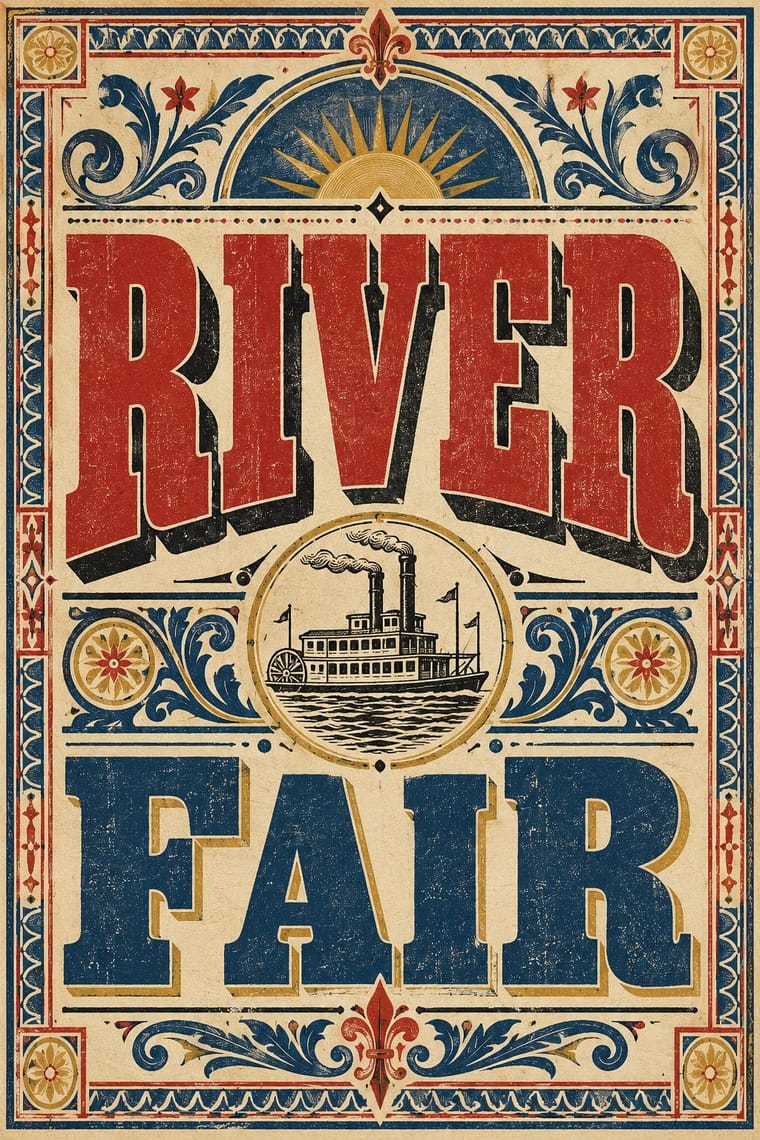
Extinction Rebellion Graphics × Victorian Letterpress
FUCXED imitates old wood type and Burrill printed XR slogans from real wood type; pair the bright XR grounds with a jobbing printer's condensed wood letters for a hand-set protest poster.
Mix them and make something Extinction Rebellion Graphics Victorian Letterpress
01
What each style brings
Each part of the design comes from the style with the stronger say in it, and each style gives at least two.
Extinction Rebellion Graphics Victorian Letterpress & Wood Type
- Type from Extinction Rebellion Graphics
- Colour from Extinction Rebellion Graphics
- Form from Victorian Letterpress
-
Extinction Rebellion Graphics avoids abundant decoration: this is where the two pull against each other.
- Composition from Victorian Letterpress
- Surface from Extinction Rebellion Graphics
02
The type
Open fonts standing in for each style’s own type, which is often hand-drawn or commercial.
Display · Extinction Rebellion Graphics
Rise
Alfa Slab One, standing in for FUCXED Caps (drawn by Clive Russell of This Ain't Rock'n'Roll from an old woodcut-style wood type he found on eBay, deliberately slightly wonky; XR's headline print face, download file FUCXED v4; FUCXED Latin is recommended for online graphics)
Text · Victorian Letterpress
The commercial jobbing print of the industrial century: posters, playbills, auction notices and ephemera built from a flood of new display types (fat faces, Egyptians, grotesques, Tuscans and condensed wood type). Lines are centred and each is set in a different face and size to fill the measure, framed in rules and stock borders and printed in black with one or two flat colours.
Zilla Slab; Victorian Letterpress used Fat face romans and Egyptian / Antique slab serifs
03
The colours
The ground and leading colours come from Extinction Rebellion Graphics, with a counter-accent from Victorian Letterpress. The ink reads on the ground at 4.5:1 or more.
Extinction Rebellion Graphics Victorian Letterpress & Wood Type
-
#f7ee6aground · 36% -
#000000ink · 14% -
#c80082accent · 18% -
#b3322baccent · 14% -
#14aa37accent · 10% -
#d9b45aaccent · 8%
As CSS
:root {
  --ground: #f7ee6a;
  --ink: #000000;
  --accent-1: #c80082;
  --accent-2: #b3322b;
  --accent-3: #14aa37;
  --accent-4: #d9b45a;
  --font-display: "Alfa Slab One", serif;
  --font-text: "Zilla Slab", serif;
}
Use it with care
Extinction Rebellion Graphics: Extinction Rebellion is a living movement and the Extinction Symbol is credited to the artist ESP, who lends it to XR only for non-commercial use; XR says it will pursue anyone selling merchandise with it. Do not put the symbol, the XR logotype or a close imitation of the kit on products, fundraising, advertising or brand campaigns, and do not dress a company's climate message in XR's look to borrow its credibility.
04
The two styles
05
More combinations
With Extinction Rebellion Graphics
- Pop Art Graphics Pairs well · The twelve bright colours were influenced by Eduardo Paolozzi; push a slogan poster further towards British Pop with fluorescent flat grounds and one playful image.
- South African Resistance Poster Pairs well · Both are cheap workshop prints with heavy capitals and an organisation's emblem; XR adds a centrally specified twelve-colour kit where the struggle posters kept to one to three hand-cut inks.
- Corporate Identity Modernism Contrasts · XR borrows a corporate identity's tools (one symbol, a fixed logotype, a colour palette, a design guide) and turns them into a free, hand-printed kit that bans commercial use.
- Stencil Street Art Pairs well · ESP spread the symbol as a street artist before XR adopted it, chalking it on Brick Lane and putting up posters and tiles around East London; pair XR's one-colour emblem and short slogans with stencil street art's hard-edged sprayed figures for walls and pavements.
- Solidarność & Polish Underground Graphics Pairs well · A later movement that also lives on one simple mark anyone can copy by hand; pair a single shared emblem with locally made, cheaply printed posters to keep a campaign recognisable without central design.
- ACT UP & Gran Fury AIDS Activist Graphics Pairs well · A later movement that again reduces its cause to one emblem and a fixed set of slogans in heavy capitals; pair XR's flat colour grounds with ACT UP's facts in small print when a protest poster must both rally and inform.
- Belarusian Protest Illustration (2020 Uprising) Contrasts · Compare a prescribed wood-type and woodcut identity with an illustrator-led shared vocabulary: Belarusian examples do not require XR's oversized headline, carved texture, print workshop or fixed logo. Shared protest tone and few-colour printing are not evidence of descent.
- Solarpunk Contrasts · Both answer the climate crisis: XR shouts alarm in woodcut and flat spot colour; solarpunk paints the hopeful world after it. Pair them for campaigns that move from warning to vision.
With Victorian Letterpress
- Hand-Painted Signage & Vernacular Lettering Pairs well · Sign writers and type founders traded letterforms; add brushed shading and drop shadows to wood-type headlines for a street-made feel.
- Push Pin Style Pairs well · Push Pin revived Victorian display faces with irony; mix one wood-type headline with modern illustration for the same knowing nostalgia.
- International Typographic Style Contrasts · One face, flush left and white space against a centred clamour of faces: use the contrast to test whether hierarchy needs variety at all.
- Arts & Crafts Movement Contrasts · Morris reacted against exactly this commercial clutter; set the two side by side to show craft restraint versus jobbing exuberance.
- HfG Ulm Systematic Design Contrasts · A Victorian mixed-face handbill is the clutter Ulm's one-family rule was meant to cure; use it as a before-and-after foil.
- Victorian Colour Toy Books (Evans, Crane, Caldecott and Greenaway) Contrasts · Its black-letter-dense, type-and-ornament jobbing page is the opposite of a picture-led page; combine them by hanging a wood-type title over a flat colour picture.
- Dada Pairs well · Raid Victorian wood type and stock ornaments as the Dadaists did, but scatter them instead of centring them.
- American Four-Colour Comic Book (Golden to Bronze Age) Pairs well · Both are cheap letterpress print that shouts to passers-by; borrow the playbill's stacked display capitals, banners and rules for a comic cover's blurbs and price box, while keeping the comic's hand-drawn letters and keyline art.