Style combination · Contrasts
Belarusian Protest Illustration × Solidarność
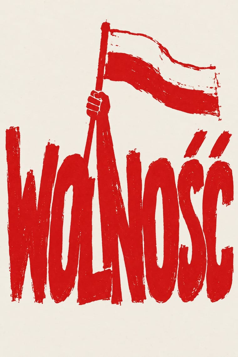
Both activate red-white national references, but the Belarusian sample places figures and visual metaphors ahead of the tightly joined lettering that defines Solidarność. Compare the role of a shared flag with that of a shared wordmark; do not infer a direct lineage.
Mix them and make something Belarusian Protest Illustration Solidarność
01
What each style brings
Each part of the design comes from the style with the stronger say in it, and each style gives at least two.
Belarusian Protest Illustration (2020 Uprising) Solidarność & Polish Underground Graphics
- Type from Solidarność
- Colour from Belarusian Protest Illustration
- Form from Solidarność
- Composition from Belarusian Protest Illustration
- Surface from Belarusian Protest Illustration
02
The type
Open fonts standing in for each style’s own type, which is often hand-drawn or commercial.
Display · Solidarność
Rise
Londrina Solid, standing in for Red hand-drawn capitals on amateur posters of the 1989 election campaign, such as Chylak's 'Głosuj na Solidarność'
Text · Belarusian Protest Illustration
An illustrator-led strand of graphics from Belarus's 2020 democracy uprising, circulated online and as solidarity placards rather than through one prescribed identity. Red and white recall the historical flag; a rider, bleeding hand, cockroach or caricature turns national memory and immediate events into a compact visual argument. Brush silhouettes, modelled portraits, cartoons and cross-stitch-style imagery coexist. This entry focuses on the 2020–early 2021 corpus, not all Belarusian design.
Oswald; Belarusian Protest Illustration used Hand-drawn Cyrillic slogan capitals, as in Pisliak's white inscription; a lettering practice, not a common proprietary font and Condensed sans-serif Cyrillic display capitals, as in Yermolenko's red headline; no specific typeface identification is claimed
03
The colours
The ground and leading colours come from Belarusian Protest Illustration, with a counter-accent from Solidarność. The ink reads on the ground at 4.5:1 or more.
Belarusian Protest Illustration (2020 Uprising) Solidarność & Polish Underground Graphics
-
#ffffffground · 36% -
#111111ink · 14% -
#e3342faccent · 18% -
#9fa0a3accent · 14% -
#a5835caccent · 10% -
#3f7a3caccent · 8%
As CSS
:root {
  --ground: #ffffff;
  --ink: #111111;
  --accent-1: #e3342f;
  --accent-2: #9fa0a3;
  --accent-3: #a5835c;
  --accent-4: #3f7a3c;
  --font-display: "Londrina Solid", cursive;
  --font-text: "Oswald", sans-serif;
}
Use it with care
Belarusian Protest Illustration (2020 Uprising): These are living artists' political statements and, in Bazlova's work, a contemporary use of Belarusian embroidery traditions, not anonymous decorative stock. Preserve attribution and the difference between national heritage and a particular maker's reinterpretation. Do not turn victims, police violence or imprisonment into commercial atmosphere. Commission and credit practitioners for related work rather than copying an identifiable artist's designs. Consider the safety and consent of people depicted; do not identify unnamed protesters. Online publication, museum reproduction or inclusion in a solidarity archive does not establish an open image licence. No file-level open licence was verified for the works discussed here; any future specimens must remain link-only unless separately cleared.
Solidarność & Polish Underground Graphics: This is still a living, contested sign: the NSZZ Solidarność union claims the logo, and a Gdańsk court awarded it the copyright and barred Janiszewski from licensing it, a ruling the Warsaw Court of Appeal upheld (reported in November 2025), while Fydrych won a copyright case over his Orange Alternative dwarf against the city of Wrocław in 2014; do not reuse the logo, or a pastiche of it, for a brand or campaign as if it were public domain. The iconography also carries Catholic symbols and the memory of people killed under martial law and after it (the nine Wujek miners shot in December 1981; Father Jerzy Popiełuszko, murdered by security-service officers in October 1984). Solidaryca is still used for logos and slogans about Poland, freedom and democracy, its designer has criticised its exploitation by right-wing groups, and the union itself has grown increasingly aligned with Law and Justice, so do not use the cross, the candles or the lettering as decoration or to suggest an endorsement nobody gave.
04
The two styles
05
More combinations
With Belarusian Protest Illustration
With Solidarność
- Extinction Rebellion Graphics Pairs well · A later movement that also lives on one simple mark anyone can copy by hand; pair a single shared emblem with locally made, cheaply printed posters to keep a campaign recognisable without central design.
- Punk & DIY Zine Contrasts · Same years and the same cheap reproduction, opposite temper: punk defaces the flag and the monarch with ransom-note collage, while Solidarity graphics carry the flag and the cross with reverence and keep to one disciplined hand-drawn word.
- NSK Retro-Avant-Garde Contrasts · Both answered a socialist state in the 1980s, but NSK impersonates power in solemn, centred heraldry, while the Polish underground mocked it with jokes, and the Orange Alternative with dwarfs, and Solidarity kept its reverence for church and nation; choose between over-identifying and laughing.
- Socialist Realist Propaganda Poster Contrasts · As the V&A notes, Janiszewski replaced the socialist motif of a leader conducting the crowd with the national flag; set a crowd of equal letters against one heroic leader to make that point.
- Atelier Populaire (May '68 Screenprint Poster) Pairs well · Both made anonymous protest prints on whatever press was to hand in one or two inks; borrow the Atelier's single brushed silhouette to give a crowded Solidarity-style word a figure to stand beside.
- Grapus (French Militant Graphic Collective) Pairs well · Opposite sides of the communist divide but the same Polish poster lineage: Janiszewski's crowded red letters and Grapus's loose handwriting both make a movement's voice look written by people, not set by an office.
- Latin American Feminist Protest Graphics (Ni Una Menos and the Green Wave) Contrasts · Both are movement identities copied by hand in the street, but Solidarność gathered behind one logo of crowded red letters and printed posters, bulletins and stamps, while the green wave gathers behind a wearable cloth and a colour; letters as the sign against an object as the sign.
- Syrian Revolution Graphics (Kafranbel Banners & Poster Collectives) Contrasts · Both made hand-lettered protest banners and cheap copies and answered force with irony, but Solidarność gathered under one logotype and a union, where these sheets were signed only by a town or a collective, bilingual and made for the feed; set them side by side to weigh one shared mark against many local, dated voices.