Style combination · Pairs well
Đông Hồ × Risograph
Both lay down one flat colour at a time; print Đông Hồ-style motifs on riso with muted inks and a pearly stock for a contemporary Tết zine.
01
What each style brings
Each part of the design comes from the style with the stronger say in it, and each style gives at least two.
Đông Hồ & Hàng Trống Folk Prints Risograph & Indie Print Culture
- Type from Risograph
- Colour from Risograph
-
Đông Hồ avoids fluorescent & neon: this is where the two pull against each other.
- Form from Đông Hồ
- Composition from Đông Hồ
- Surface from Đông Hồ
02
The type
Open fonts standing in for each style’s own type, which is often hand-drawn or commercial.
Display · Risograph
Hello
Inter Tight, standing in for Neo-grotesques set large (e.g. Akzidenz-Grotesk, Helvetica)
Text · Đông Hồ
Vietnam's two classic folk-print schools, bought for Tết. Đông Hồ families press each colour from its own carved block onto giấy điệp, dó paper brushed with ground scallop shell whose streaked, faintly sparkling surface serves as the white, and print the black line last. Plump animals and children, folk tales and satire such as the Rats' Wedding carry a short Hán or Nôm caption. In Hanoi's Hàng Trống only the outline was printed and the colour was brushed on in graded vờn washes, mostly for worship images. Kim Hoàng and Làng Sình prints fall outside this entry.
Archivo; Đông Hồ used Chữ Hán captions carved into the line block beside the image and Chữ Nôm inscriptions on older prints
03
The colours
The ground and leading colours come from Risograph, with a counter-accent from Đông Hồ. The ink reads on the ground at 4.5:1 or more.
Đông Hồ & Hàng Trống Folk Prints Risograph & Indie Print Culture
-
#f4f1eaground · 36% -
#3255a4ink · 14% -
#ff48b0accent · 18% -
#d8a63aaccent · 14% -
#f15060accent · 10% -
#b2412eaccent · 8%
As CSS
:root {
  --ground: #f4f1ea;
  --ink: #3255a4;
  --accent-1: #ff48b0;
  --accent-2: #d8a63a;
  --accent-3: #f15060;
  --accent-4: #b2412e;
  --font-display: "Inter Tight", sans-serif;
  --font-text: "Archivo", sans-serif;
}
Use it with care
Đông Hồ & Hàng Trống Folk Prints: Đông Hồ printing is a living family craft. In 2025 UNESCO inscribed it on its List of Intangible Cultural Heritage in Need of Urgent Safeguarding, noting that only a small number of families continue it and that their carved blocks are heirlooms; Vietnamese press counts about three households. Machine-printed fakes also undercut the workshops, so commission, buy from or credit the Đông Hồ workshops rather than tracing their designs. Do not invent pseudo-Hán captions or strip the real ones for decoration; the carved inscriptions state each print's meaning. Treat worship prints, including Hàng Trống images for the Mother Goddess cult and for temples, as devotional objects rather than decor, and keep Vietnamese diacritics intact.
04
The two styles
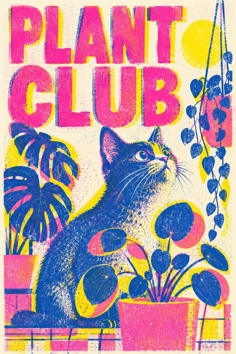
05
More combinations
With Đông Hồ
- Vietnamese Propaganda Poster (Tranh cổ động) Pairs well · Give Đông Hồ's plump figures and earth palette hand-painted Quốc ngữ capitals from the poster tradition for a Vietnamese campaign that feels festive rather than martial.
- Lubok Popular Print Pairs well · Lubok's Mice Burying the Cat and Đông Hồ's Rats' Wedding tell the same joke about power; pair them for a folk-satire series or exhibition identity.
- Kalighat Pat & Battala Bazaar Prints Pairs well · Both are cheap bazaar pictures that set a single figure on bare paper and mix devotion with satire; combine their quiet grounds and comic social types.
- Nianhua & Chinese Folk Print Contrasts · Its Chinese cousin shares the New Year function; set a sparse Đông Hồ sow on shell-white ground beside a crowded, saturated door-god pair to contrast emptiness with abundance.
- Tingatinga Painting Pairs well · Both are cheap popular pictures of plump, joking animals on a plain ground; combine them for a children's or folk-humour series across two continents.
- Serizawa Katazome and Mingei Stencil-Dye Graphics Pairs well · Another East Asian folk picture on handmade paper in earth colours; compare the woodblock's carved line with the stencil's cut field.
With Risograph
- Corporate Identity Modernism Contrasts · Exact Pantone-matched corporate colour is the opposite of riso's drifting inks; use the contrast to signal independence.
- Neo-Swiss Revival Pairs well · Print neo-Swiss grids in two fluorescent riso inks to soften their rigour with grain and overprint.
- Y2K Futurism Contrasts · Glossy chrome renders are everything a riso cannot print; set frictionless screen gloss against tactile grain for deliberate friction.
- WPA Silkscreen Posters Pairs well · WPA silkscreen's flat, separated colour translates directly to riso drums; borrow its layered spot-colour scenes.
- Literatura de Cordel Woodcut Pairs well · Print a cordel-style woodcut on a riso in one ink on tinted stock to keep the pocket-chapbook economy for zines and poetry pamphlets.
- Cubist Pictorial Space Pairs well · Print synthetic-Cubist planes as overlapping flat riso inks so the overprints do the faceting for you.
- Leningrad Avant-Garde Picture Book Pairs well · Today's riso picture books share the few flat inks, bare paper and speckled texture; print a Lebedev-style sequence of floating figures in two or three riso inks.
- Die Neue Typographie Pairs well · Two-colour riso printing suits its black-plus-red restraint for low-budget editorial and posters.