Style combination · Pairs well
Cranbrook × Brutalist Web Design
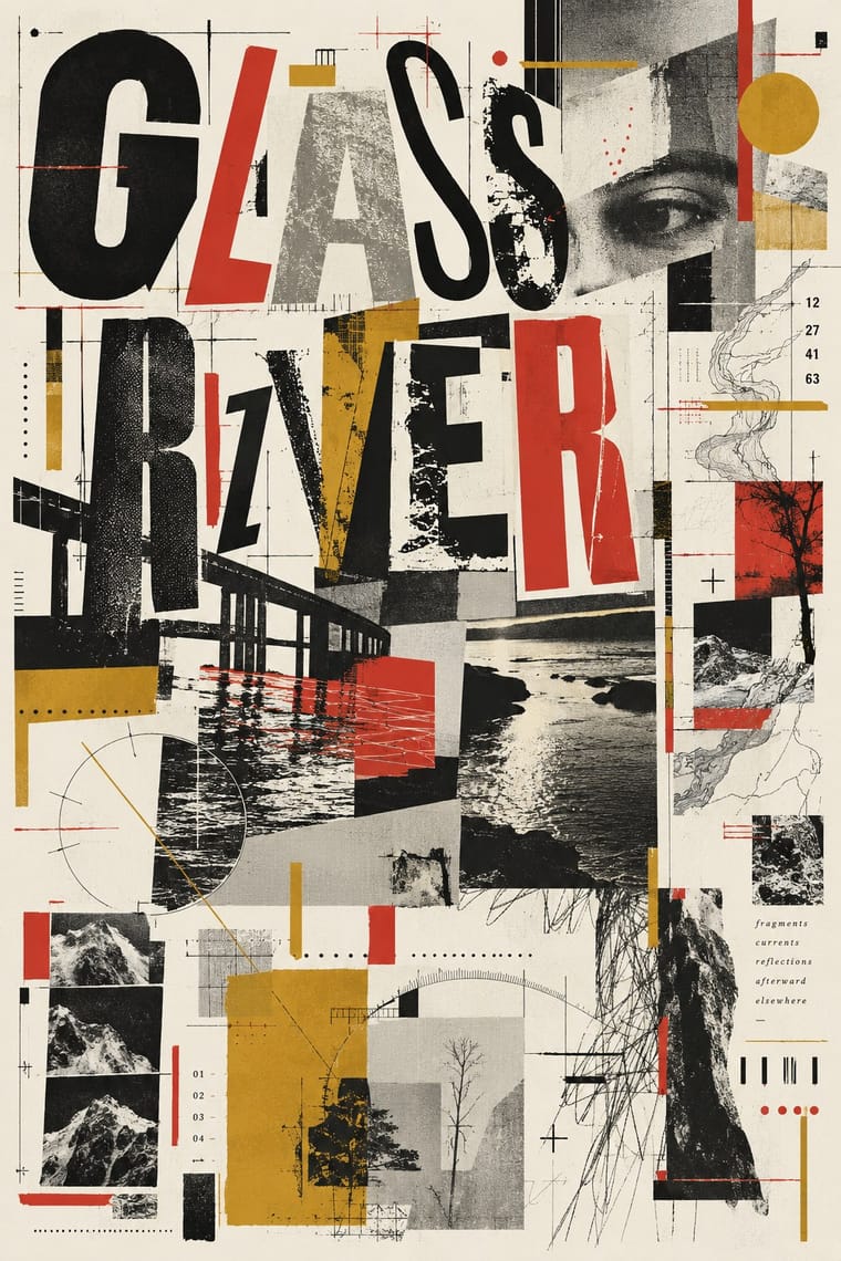
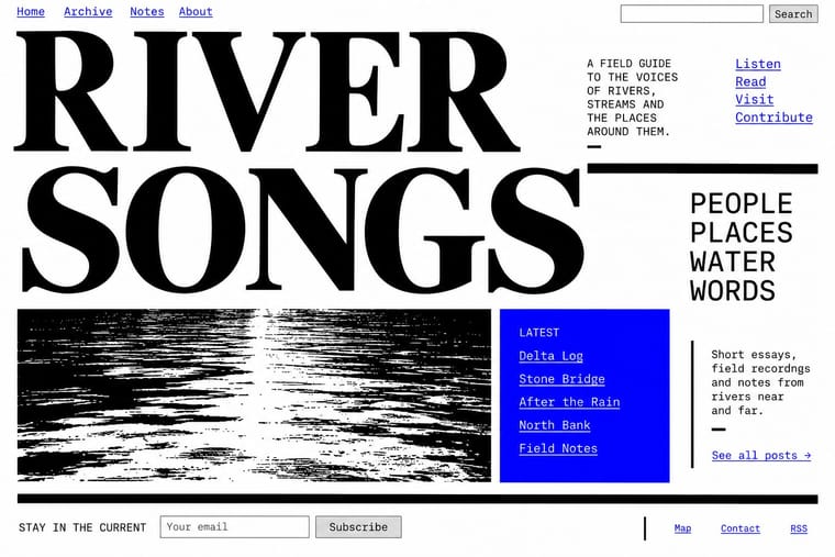
Competing hierarchies translate to the browser as overlapping, barely styled HTML layers.
01
What each style brings
Each part of the design comes from the style with the stronger say in it, and each style gives at least two.
Cranbrook & Deconstructivist Typography Brutalist Web Design
- Type from Cranbrook
- Colour from Brutalist Web Design
- Form from Brutalist Web Design
- Composition from Cranbrook
- Surface from Cranbrook
-
02
The type
Open fonts standing in for each style’s own type, which is often hand-drawn or commercial.
Text · Brutalist Web Design
A reaction against templated, conversion-optimised web design that exposes the raw materials of the browser: default system fonts, blue underlined links, visible borders, unstyled forms and plain document flow. Named after architectural Brutalism by Pascal Deville's survey site brutalistwebsites.com (2014), it ranges from functional austerity to deliberately abrasive antidesign.
Courier Prime; Brutalist Web Design used Times New Roman and Courier New and system monospace
03
The colours
The ground and leading colours come from Brutalist Web Design, with a counter-accent from Cranbrook. The ink reads on the ground at 4.5:1 or more.
Cranbrook & Deconstructivist Typography Brutalist Web Design
-
#ffffffground · 36% -
#000000ink · 14% -
#ff0000accent · 18% -
#d1342caccent · 14% -
#0000eeaccent · 10% -
#c99a2eaccent · 8%
As CSS
:root {
  --ground: #ffffff;
  --ink: #000000;
  --accent-1: #ff0000;
  --accent-2: #d1342c;
  --accent-3: #0000ee;
  --accent-4: #c99a2e;
  --font-display: "Inter Tight", sans-serif;
  --font-text: "Courier Prime", monospace;
}
04
The two styles
05
More combinations
With Cranbrook
- Renaissance Book Typography Contrasts · The single justified book block is what deconstruction questions; quoting it inside a layered layout makes the critique explicit.
- International Typographic Style Contrasts · Swiss clarity is the master narrative Cranbrook took apart; keep one Swiss column as a legible anchor in a deconstructed spread.
- Emigre & Early Digital Type Pairs well · Emigre published Cranbrook work; set layered Cranbrook-style spreads in Emigre's early digital typefaces.
- Dutch Expressive Postmodernism (Studio Dumbar & Hard Werken) Contrasts · Its transatlantic contemporary: Katherine McCoy of Cranbrook co-organised the 1986 Chicago show of Dutch design. Cranbrook layers text to be read and argued over; the Dutch studios layer pictures, colour and staged depth to be enjoyed. Choose Cranbrook for theory-laden spreads and the Dutch idiom for posters that must play.
- Die Neue Typographie Contrasts · Cranbrook dismantled exactly these rules; state one New Typography convention clearly, then break it on purpose.
- Total Design & Dutch Functionalism Contrasts · Cranbrook's layered, reader-dependent pages invert Total Design's single impersonal reading; set one against the other to argue order versus interpretation.
- South African Vernacular Design (Ijusi) Contrasts · Both layer vernacular lettering into experimental pages, but Cranbrook starts from literary theory and Ijusi from Durban's streets and the politics of a new democracy; choose by whether the brief is about reading or about place.
With Brutalist Web Design
- International Typographic Style Pairs well · Pair raw HTML with a strict Swiss grid and one grotesque so brutalism reads as intentional rather than broken.
- Glassmorphism Contrasts · Glass's layered translucency is everything brutalism strips away; use the contrast to decide how much polish a product really needs.
- Corporate Memphis Contrasts · Corporate Memphis is the friendly corporate gloss brutalism rejects; quote it ironically to sharpen a critique.
- Punk & DIY Zine Pairs well · Borrow zine cut-and-paste attitude: collide screenshots, default fonts and scrawled notes on one page.
- Frutiger Aero Contrasts · Raw HTML against bubbly gloss is a sharp foil for ironic or nostalgic web projects.
- Glitch Art & Datamosh Graphics Pairs well · Both put the machinery on show; set corrupted images on a raw-HTML page of default fonts so the code and the broken pictures make one argument about the medium.
- Internet Ugly & Meme Vernacular Pairs well · Put MS Paint drawings and image macros on a raw-HTML page of default fonts and blue links; both treat software defaults as honesty rather than lack of taste.
- Flash-Era Web Design (Flash Portfolio Sites) Contrasts · Raw, static HTML defaults against the fully art-directed animated stage.