Style combination · Contrasts
Cranbrook × Die Neue Typographie
Cranbrook dismantled exactly these rules; state one New Typography convention clearly, then break it on purpose.
01
What each style brings
Each part of the design comes from the style with the stronger say in it, and each style gives at least two.
Cranbrook & Deconstructivist Typography Die Neue Typographie
- Type from Cranbrook
- Colour from Die Neue Typographie
- Form from Die Neue Typographie
- Composition from Cranbrook
- Surface from Cranbrook
-
02
The type
Open fonts standing in for each style’s own type, which is often hand-drawn or commercial.
Display · Cranbrook
Index
Inter Tight, standing in for Univers and Helvetica, fragmented and layered
Text · Die Neue Typographie
The programme that turned avant-garde experiment into a functional typographic method, named by Moholy-Nagy in 1923 and codified in Jan Tschichold's 'elementare typographie' (1925) and Die neue Typographie (1928). It demanded asymmetric layouts, sans-serif type, standard paper formats, photography and active white space, all justified by clarity of communication, and spread through the Ring neue Werbegestalter and designers from Delft to Prague.
Jost; Die Neue Typographie used Futura and Akzidenz-Grotesk
03
The colours
The ground and leading colours come from Die Neue Typographie, with a counter-accent from Cranbrook. The ink reads on the ground at 4.5:1 or more.
Cranbrook & Deconstructivist Typography Die Neue Typographie
-
#f3efe4ground · 39% -
#141414ink · 15% -
#d32a1faccent · 20% -
#7d7a73accent · 15% -
#c99a2eaccent · 11%
As CSS
:root {
  --ground: #f3efe4;
  --ink: #141414;
  --accent-1: #d32a1f;
  --accent-2: #7d7a73;
  --accent-3: #c99a2e;
  --font-display: "Inter Tight", sans-serif;
  --font-text: "Jost", sans-serif;
}
04
The two styles
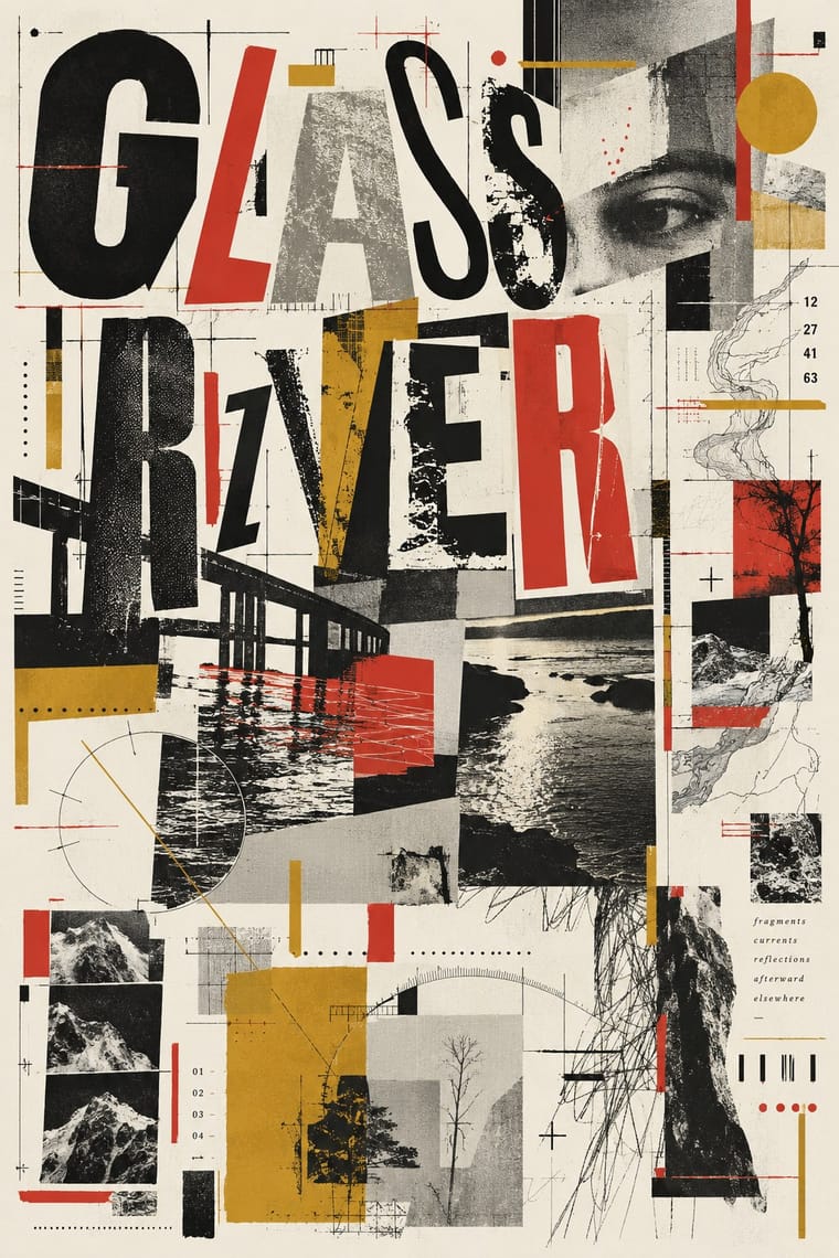
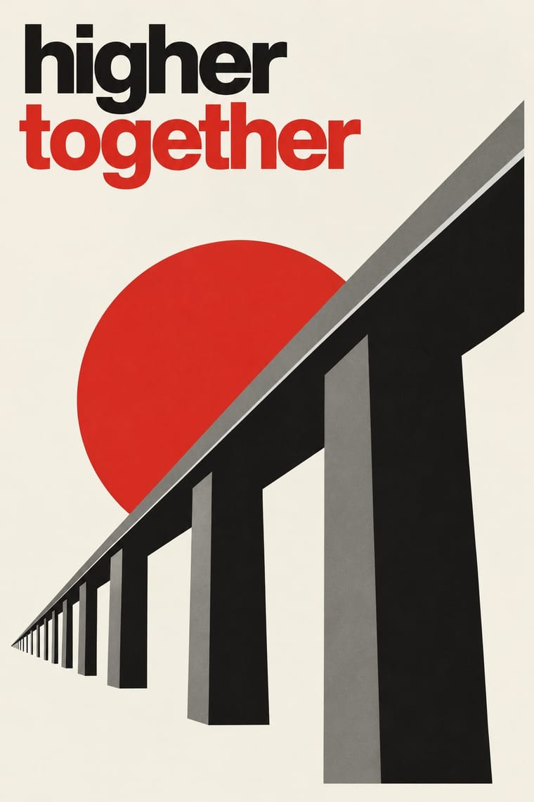
05
More combinations
With Cranbrook
- Renaissance Book Typography Contrasts · The single justified book block is what deconstruction questions; quoting it inside a layered layout makes the critique explicit.
- International Typographic Style Contrasts · Swiss clarity is the master narrative Cranbrook took apart; keep one Swiss column as a legible anchor in a deconstructed spread.
- Emigre & Early Digital Type Pairs well · Emigre published Cranbrook work; set layered Cranbrook-style spreads in Emigre's early digital typefaces.
- Brutalist Web Design Pairs well · Competing hierarchies translate to the browser as overlapping, barely styled HTML layers.
- Dutch Expressive Postmodernism (Studio Dumbar & Hard Werken) Contrasts · Its transatlantic contemporary: Katherine McCoy of Cranbrook co-organised the 1986 Chicago show of Dutch design. Cranbrook layers text to be read and argued over; the Dutch studios layer pictures, colour and staged depth to be enjoyed. Choose Cranbrook for theory-laden spreads and the Dutch idiom for posters that must play.
- Total Design & Dutch Functionalism Contrasts · Cranbrook's layered, reader-dependent pages invert Total Design's single impersonal reading; set one against the other to argue order versus interpretation.
- South African Vernacular Design (Ijusi) Contrasts · Both layer vernacular lettering into experimental pages, but Cranbrook starts from literary theory and Ijusi from Durban's streets and the politics of a new democracy; choose by whether the brief is about reading or about place.
With Die Neue Typographie
- Risograph & Indie Print Culture Pairs well · Two-colour riso printing suits its black-plus-red restraint for low-budget editorial and posters.
- International Typographic Style Pairs well · Extend its asymmetric black-and-red onto a full modular grid for a seamless Swiss-era update.
- Renaissance Book Typography Contrasts · Tschichold himself returned to the centred classical page; set the two side by side to choose between symmetric tradition and asymmetric function.
- Mechano-Faktura & Polish Constructivist Advertising Pairs well · Pair the line-field image with asymmetric sans setting for an advertising layout.
- Post-Punk Record Sleeve (Stiff, Factory, 4AD) Pairs well · Saville's model: borrow Tschichold's asymmetric placement and small sans-serif capitals, then replace his photographs with one quoted image to get a cool, ordered sleeve.
- Brodovitch Editorial Design (Harper's Bazaar) Contrasts · Asymmetry without rules: improvised and photographic rather than systematic.
- German Book Art Movement (Buchkunstbewegung) Contrasts · From the mid-1920s the Bauhaus and the New Typography took over the avant-garde of the book; centred hand-press pages against asymmetric sans-serif layouts make a clear old-against-new tension.
- ECM Sleeve Aesthetic (Munich) Pairs well · Barbara Wojirsch named Tschichold as an influence: borrow his asymmetric blocks of small sans-serif type and set them beside one quiet photograph instead of his photomontage.