Style combination · Pairs well
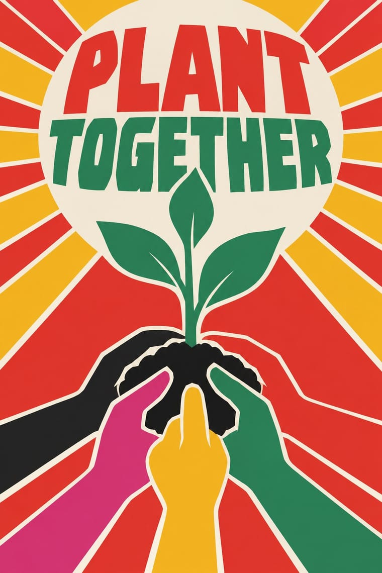
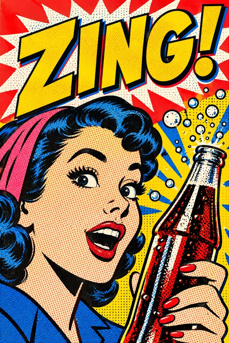
Cuban Revolutionary Poster × Pop Art Graphics
Pair Pop's flat, brand-like imagery with Cuban single-idea silhouettes for bold campaign posters.
Mix them and make something Cuban Revolutionary Poster Pop Art Graphics
01
What each style brings
Each part of the design comes from the style with the stronger say in it, and each style gives at least two.
Cuban Revolutionary Poster (OSPAAAL & ICAIC) Pop Art Graphics
- Type from Cuban Revolutionary Poster
- Colour from Pop Art Graphics
- Form from Cuban Revolutionary Poster
- Composition from Cuban Revolutionary Poster
- Surface from Pop Art Graphics
02
The type
Open fonts standing in for each style’s own type, which is often hand-drawn or commercial.
Display · Cuban Revolutionary Poster
Yay!
Archivo Black; Cuban Revolutionary Poster used Hand-cut silkscreen display lettering and Neo-grotesque sans captions repeated in Spanish, English, French and Arabic
Text · Pop Art Graphics
Pop turned the commercial imagery of post-war consumer culture (comics, packaging, celebrity photographs and advertising) into both its subject and its method. Images are appropriated, enlarged, flattened and repeated; colour is bright and unmodulated; and the printing process itself, from Ben-Day dots to off-register silkscreen, is left visible as a sign of mass production.
Archivo; Pop Art Graphics used Comic-book hand lettering and Franklin Gothic
03
The colours
The ground and leading colours come from Pop Art Graphics, with a counter-accent from Cuban Revolutionary Poster. The ink reads on the ground at 4.5:1 or more.
Cuban Revolutionary Poster (OSPAAAL & ICAIC) Pop Art Graphics
-
#fbf8f0ground · 36% -
#111111ink · 14% -
#ffd400accent · 18% -
#e10600accent · 14% -
#e3342baccent · 10% -
#0057b8accent · 8%
As CSS
:root {
  --ground: #fbf8f0;
  --ink: #111111;
  --accent-1: #ffd400;
  --accent-2: #e10600;
  --accent-3: #e3342b;
  --accent-4: #0057b8;
  --font-display: "Archivo Black", sans-serif;
  --font-text: "Archivo", sans-serif;
}
04
The two styles
05
More combinations
With Cuban Revolutionary Poster
- Socialist Realist Propaganda Poster Contrasts · Cuba largely avoided Soviet painted realism; set a flat silhouette against a heroic painting to show abstraction carrying politics.
- Corporate Identity Modernism Contrasts · Militant, colourful single-image posters versus neutral corporate systems; use the Cuban mode where a cause needs urgency.
- Gráfica del 68 (Mexican Student Movement Graphics) Contrasts · OSPAAAL and ICAIC posters were planned, many-coloured and made to last, while the 68 brigades printed one ink for the next march; choose Cuba for a solidarity campaign, 68 for an emergency.
- Saul and Elaine Bass Conceptual Film Graphics Contrasts · ICAIC's film posters also read a film through one silhouette or pun, but in saturated, clashing screenprint colour for a revolutionary public; Bass keeps to one or two flat colours and black, and the symbol's real home is the moving title.
- Pop Achorado (Peruvian Agrarian Reform Posters) Pairs well · Both are state poster programmes that took up pop and op colour; give an OSPAAAL-style single emblem Ruiz Durand's comic contour and enlarged dot ground for a campaign that must read from across a village square.
- Puerto Rican Silkscreen Poster (DIVEDCO & ICP) Pairs well · Both are state-backed Caribbean silkscreen cultures for cinema and the arts, and Puerto Rico's began more than a decade before ICAIC's workshop; combine ICAIC's single conceptual image with Homar's hand-drawn Spanish lettering built into it.
- Atelier Populaire (May '68 Screenprint Poster) Contrasts · Same decade, opposite means: ICAIC's silkscreened film posters and OSPAAAL's mostly offset solidarity posters were polished, many-coloured and made to last, while the Atelier's one anonymous ink was pulled overnight for the next morning's wall; decide which of the two the brief needs.
- Spanish Civil War Poster Contrasts · Cuba kept the raised fist but traded urgent painted bodies for one witty silhouette; use the pair to choose between urgency and wit.
With Pop Art Graphics
- International Typographic Style Contrasts · Set one loud appropriated Pop image inside a strict grid with a neutral grotesque so the irony reads as deliberate rather than chaotic.
- Ma & Wabi-sabi Aesthetics Contrasts · Where Pop multiplies glossy commodities, wabi-sabi values the single worn object; use one to puncture the mood of the other.
- Guna Mola Pairs well · Guna women redraw brand logos and cartoons (RCA Victor, Bullwinkle) in reverse appliqué; let that act of translation inspire Pop work, but buy or commission molas rather than imitating them.
- Neo-Brutalism Pairs well · Lift Pop's thick black outlines and flat primaries into UI cards and buttons for a confident, comic-strip interface.
- Risograph & Indie Print Culture Pairs well · Print Ben-Day dot screens in fluorescent pink and yellow riso inks to give Pop's mass-media imagery a small-run, handmade warmth.
- Screenprinted Gig & Alt-Movie Poster Pairs well · Shepard Fairey called Kozik 'the punk rock Warhol'; take Pop's appropriated cartoons and halftones and give them a gig poster's single idea and hand-lettered title.
- Finnish Bold Print (Marimekko Modernism) Pairs well · Contemporaries in saturated flat colour at a giant scale; borrow pop's isolated, enlarged object for a poster, but drop its halftone and irony to keep Marimekko's sincerity.
- Superflat Contrasts · Both turn commodities into art; take Pop's repetition and frontal commodity but swap its halftone and off-register silkscreen for Superflat's smooth vector fills and anime characters, so the print process disappears.