Style combination · Contrasts
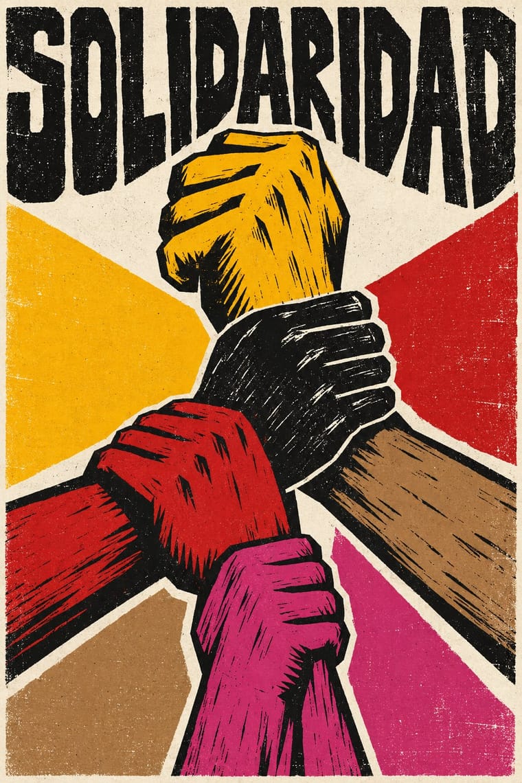
Cuban Revolutionary Poster × Gráfica del 68
OSPAAAL and ICAIC posters were planned, many-coloured and made to last, while the 68 brigades printed one ink for the next march; choose Cuba for a solidarity campaign, 68 for an emergency.
Mix them and make something Cuban Revolutionary Poster Gráfica del 68
01
What each style brings
Each part of the design comes from the style with the stronger say in it, and each style gives at least two.
Cuban Revolutionary Poster (OSPAAAL & ICAIC) Gráfica del 68 (Mexican Student Movement Graphics)
- Type from Gráfica del 68
- Colour from Cuban Revolutionary Poster
-
Gráfica del 68 avoids full polychrome: this is where the two pull against each other, which is the point of the contrast.
- Form from Gráfica del 68
- Composition from Cuban Revolutionary Poster
- Surface from Gráfica del 68
02
The type
Open fonts standing in for each style’s own type, which is often hand-drawn or commercial.
Display · Gráfica del 68
Rise
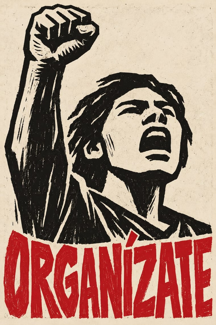
Permanent Marker; Gráfica del 68 used Capitals cut into the linoleum block together with the image and Brushed and stencilled slogans on cardboard placards and cloth mantas
Text · Cuban Revolutionary Poster
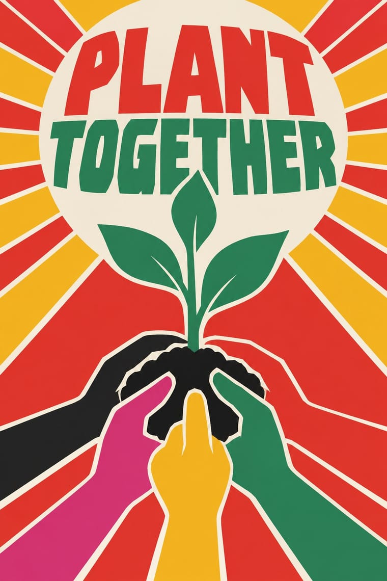
The poster culture of revolutionary Cuba, produced for the film institute ICAIC and the solidarity organisation OSPAAAL. With no commercial advertising and scarce materials, designers made bold silkscreen and offset posters that combined Pop and psychedelic colour, op-art pattern, flat silhouettes and single conceptual images, for cinema and for internationalist causes from Vietnam to Africa.
Archivo; Cuban Revolutionary Poster used Hand-cut silkscreen display lettering and Neo-grotesque sans captions repeated in Spanish, English, French and Arabic
03
The colours
The ground and leading colours come from Cuban Revolutionary Poster, with a counter-accent from Gráfica del 68. The ink reads on the ground at 4.5:1 or more.
Cuban Revolutionary Poster (OSPAAAL & ICAIC) Gráfica del 68 (Mexican Student Movement Graphics)
-
#f2ede0ground · 36% -
#1c1c1cink · 14% -
#f5b81caccent · 18% -
#c4161caccent · 14% -
#a9845baccent · 10% -
#d6337aaccent · 8%
As CSS
:root {
  --ground: #f2ede0;
  --ink: #1c1c1c;
  --accent-1: #f5b81c;
  --accent-2: #c4161c;
  --accent-3: #a9845b;
  --accent-4: #d6337a;
  --font-display: "Permanent Marker", cursive;
  --font-text: "Archivo", sans-serif;
}
Use it with care
Gráfica del 68 (Mexican Student Movement Graphics): These images answered real repression: soldiers entered the schools, a raid on San Carlos destroyed its workshop and prints, and the number of people killed at Tlatelolco on 2 October 1968 is still not known, so do not use the bloodied dove, the gorilla or Tlatelolco imagery as edgy styling for a brand, a product or an Olympic-themed event. Mexiac's chained, gagged figure is a Tzotzil man, drawn in 1954 against the coup in Guatemala; do not turn it into a generic mascot of silencing. The makers agreed not to sign their work, for the movement's sake and for their own safety, and many attributions are later and disputed (the dove placard among them), so credit works as 'attributed to' or to the brigade, and never present a pastiche as a 1968 original.
04
The two styles
05
More combinations
With Cuban Revolutionary Poster
- Socialist Realist Propaganda Poster Contrasts · Cuba largely avoided Soviet painted realism; set a flat silhouette against a heroic painting to show abstraction carrying politics.
- Corporate Identity Modernism Contrasts · Militant, colourful single-image posters versus neutral corporate systems; use the Cuban mode where a cause needs urgency.
- Pop Art Graphics Pairs well · Pair Pop's flat, brand-like imagery with Cuban single-idea silhouettes for bold campaign posters.
- Saul and Elaine Bass Conceptual Film Graphics Contrasts · ICAIC's film posters also read a film through one silhouette or pun, but in saturated, clashing screenprint colour for a revolutionary public; Bass keeps to one or two flat colours and black, and the symbol's real home is the moving title.
- Pop Achorado (Peruvian Agrarian Reform Posters) Pairs well · Both are state poster programmes that took up pop and op colour; give an OSPAAAL-style single emblem Ruiz Durand's comic contour and enlarged dot ground for a campaign that must read from across a village square.
- Puerto Rican Silkscreen Poster (DIVEDCO & ICP) Pairs well · Both are state-backed Caribbean silkscreen cultures for cinema and the arts, and Puerto Rico's began more than a decade before ICAIC's workshop; combine ICAIC's single conceptual image with Homar's hand-drawn Spanish lettering built into it.
- Atelier Populaire (May '68 Screenprint Poster) Contrasts · Same decade, opposite means: ICAIC's silkscreened film posters and OSPAAAL's mostly offset solidarity posters were polished, many-coloured and made to last, while the Atelier's one anonymous ink was pulled overnight for the next morning's wall; decide which of the two the brief needs.
- Spanish Civil War Poster Contrasts · Cuba kept the raised fist but traded urgent painted bodies for one witty silhouette; use the pair to choose between urgency and wit.
With Gráfica del 68
- Atelier Populaire (May '68 Screenprint Poster) Pairs well · Paris and Mexico City made the same unsigned, one-ink protest posters in the same year, largely without knowing each other's work; combine the Atelier's brushed silhouettes with the Mexican linocut and Olympic parody for graphics that answer a specific official image.
- Chicano Screenprint Poster Pairs well · Both descend from the Taller de Gráfica Popular and parody official imagery; add Chicano flat colour and bilingual wordplay to a 68-style emblem when the audience lives on both sides of the border.