Style combination · Pairs well
Lo-fi Anime Aesthetic × Solarpunk
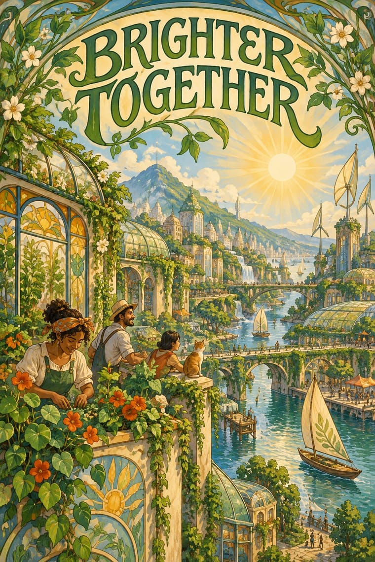
Both draw on Miyazaki and Ghibli-style painted backgrounds; lofi turns inward to one quiet room at dusk, solarpunk outward to a shared, sunlit city.
01
What each style brings
Each part of the design comes from the style with the stronger say in it, and each style gives at least two.
Lo-fi Anime Aesthetic Solarpunk
- Type from Solarpunk
- Colour from Lo-fi Anime Aesthetic
- Form from Solarpunk
- Composition from Lo-fi Anime Aesthetic
- Surface from Lo-fi Anime Aesthetic
02
The type
Open fonts standing in for each style’s own type, which is often hand-drawn or commercial.
Display · Solarpunk
Home
Federant, standing in for Swash, Art Nouveau-flavoured upper- and lowercase display lettering, as in Solarpunk Magazine's orange masthead (Issue #14, 2024)
Text · Lo-fi Anime Aesthetic
The look of YouTube's 24/7 lo-fi hip hop streams. Early uploads looped found clips from cartoons and anime (The Simpsons, Whisper of the Heart); the look was fixed when ChilledCow (now Lofi Girl) swapped its Ghibli clip for Juan Pablo Machado's 'Miyazaki-esque' girl studying by a window over Lyon, art many channels copied. One absorbed figure, anime person or animal mascot, in a cosy painted room, a city or rain at dusk outside, cool blue-violet light warmed by a lamp, a few things moving in a seamless loop: a picture to work beside, sincere where vaporwave is ironic.
Zen Kaku Gothic New; Lo-fi Anime Aesthetic used Lowercase stream and track titles in plain sans text with a single emoji as the only ornament, as in Lofi Girl's 'lofi hip hop radio 📚 beats to relax/study to' and 'jazz lofi radio 🎷 beats to chill/study to' and Letter-spaced capitals in track and compilation titles ('RAINING IN P A R I S', 'L O V E S I C K'), which fans trace to vaporwave and to typing Latin words with Japanese keyboards and typefaces (Wang, 2020)
03
The colours
The ground and leading colours come from Lo-fi Anime Aesthetic, with a counter-accent from Solarpunk. The ink reads on the ground at 4.5:1 or more.
Lo-fi Anime Aesthetic Solarpunk
-
#262a52ground · 36% -
#e9a3b8ink · 14% -
#f2a65aaccent · 18% -
#7a4e3aaccent · 14% -
#b8652faccent · 10% -
#6a5a9aaccent · 8%
As CSS
:root {
  --ground: #262a52;
  --ink: #e9a3b8;
  --accent-1: #f2a65a;
  --accent-2: #7a4e3a;
  --accent-3: #b8652f;
  --accent-4: #6a5a9a;
  --font-display: "Federant", sans-serif;
  --font-text: "Zen Kaku Gothic New", sans-serif;
}
Use it with care
Lo-fi Anime Aesthetic: The study girl (Jade), the Synthwave Boy and Chillhop's raccoon are owned characters, and the genre's first face, a Studio Ghibli clip used without permission, cost ChilledCow its stream in 2017: draw an original figure, room and view instead of tracing Ghibli frames or the Lofi Girl scene. The combination that identifies Lofi Girl (a girl in headphones writing at a desk, a cat on the sill, Lyon's Croix-Rousse hill beyond) is the one to change first: swap at least the figure, the companion and the view. Lofi Girl makes all its art by hand and objects to AI-generated avatars that resemble or recreate its characters, so never generate a look-alike of Jade or her companions, and disclose generated pictures. Leave out Japanese text unless it is correct and means something, and do not dress a room in random kana or generic 'Japan' scenery.
Solarpunk: Draw original worlds rather than pastiches of Studio Ghibli films or of living illustrators such as Likhain, Fei Fei Ruan or Stephen Lillie, and do not prompt an image model with their names. Do not use the look to greenwash: Adam Flynn calls luxury condos with a green roof that price out existing communities 'fake Solarpunk urbanism', so show shared, affordable infrastructure and ordinary people. When a scene borrows architecture, dress or symbols from a specific culture (Afrofuturist, Indigenous or other), keep their meanings and credit their makers.
04
The two styles
05
More combinations
With Lo-fi Anime Aesthetic
- Superflat Contrasts · Both draw on anime, but superflat flattens otaku imagery into ironic, polychrome, all-over fields with no depth; choose lofi for one sincere, softly lit room with depth, and superflat when the brief wants pop density and knowing play.
- Synthwave / Outrun Pairs well · Lofi Girl paired them itself in 2023, putting a synthwave stream's boy, neon Saturn sign and lava lamp in the window across from the study girl; add synthwave's neon glow to a lofi room for gaming or late-night variants.
- Kawaii Design Contrasts · Both draw cute, anime-derived figures, but kawaii sets a mascot frontally on a plain pastel ground; switch to lofi when the figure should be absorbed in a painted room at dusk rather than smiling at the viewer.
- Vaporwave Contrasts · Its sibling on YouTube's 24/7 streams: vaporwave collages found consumer debris (busts, dialog boxes, malls) with irony, lofi paints one sincere, lived-in room. Borrow vaporwave's letter-spaced titles at most, and leave its collage out when the brief is calm focus.
- Generative-AI Image Aesthetic Contrasts · Lofi Girl's policy rules out AI generation, AI upscaling and AI avatars resembling its characters in favour of handcrafted frames; keep the loop hand-animated and the room specific so it does not slide into glossy, averaged diffusion realism.
- Taishō Roman & Lyrical Illustration Pairs well · Both rest on one absorbed, wistful figure made for an intimate format; Taishō's muted cream-paper colour and hand-lettered titles give a lofi playlist cover or print an older, printed melancholy.
- VTuber Avatar and Stream Graphics Contrasts · Both put an anime figure on a 24/7 YouTube screen, but lofi's figure is a looping painting turned away from the viewer; a VTuber faces the camera, lip-syncs to a real performer and reads the chat, so use lofi for background calm and VTuber graphics for presence and talk.
- City Pop Illustration Contrasts · Both are sincere, painted and calm, and both found a worldwide audience on YouTube, lofi in its 24/7 streams and city pop in its 2010s revival; lofi puts one absorbed anime figure in a lamp-lit room at dusk with soft edges, city pop opens onto an empty sunlit place under a deep blue sky in hard-edged colour. Choose city pop when the brief is a place, not a person.
With Solarpunk
- Afrofuturist Design Pairs well · Wakanda is claimed by both: Afrofuturism brings ancestral glyphs, regal figures and cosmic dark grounds, solarpunk daylight, gardens and ordinary communities; join them with the symbols' meanings intact and Black artists credited.
- Frutiger Aero Contrasts · Both pair green nature with optimistic technology, but Aero renders it as glossy stock photography, bubbles and glass for a product; choose solarpunk for painted, handmade, lived-in places and shared infrastructure.
- Extinction Rebellion Graphics Contrasts · Both answer the climate crisis: XR shouts alarm in woodcut and flat spot colour; solarpunk paints the hopeful world after it. Pair them for campaigns that move from warning to vision.
- Synthwave / Outrun Contrasts · Synthwave's retro future is neon, chrome and night on an empty grid; solarpunk is daylit, green and crowded with people. Put them side by side to stage a fossil-fuelled nostalgia against a renewable future.
- Art Nouveau Pairs well · Olivia Louise built the look on 'updated Art Nouveau': borrow arched frames, whiplash vines and Mucha-style lettering for the veneer, but keep the painted vista and future infrastructure so it reads as a world to come rather than a period revival.
- Arts & Crafts Movement Pairs well · Both prize the artisan over the factory; wrap a solarpunk scene in a Morris-style foliage border or woodcut initial for zines, seed packets and printed manifestos.
- Cottagecore Pairs well · Add solarpunk's hopeful green futures to cottagecore's gardens for an eco-pastoral look.
- Biobrand (Organic Biotech CGI) Contrasts · Both pair nature with technology, but solarpunk paints a communal daylit landscape; the biobrand isolates one rendered organism as a product. Switch to solarpunk when the story is a shared future rather than a single item.